Glow set out to re-imagine how kids communicate — building a connected device and iOS companion app that put safety and simplicity first. I came on as a founding designer, shaping the product from investor pitch to beta launch across brand, device UX, and the iOS companion app.
Role: Founding Product & Brand Designer
Client: Glow LLC
Type: 0→1 Product Design, Brand Identity, IoT, iOS
Year: May 2020 – March 2021
Tools: Figma, Cinema 4D
The Challenge
Glow needed an iOS companion app that gave parents complete control over their child's device without making that control feel complicated. Simple to hand over. Hard to misuse.
The beta test had a clear scope: parents needed to successfully onboard the app, create an account, and pair their child's Glow device — all without friction. From there, the experience had to support contact management, giving parents full visibility and approval over who their child could communicate with. Only kids with Glow devices could connect, keeping the network intentionally closed and safe.
A collaborative play mode allowed kids with Glow devices to play games together, adding a layer of social engagement that went beyond basic communication. Every feature served the same underlying promise — parents stay in the loop, kids stay safe, and the experience stays simple enough for both.
iOS Companion App
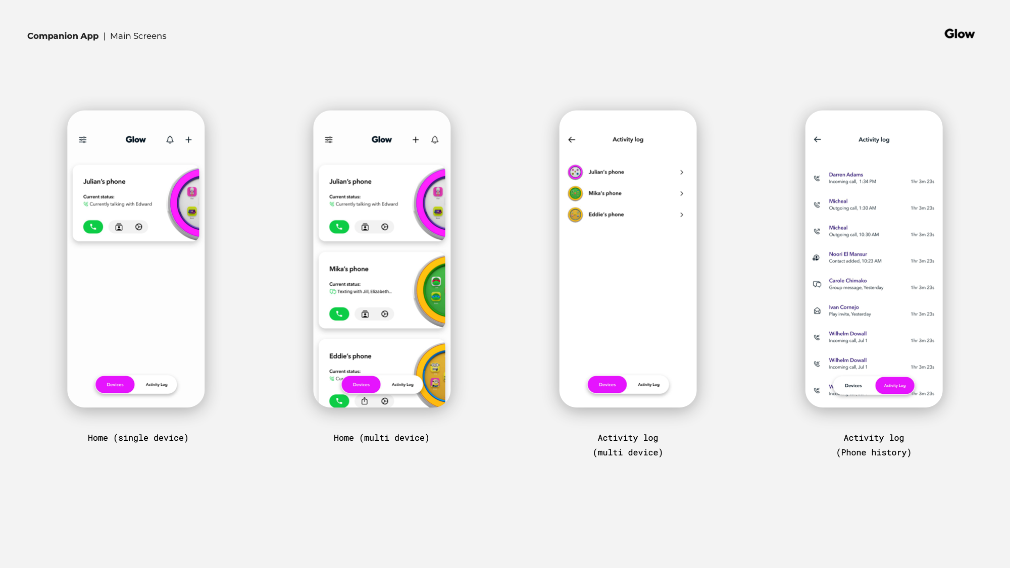
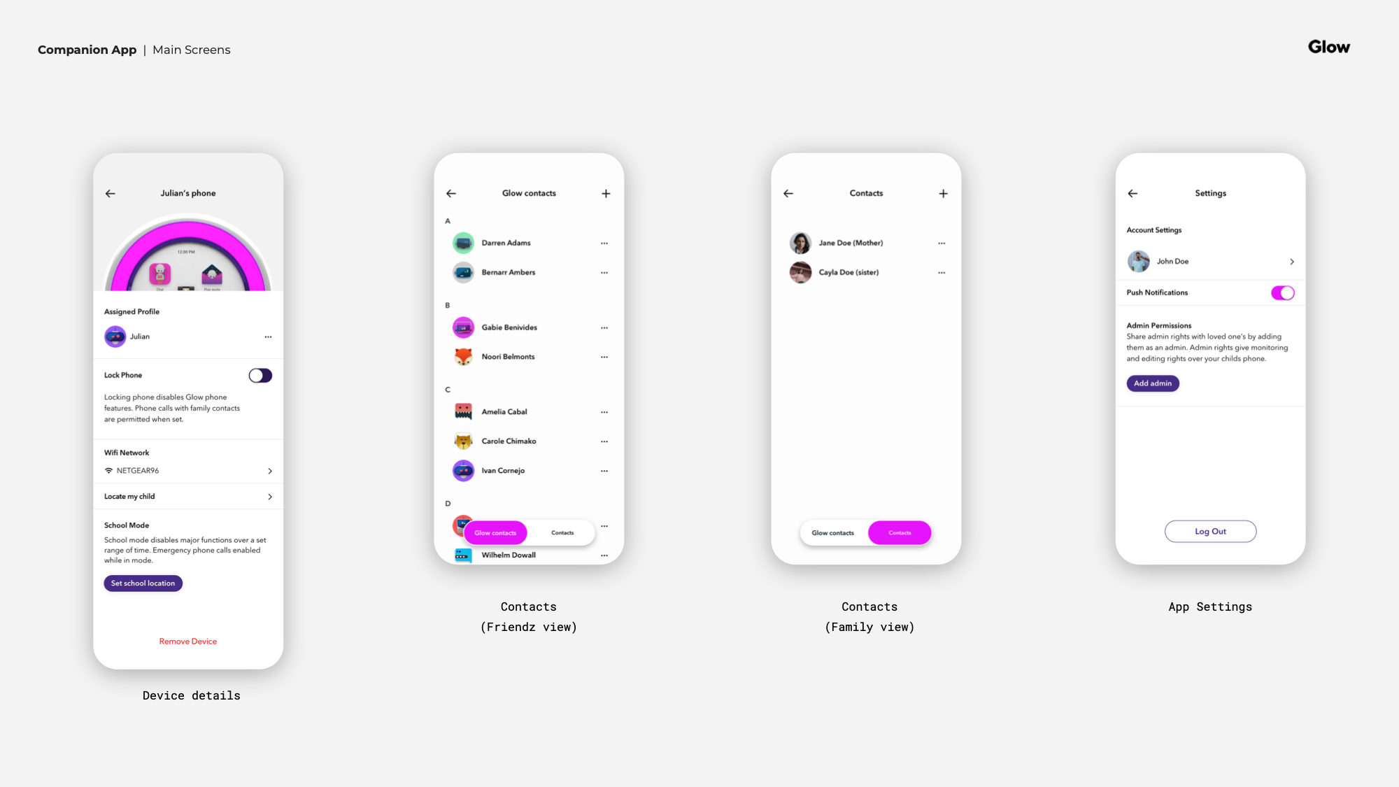
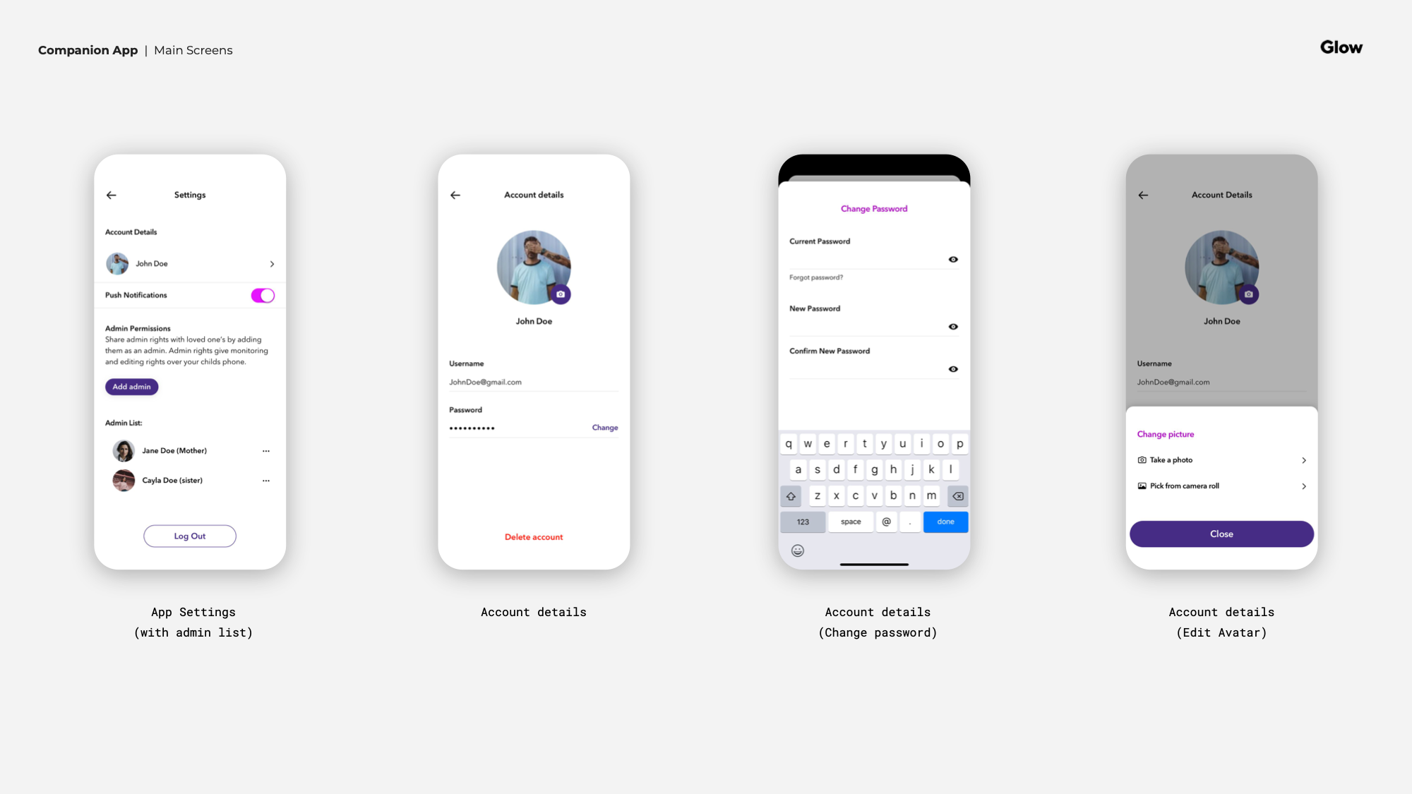
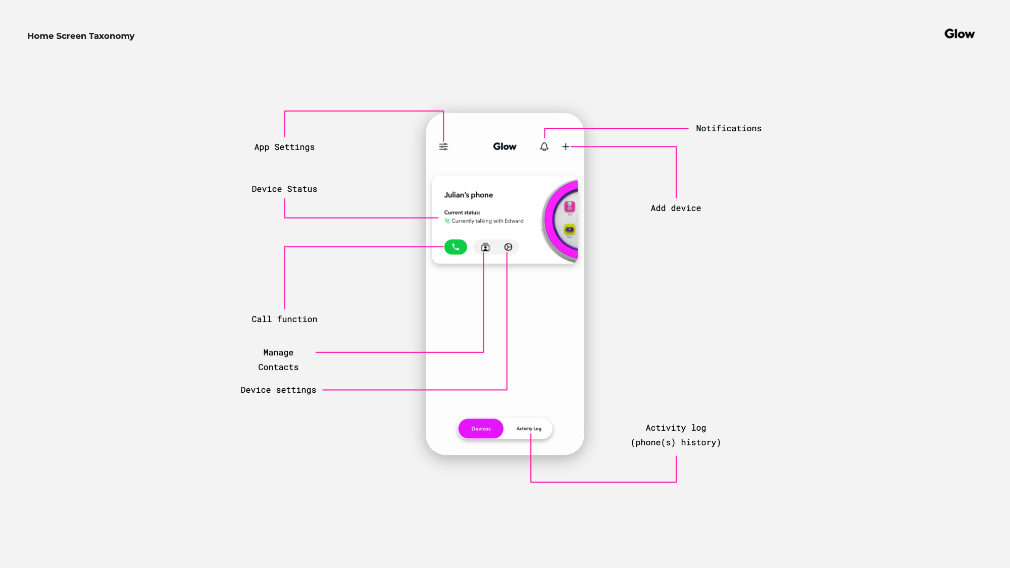
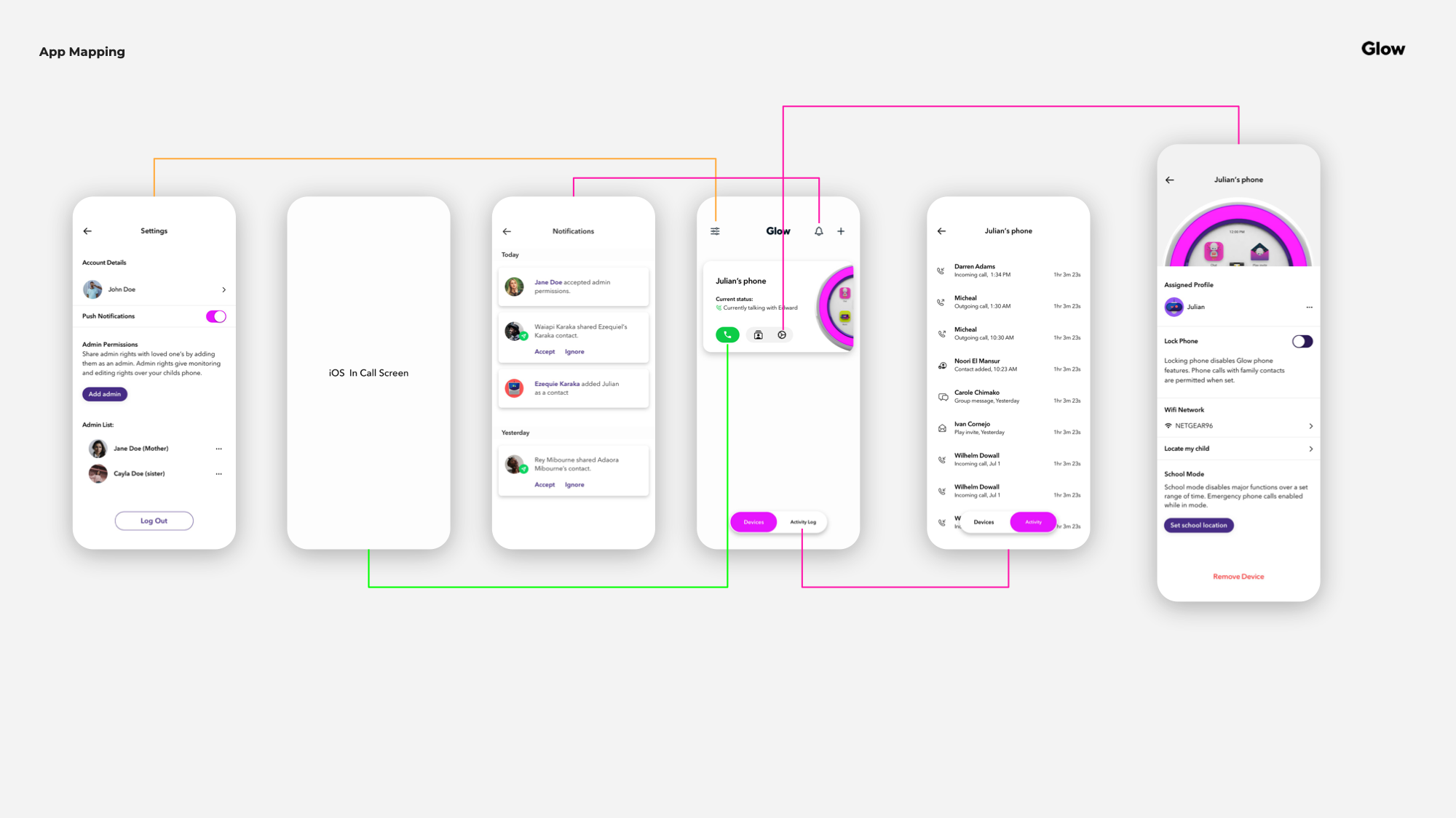
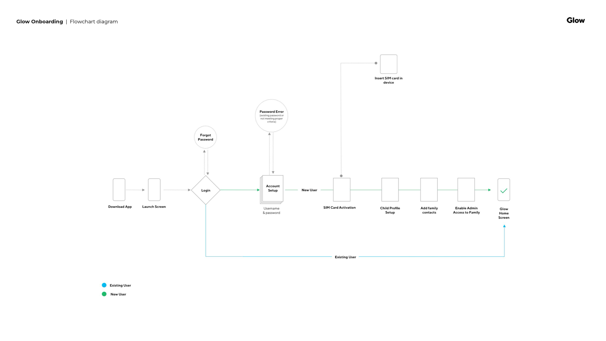
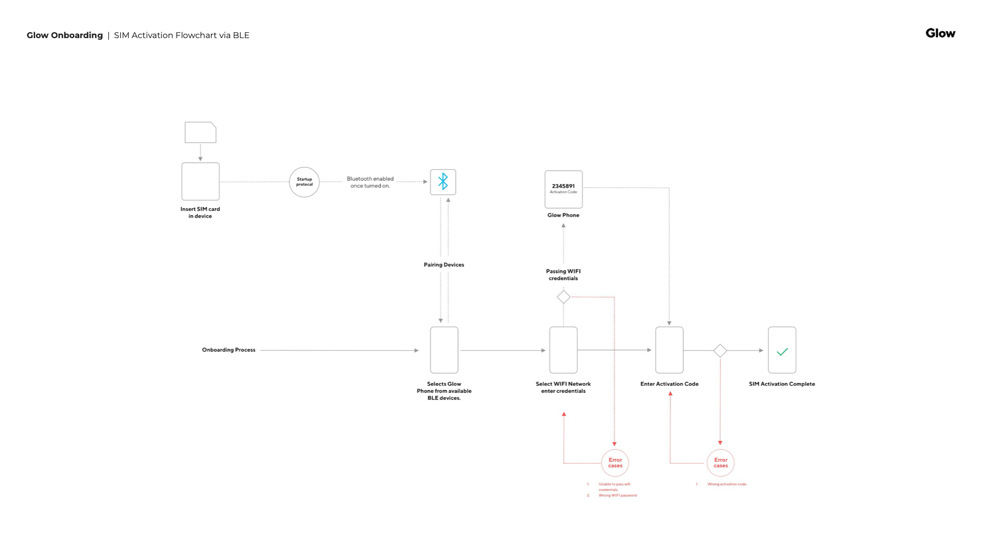
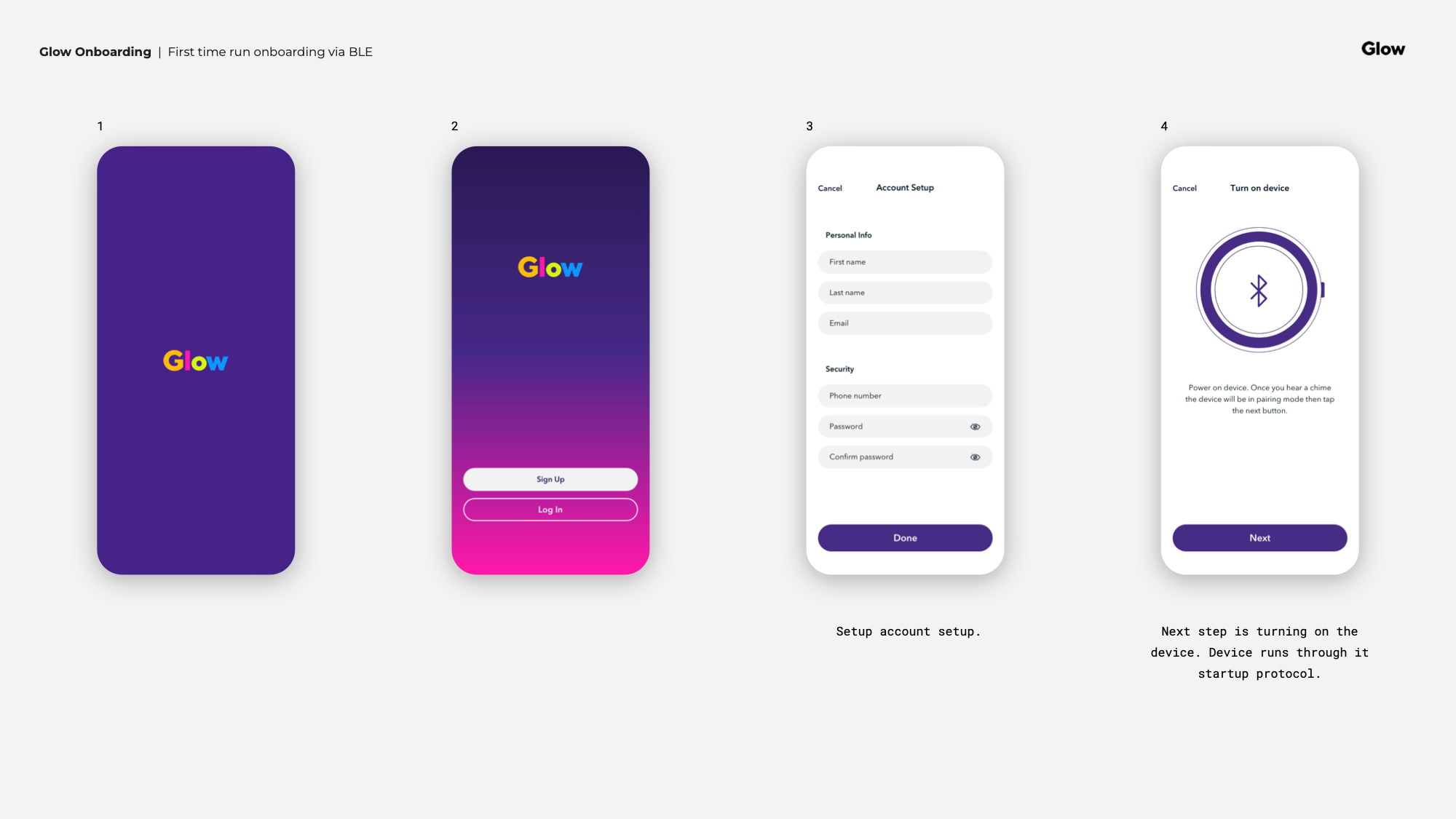
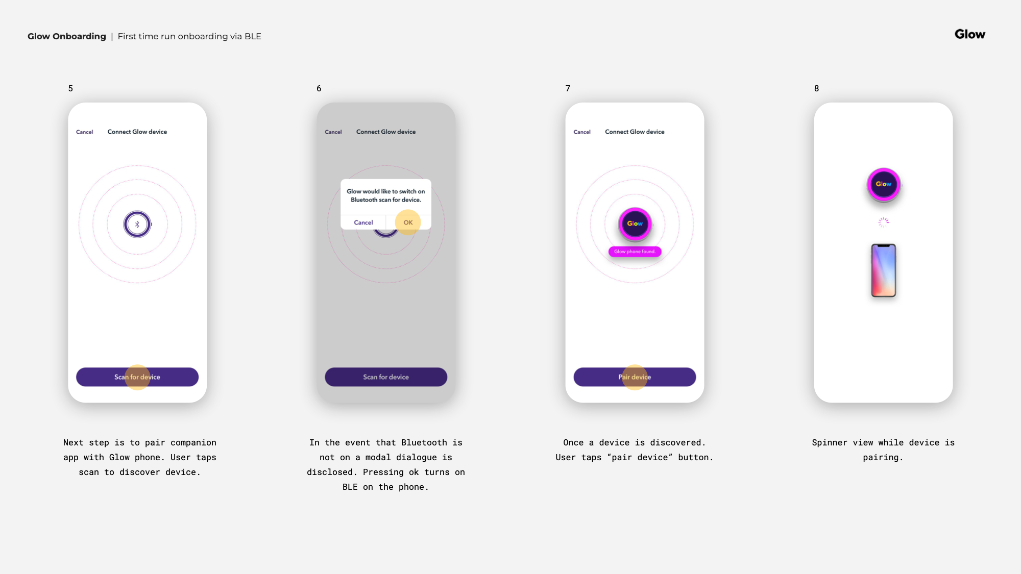
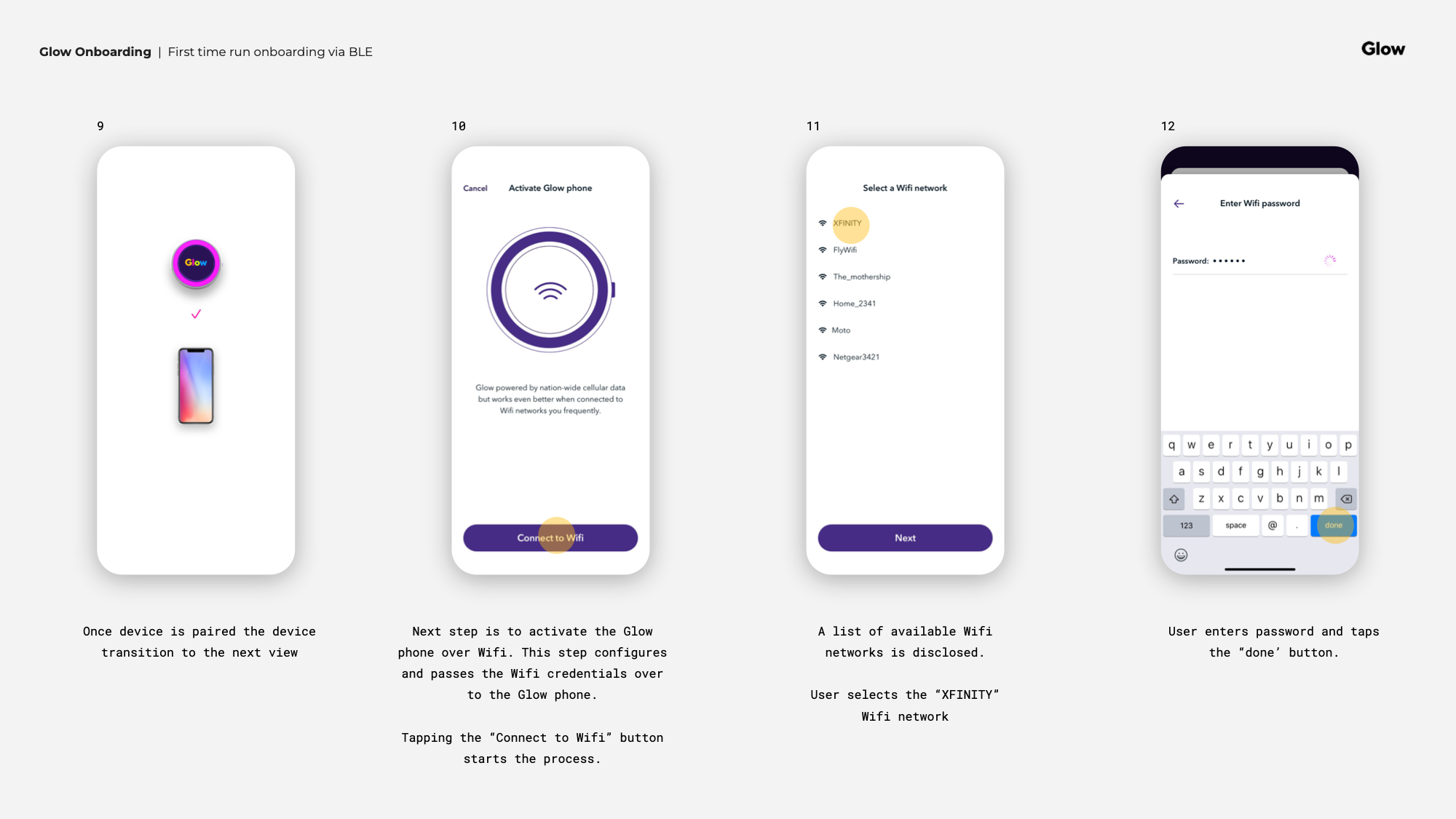
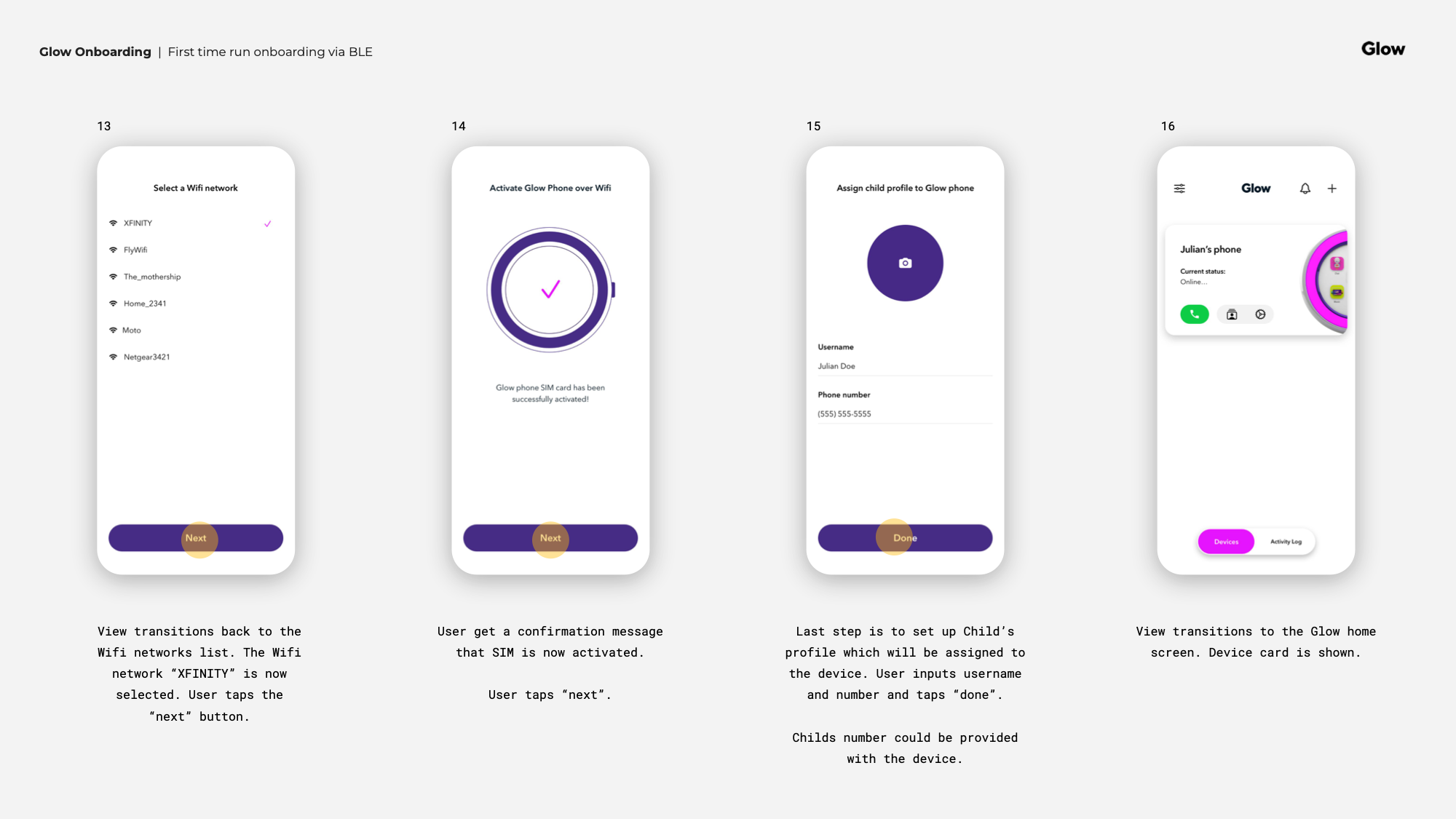
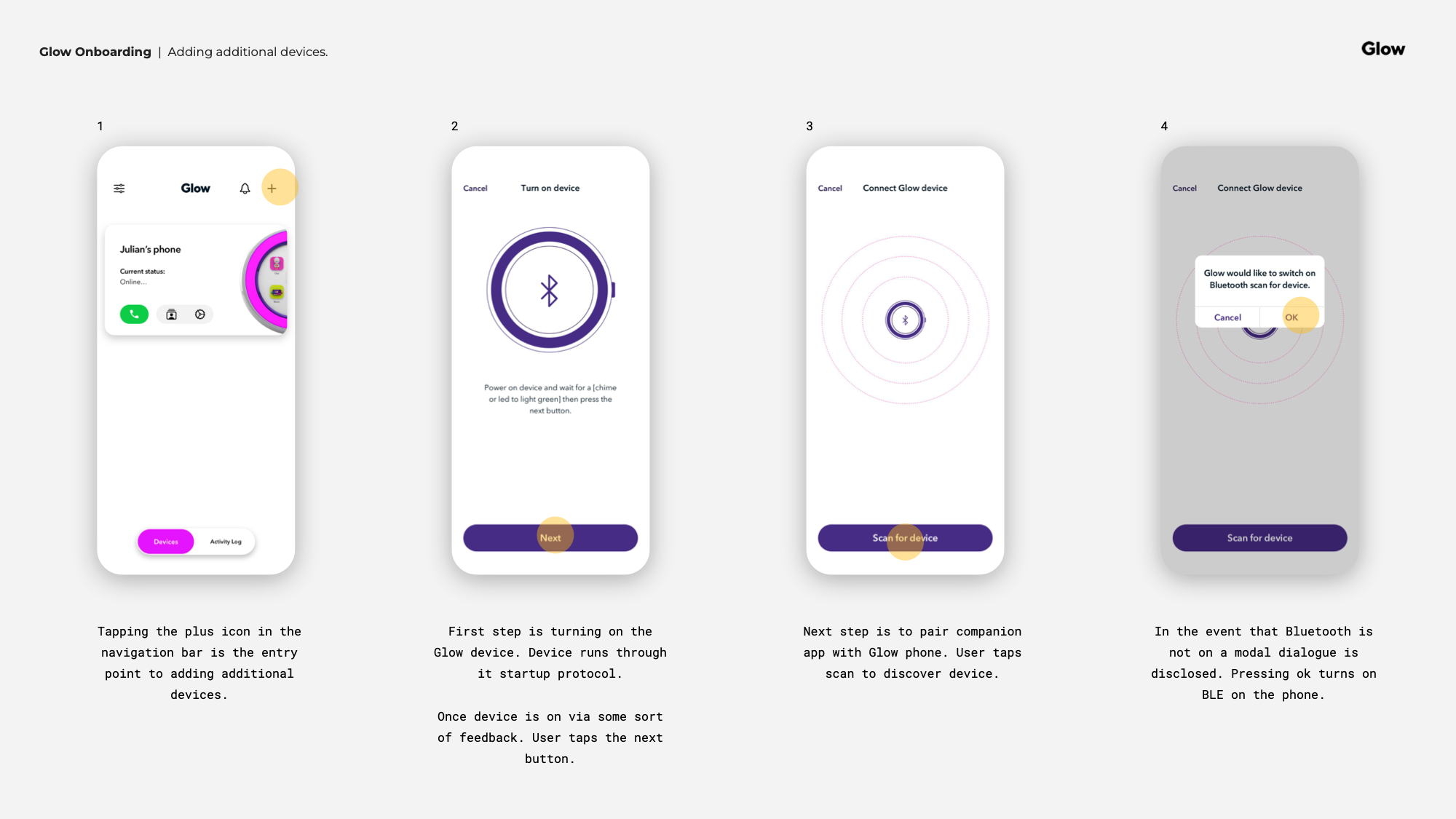
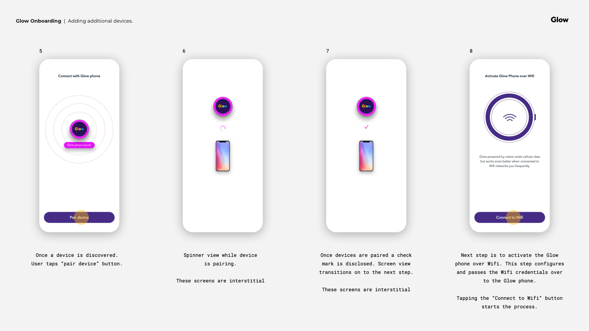
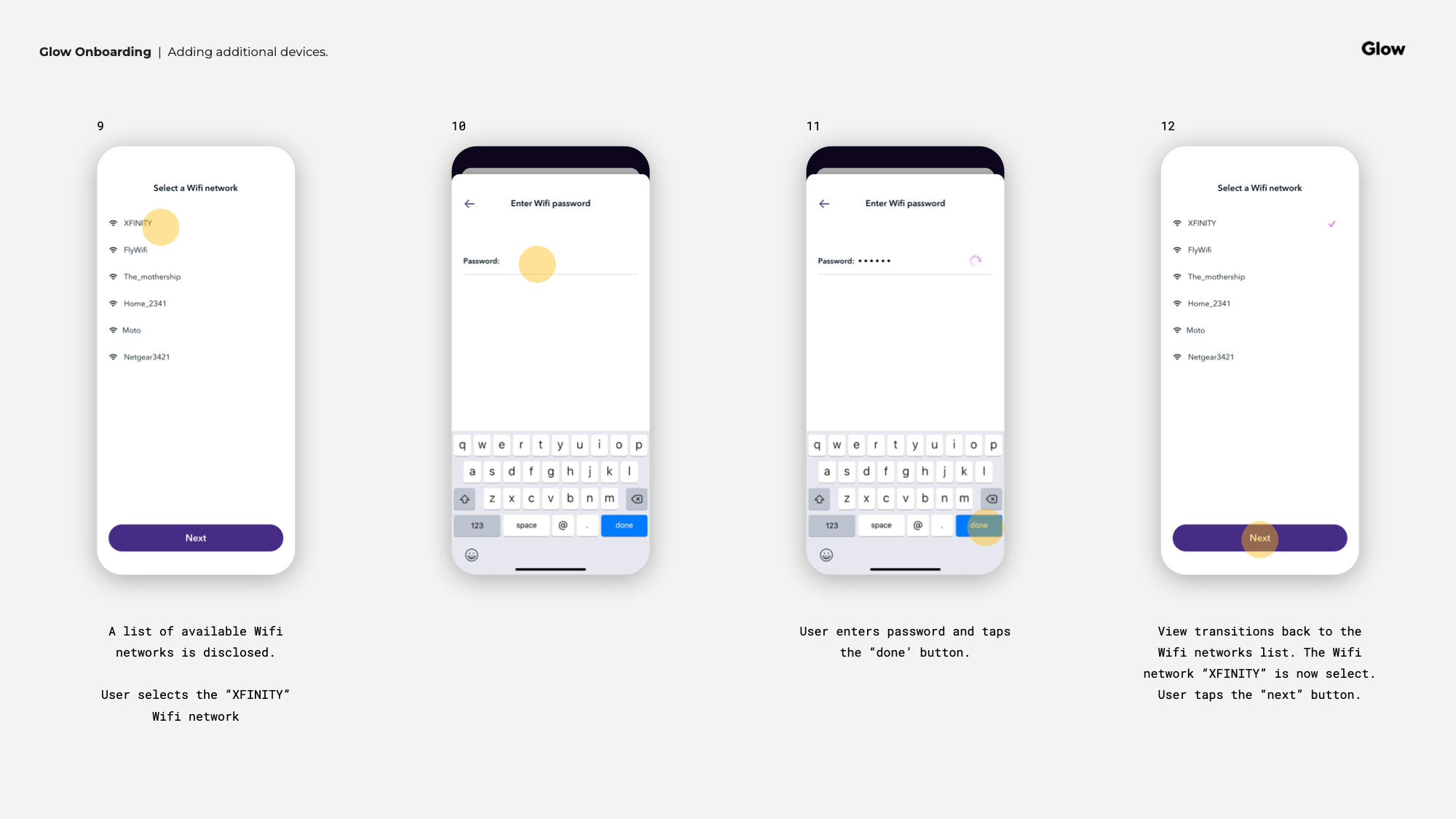
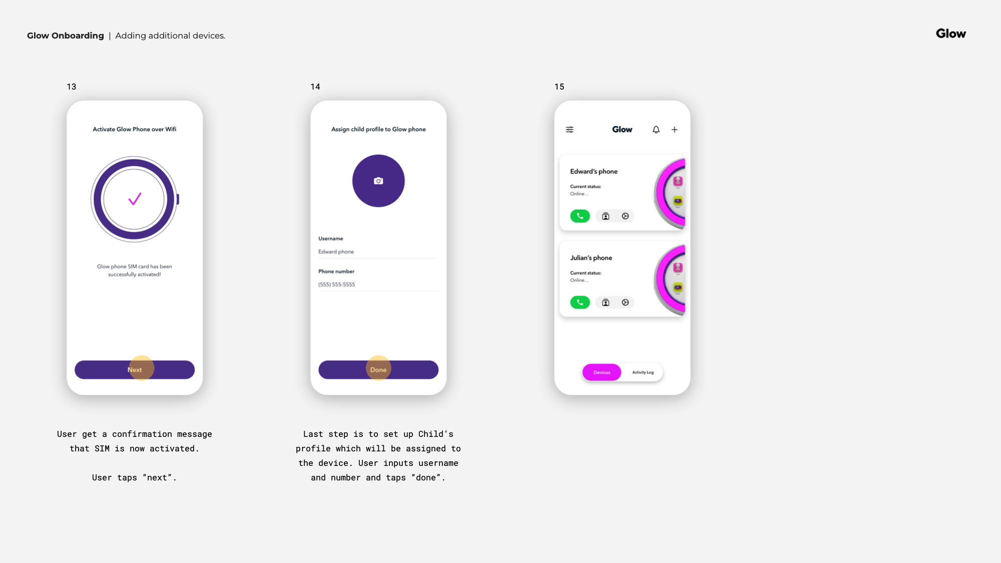
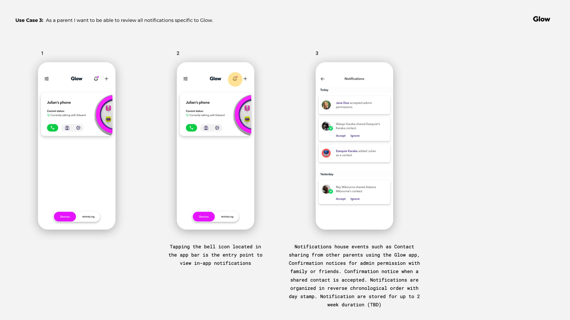
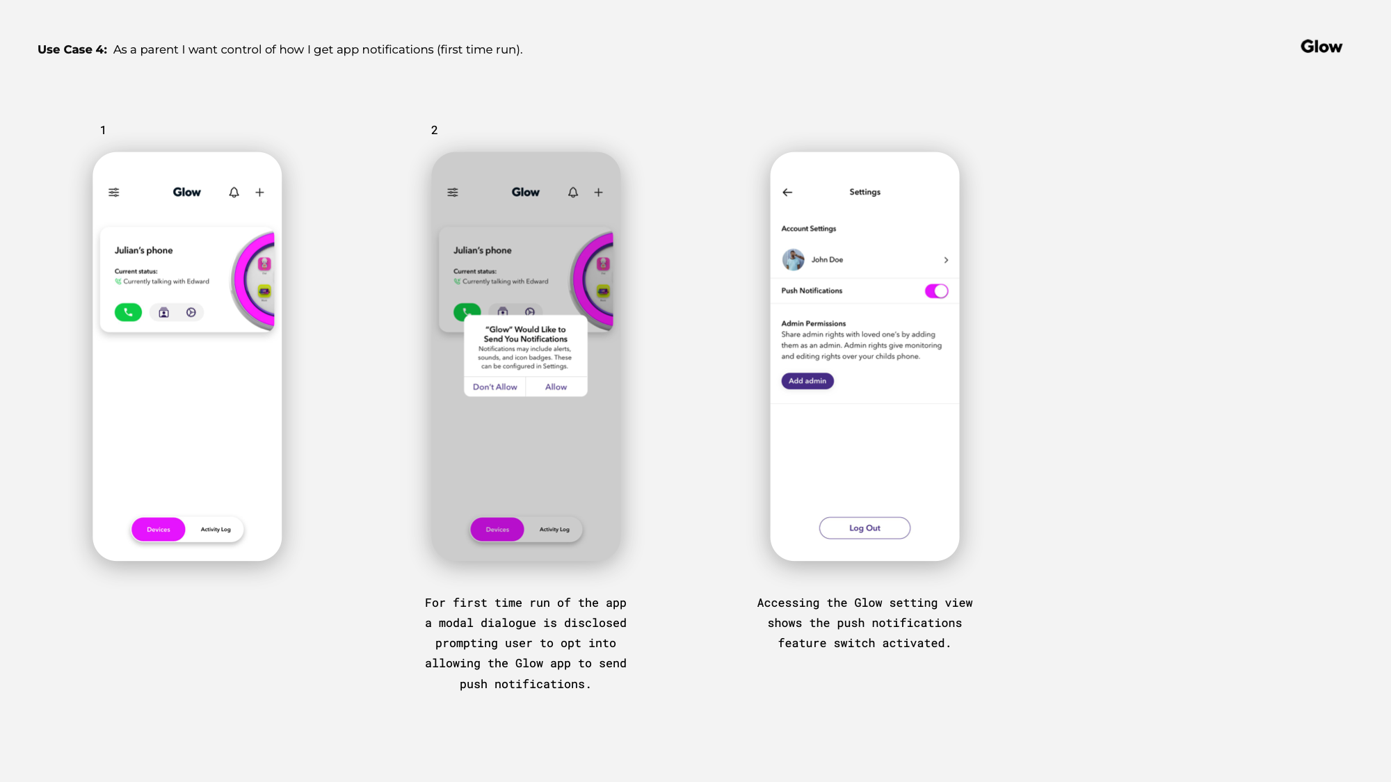
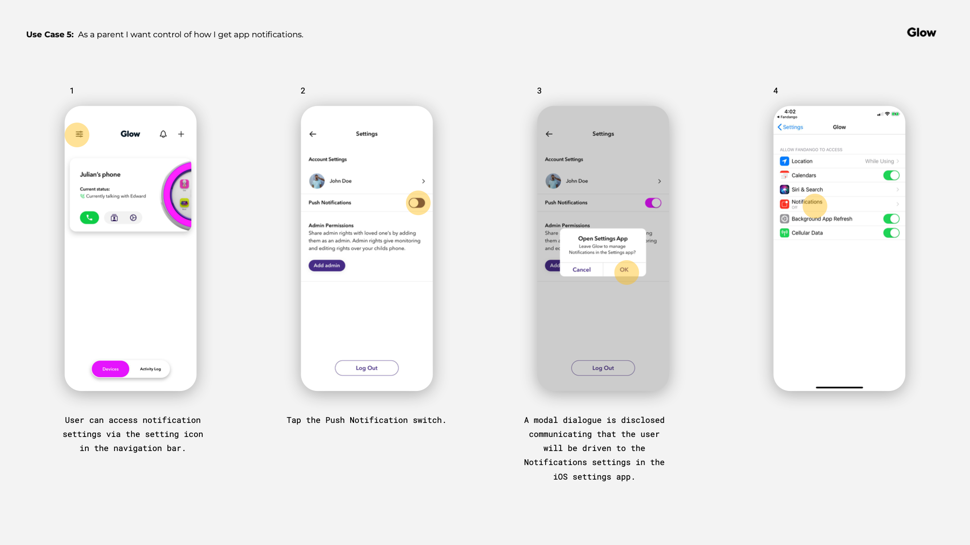
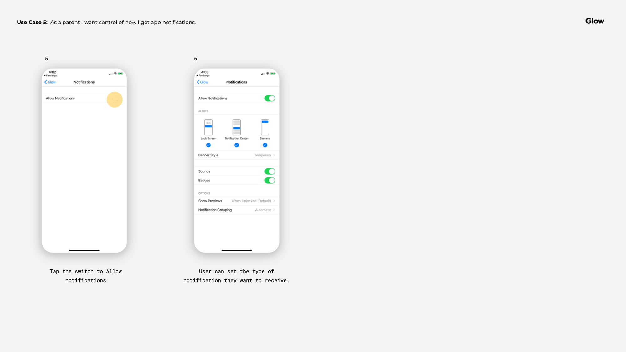
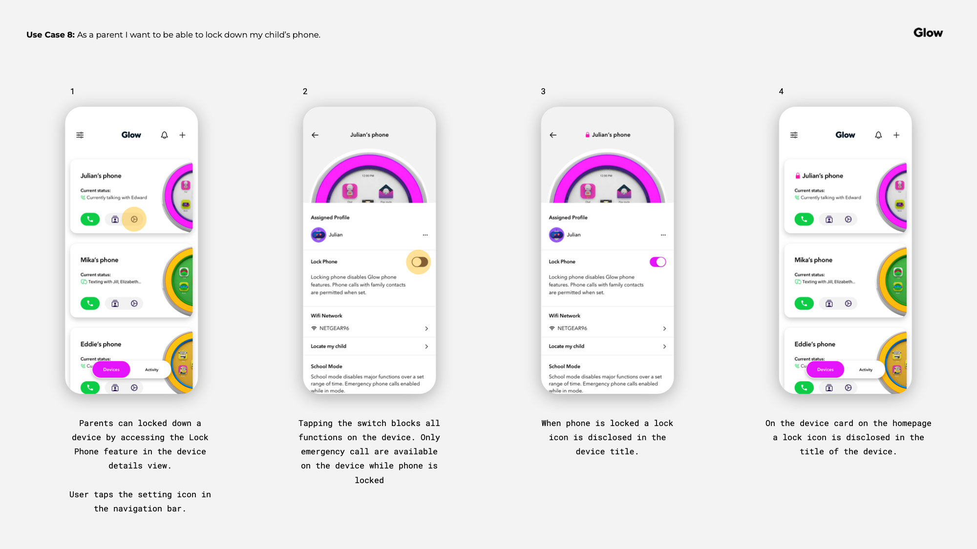
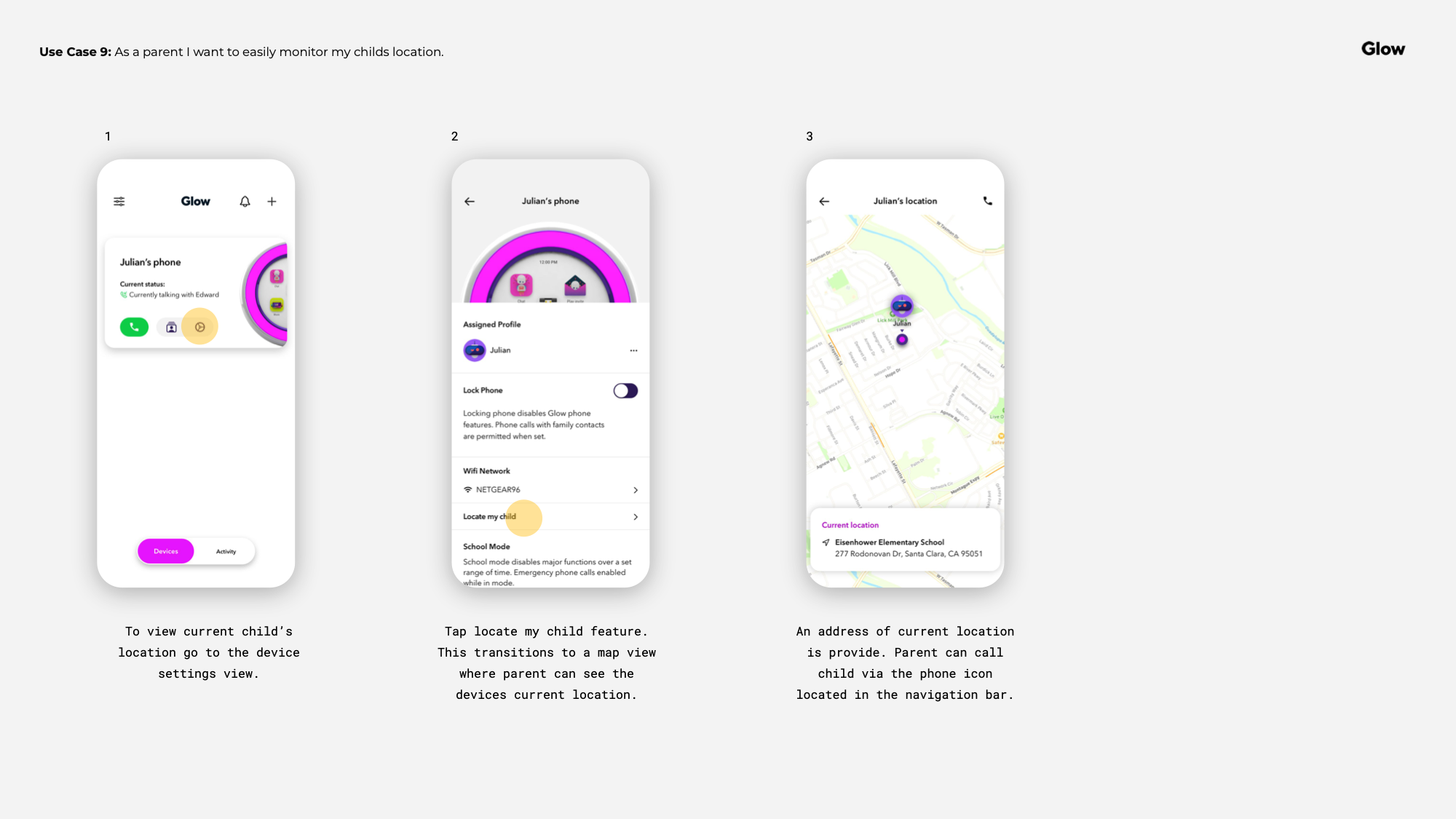
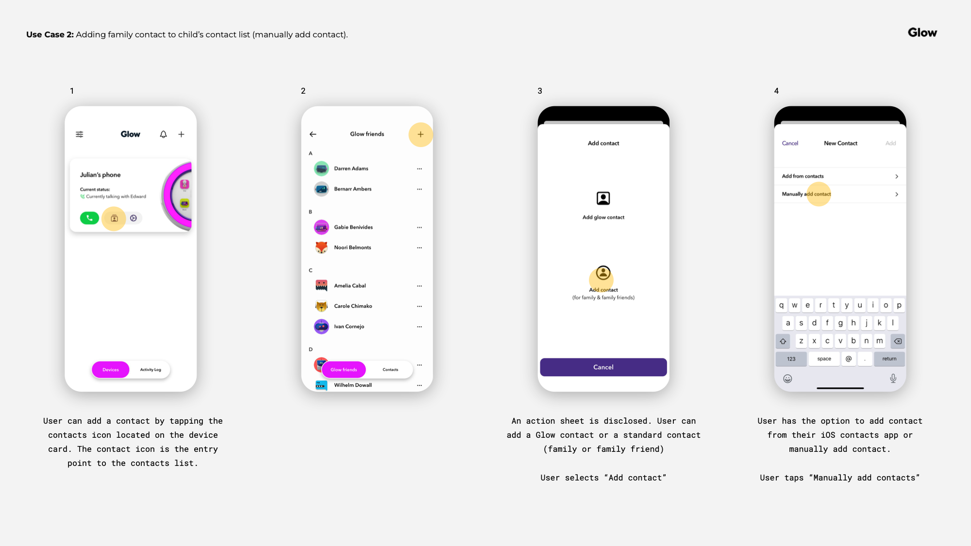
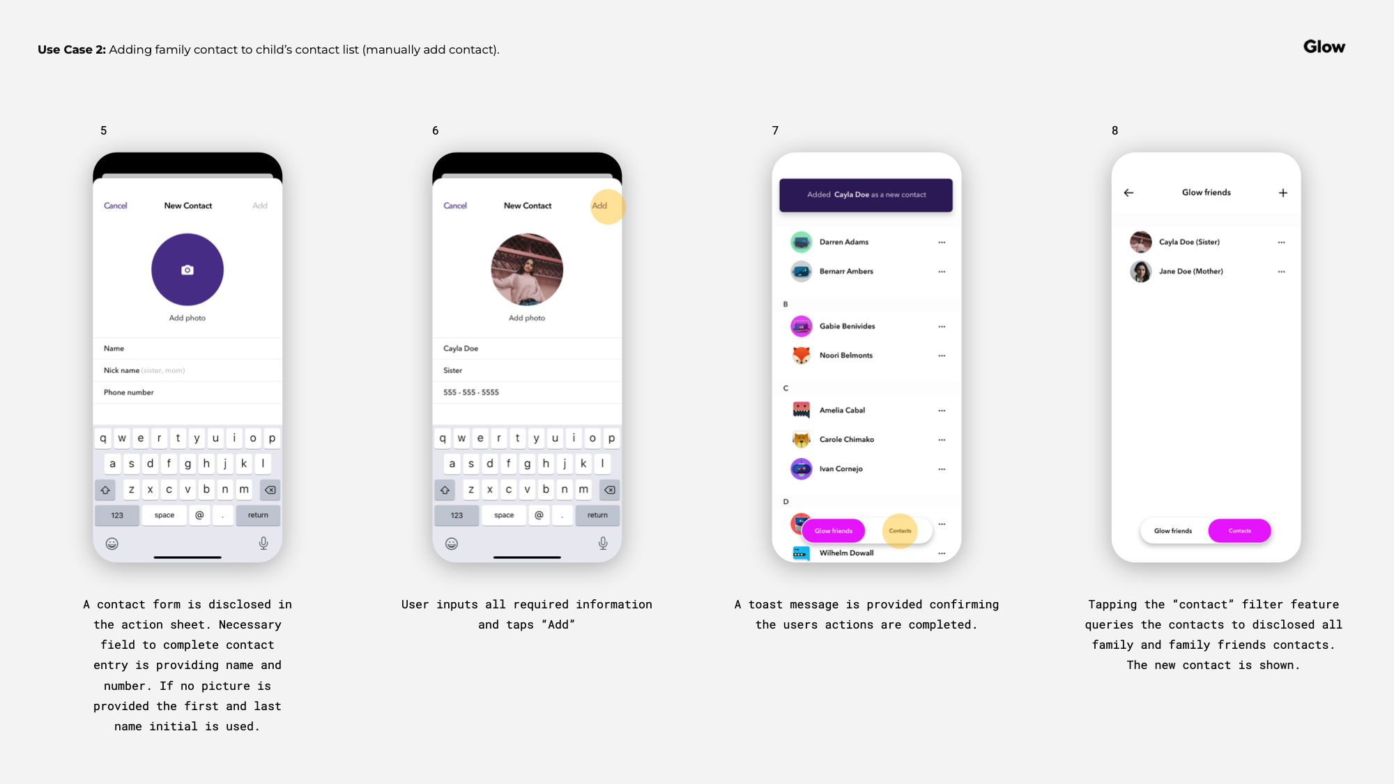
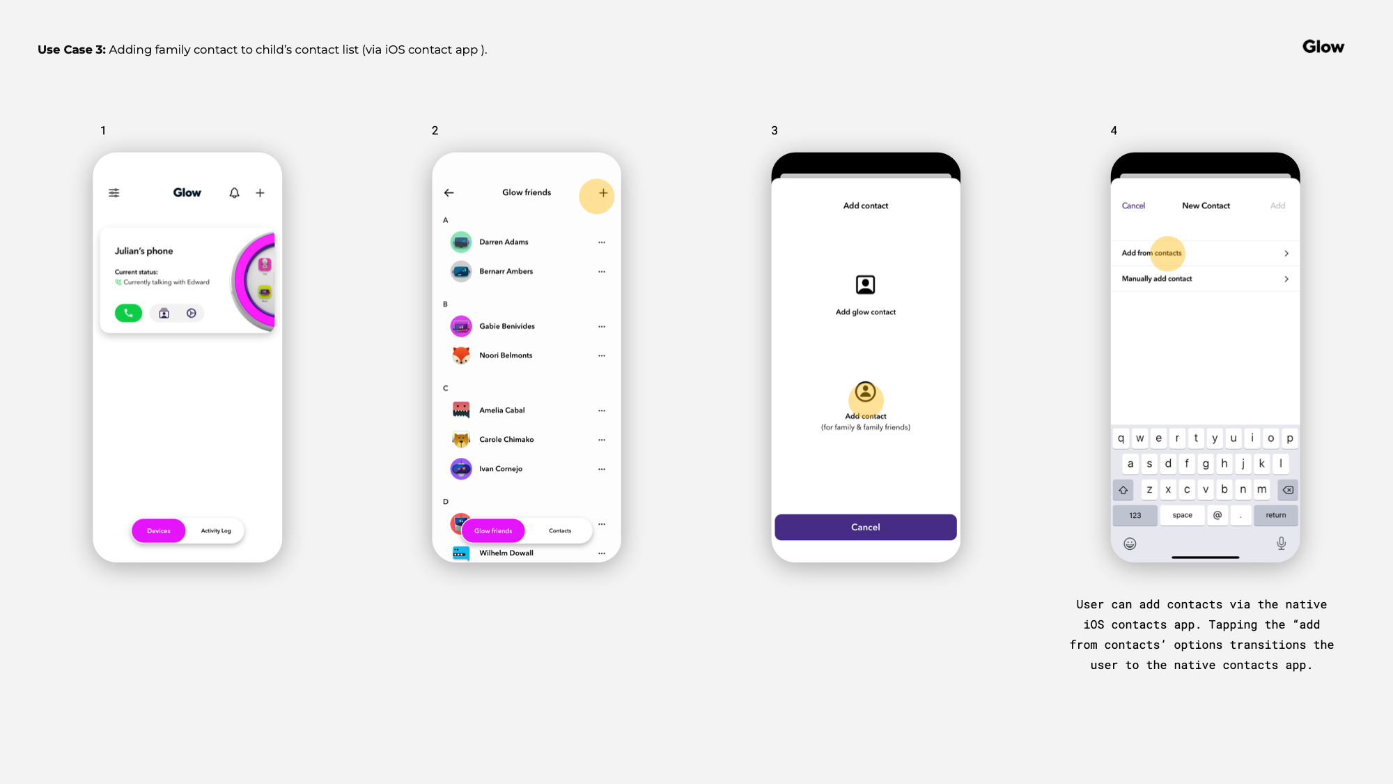
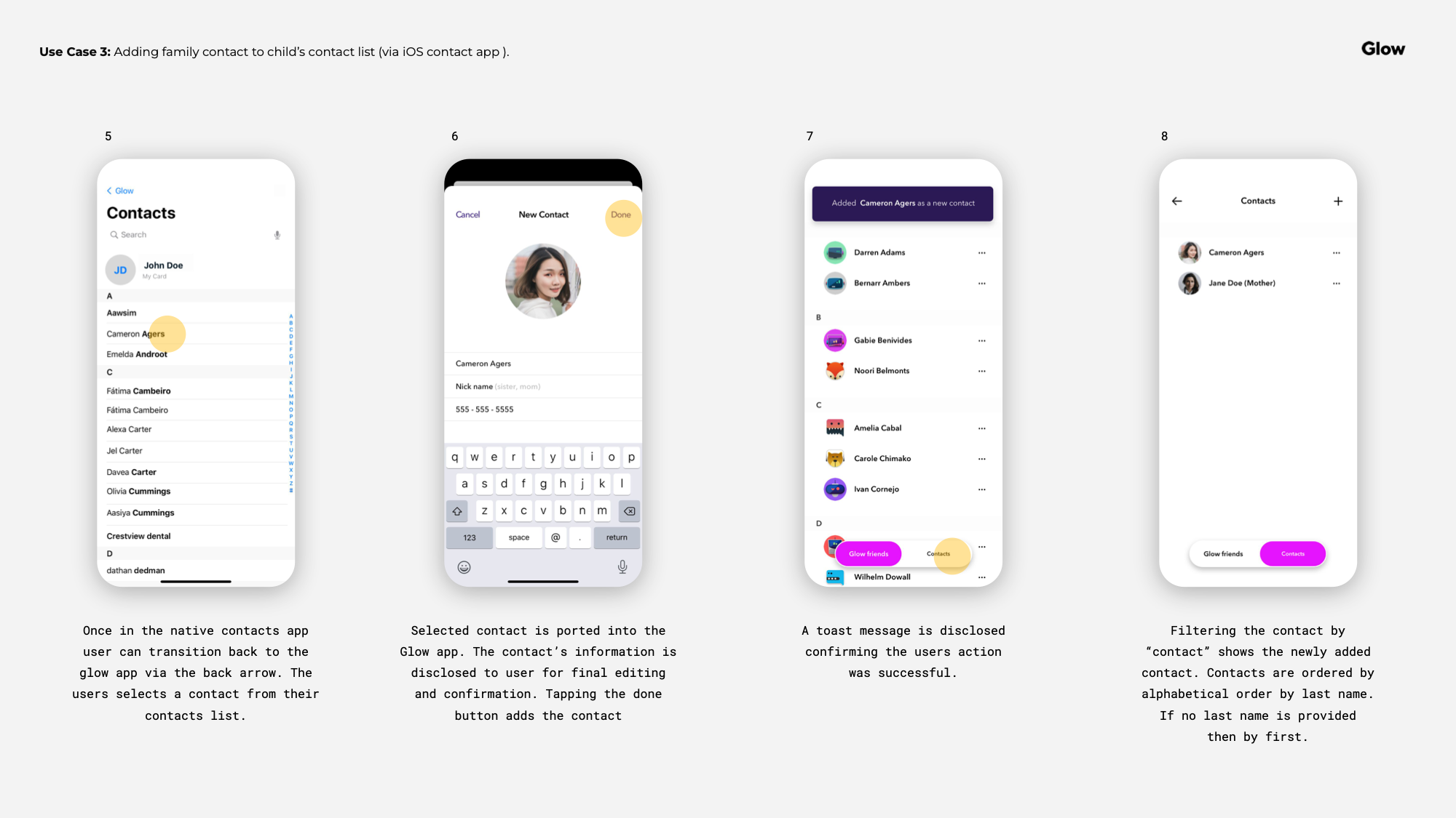
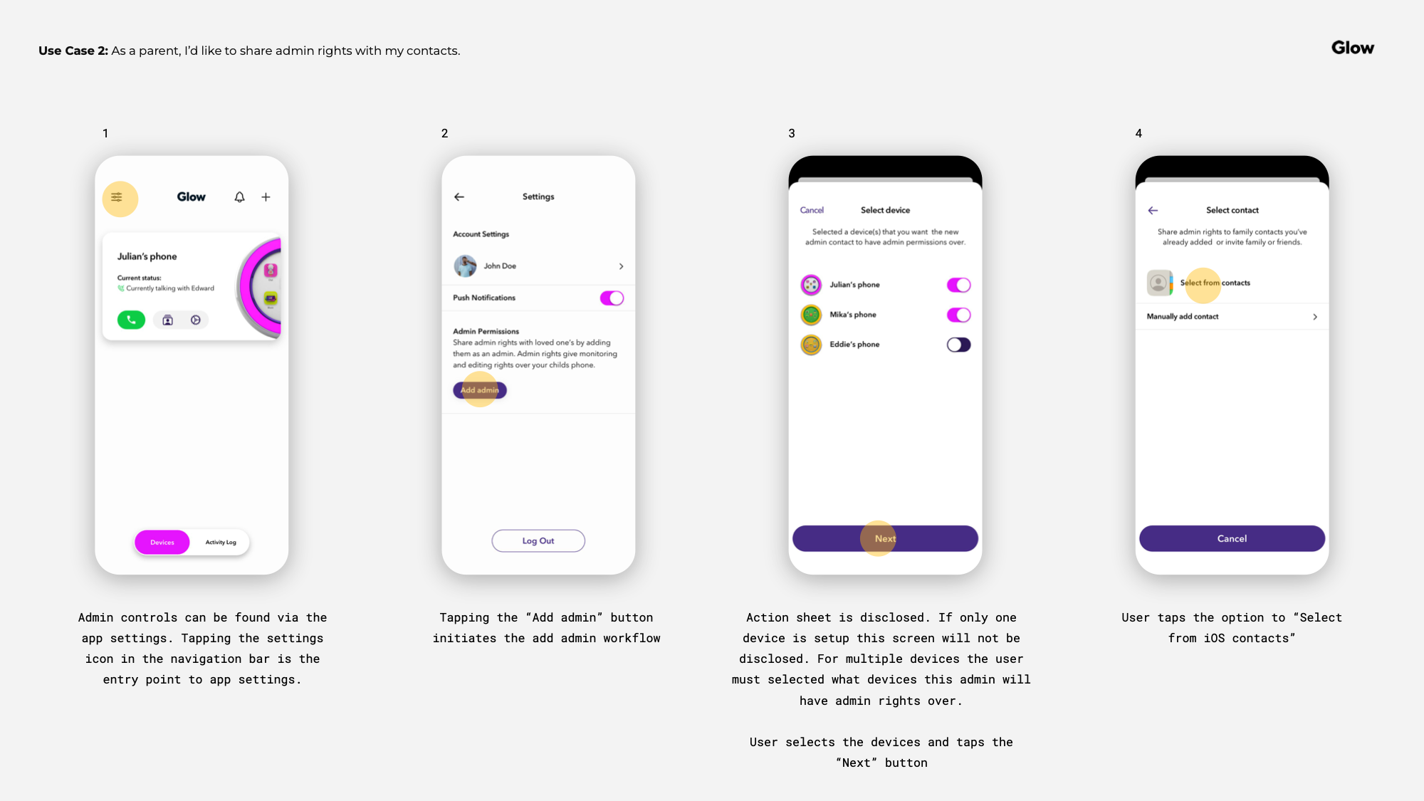
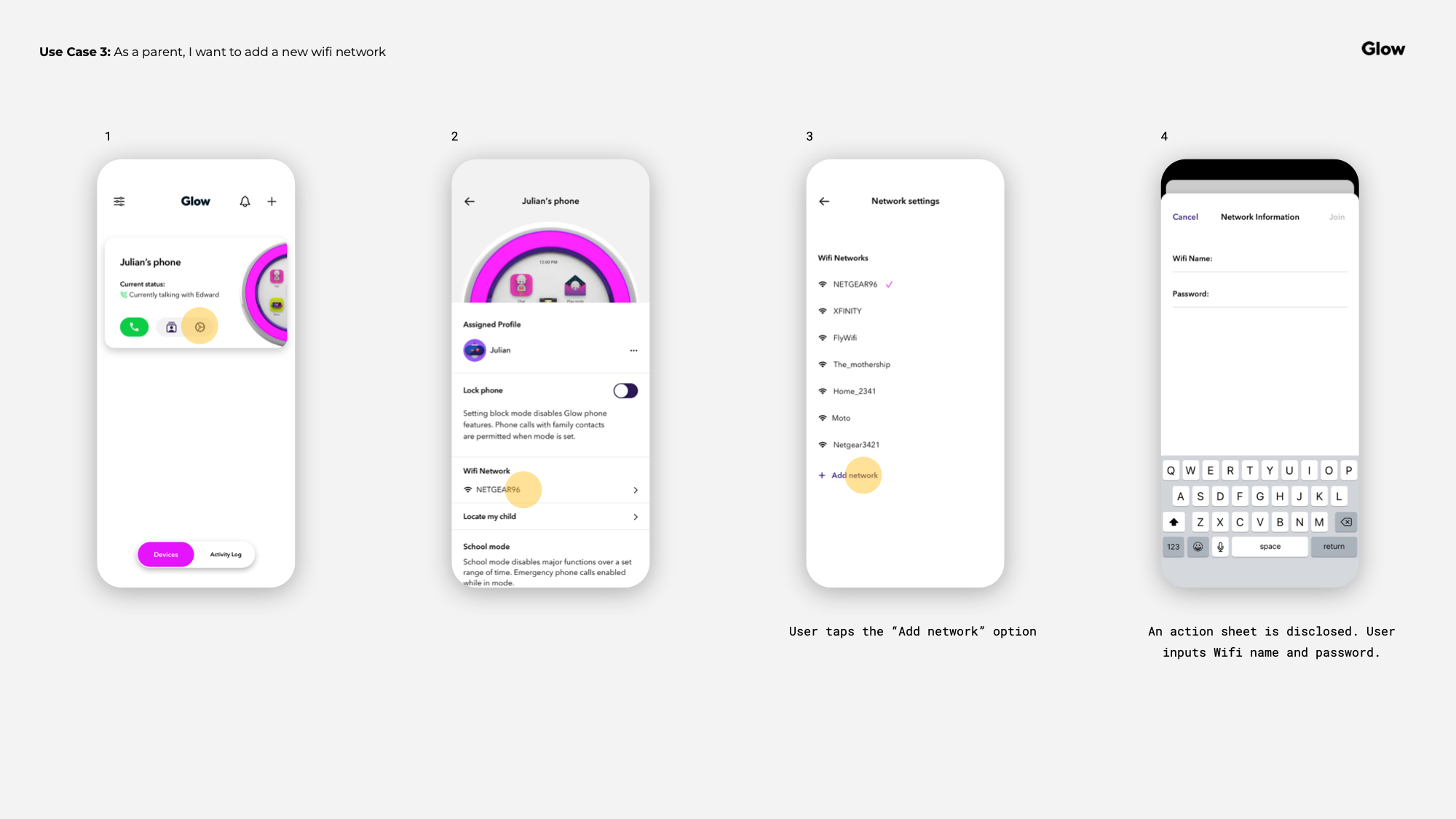
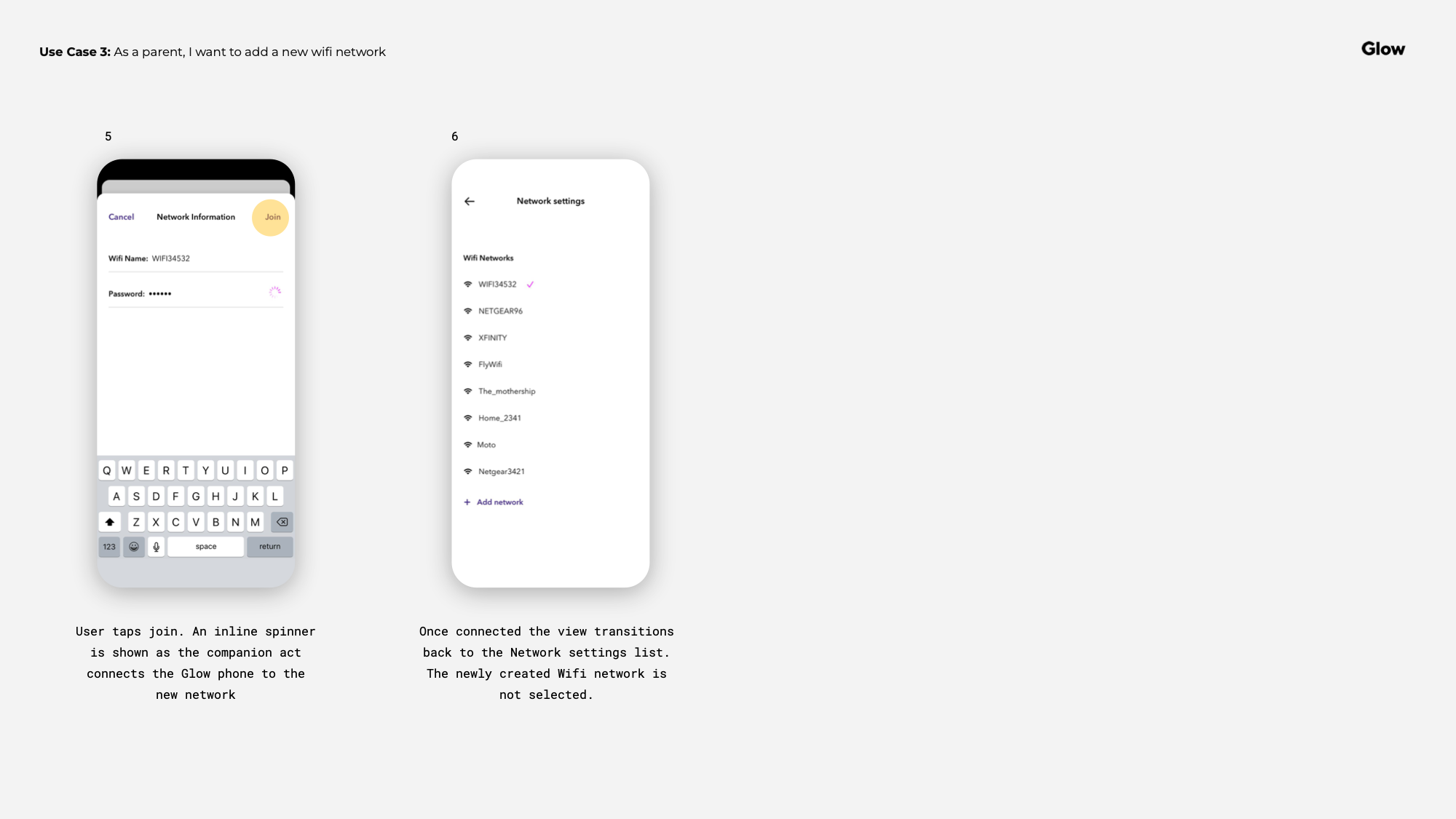
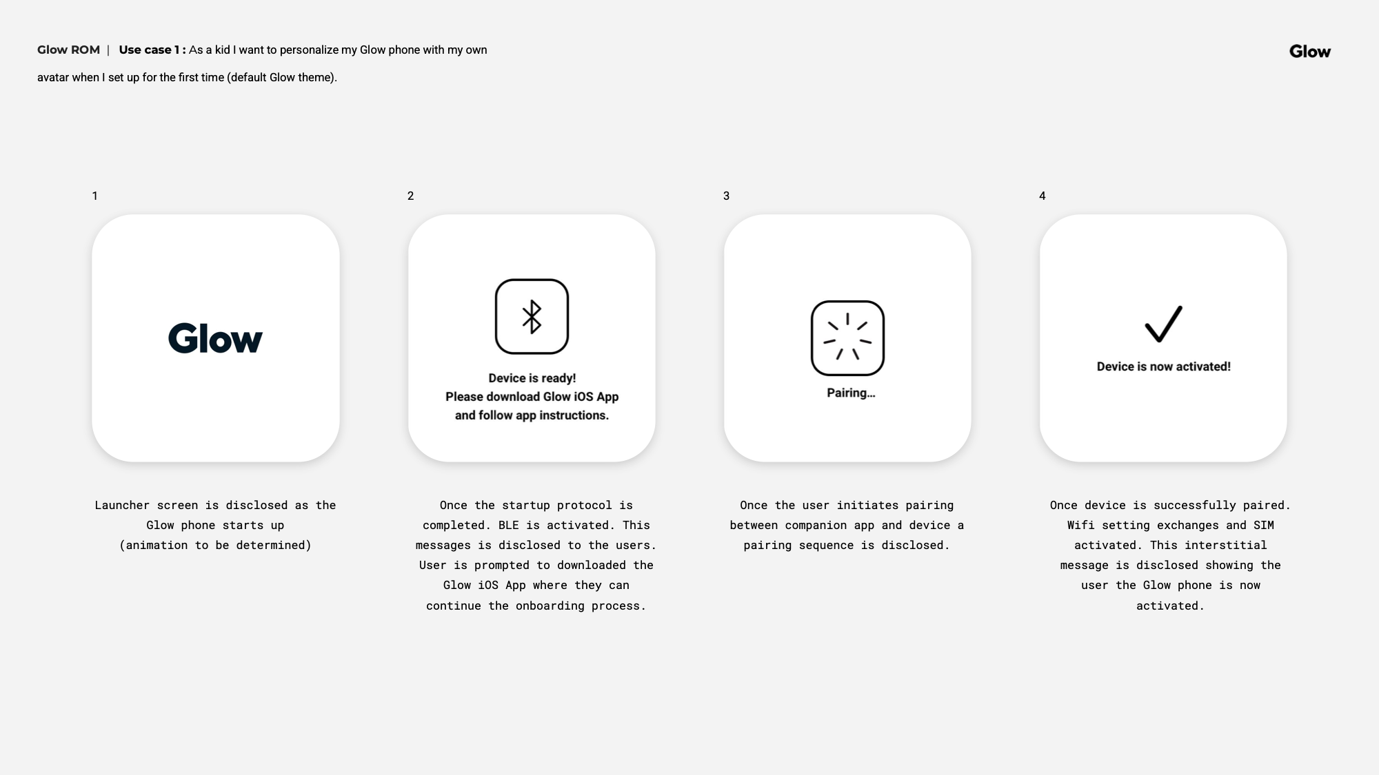
The companion app was designed primarily around the parent experience. The core flows covered on-boarding, account setup, SIM activation, device pairing, and contact management — a lot of ground to cover without overwhelming a parent who just wants to set it up and hand it to their kid.
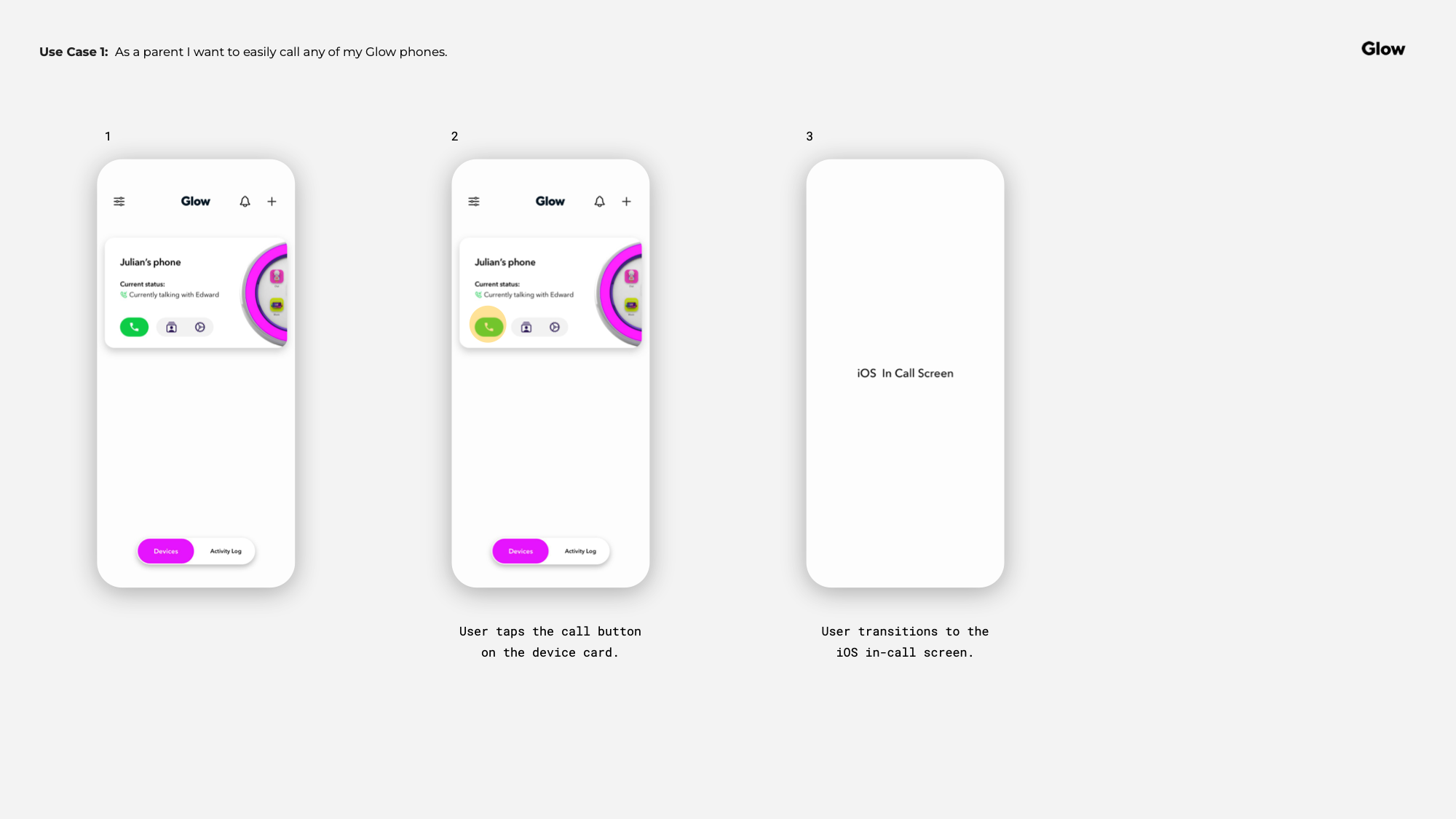
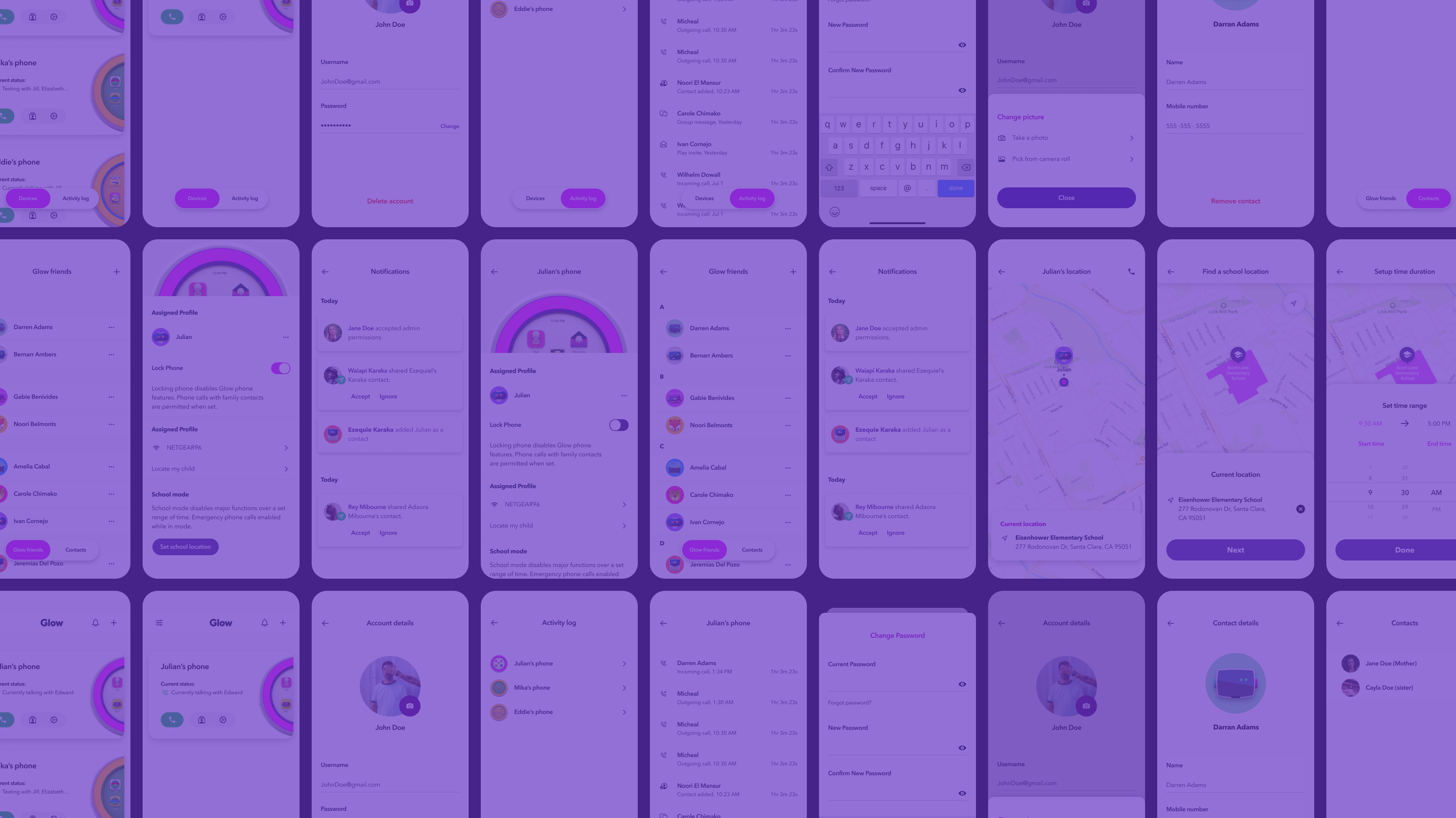
To move fast without sacrificing the experience, I leveraged native iOS components and system icons where it made sense — tab navigation, standard form patterns — but customized enough to keep the visual language consistent with the Glow brand. The tab view in particular was reworked to feel distinctly Glow rather than off-the-shelf iOS.
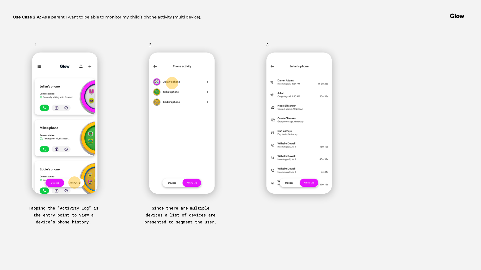
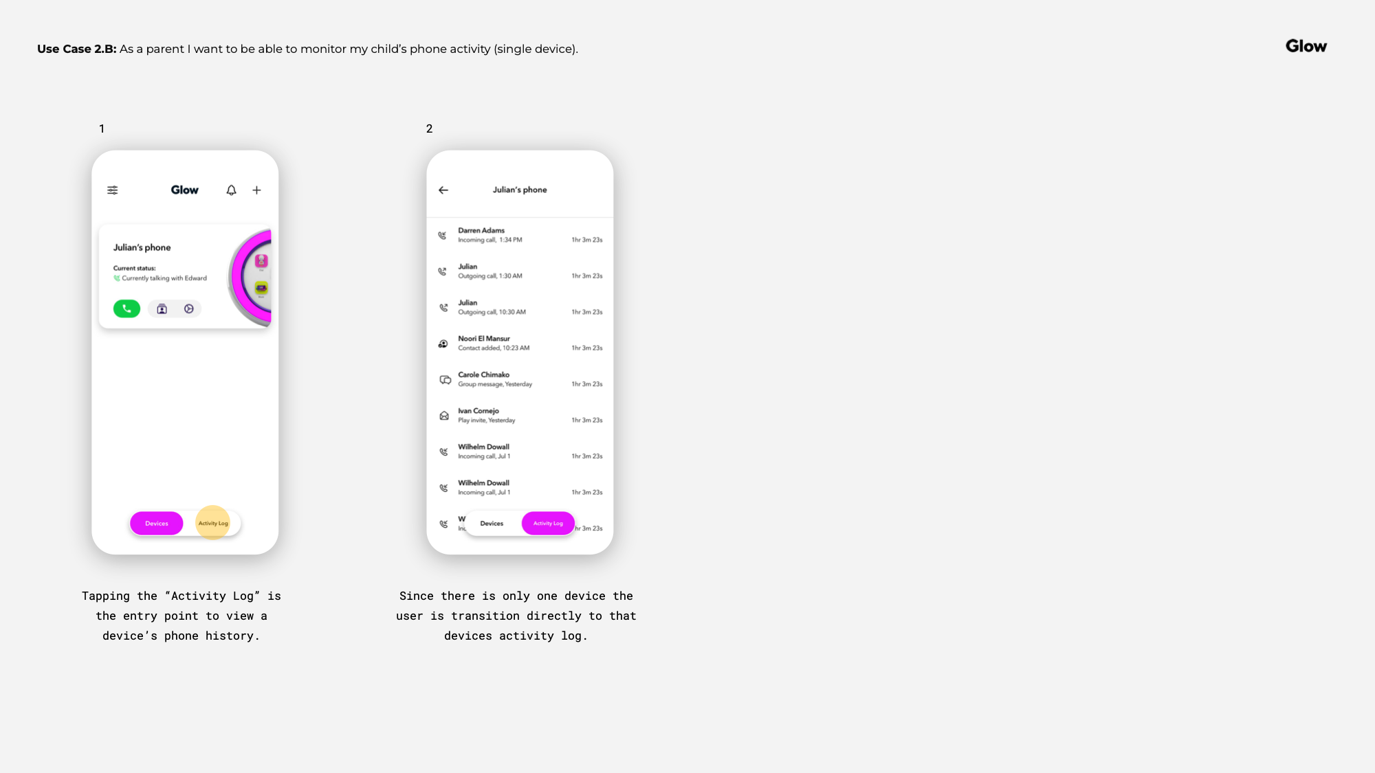
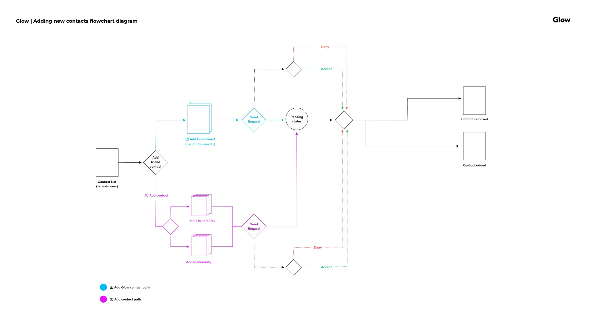
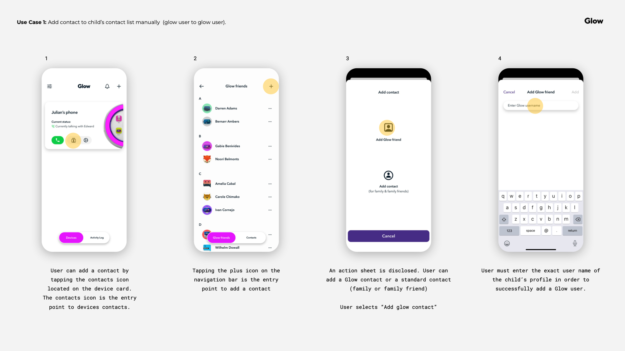
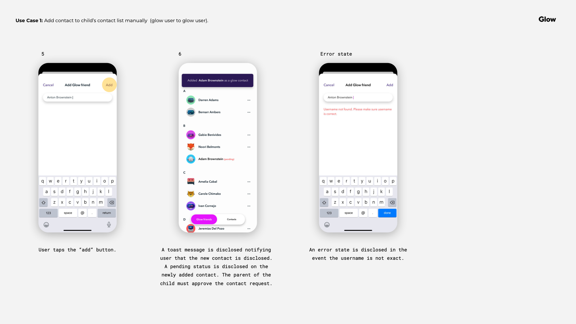
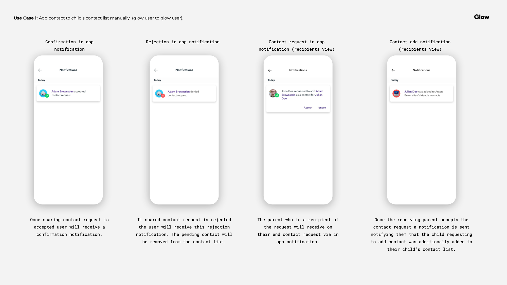
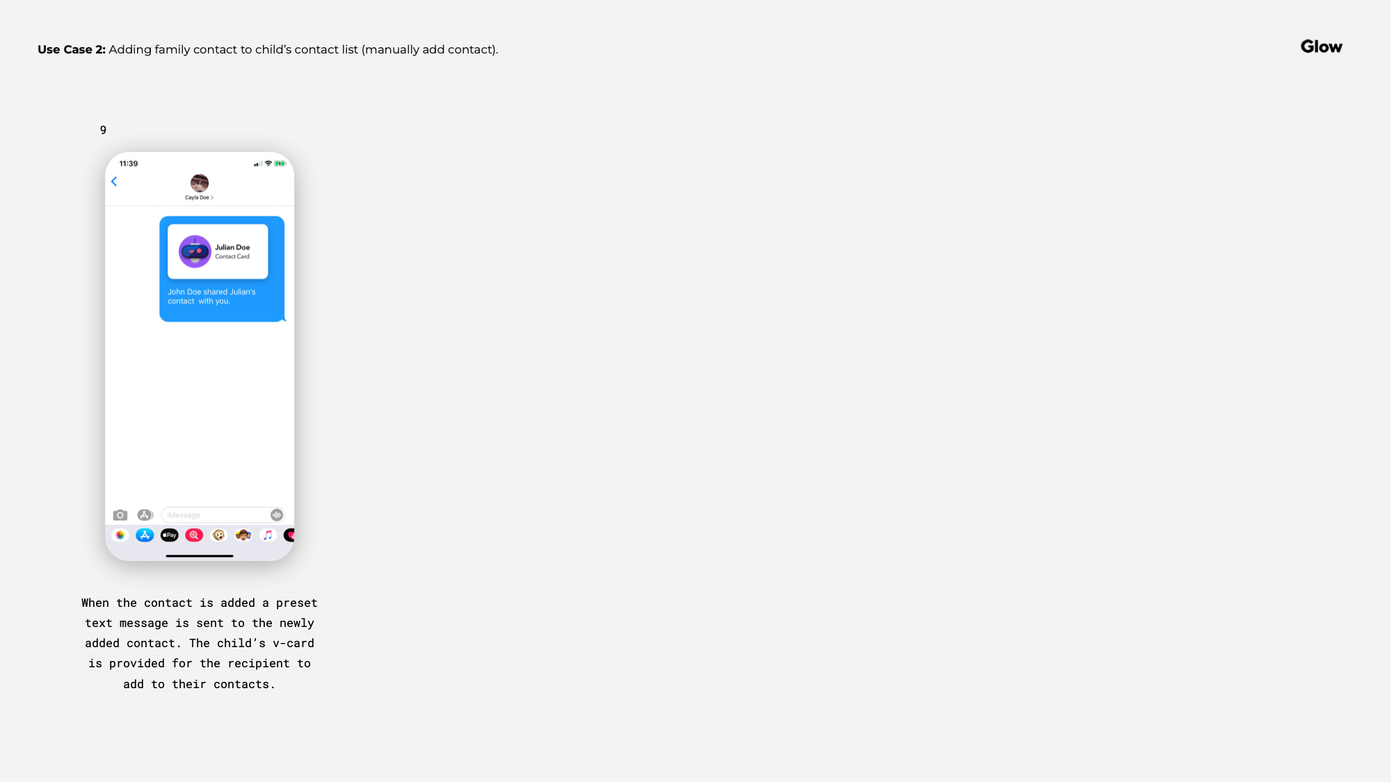
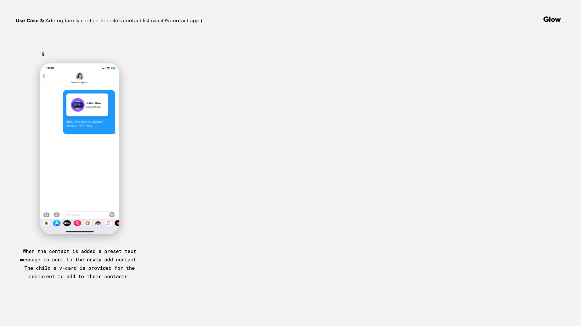
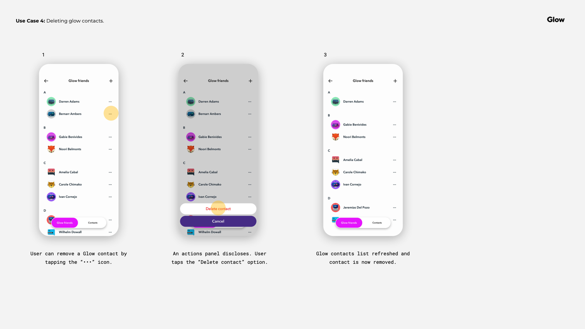
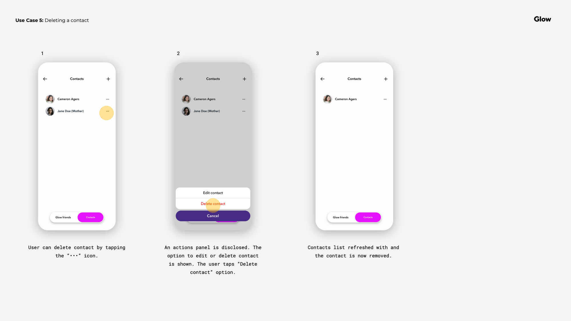
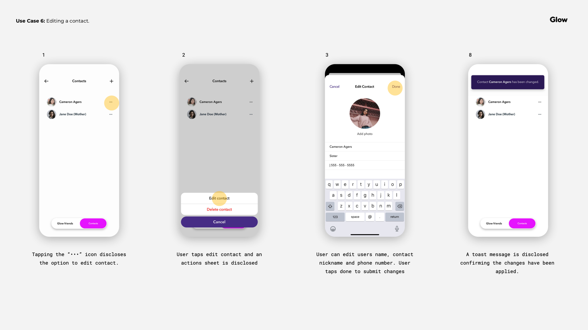
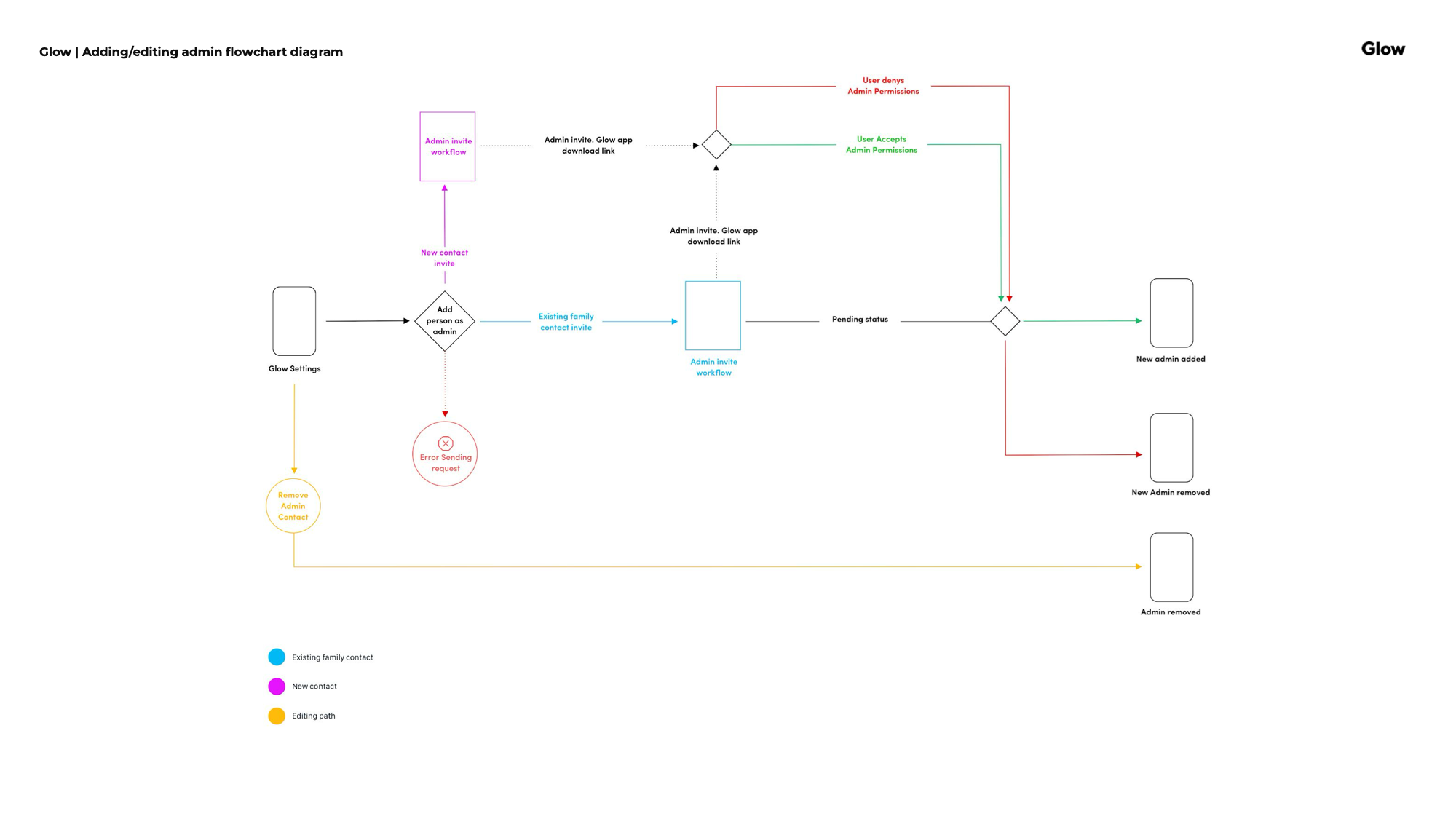
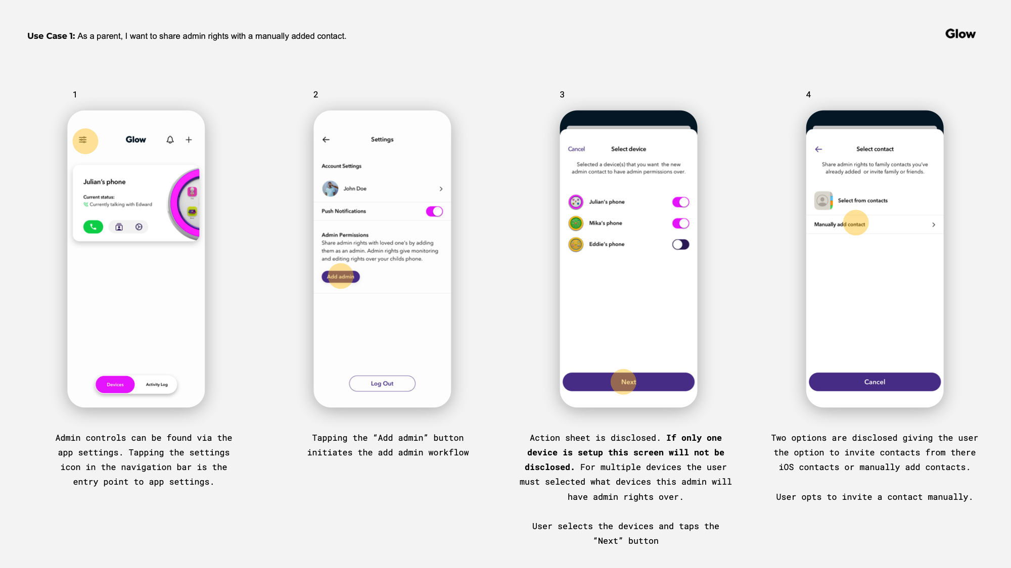
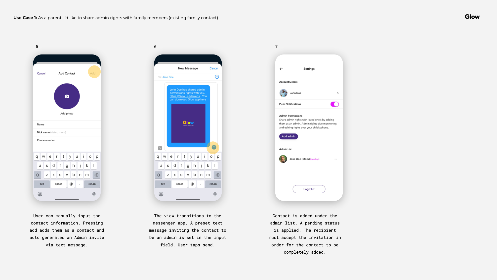
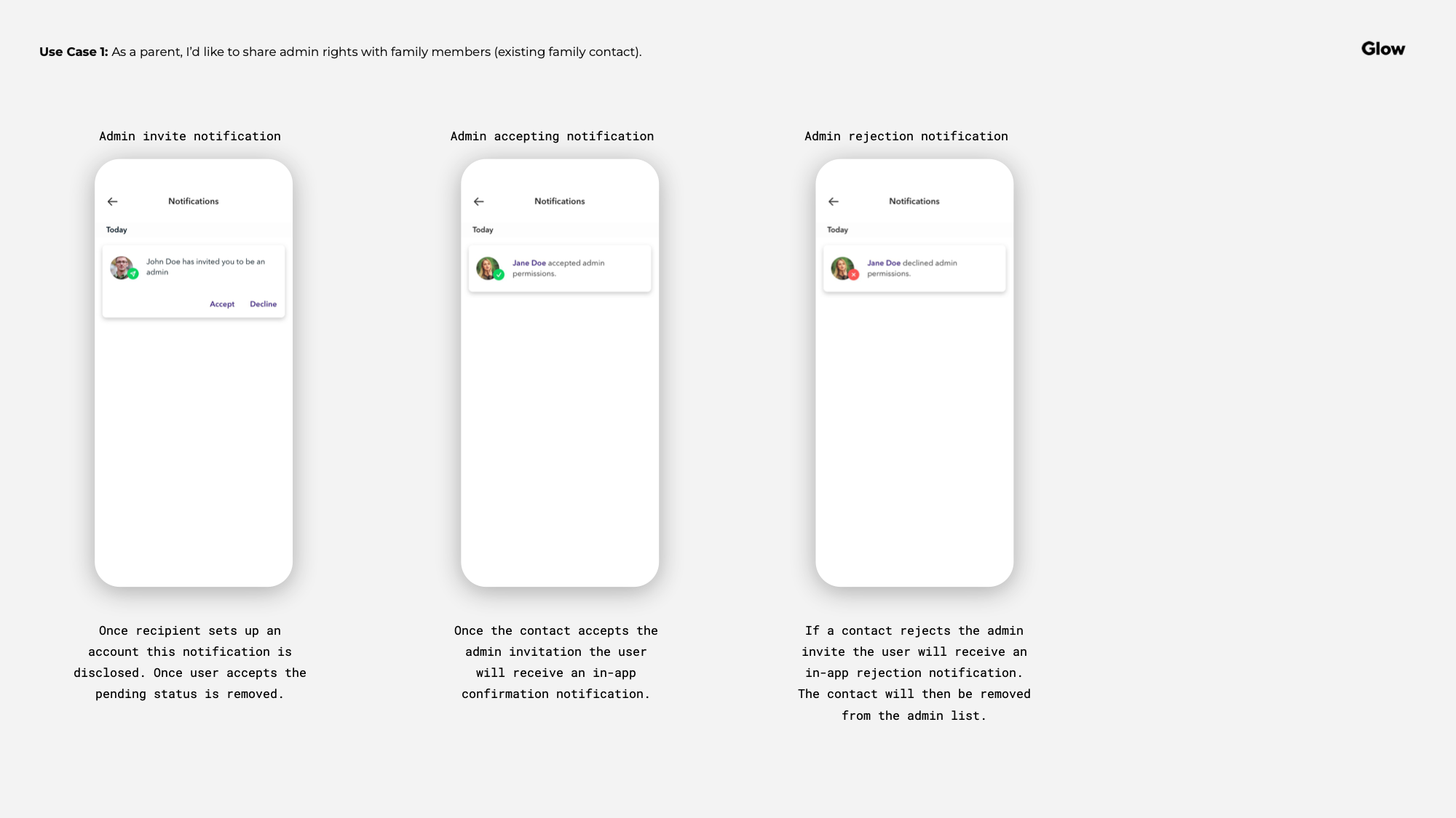
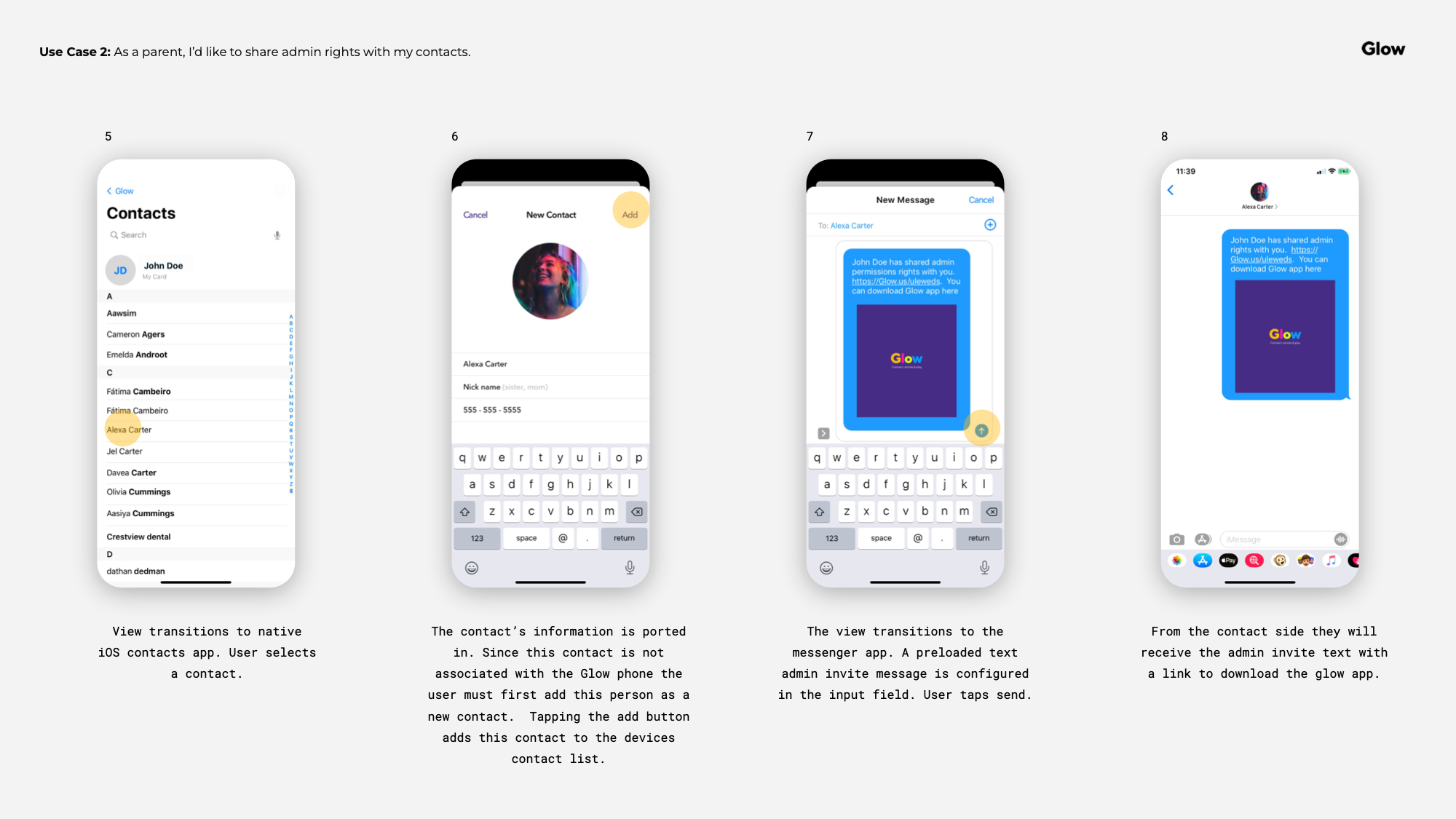
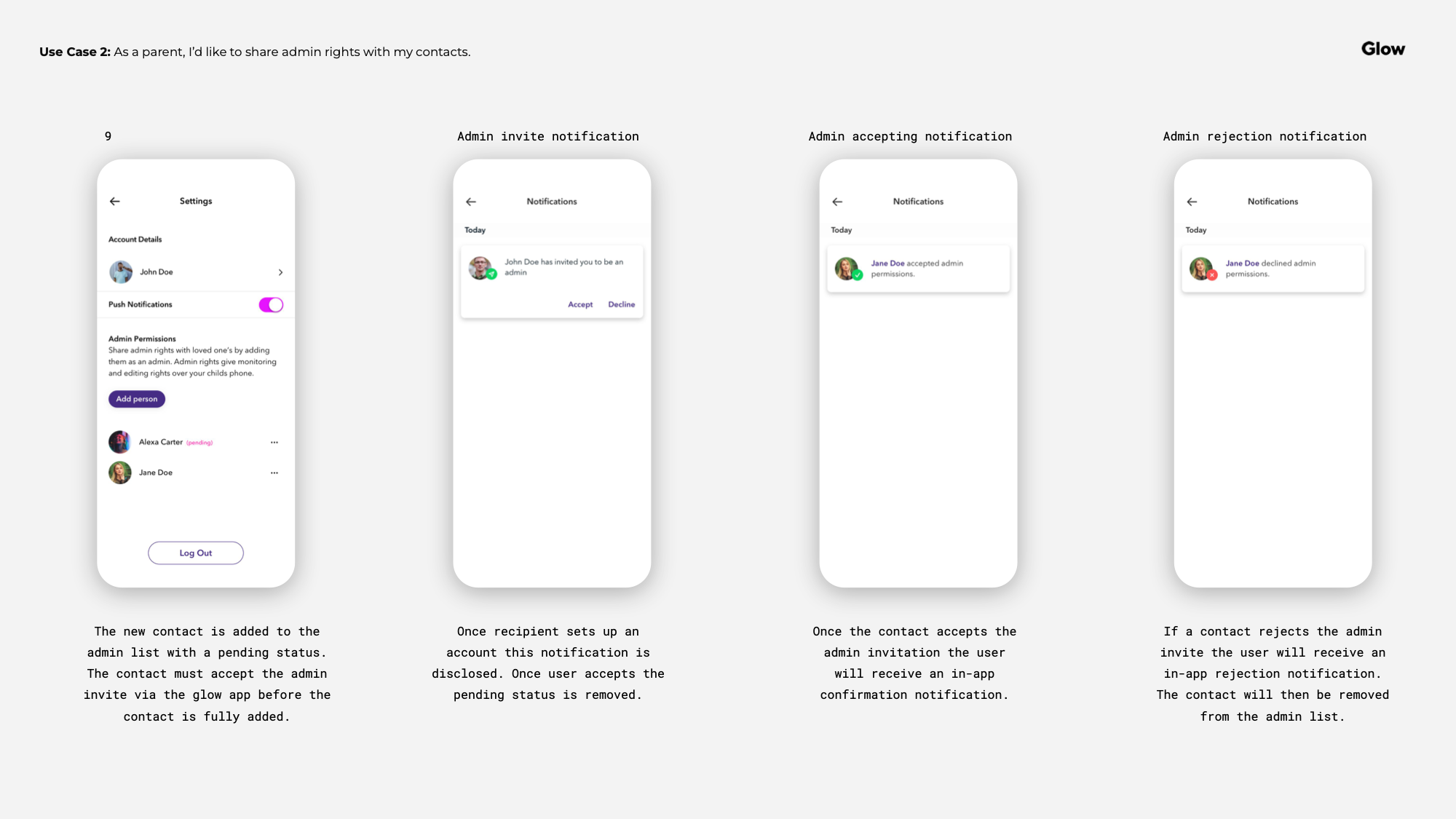
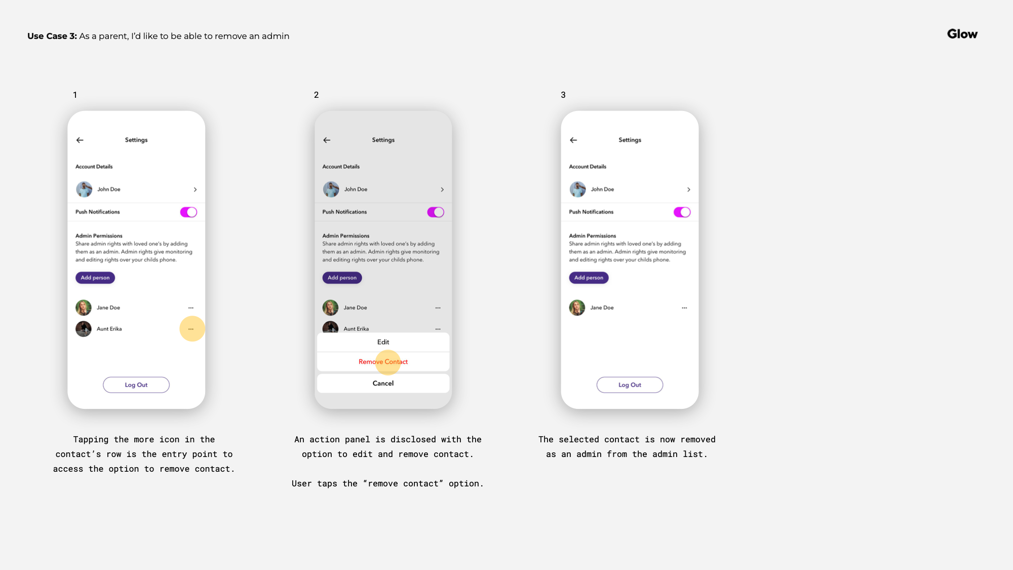
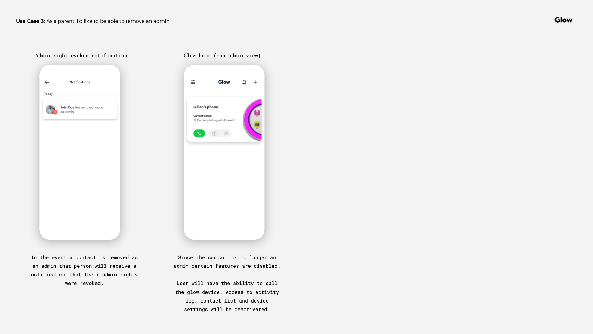
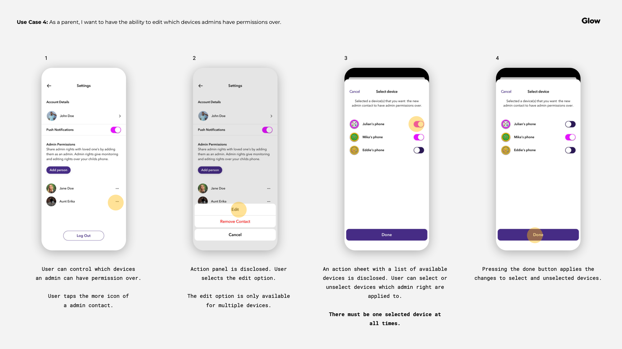
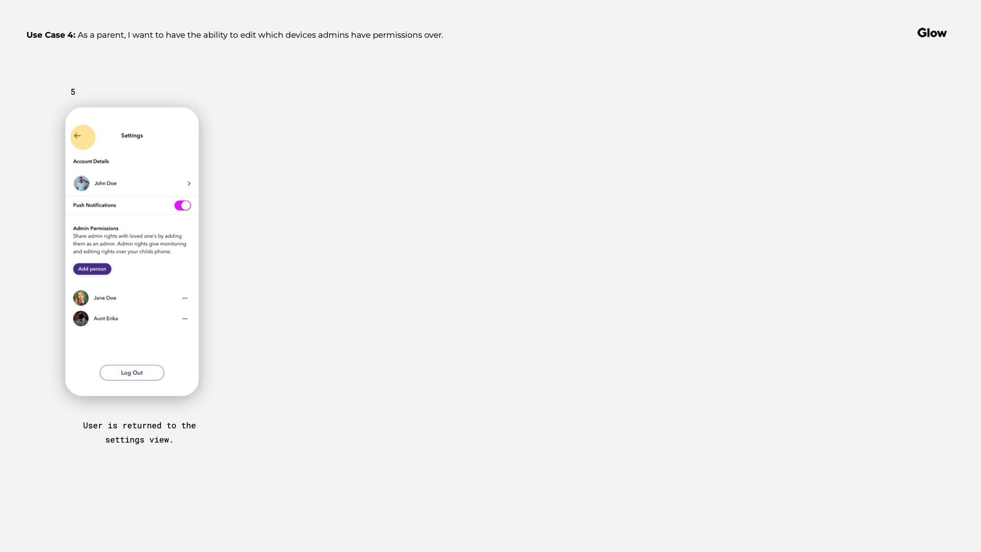
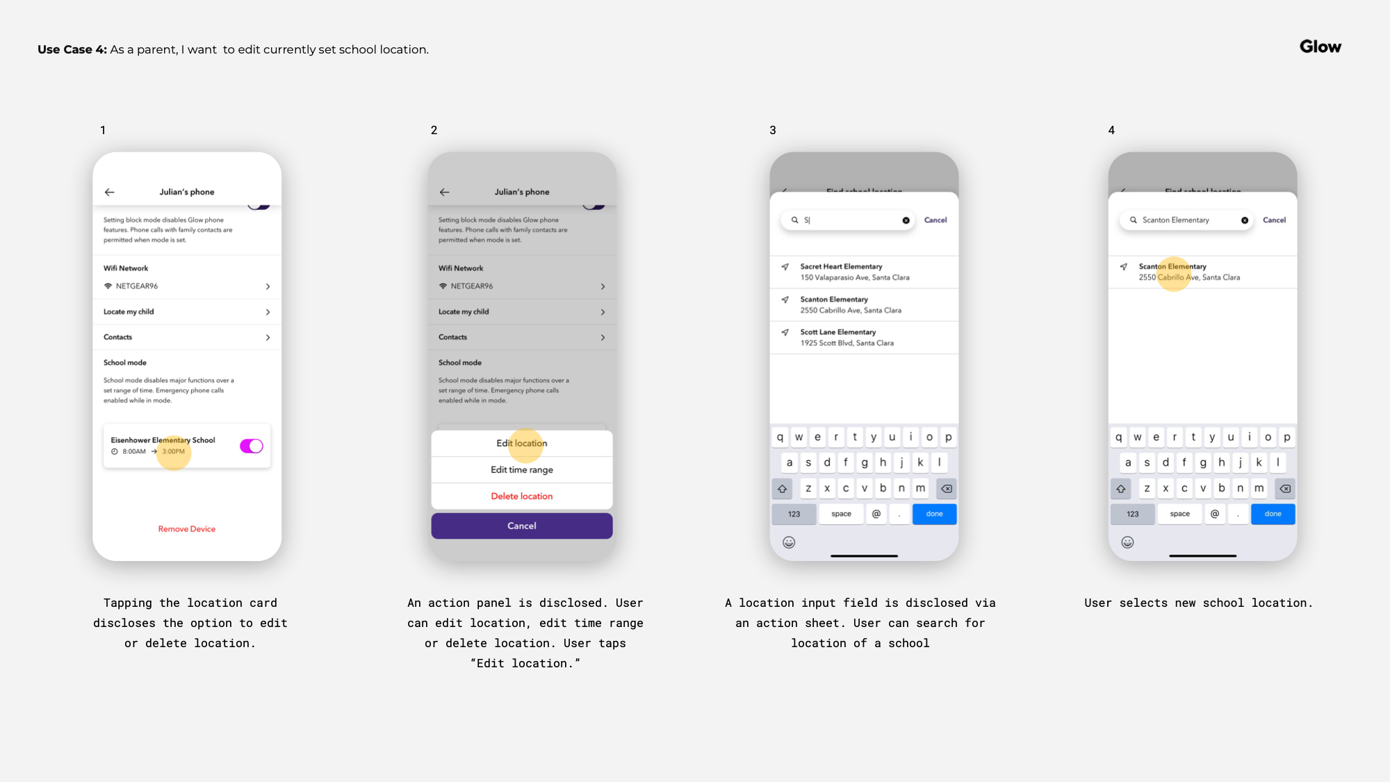
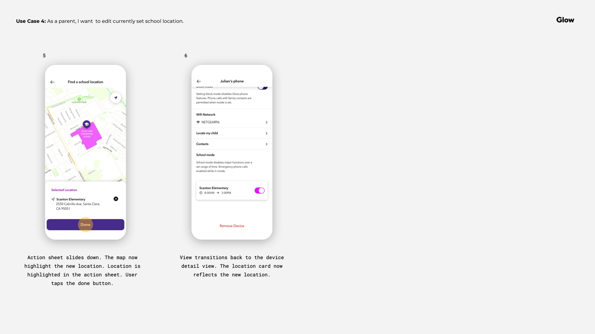
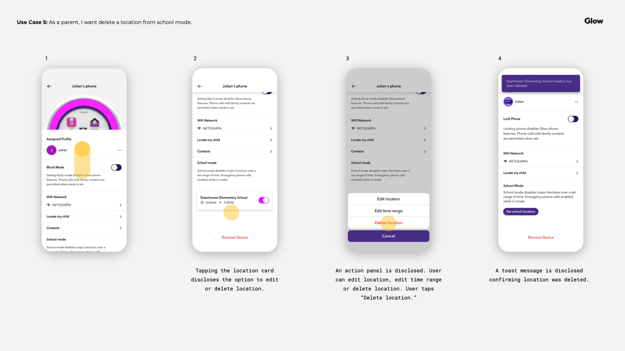
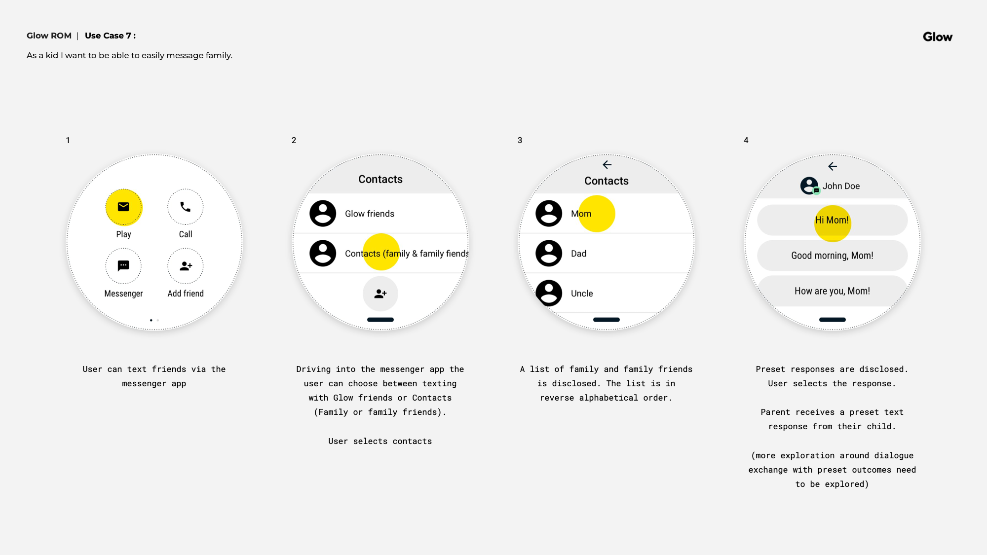
Contact management was one of the more nuanced features. Parents needed clear, simple controls to approve who their child could communicate with — and the design had to make that feel empowering rather than paranoid. The closed network model helped: because only Glow device owners could connect, the trust was already built into the system. The UI just had to make that visible.
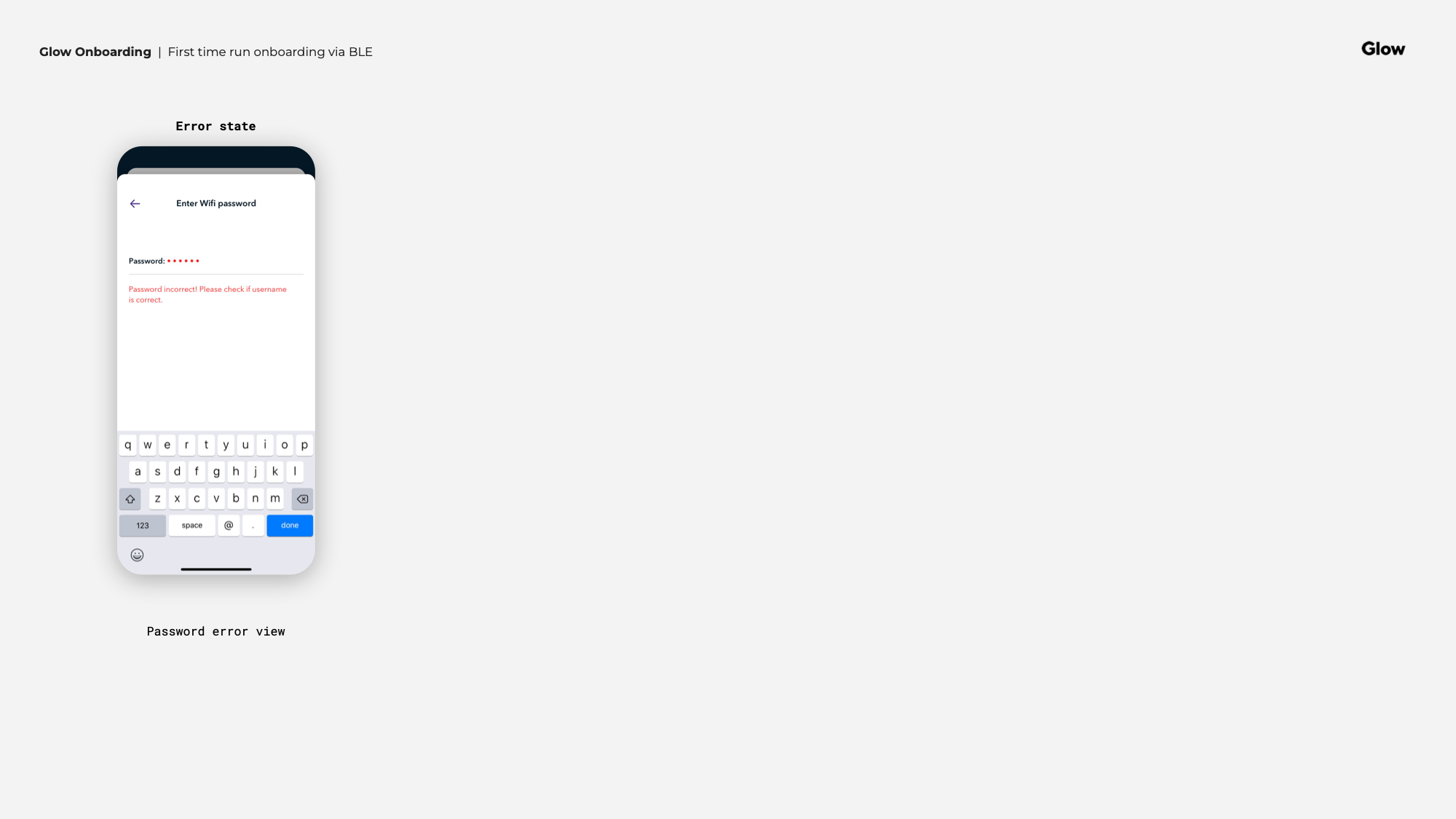
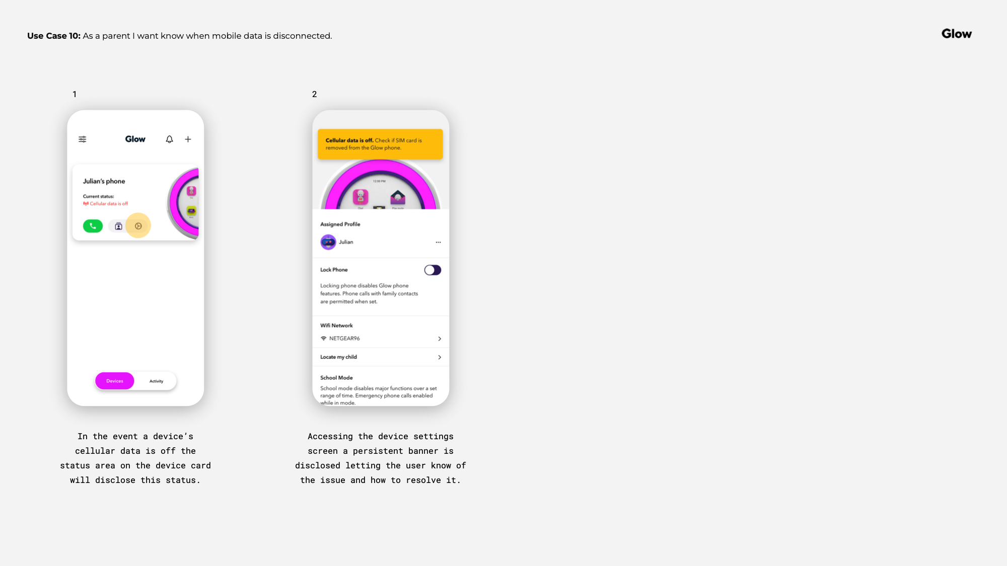
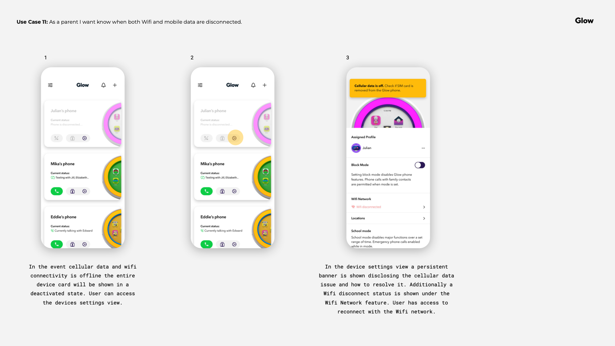
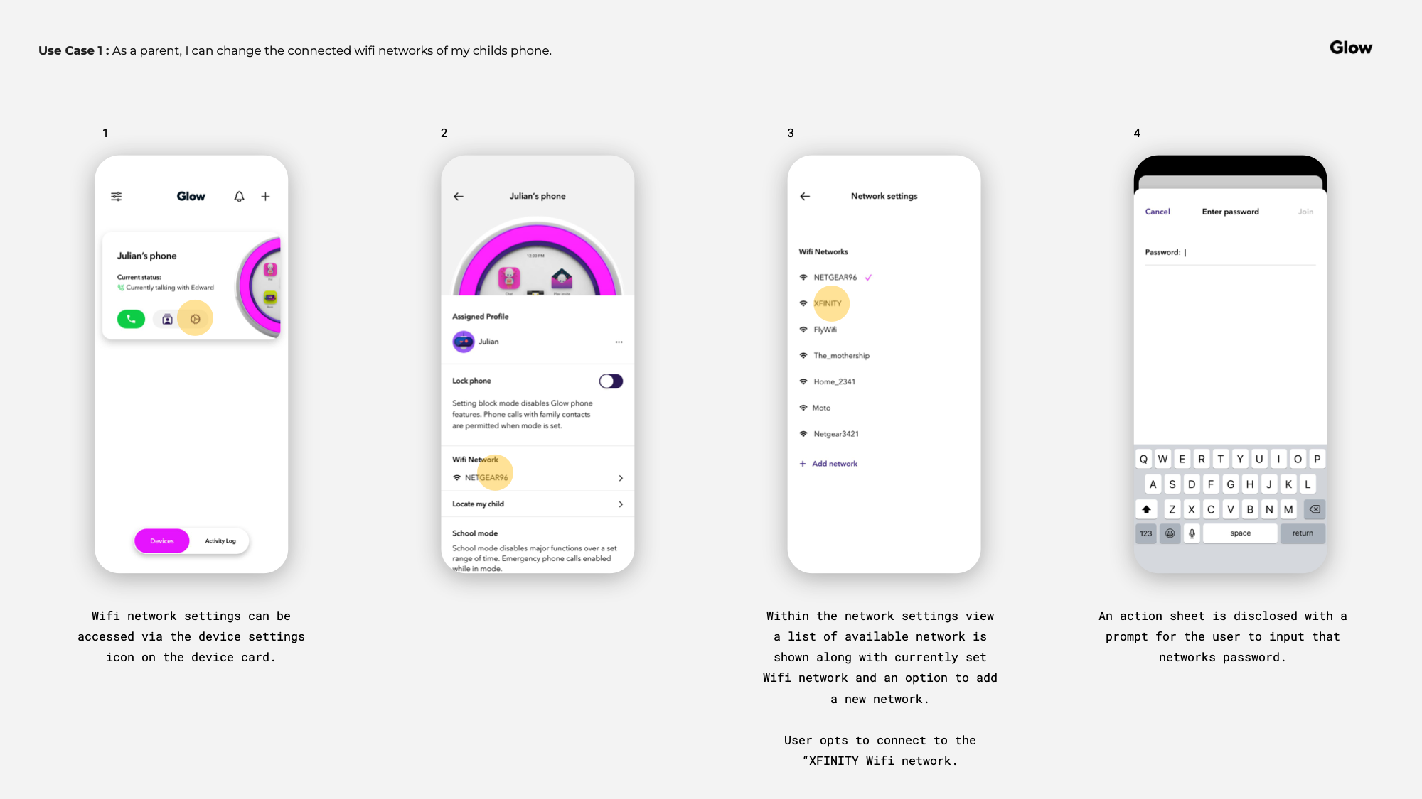
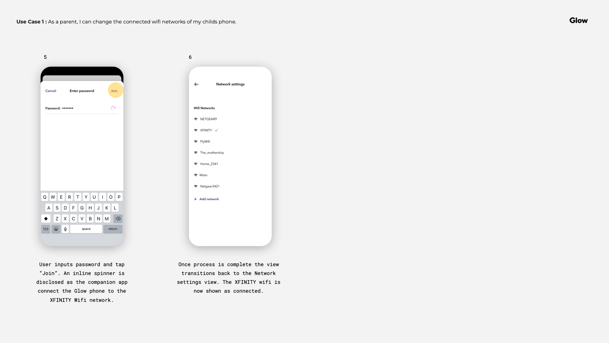
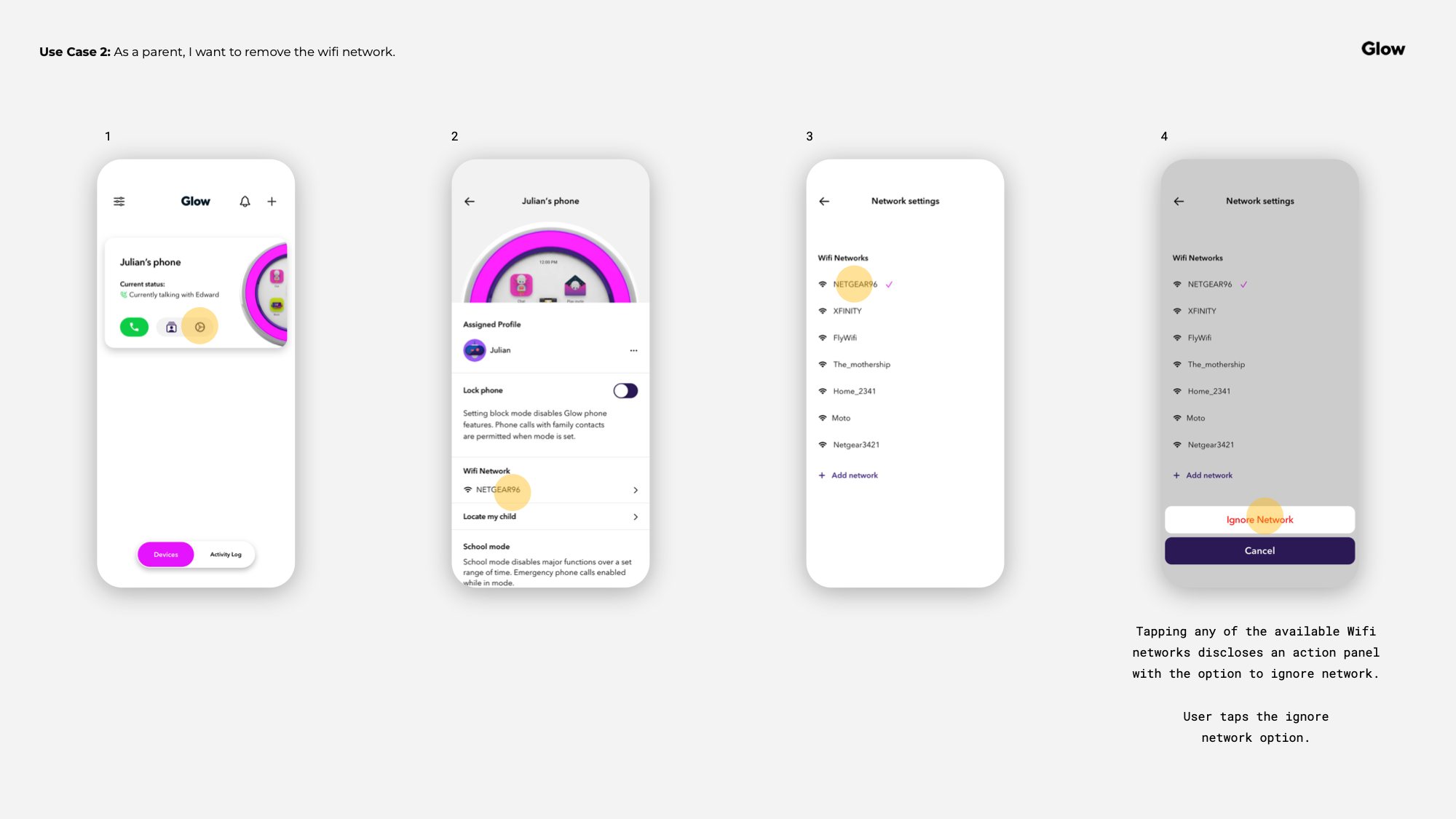
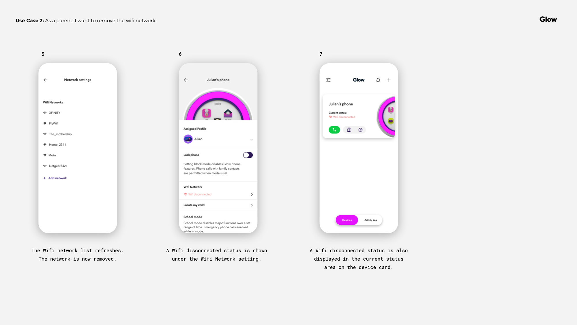
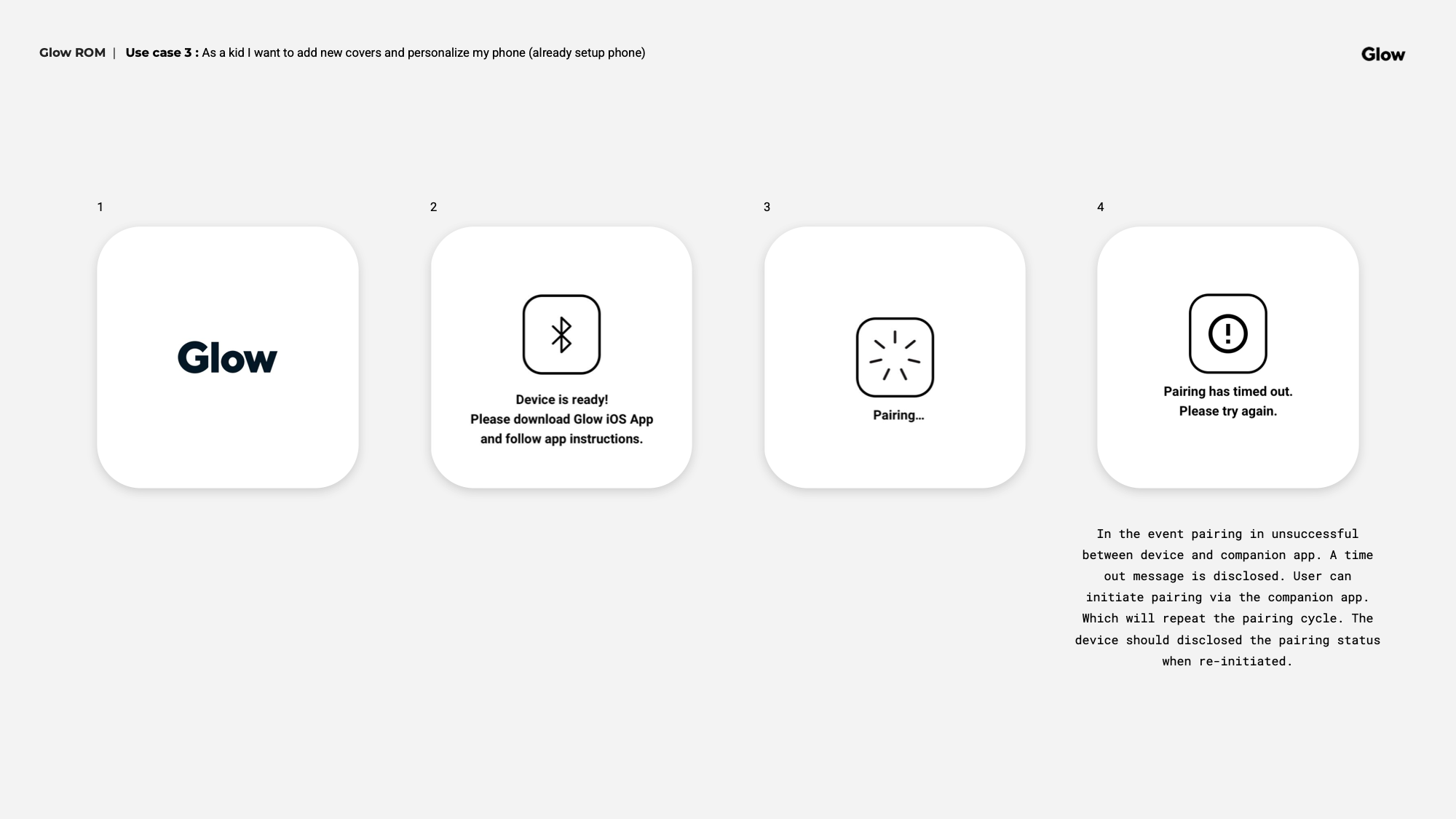
WiFi setup and device management surfaced unexpected technical constraints during collaboration with the engineering team in Ukraine. As limitations emerged, the UX had to adapt — adjusting flows and simplifying certain interactions to stay within what was buildable for the MVP.


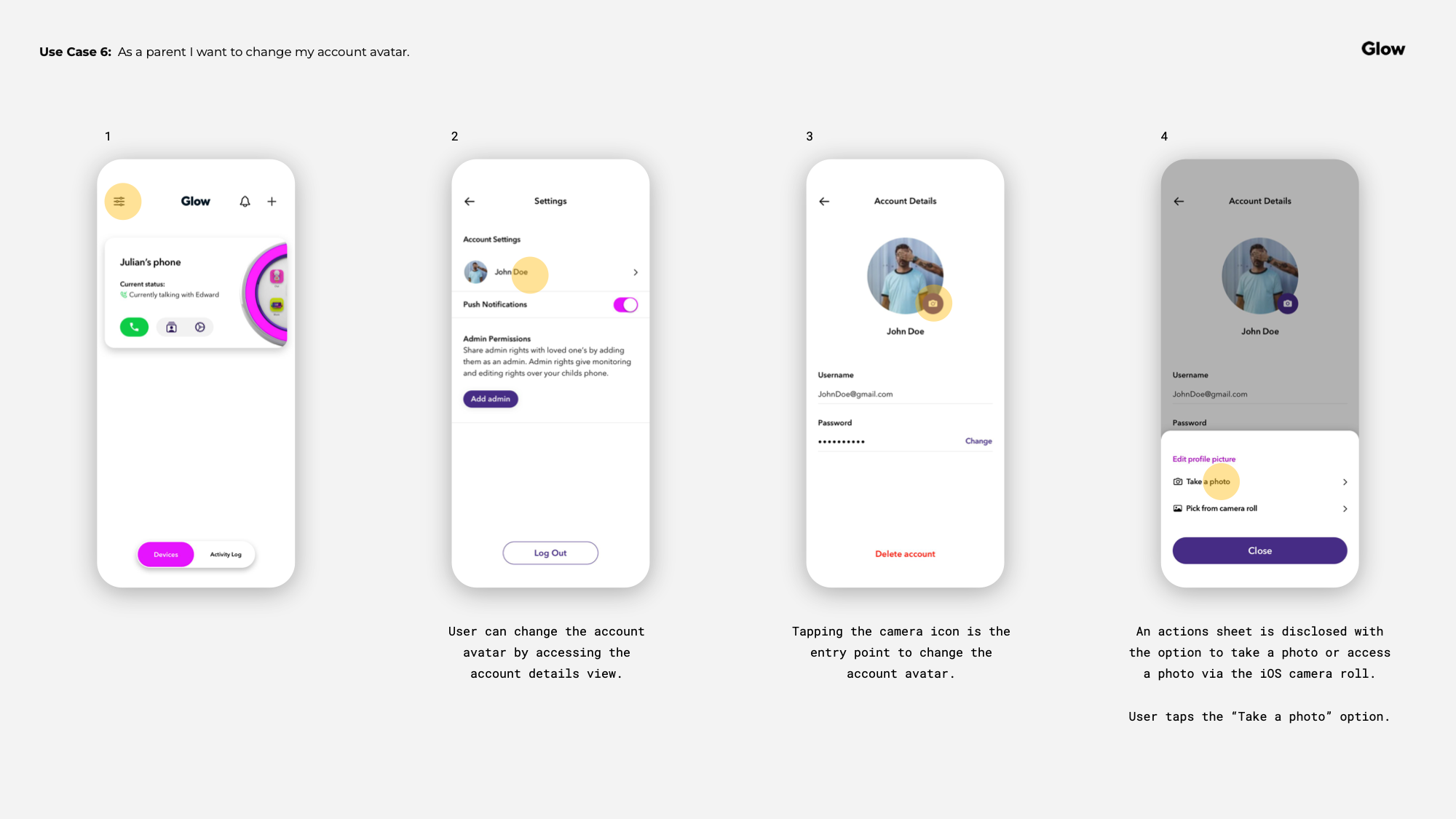
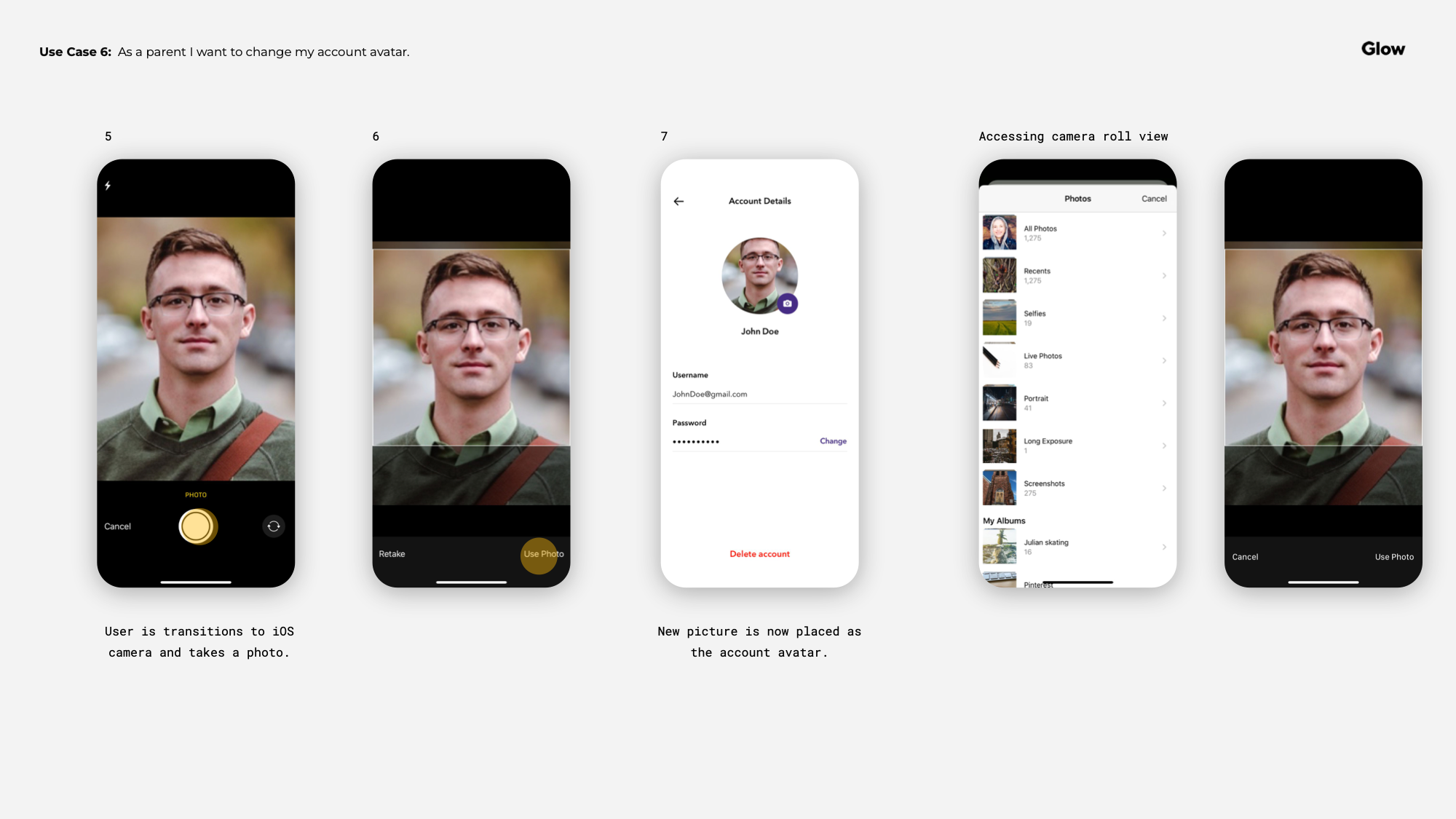
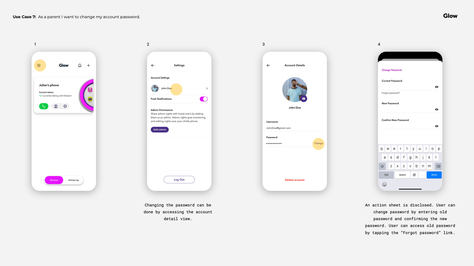
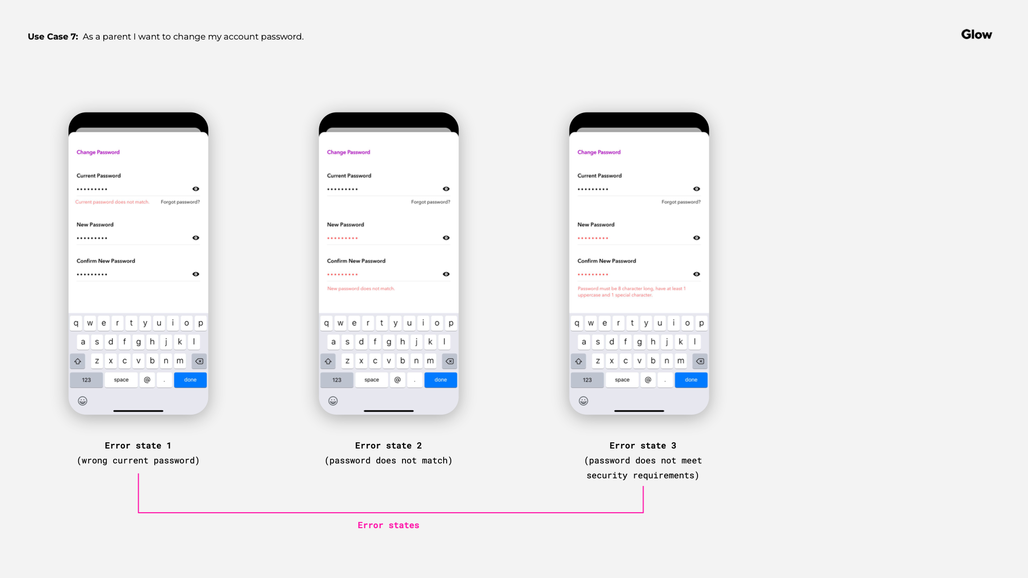


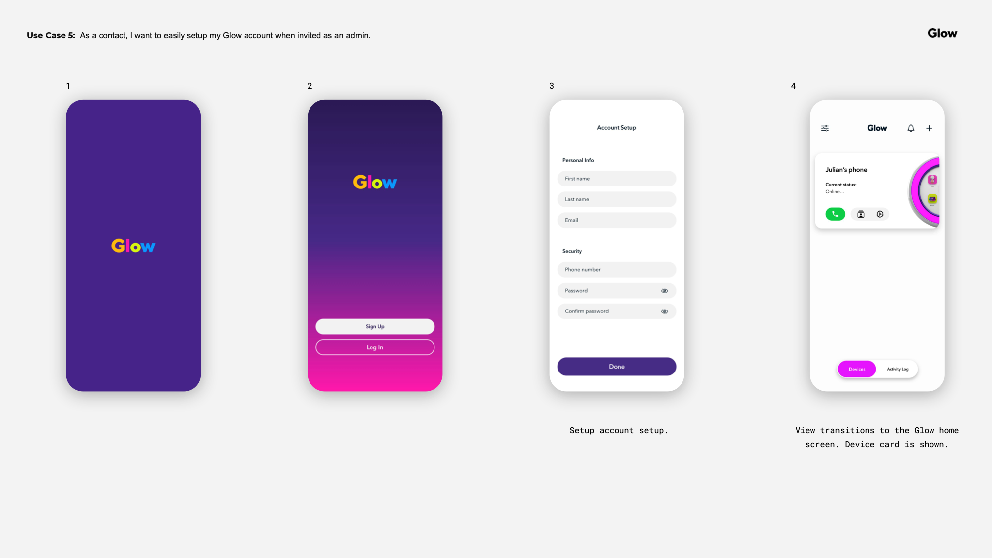
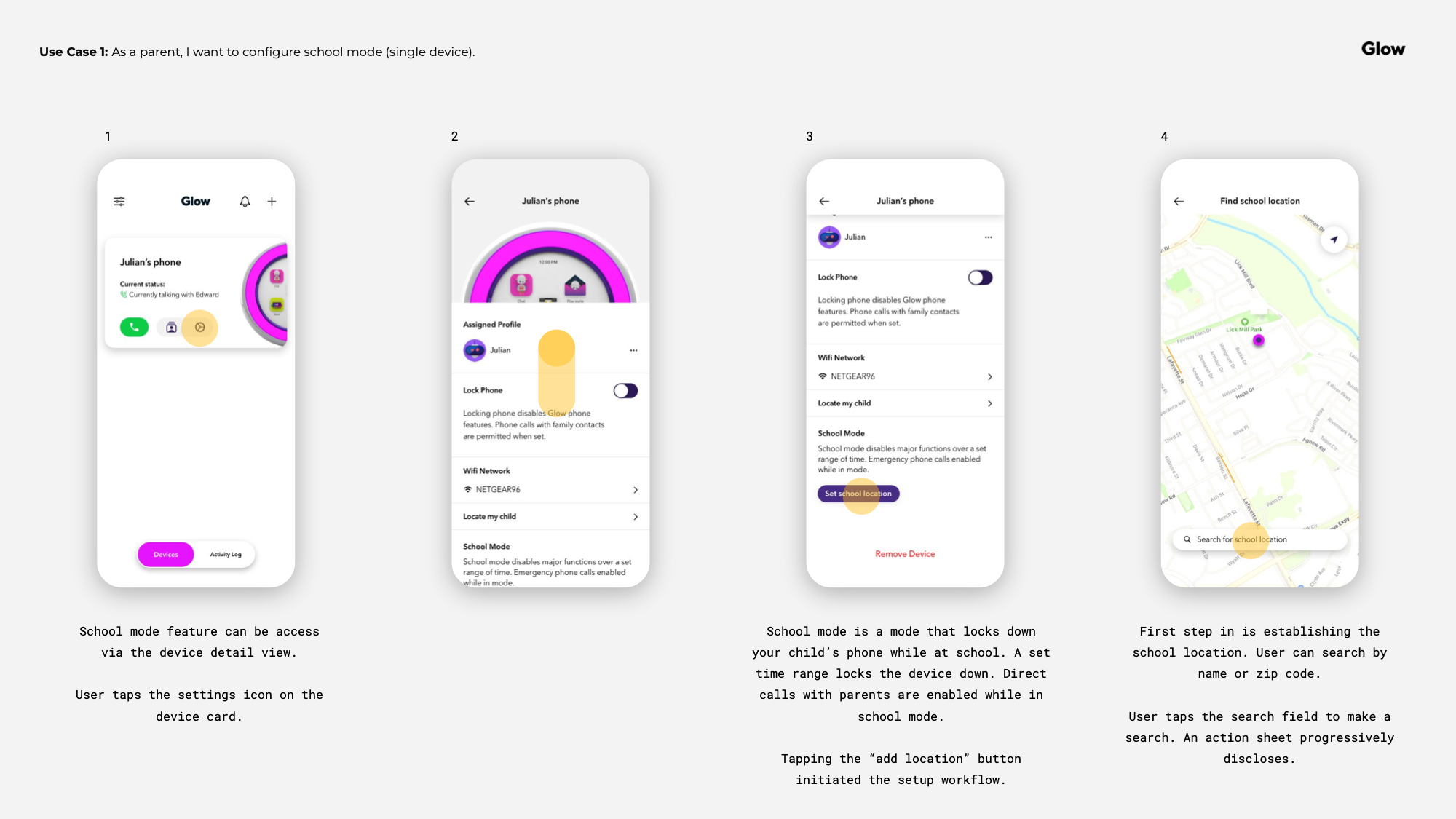
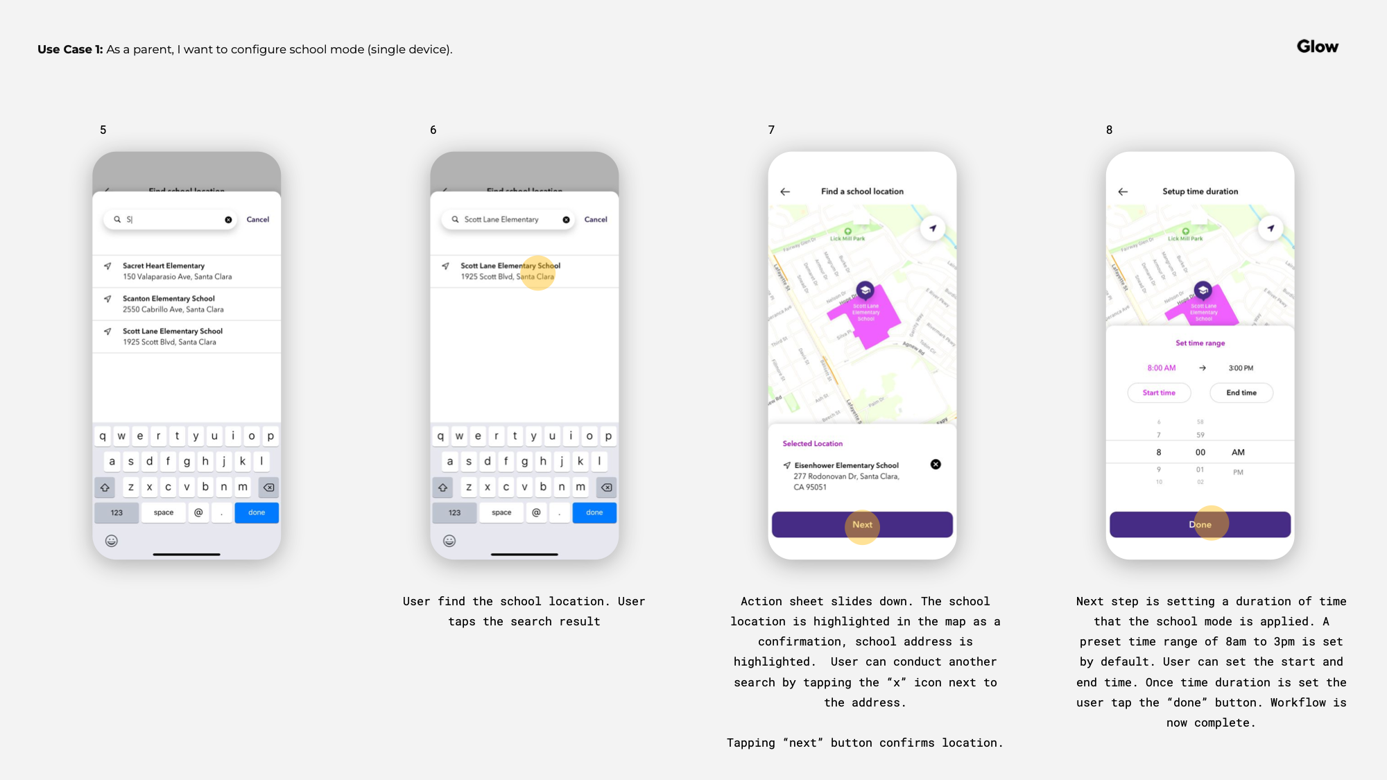
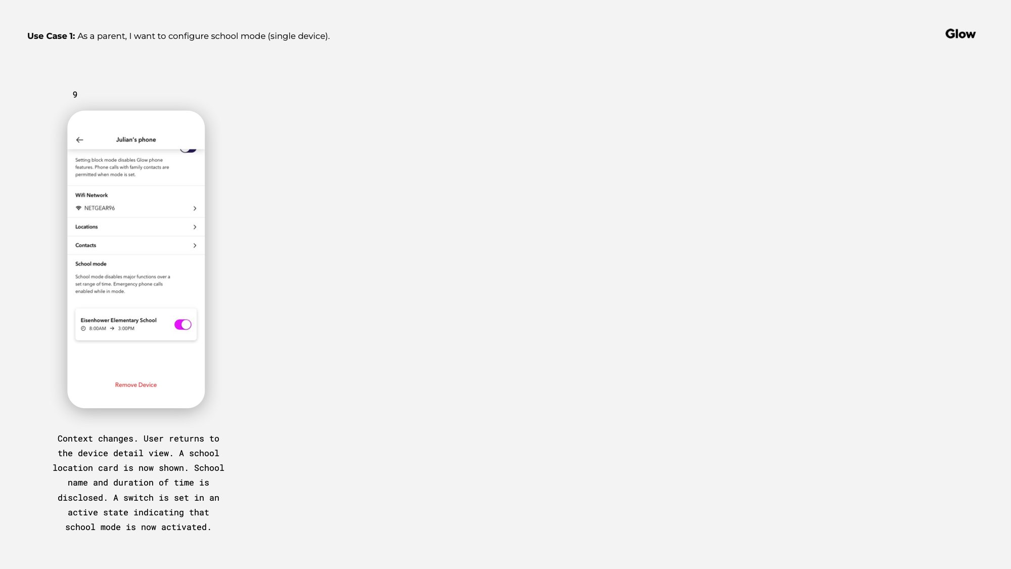
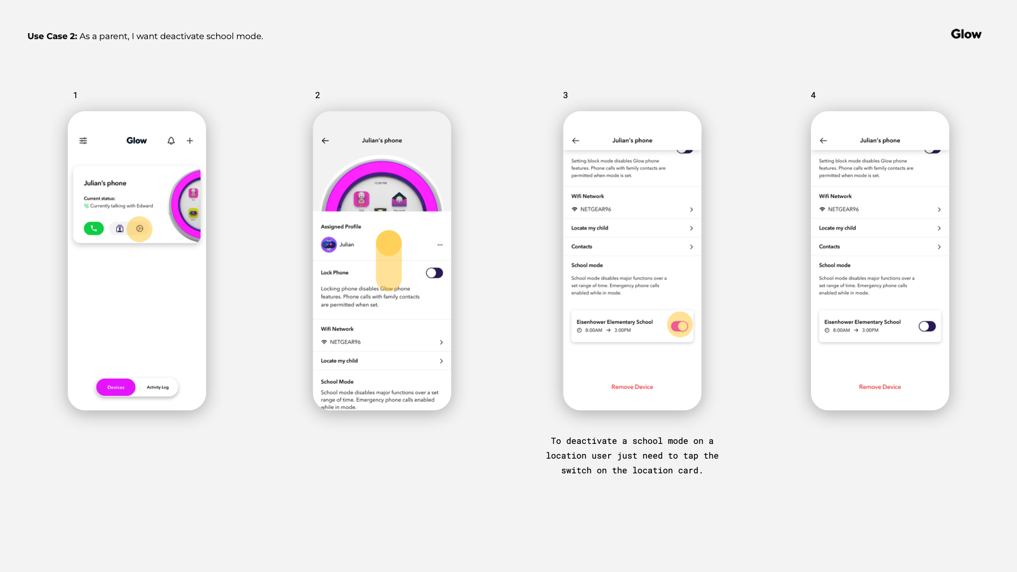
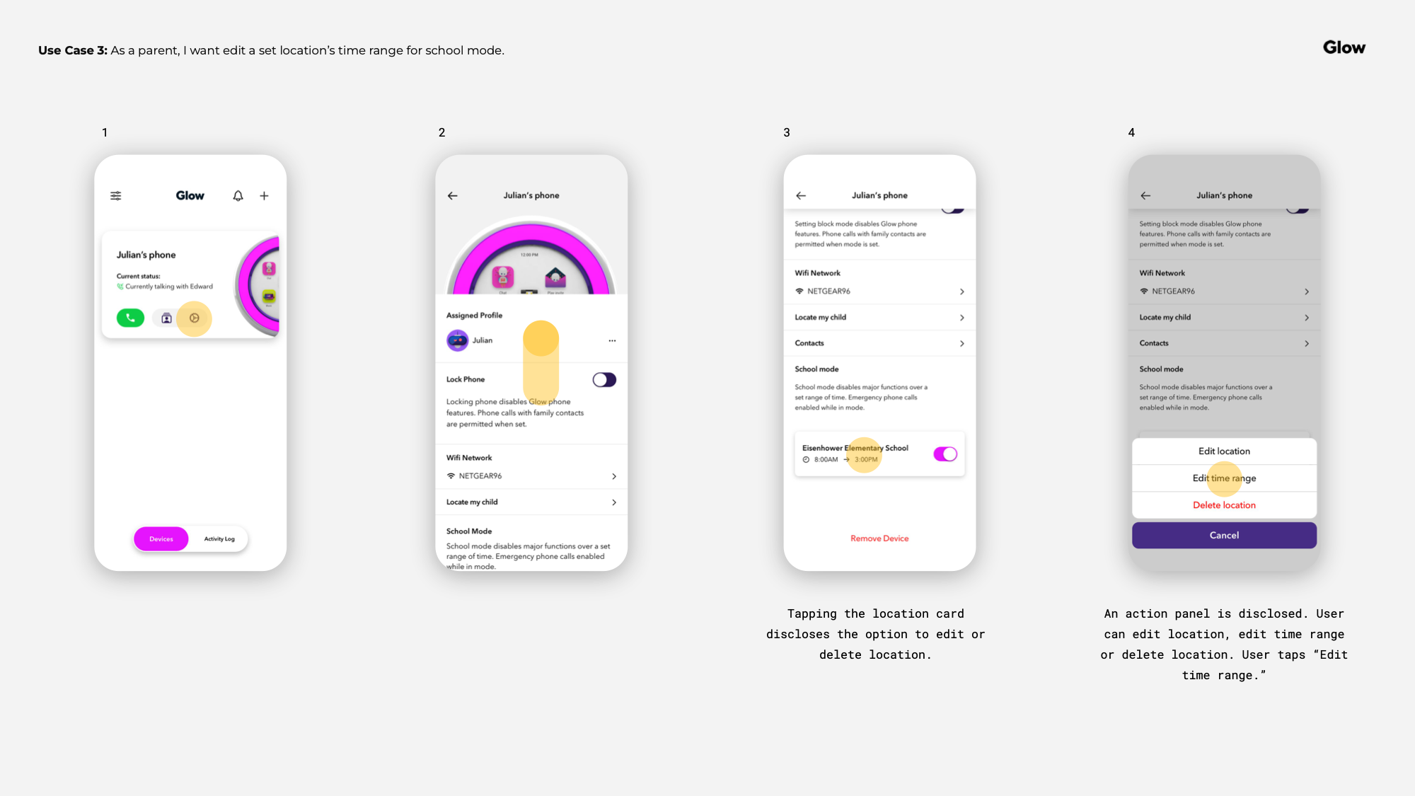
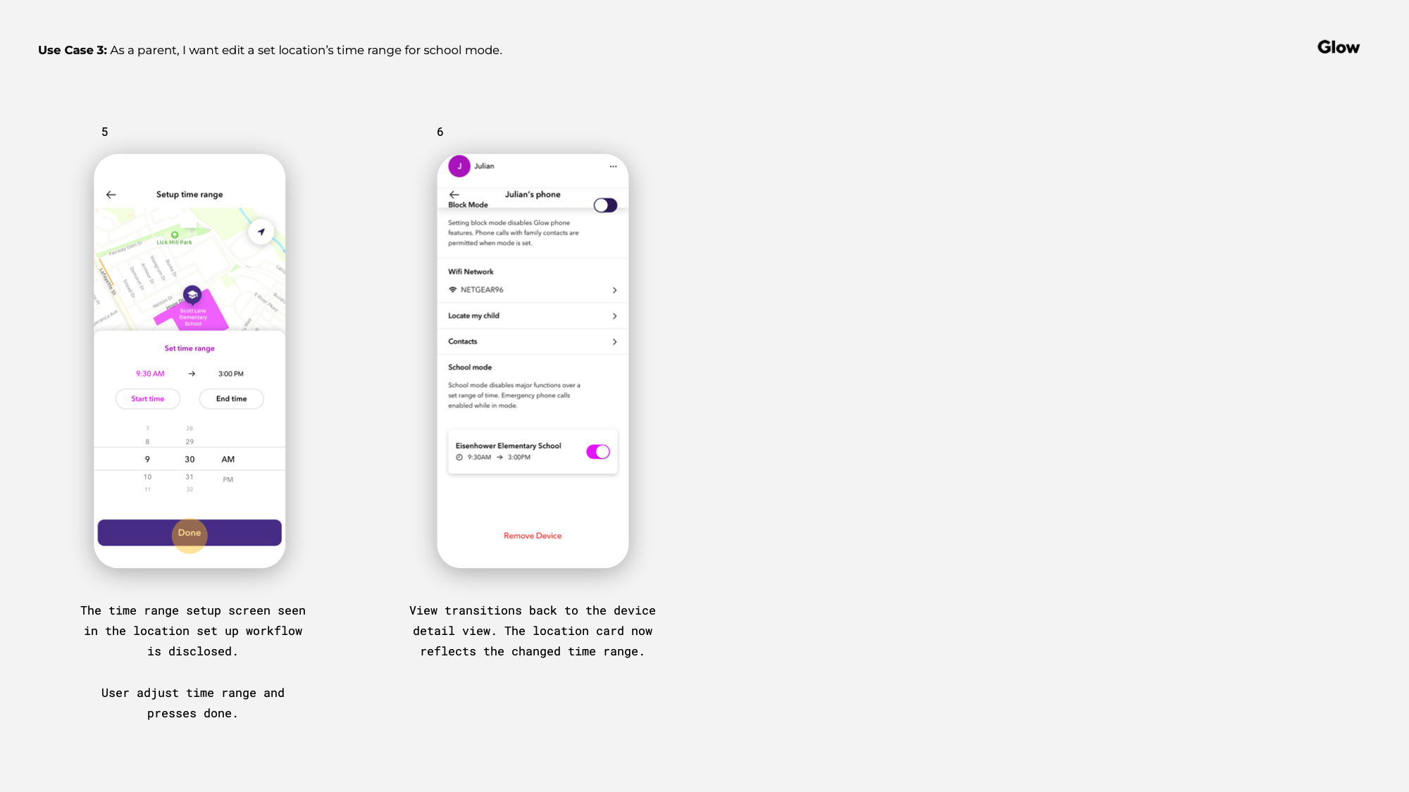
Glow Device UX
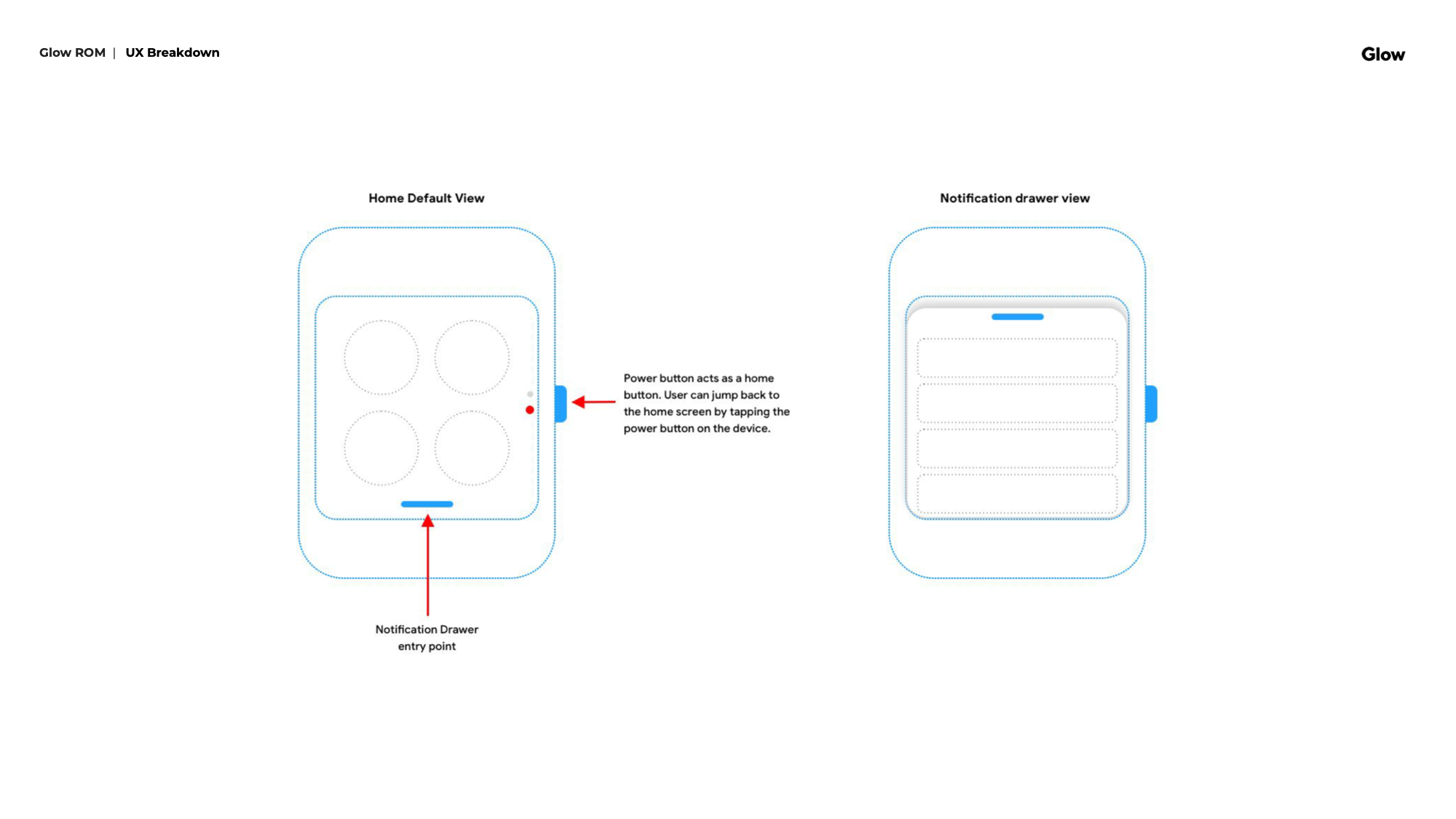
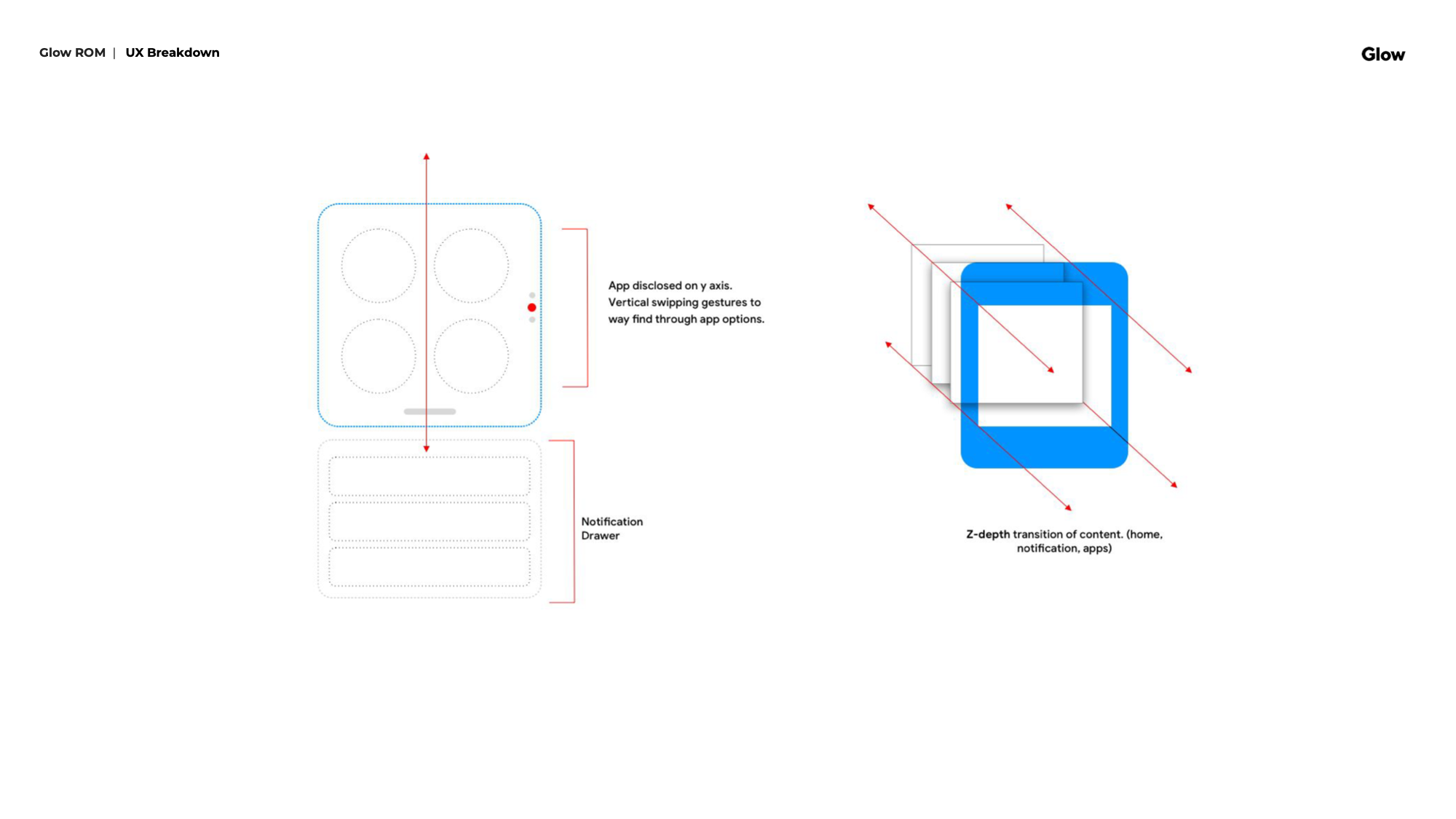
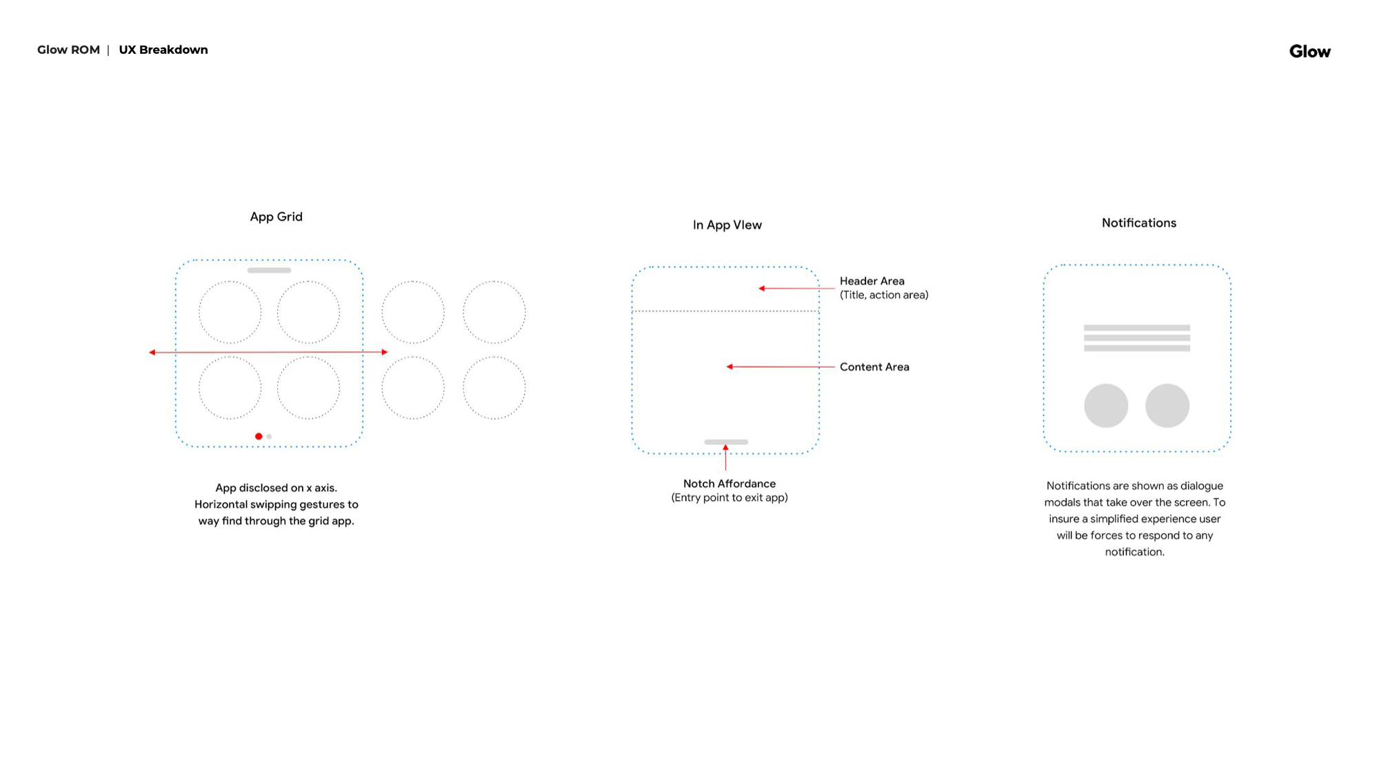
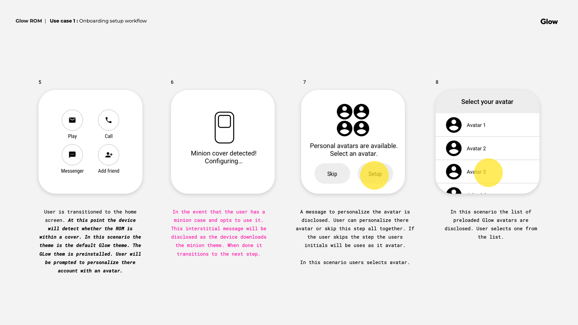
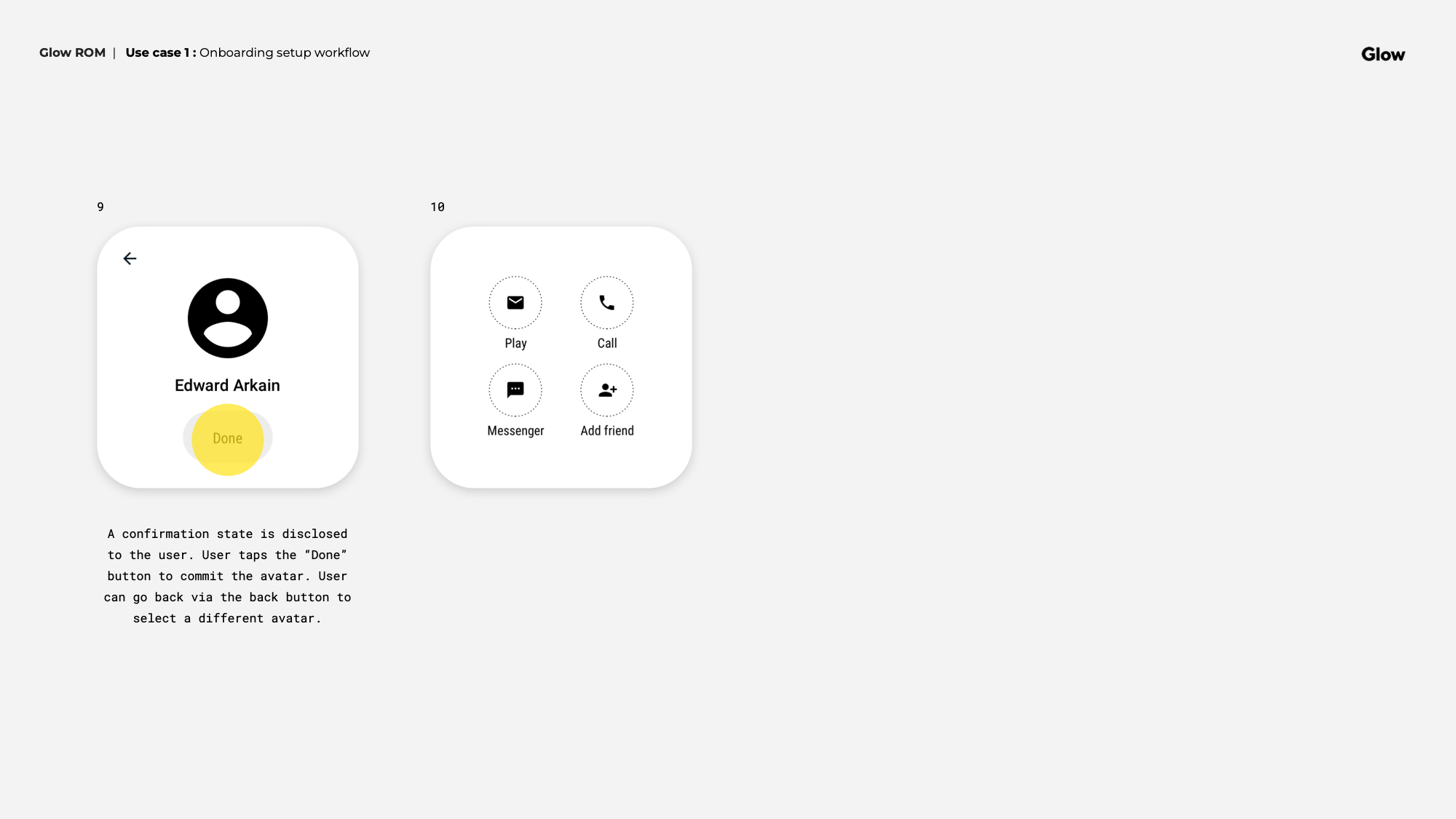
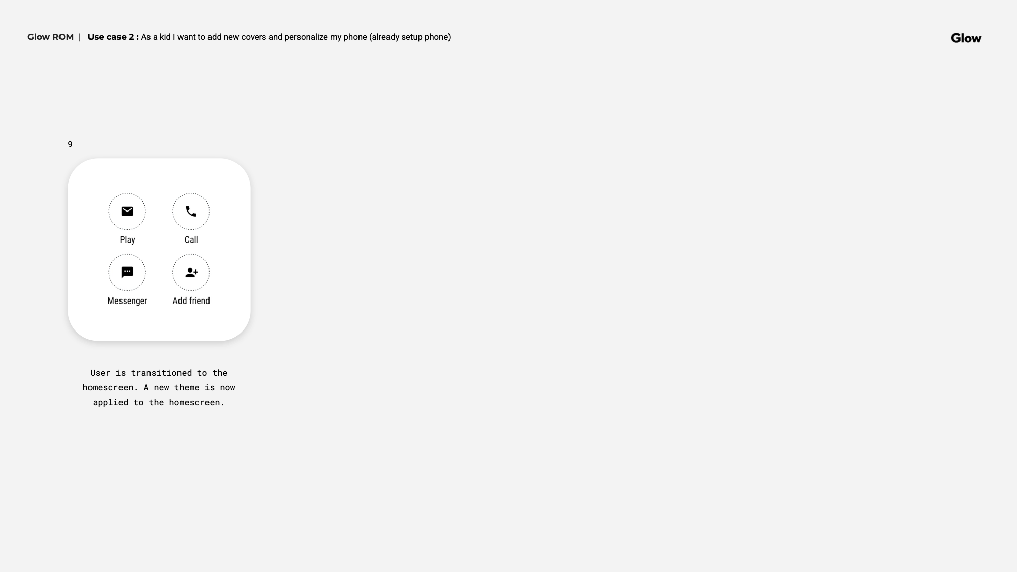
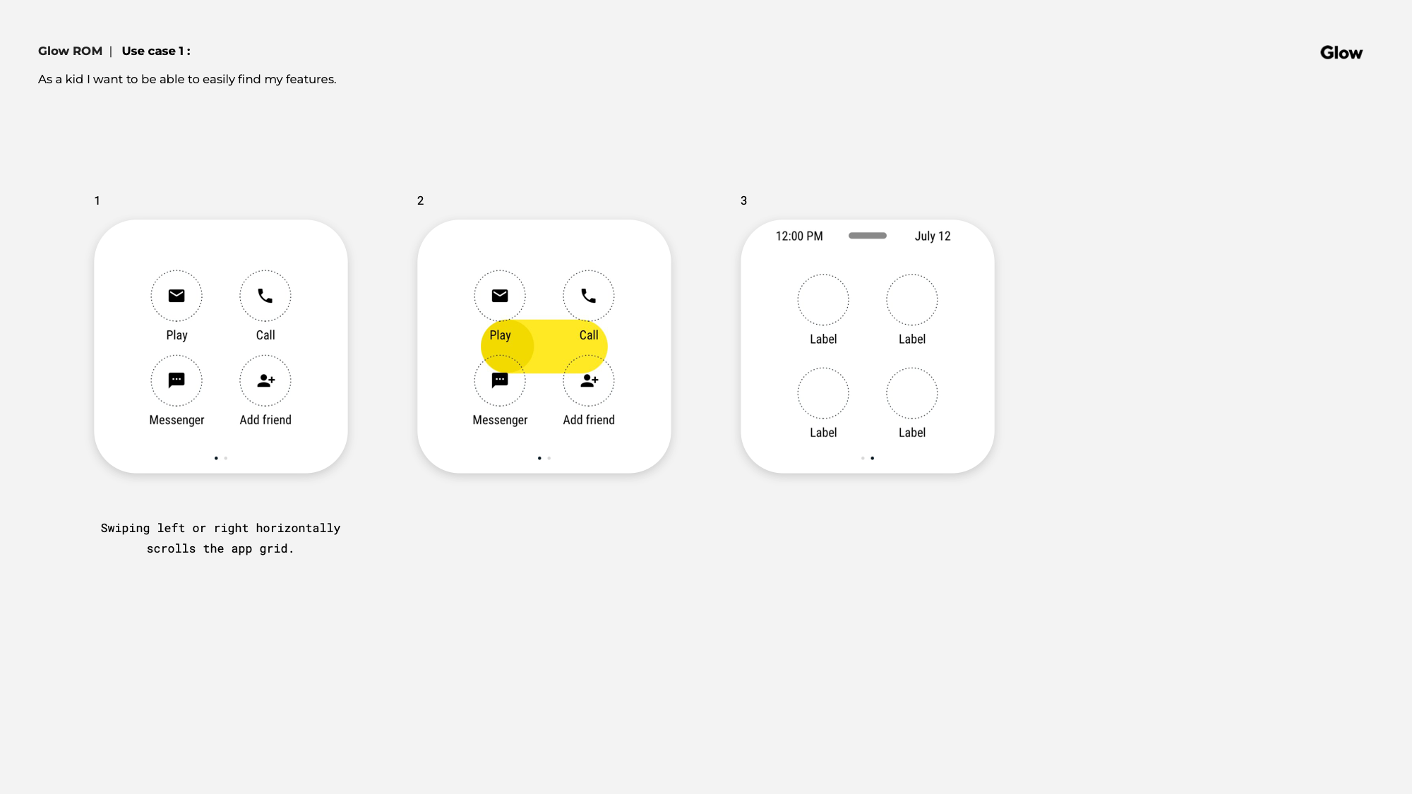
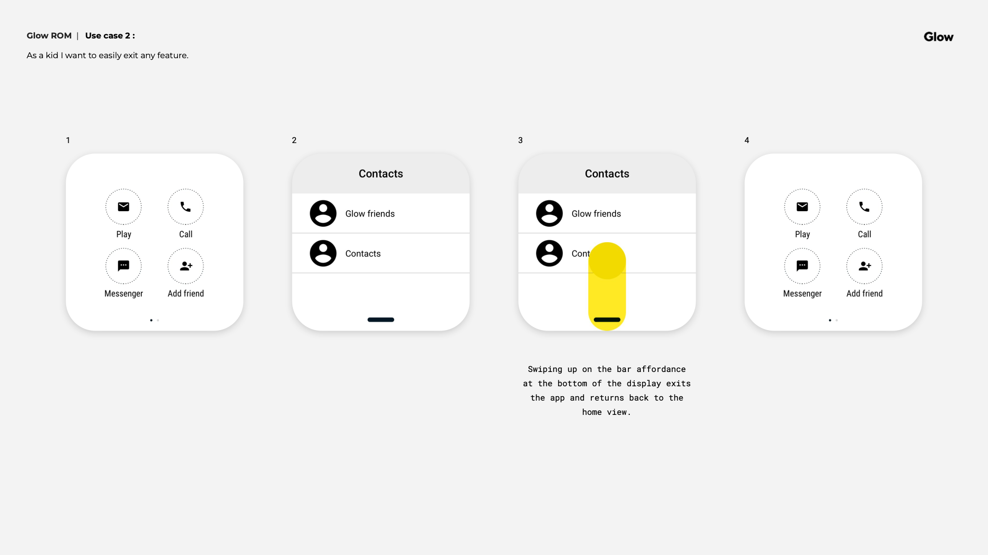
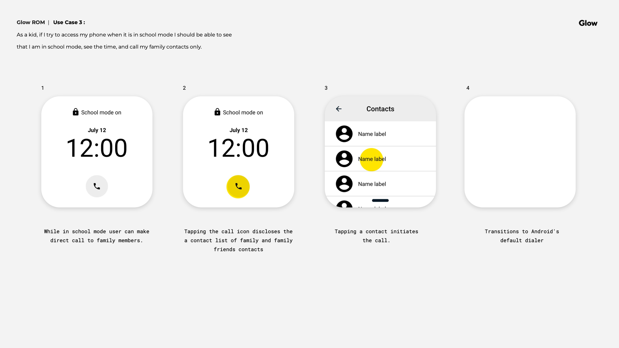
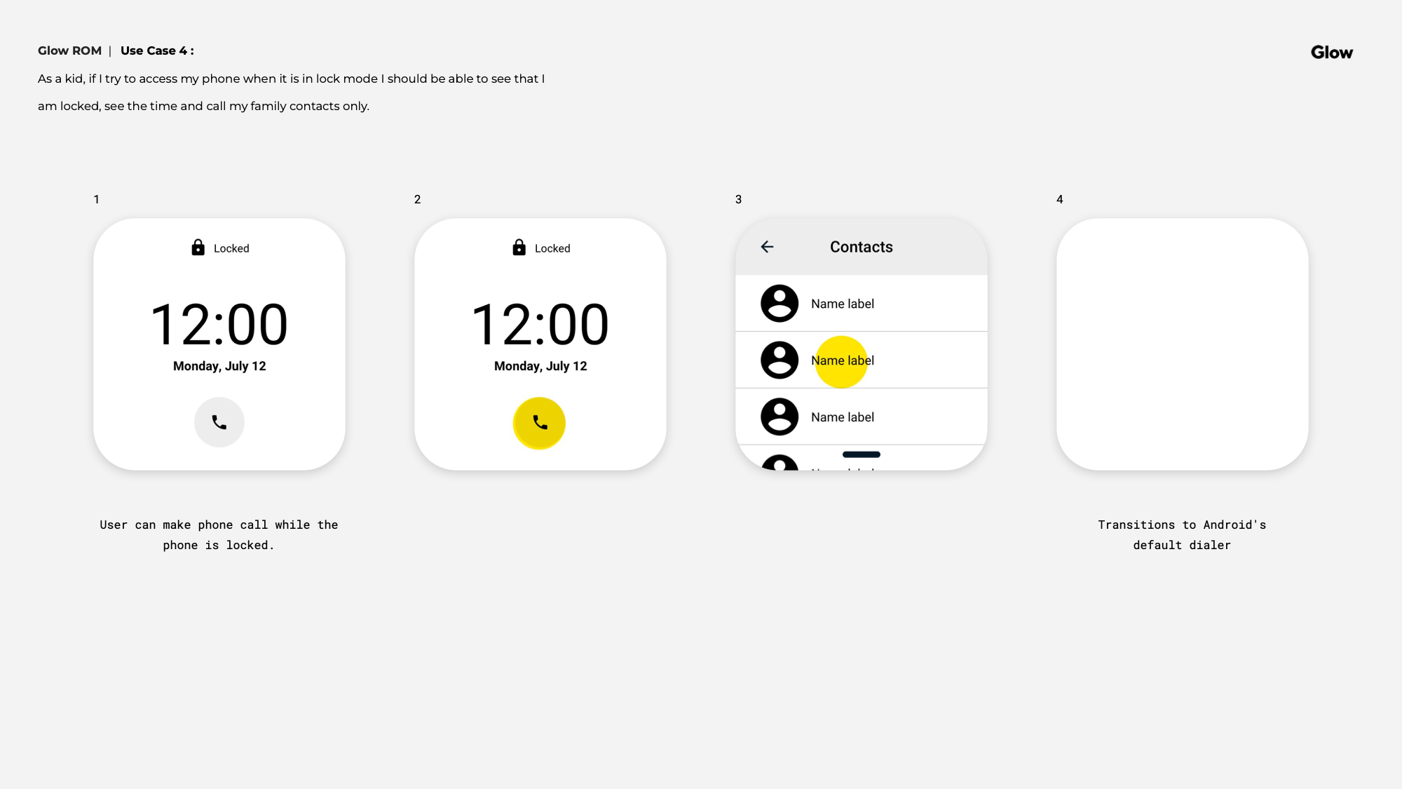
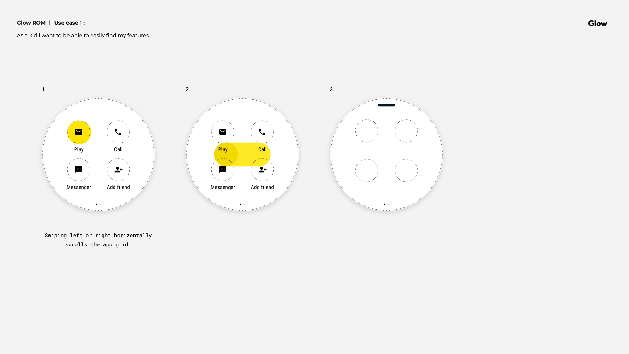
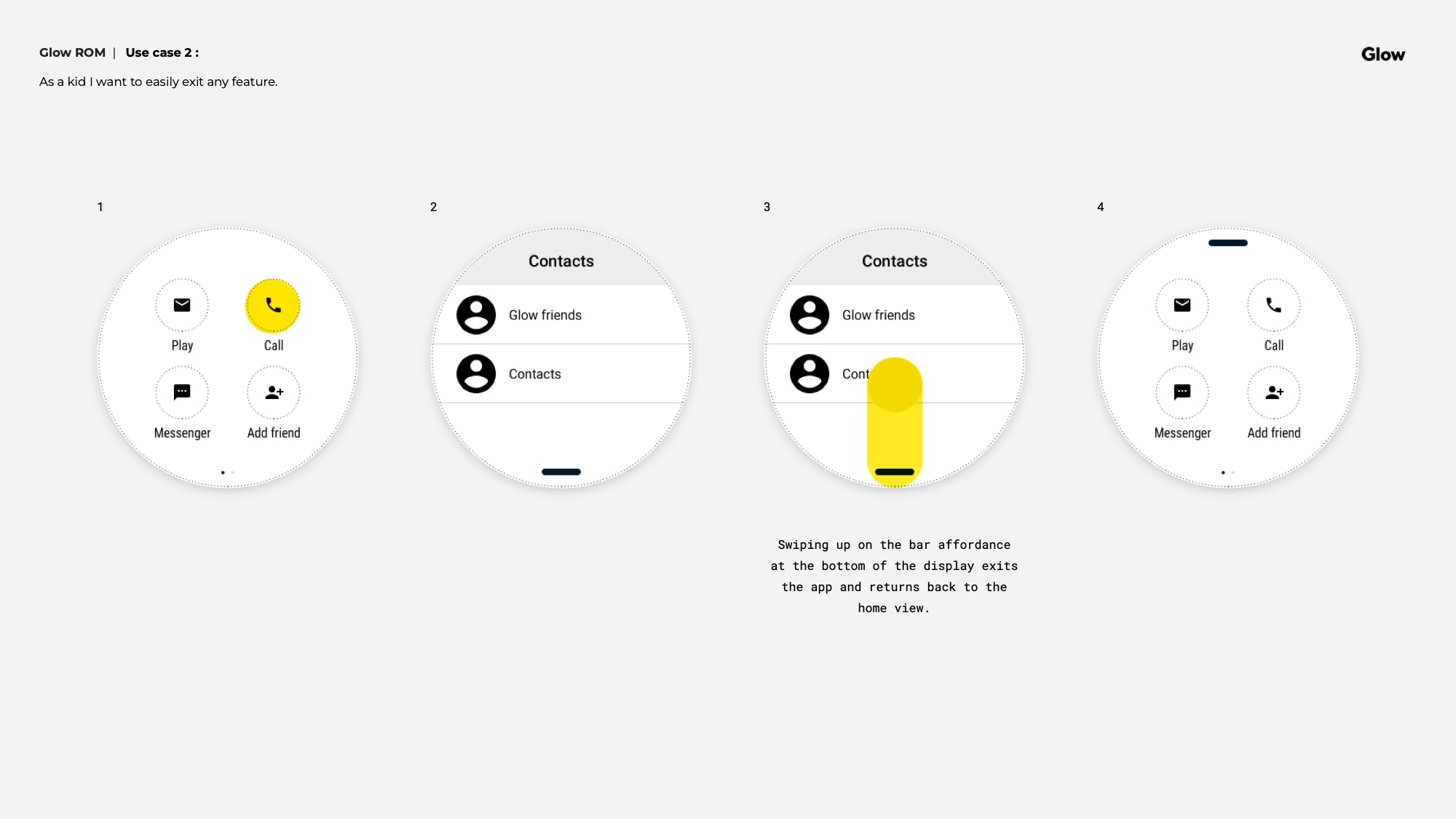
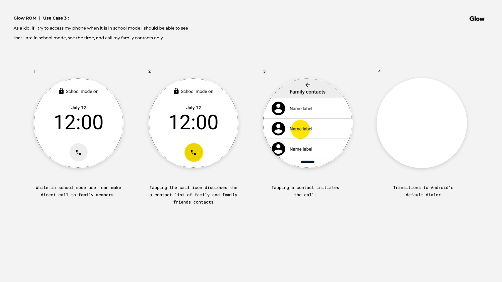
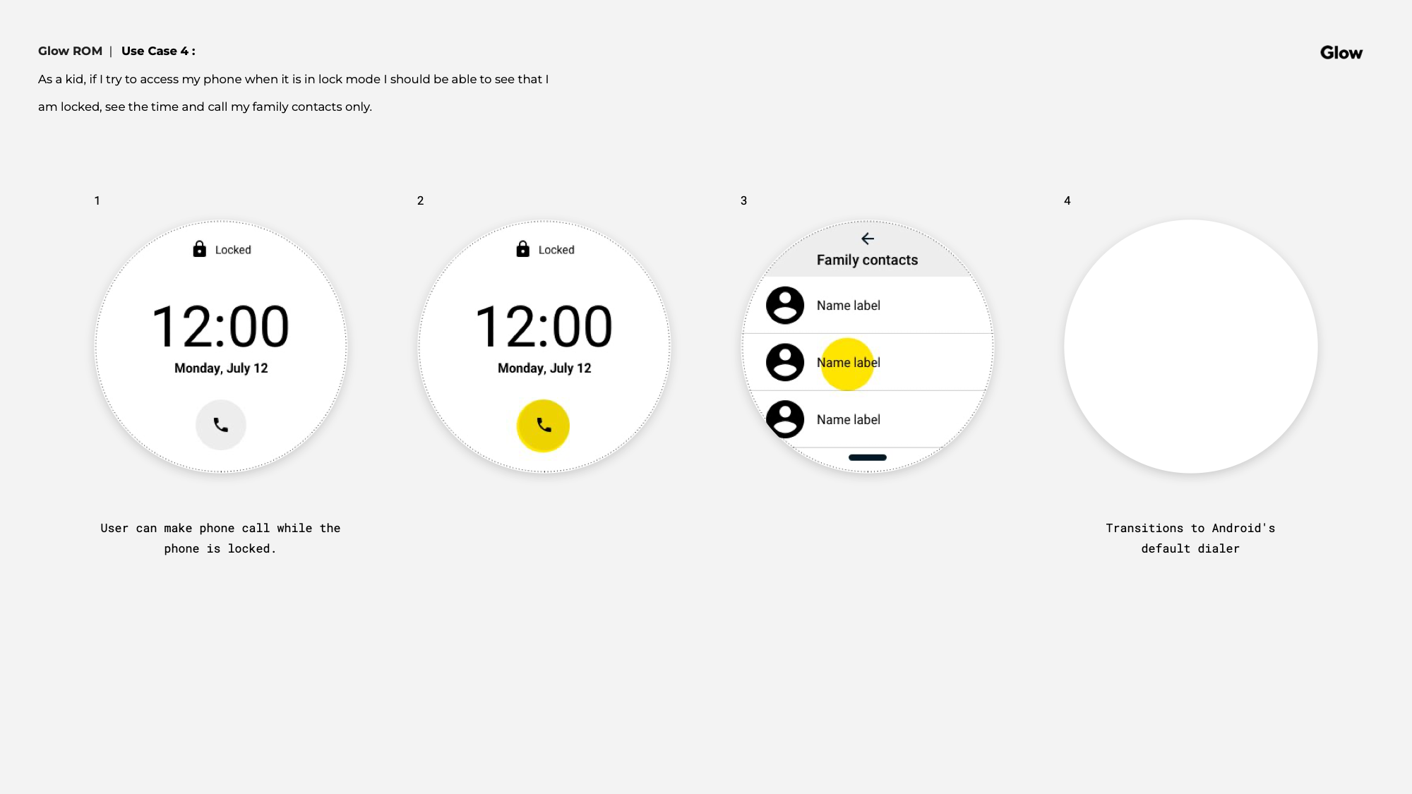
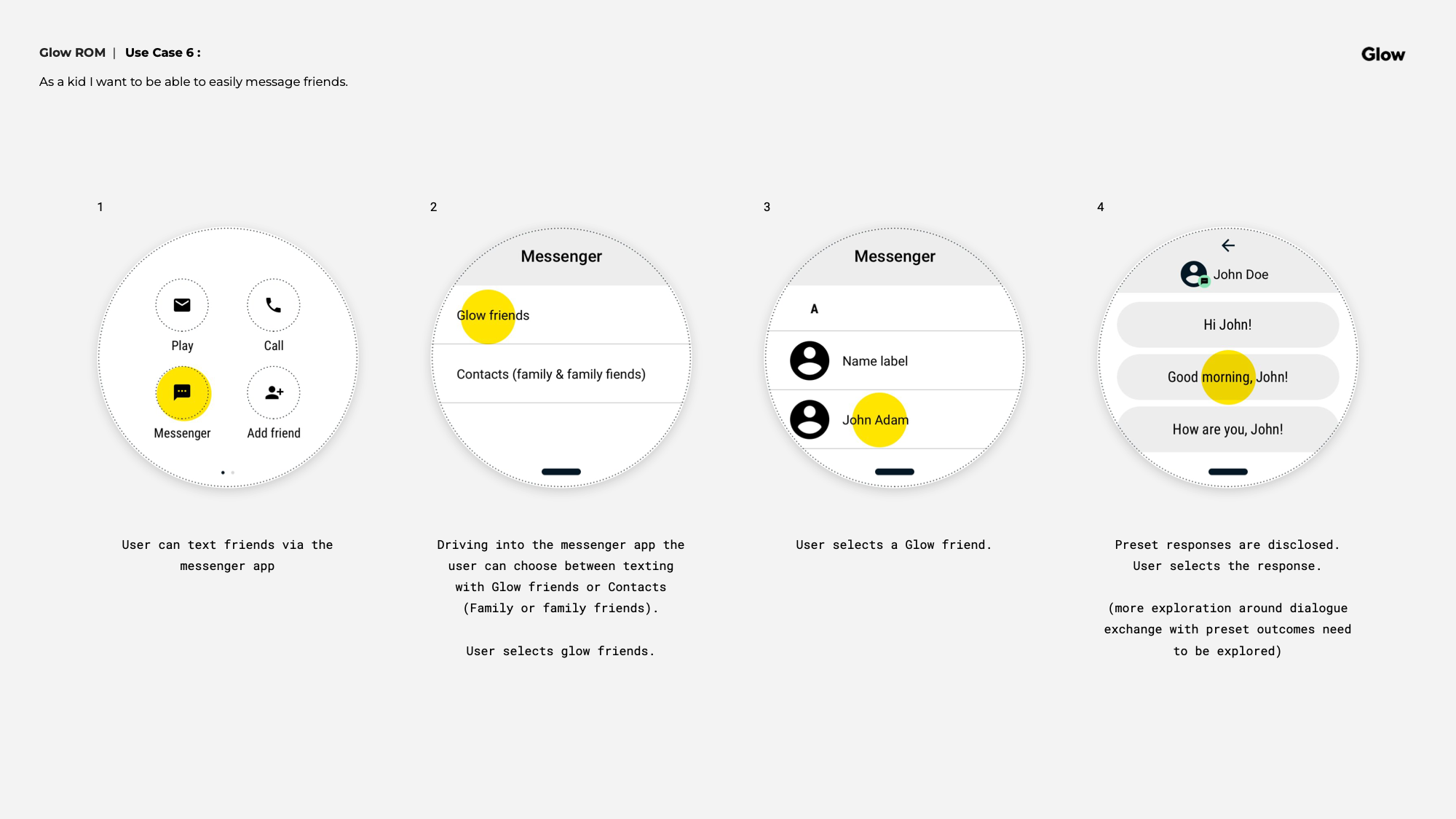
The Glow device was designed around a single principle: a child should be able to pick it up and figure it out without any instruction. The home screen kept it to four apps — Play, Call, Messenger, and Add Friend — organized in a simple 2x2 grid. Apps were disclosed along the Y axis through vertical swiping, and the power button doubled as a home button. Getting lost wasn't really an option.
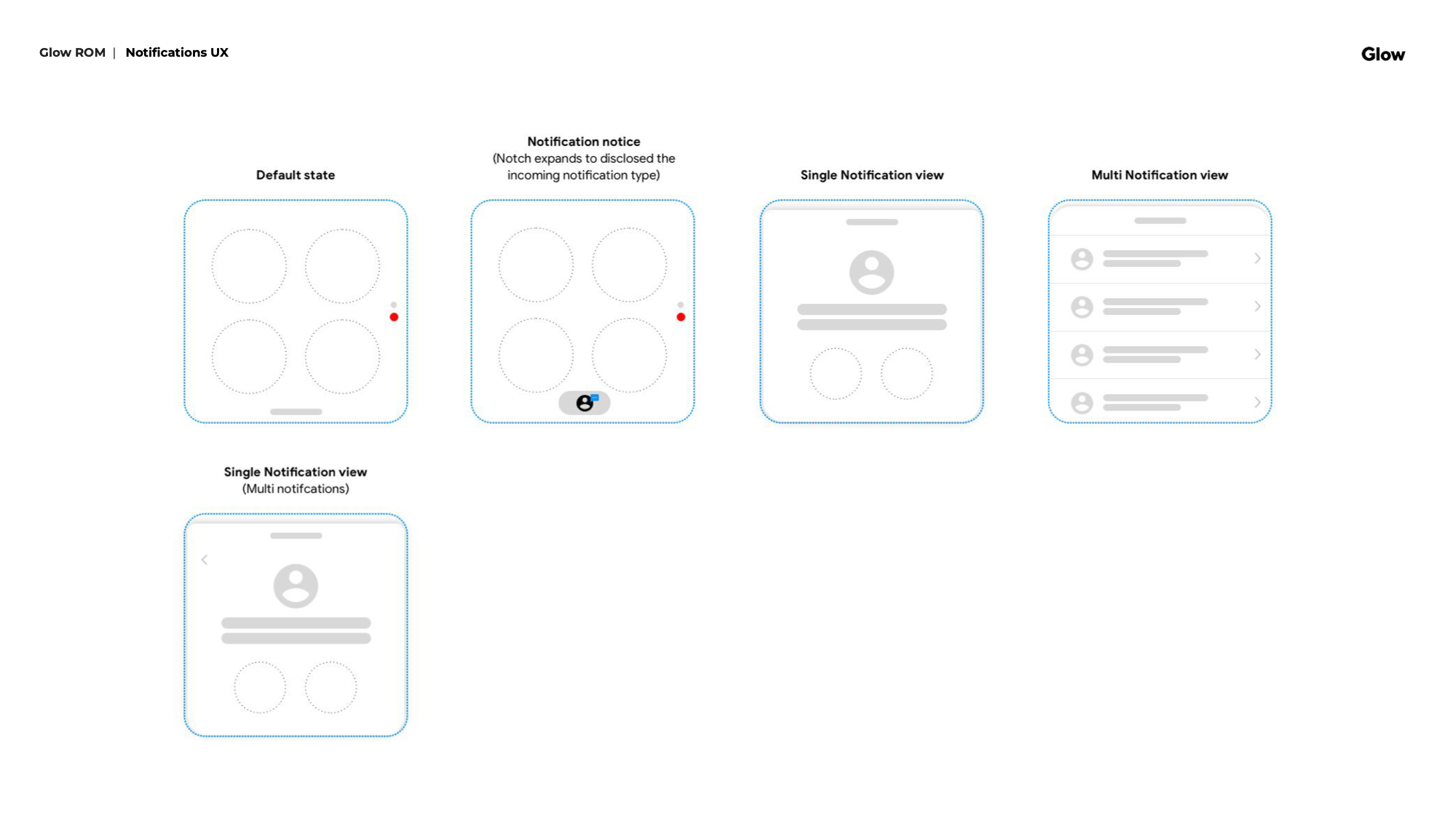
Navigation transitions used a Z-depth model — moving between home, notifications, and apps felt spatial and intuitive rather than hierarchical. The notification drawer surfaced from the bottom of the screen, keeping the home experience clean.
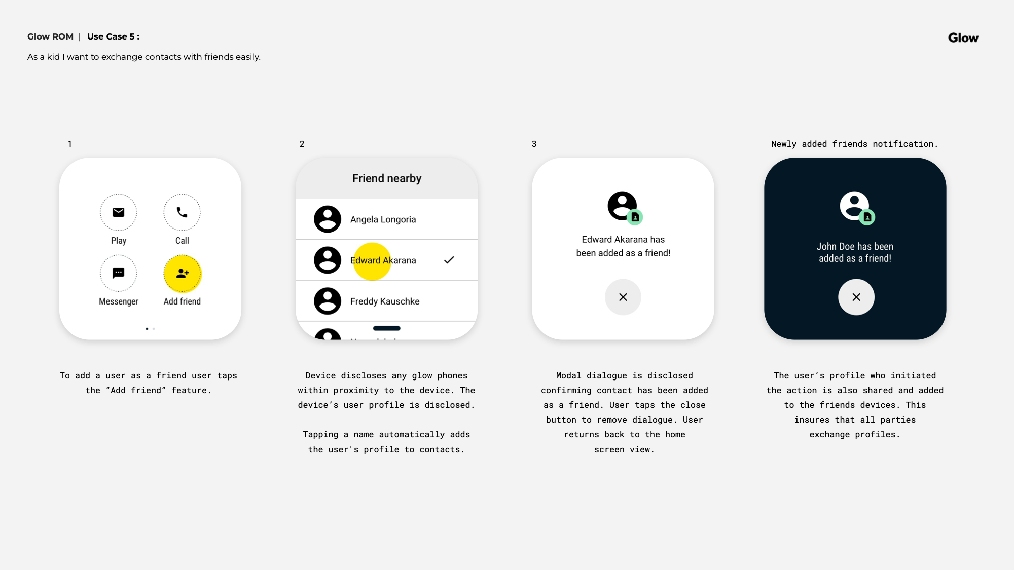
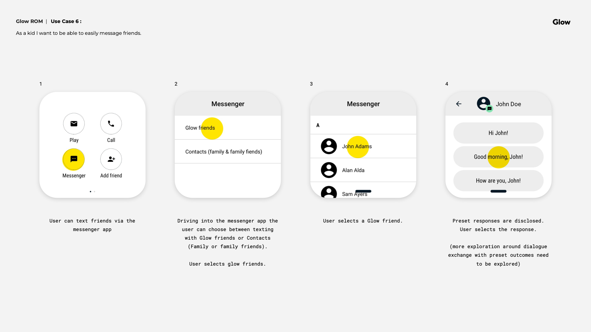
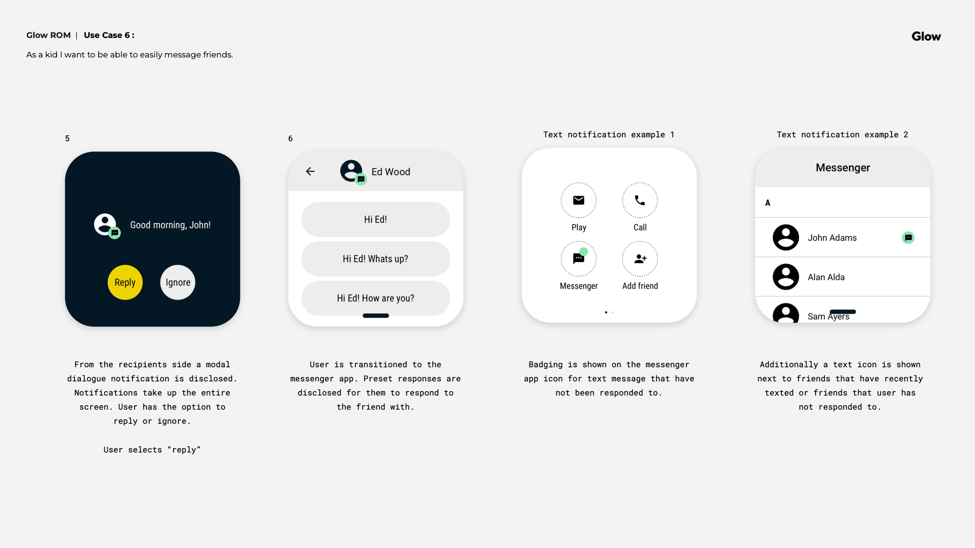
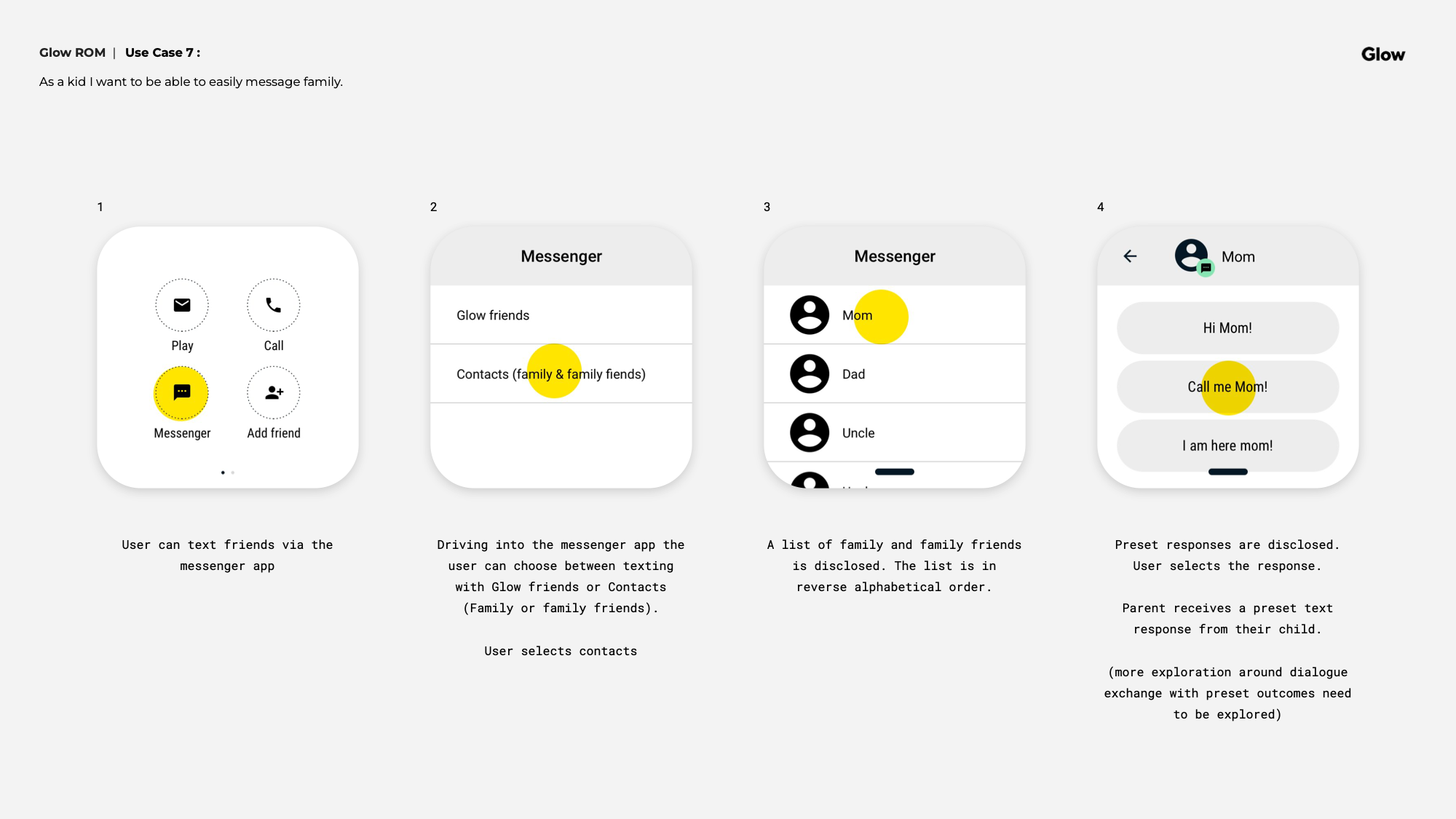
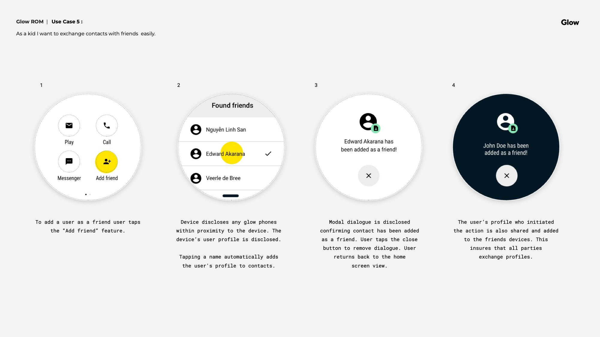
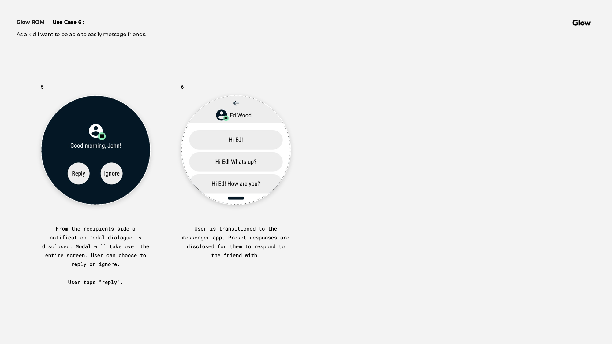
Messaging was intentionally constrained to preset responses, exchangeable only between Glow device owners. No free text, no open internet. Adding a friend was done by physically touching two Glow devices together via NFC — a deliberate design choice that made friendship feel tangible rather than digital.
The most complex experience on the device was collaborative play — inviting friends to a remote play session, joining sessions via notification, and managing proximity-based play when other Glow devices were nearby. Each flow was designed with a one-minute time window to dock and start, keeping the energy moving and the experience feeling alive.
Design System
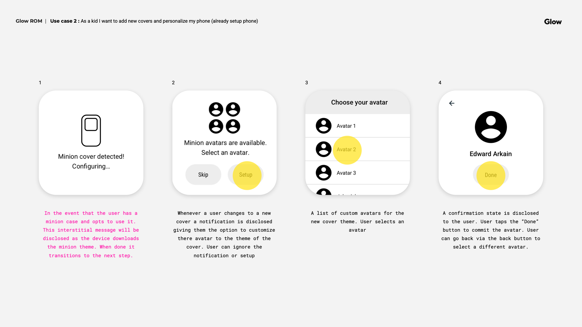
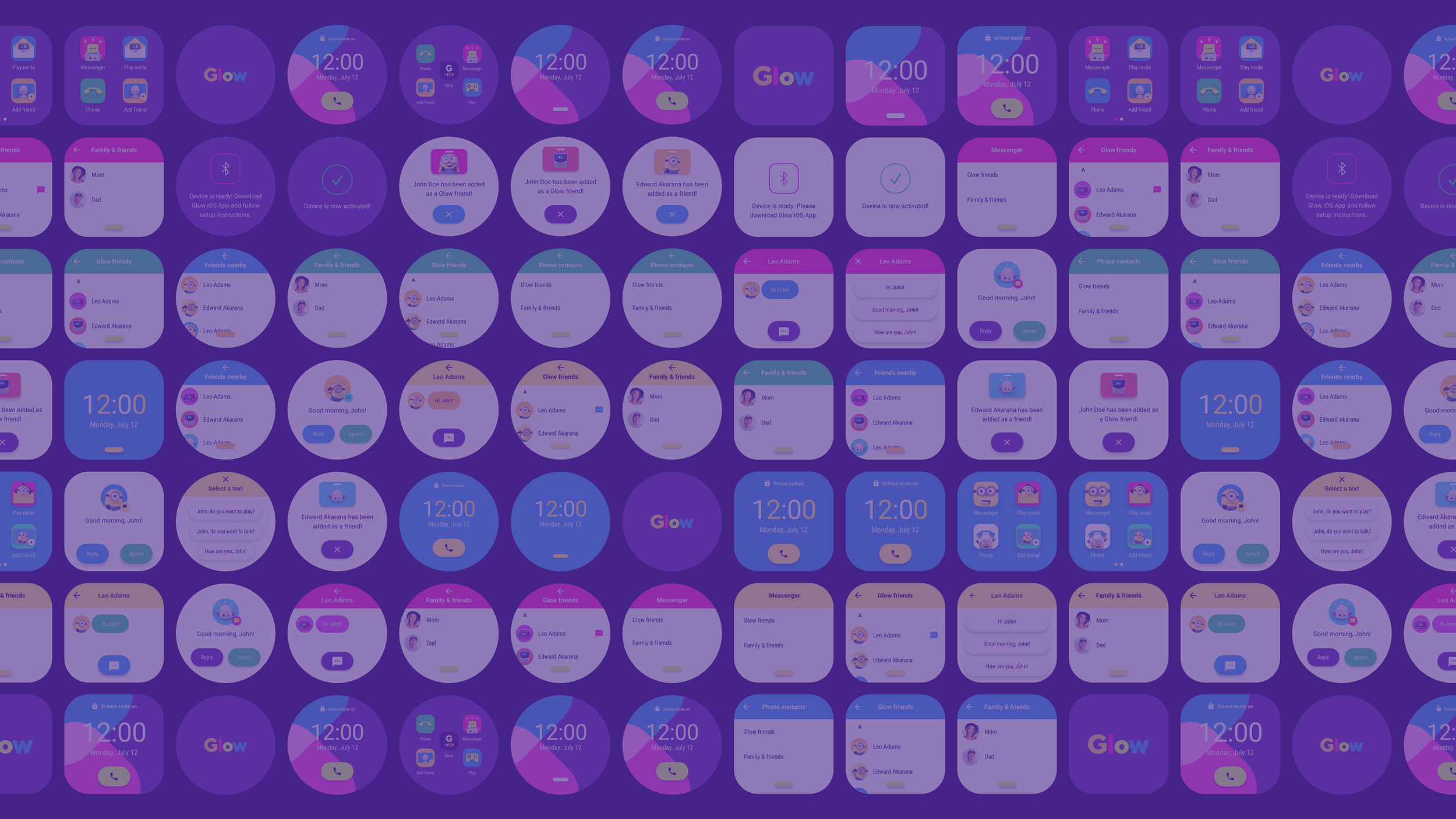
To maintain visual coherence across both the Glow device and the iOS companion app, I delivered an initial design system for the MVP. The system was built on the brand identity I established — carrying the same visual language, color, and typography across two very different surfaces: a square and circular device screen, and a full iOS mobile app.
For the device, the system defined launcher themes, icon treatments, and interaction patterns that felt consistent regardless of which hardware prototype was in hand. The circular screen required a revisited approach to layout and wayfinding — what worked on a square didn't always translate, and the system had to account for both without feeling like two separate products.
For the iOS companion app, I leaned on native iOS components and system icons to move fast without sacrificing quality. The tab view was customized to stay on brand rather than feeling like a stock app. The system gave the engineering team clear guardrails — enough flexibility to build quickly, enough specificity to stay visually cohesive.


Outcome
The beta shipped and was met with strong reception. The onboarding flows, device pairing, contact management, and collaborative play features were all validated through testing — proof that the concept worked and the experience held up in the hands of real users.
The project was ultimately shelved due to pandemic-era economic pressures and supply chain constraints that made manufacturing the device unfeasible at the time. Not a product failure — a timing one. The brand, the UX system, and the validated beta remain a proof of concept for what a genuinely safe, genuinely fun connected device for kids could be.