In December 2017, I joined Huawei's R&D group in San Francisco as a senior UX designer, working on a US-market vision for EMUI — the company's Android-based mobile software. As part of the Eames project, I led a launcher concept through a full cycle of discovery, prototyping, and user testing.
Role: Senior UX Designer
Client: Huawei
Type: UX Research & Design
Year: 2017–2018
Tools: Sketch, Framer
Eames Project Objectives
Design and validate a launcher concept tailored for the US market across discovery, prototyping, and testing.
Uncover opportunities for new features and interaction patterns to strengthen the EMUI experience.
Define a set of design principles to guide the broader EMUI vision, shared directly with Huawei HQ.
Discovery Phase
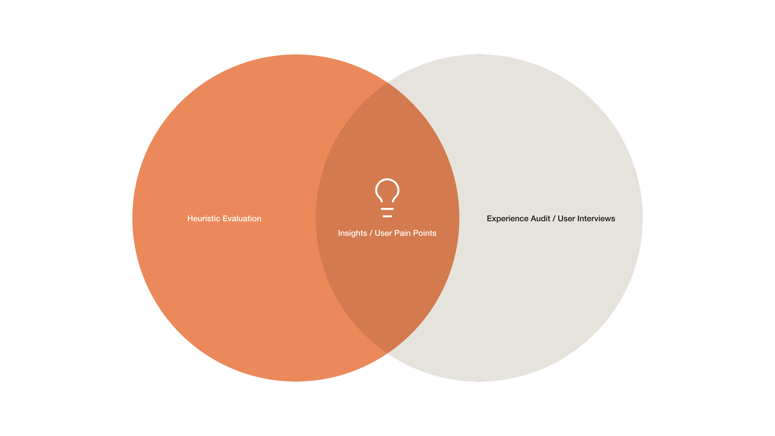
I began with a heuristic evaluation of the existing EMUI software, systematically working through the launcher experience to surface usability issues, interaction inconsistencies, and areas where the interface borrowed too heavily from iOS conventions without adapting them for Android. In parallel, I audited a beta release of Android P — gesture-based navigation was still an emerging convention at the time, largely untested in the market. Recognizing its potential significance for the US launcher direction, I incorporated it into my own concept so it could be properly evaluated under real testing conditions.
Heuristic evaluation findings
I began with a heuristic evaluation of the existing EMUI software, systematically working through the launcher experience to surface usability issues, interaction inconsistencies, and areas where the interface borrowed too heavily from iOS conventions without adapting them for Android. In parallel, I audited a beta release of Android P — gesture-based navigation was still an emerging convention at the time, largely untested in the market. Recognizing its potential significance for the US launcher direction, I incorporated it into my own concept so it could be properly evaluated under real testing conditions.
Mix of iOS, Android elements & patterns
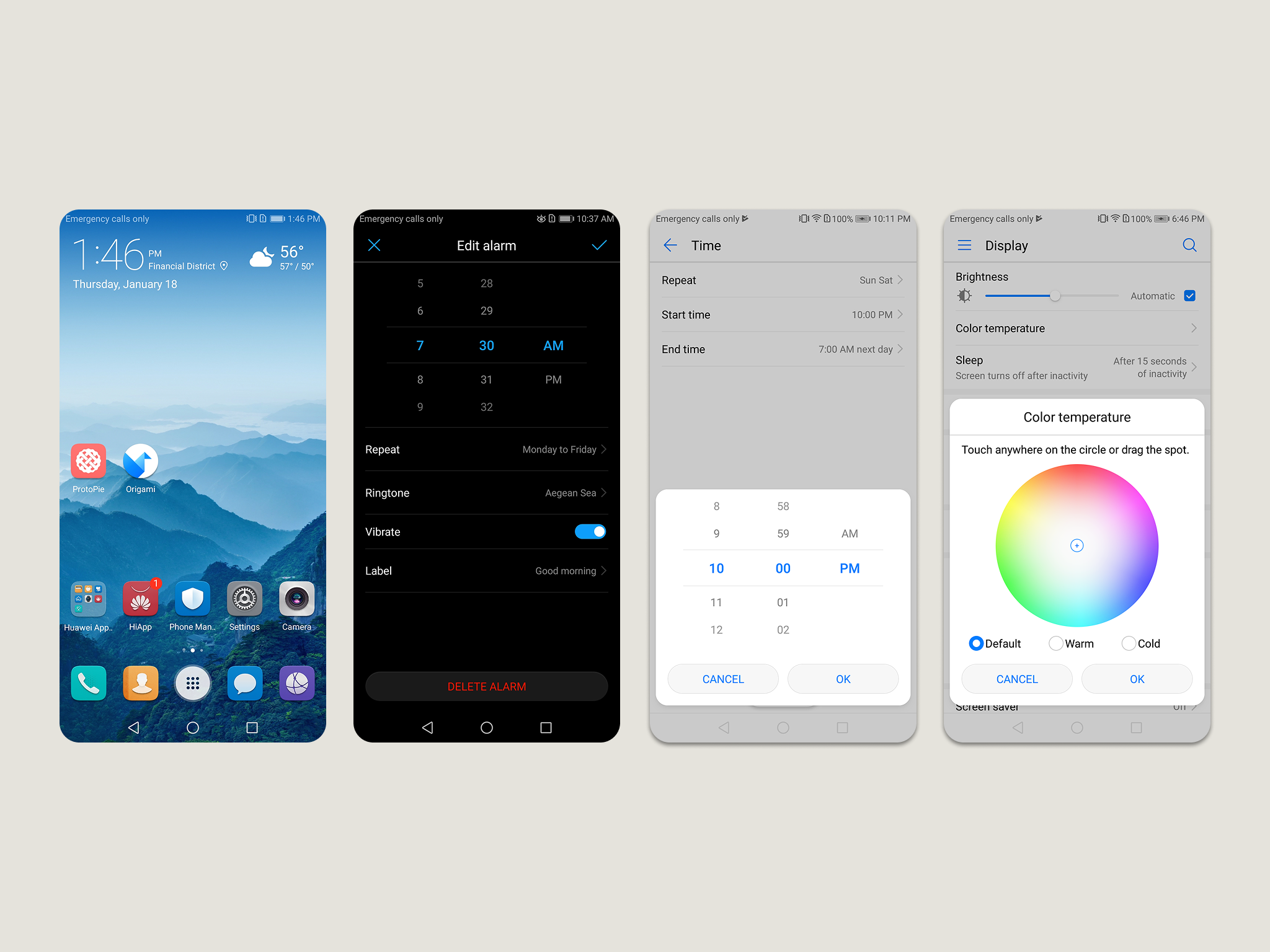
EMUI borrowed heavily from iOS visually while running on Android conventions underneath — a combination that produced interaction inconsistencies and performance issues throughout the UI. The result was an experience that felt neither cohesive nor distinctly Huawei.
Gesture-based navigation issues
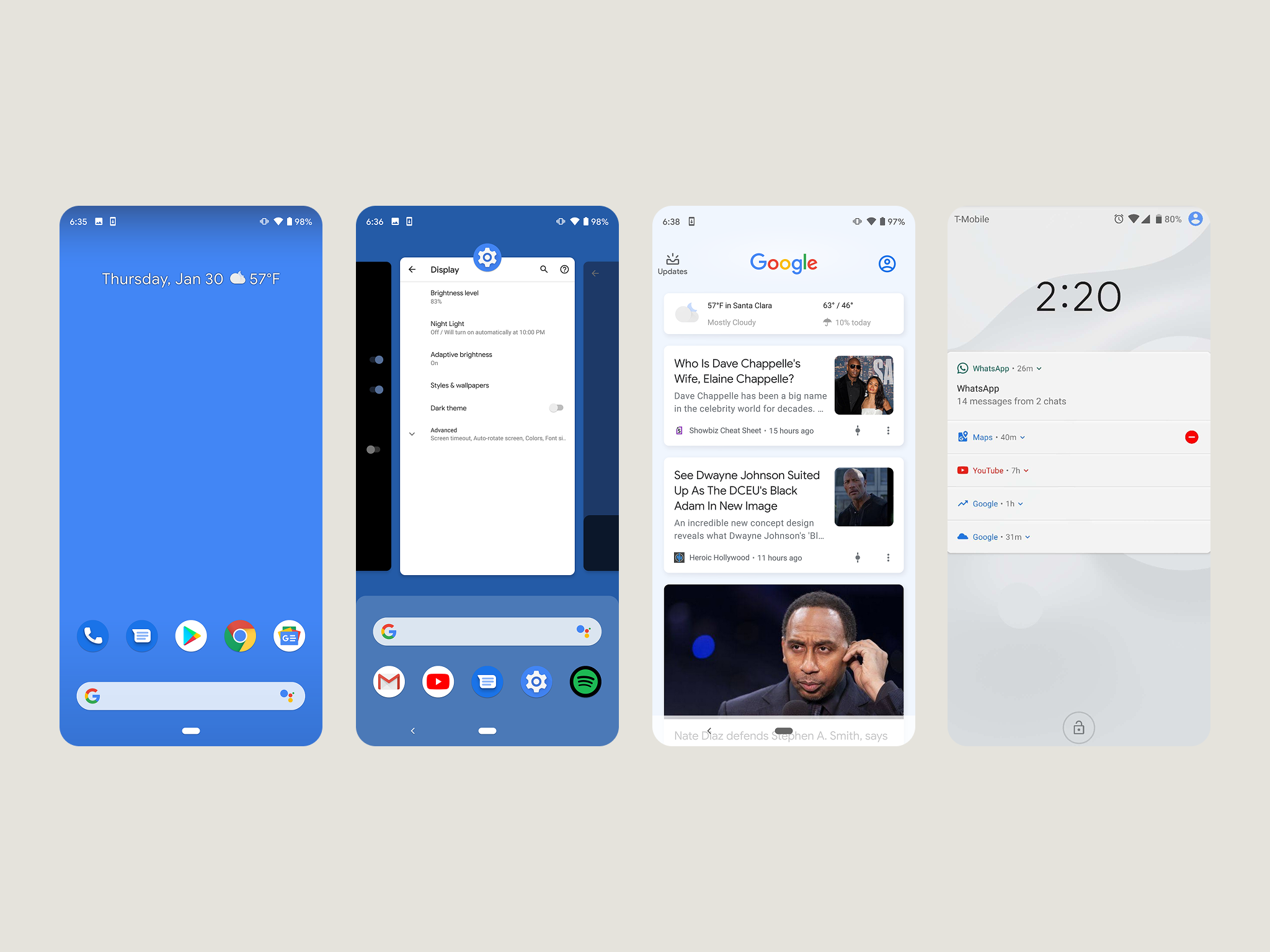
Android P's pill button was overloaded with functions — tap, swipe, and long-press each triggered different behaviors, making the correct gesture hard to predict. The long-press to activate the digital assistant was particularly unreliable, frequently misfiring during normal swipe and tap interactions.
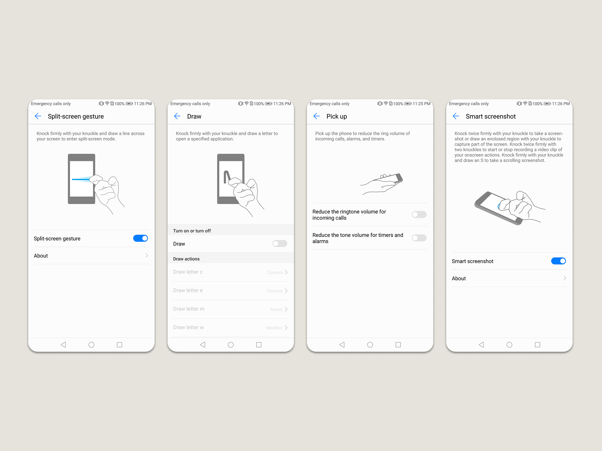
Convoluted gesture patterns
The custom gestures bundled into Smart Assistance were context-inappropriate and placed too high a memory burden on users — making them easy to forget and hard to rediscover.
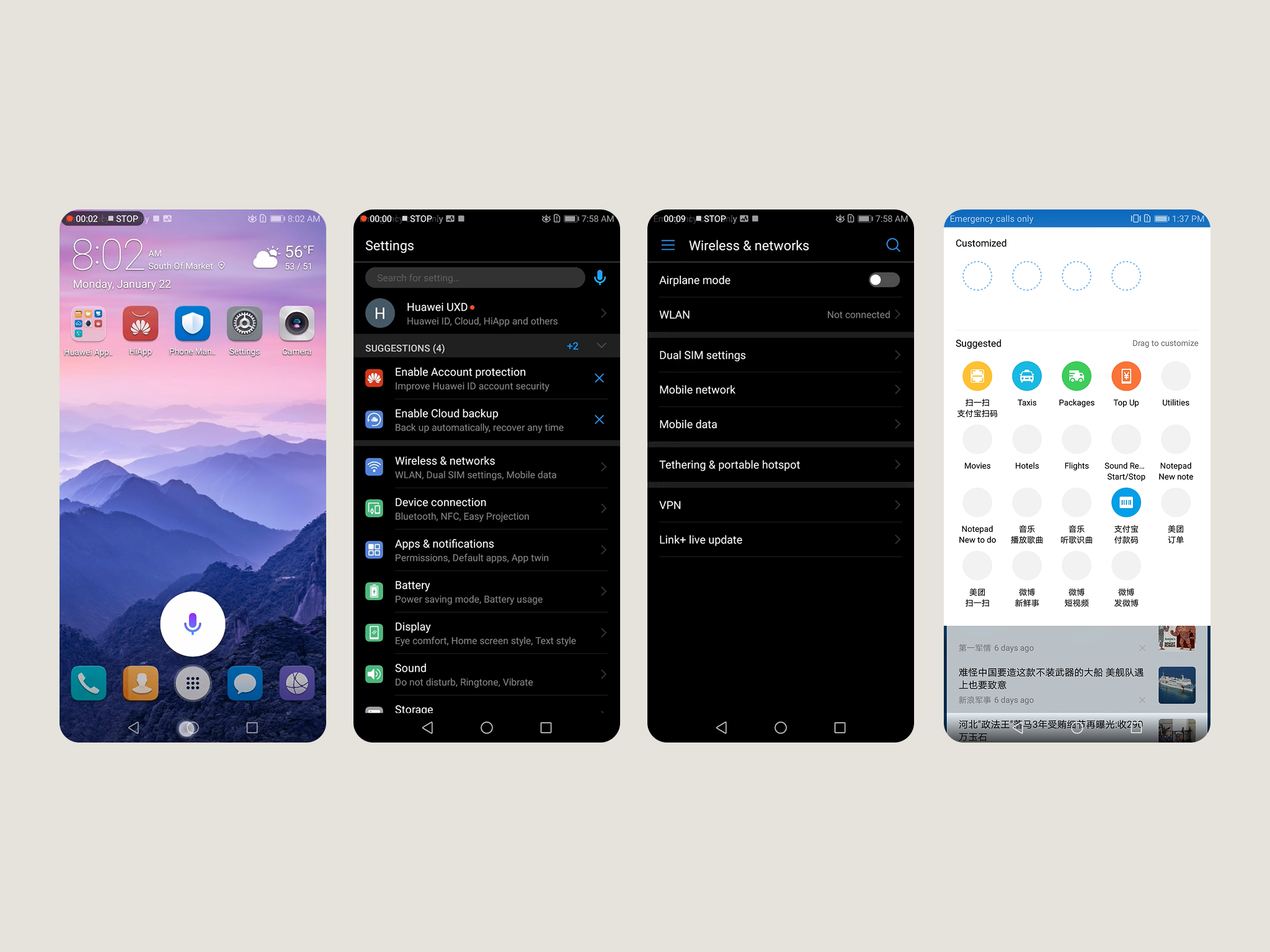
Convoluted interactions & inconsistent native patterns
The evaluation revealed non-standard patterns throughout — long-pressing to trigger the digital assistant, unpredictable action bar behavior, and iOS-style list arrows that clashed with Android conventions. Each was a small friction point that compounded into a disjointed overall experience.
Initial Interviews
Discovery Challenges
With no North American presence, Huawei had no local user data to draw from — and many features popular in the Chinese market simply didn't translate. Discovery relied on qualitative research to build the rationale for design decisions and challenge existing EMUI conventions. Participants were sourced across Huawei, Samsung, Pixel, and HTC to compensate for limited access to Huawei's own customer base.
The initial discovery methods were broken down by initial phone interviews, followed by an in-person experience audit.
Phone Interview Objective
The phone interviews aimed to build a clear picture of how users understood and related to their current launcher experience — covering the lock screen, notification shade, settings shade, app tray, minus one screen, and primary navigation. Five interviews were conducted with Android users aged 32–55 across Samsung, HTC, Pixel, and Huawei devices.
Phone Interview Insights
The lock screen was perceived by most interviewees as a security measure to protect sensitive information. Only one participant understood its original intent to prevent unintentional opening of the phone.
When asked about notification organization and prioritization, most interviewees could not recall. Two participants found the notification shade too cluttered.
One interviewee suggested that Google Assistant would be an ideal way to engage quick settings.
All interviewees found the order of the settings shade acceptable but were not aware that it could be personalized.
Interviewees found the minus one screen of little value due to a lack of interesting and relevant content, and struggled to explain its concept.
Most interviewees did not use the digital assistant and did not understand its functions, preferring manual searches instead.
Phone interview testimonials
“I leave it open {Lock screen}. No pin, no finger and no face id. I don’t store information on my phone that could be stolen. One last thing I don’t need to use.”
“No. Just by accident. The reason why I don’t use it digital assistant is primarily because I’m ignorant to it and I don’t have the time to learn it. I can’t say I don’t like it because I don’t use it.”
“If the assistant had more character, I’d engage it. Articulate what your trying to ask. Suggestion would be helpful.”
“If I get a lot of notifications, it’s like being bombarded constantly — not only is it a distraction, it takes up room.”
“No. Just by accident. The reason why I don’t use it digital assistant is primarily because I’m ignorant to it and I don’t have the time to learn it. I can’t say I don’t like it because I don’t use it.”
“I don’t like it and I never use it [Minus one screen]. I find the feature useless. I never found a use for it. It just seemed like product placement. It seemed more like bloat. If it had some relevant information, then maybe I would use it. But then I could just place that on my home screen. The feature has to prove to me that it’s not bothersome. If it’s interesting, then it’s not bothersome.”
Experience audit (in-person interviews)
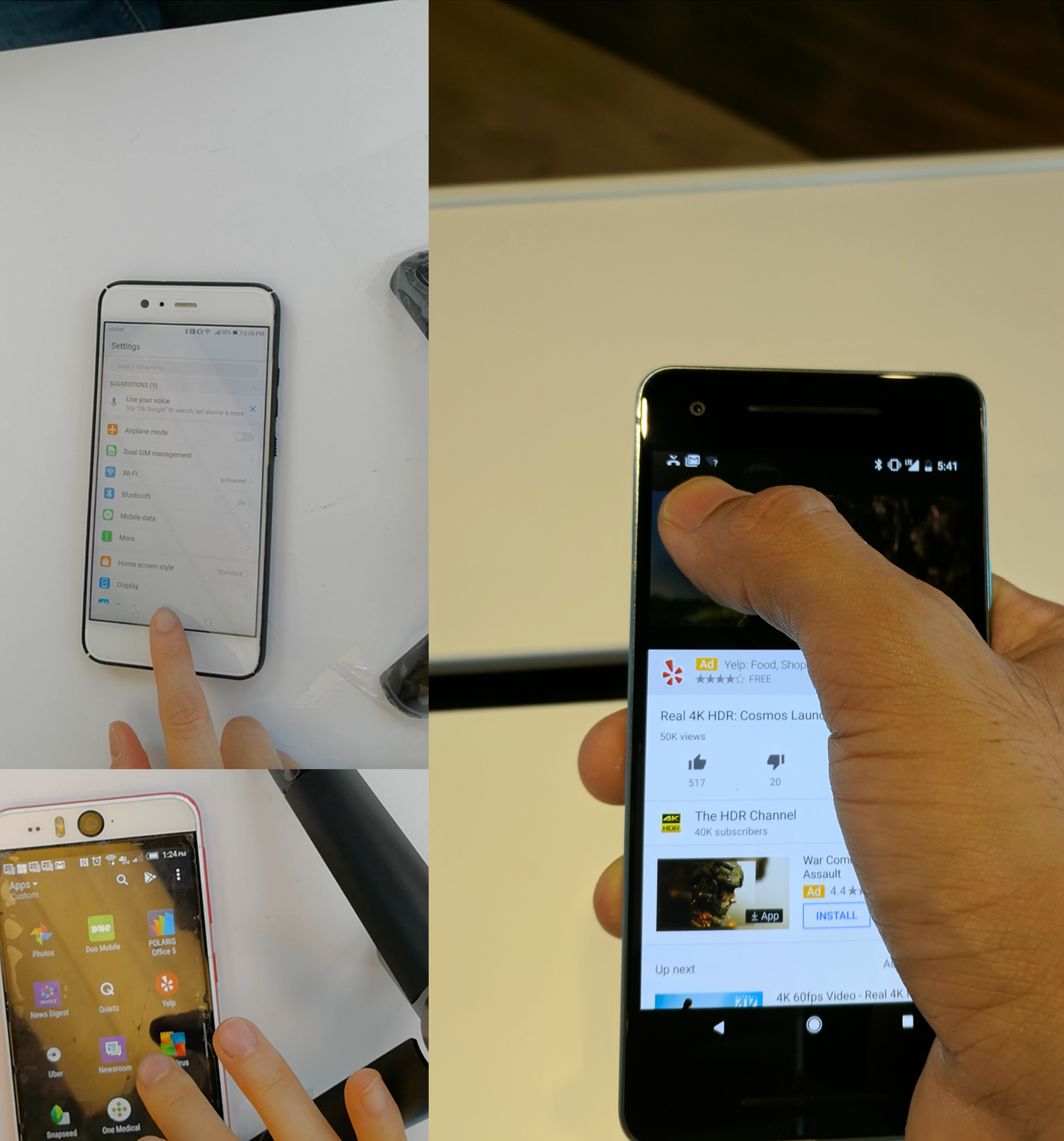
To conduct a comprehensive audit, I primarily focused on the Android system since most interviewees had not used Huawei's EMUI software. Over several weeks, I conducted in-person user tests to observe and record user behavior.
During the audit, I concentrated on the essential features of the Android system, including the Lock screen, launcher, notifications, settings, app tray, and minus 1 screen. I instructed each test subject to complete specific tasks across all these features while narrating their thought process.
The experience audit consisted of:
6 Android users
Participants where a mix of Huawei, Samsung, HTC and Pixel users.
Ages of subjects ranged between 24 and 55.
Key findings from experience audit:
Notifications caused increased habituation due to constant triggering.
The majority of users found no utility for the minus-one screen.
I observed an overall inconsistency of behavior as users completed certain tasks per feature. Some test subjects were unaware of certain features and/or design patterns, possibly due to inconsistency set by OEMs.
The heuristic eval., telephone and in person interviews produces good insights, uncovered existing pain point with native Android. From the feedback captured certain themes came to light that informed the launcher designs.