Huawei (Eames Project) Part 3
The Eames project concludes with testing — six Android users in Portland, Oregon, putting the designs through their paces before final handoff to Huawei HQ.
Role: Senior UX Designer
Client: Huawei
Type: UX Research & Design
Year: 2017–2018
Tools: Sketch, Framer
In Portland, Oregon, I conducted test sessions for the launcher concept with a sample size of six Android users, aged between 24 to 44. The main objective was to obtain qualitative feedback on the launcher concept, and the users were asked to complete tasks related to core features such as the lock screen, notification shade, system bar, settings shade, app tray, and new features like gesture-based navigation and itinerary center. Based on the tests, below are the findings and recommendations that were included in the final deliverable for handoff to HQ.
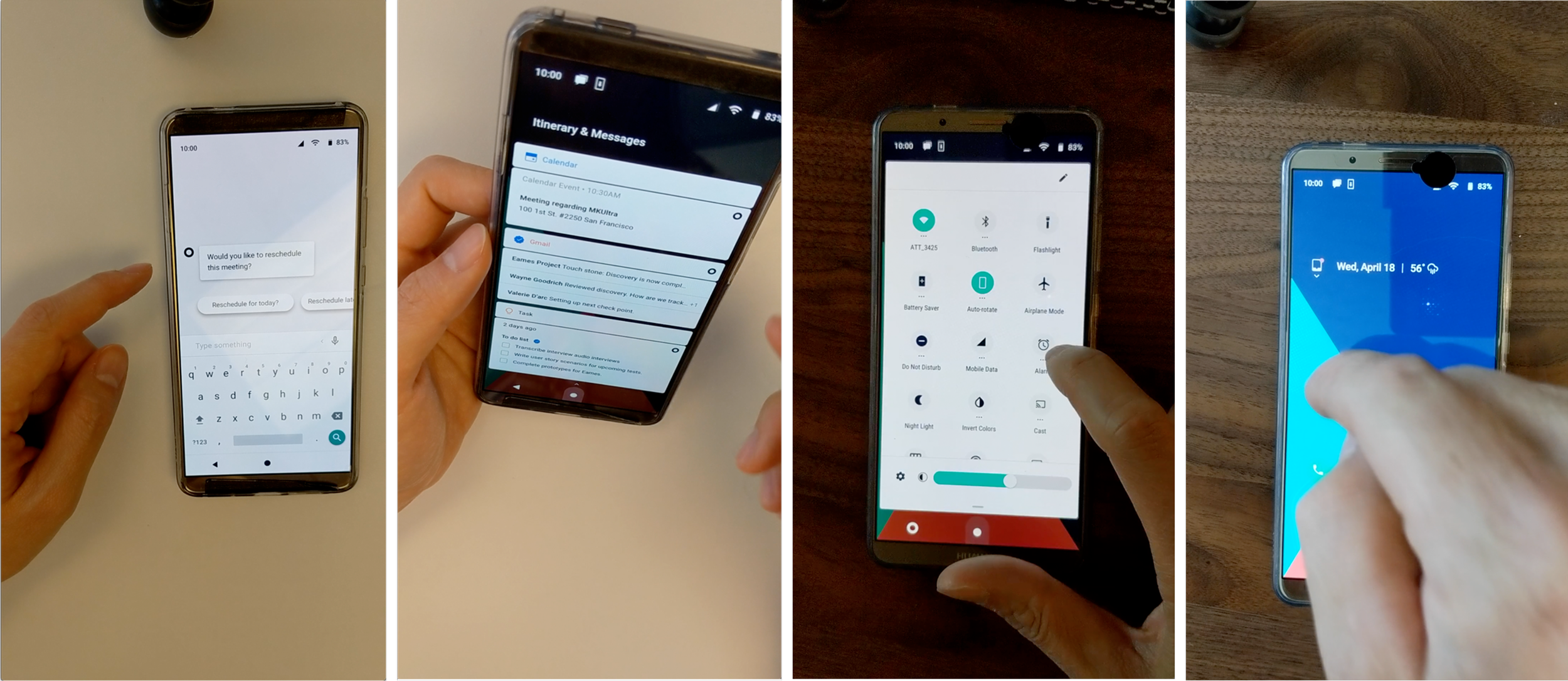
Objectives for Prototypes
Evaluate the gesture-based navigation introduced with Android Q.
Measure the affordances implemented on the new home screen.
Evaluate discoverability and learnability of the redesigned notification and settings features.
Gather feedback on the itinerary feature as a replacement for the minus-one screen.
Evaluate AI opportunities through a structured user task.
Prototype Test Criteria
Key Areas
Homescreen
Notification Shade
Settings Shade
App Tray
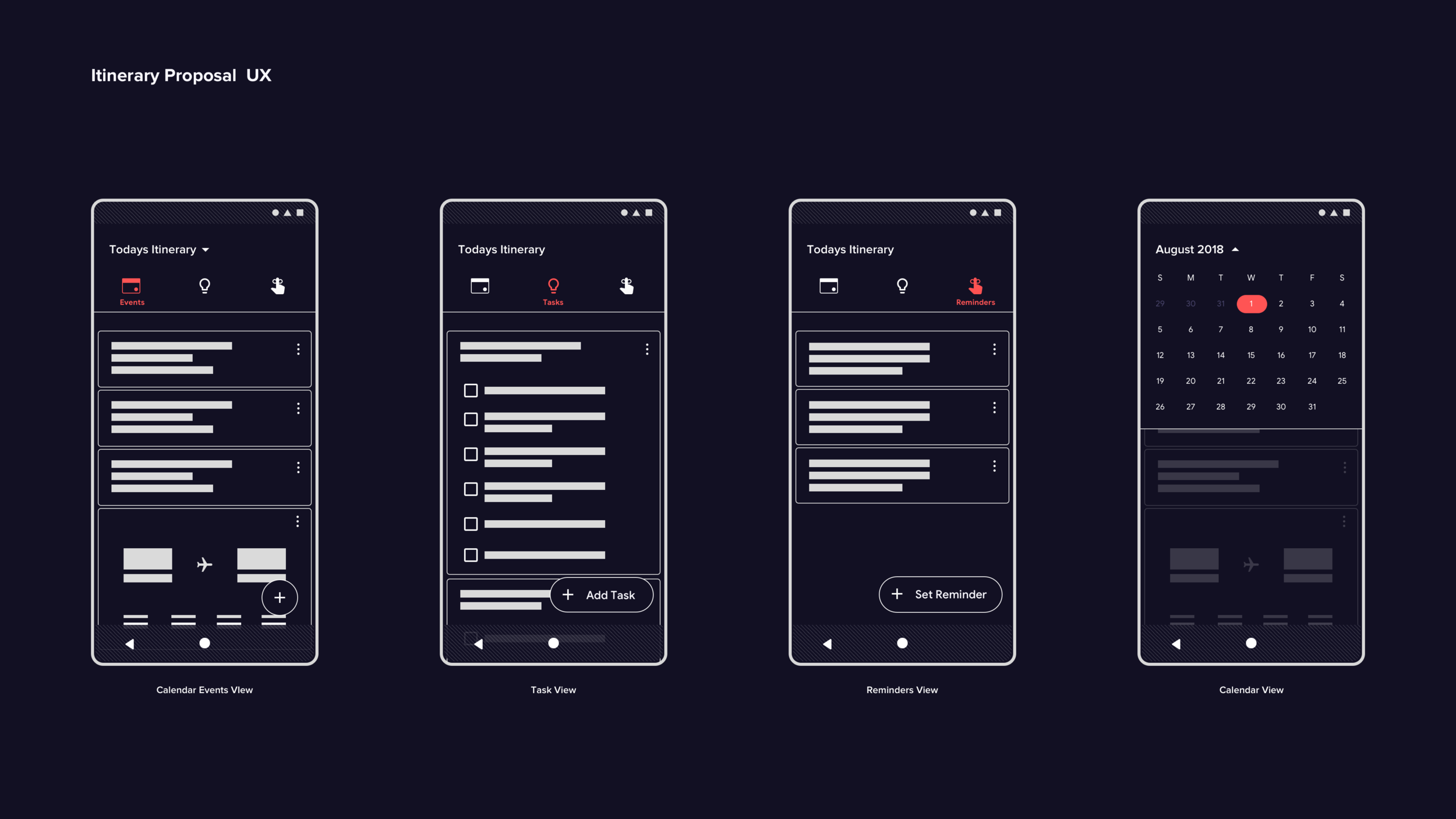
Itinerary Section
Qualitative Metrics
Time on task
Observed user errors
Subjective satisfaction (ease of use)
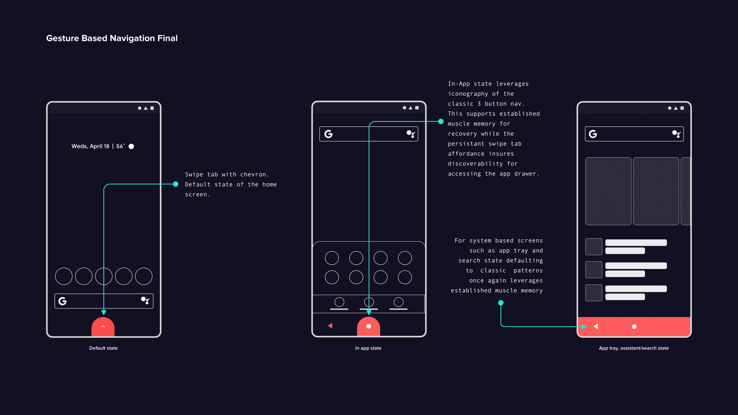
Gesture-Based Navigation
Findings
The tab affordance with an up chevron icon improves the usability of gesture navigation in the Eames prototype. Leveraging classic 3-button navigation iconography reduces confusion with the new UI. All users tested encounter minimal friction with this feature.
Recommendations
Use classic 3-button navigation iconography to reduce user recall.
Reinforce functionality through contextually relevant iconography — a tab affordance with a chevron for first-time users on the home screen, and a mix of classic and new swipe affordances for in-app and system views.
Move the assistant entry point to the search bar to simplify the home button's functionality, improving discoverability while streamlining overall gesture-based navigation.
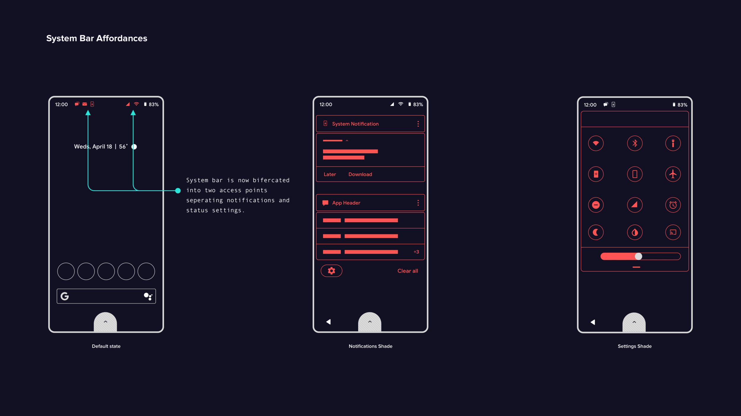
System Bar Redesign
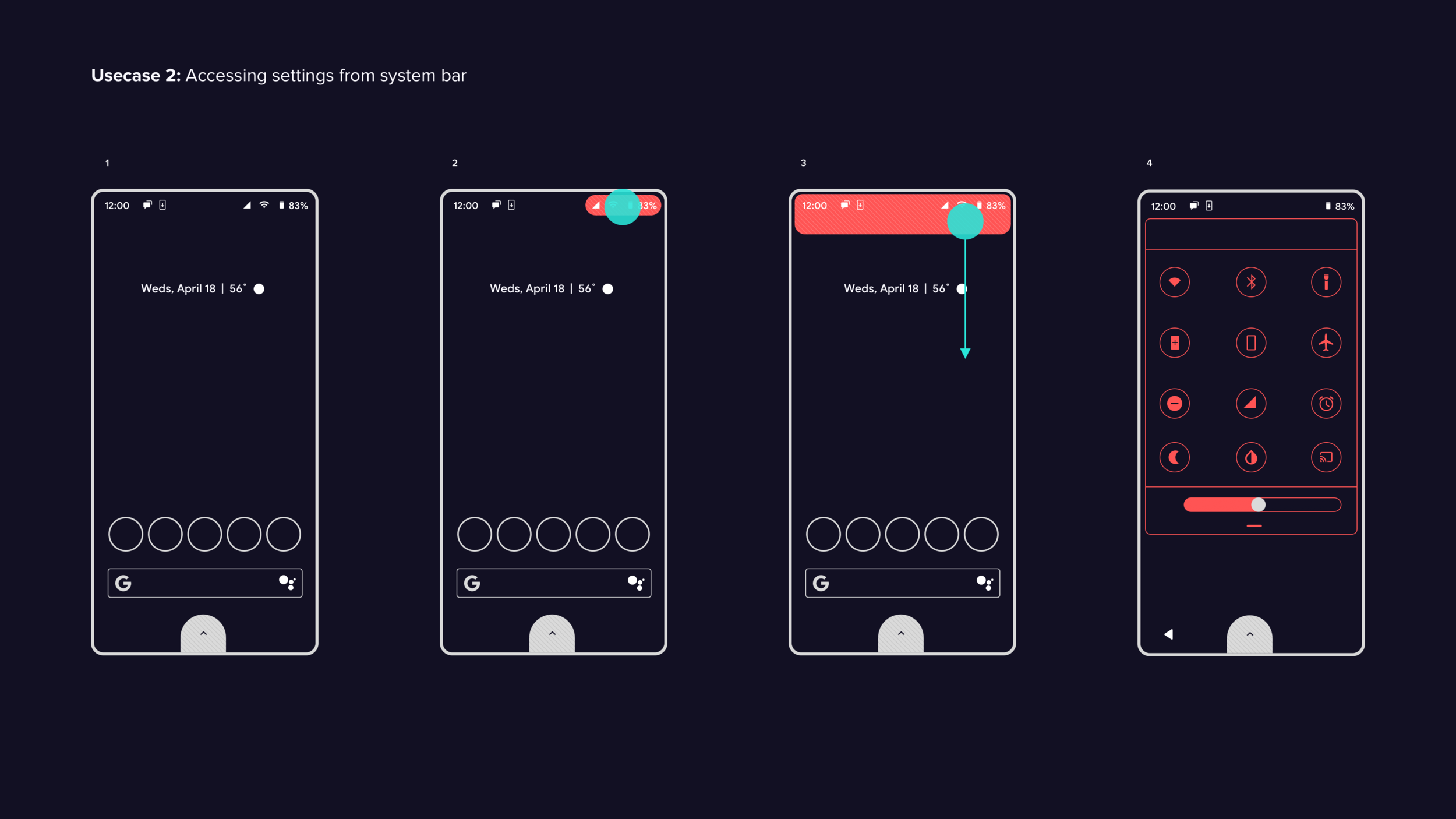
Findings Half of the users find it challenging to access settings and notifications via the system bar — likely due to Android version differences or OEM customizations. While users quickly grasp the benefit of separating settings and notifications, they initially struggle to locate the entry points. One participant suggests adding an indicator to highlight these entry points. With the introduction of the notch in Pixel 3 phones, users will likely need time to adapt to the new design pattern.
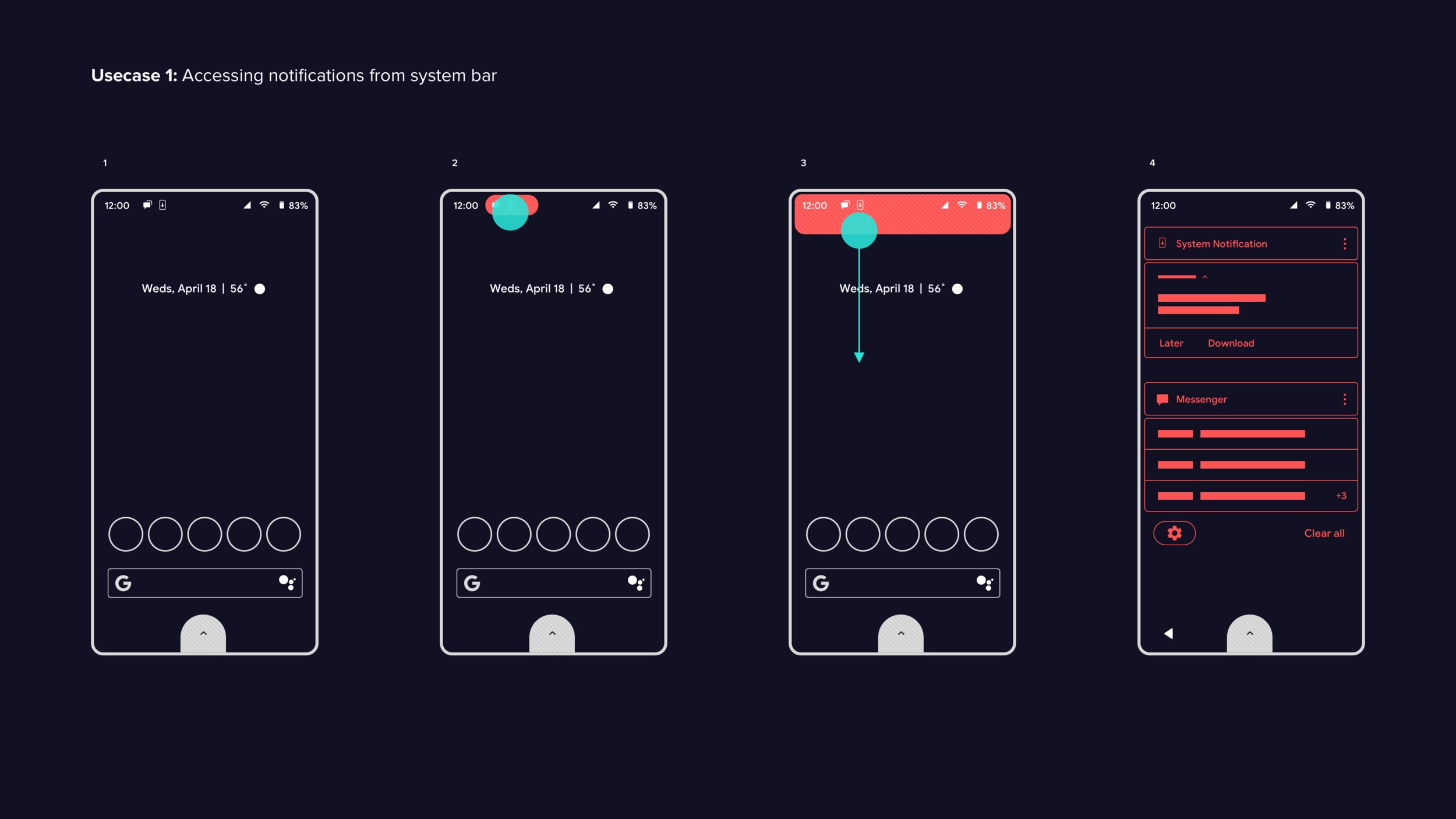
Notification Shade
Findings
User interviews identify three key focus areas for notification handling: information density, content priority, and the discoverability of quick actions like muting. These insights inform the redesigned feature, which is then validated through Framer prototype testing.
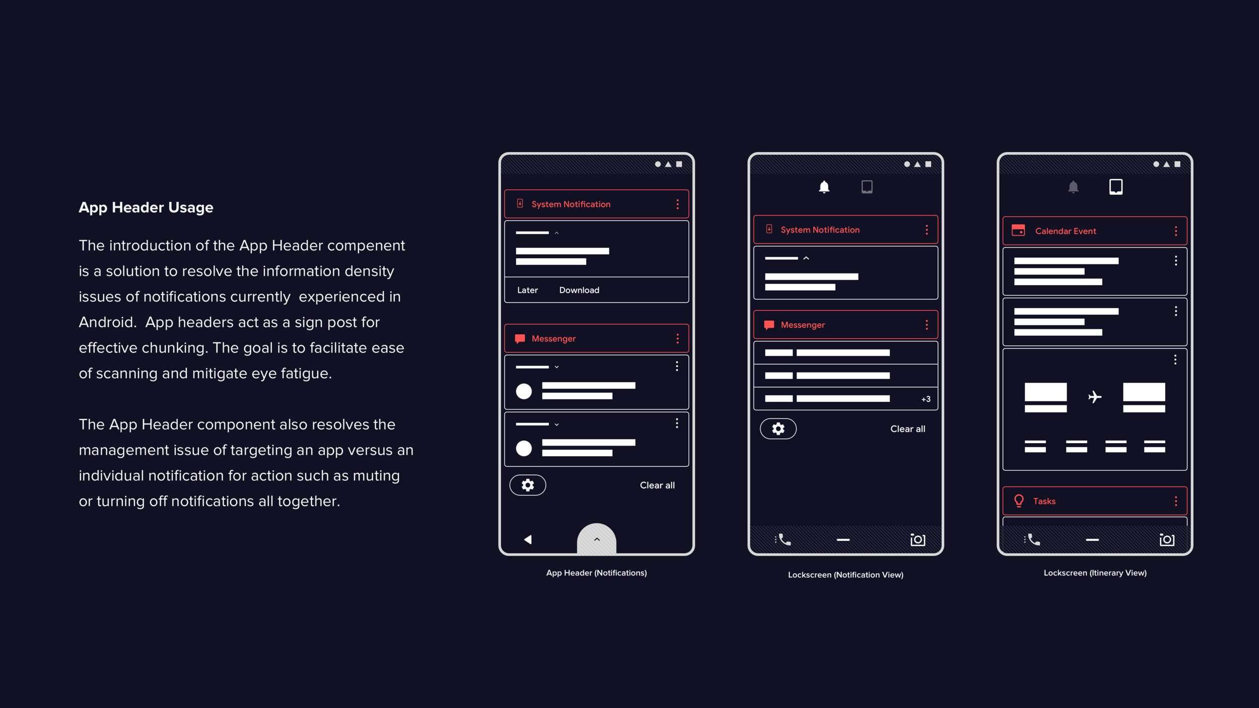
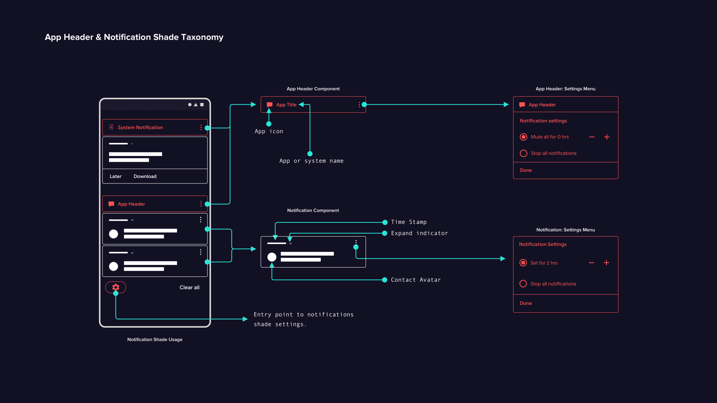
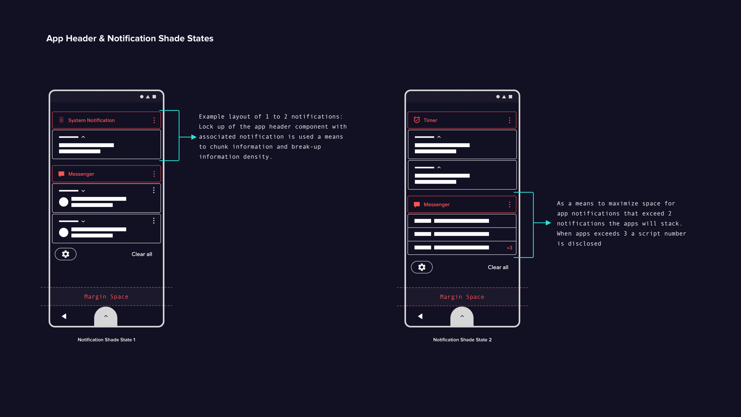
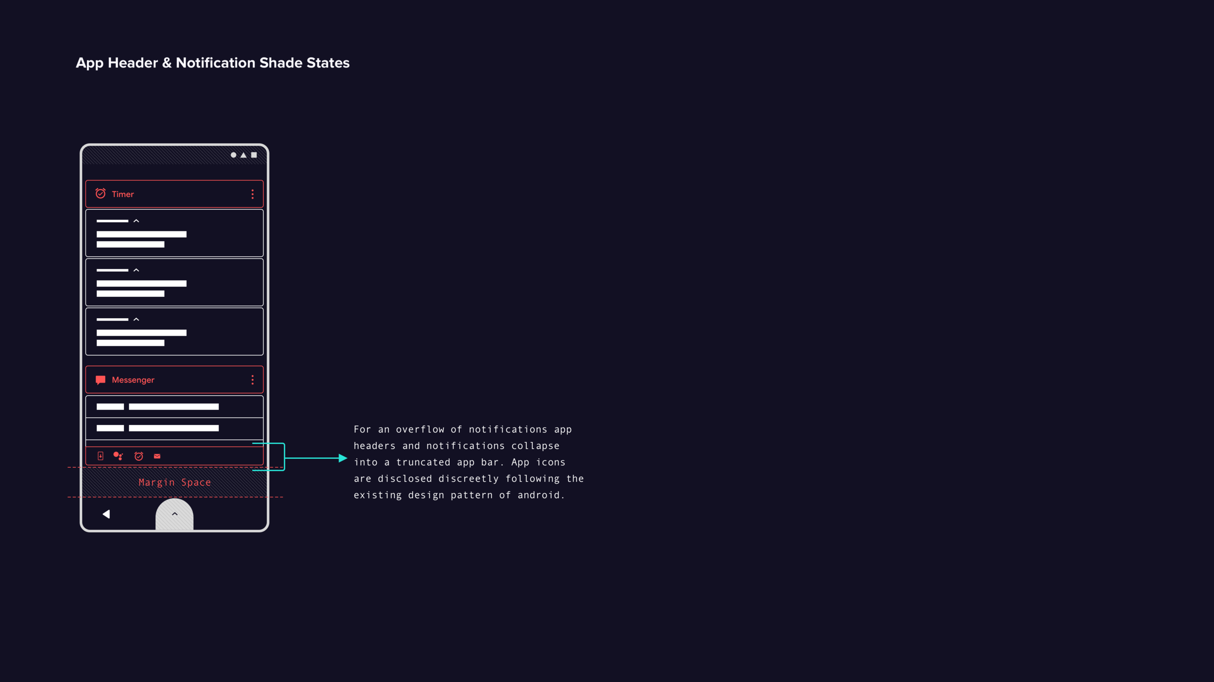
Participants easily grasp the app header component, which helps organize notifications and address information density in the current Android design.
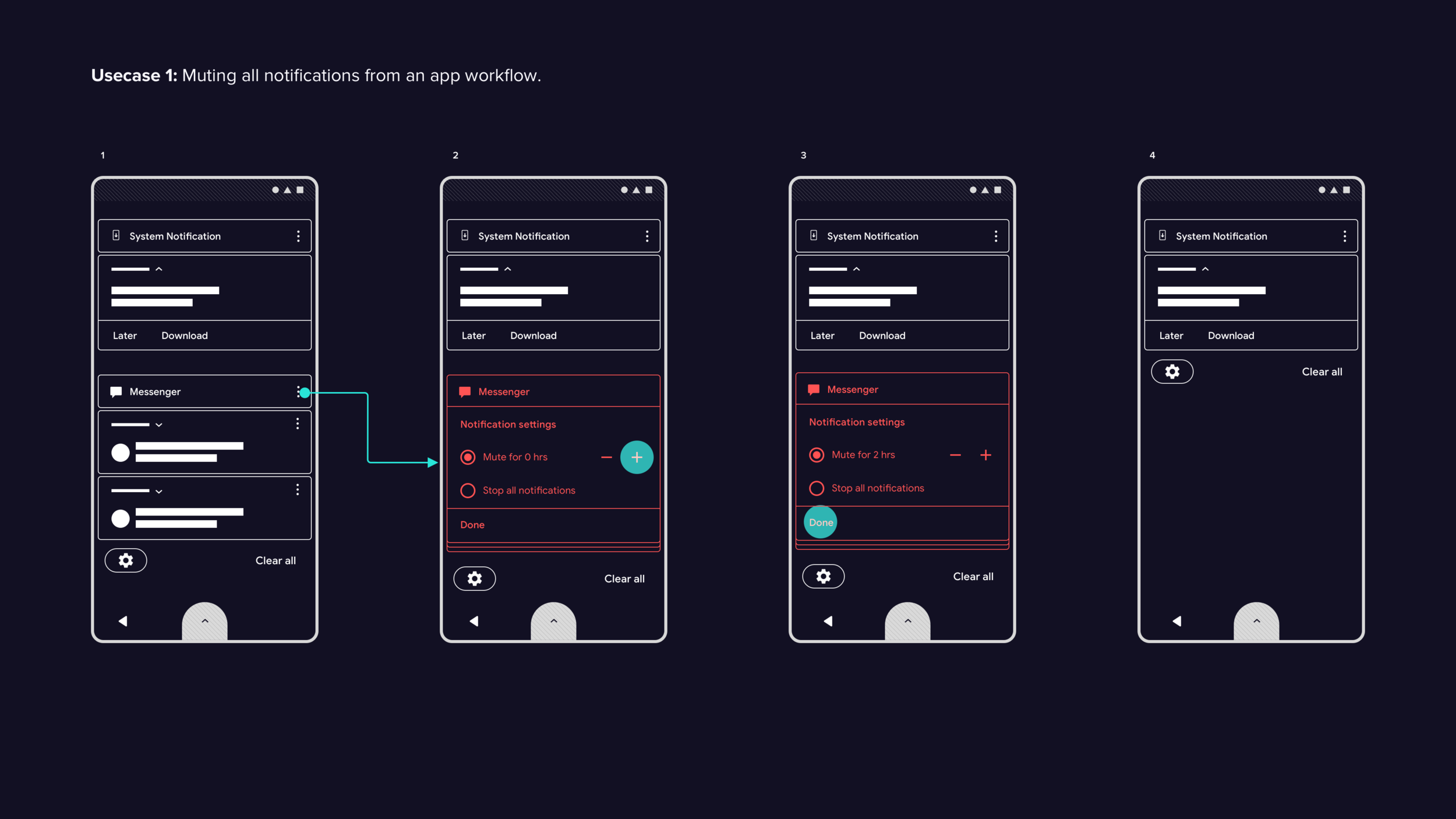
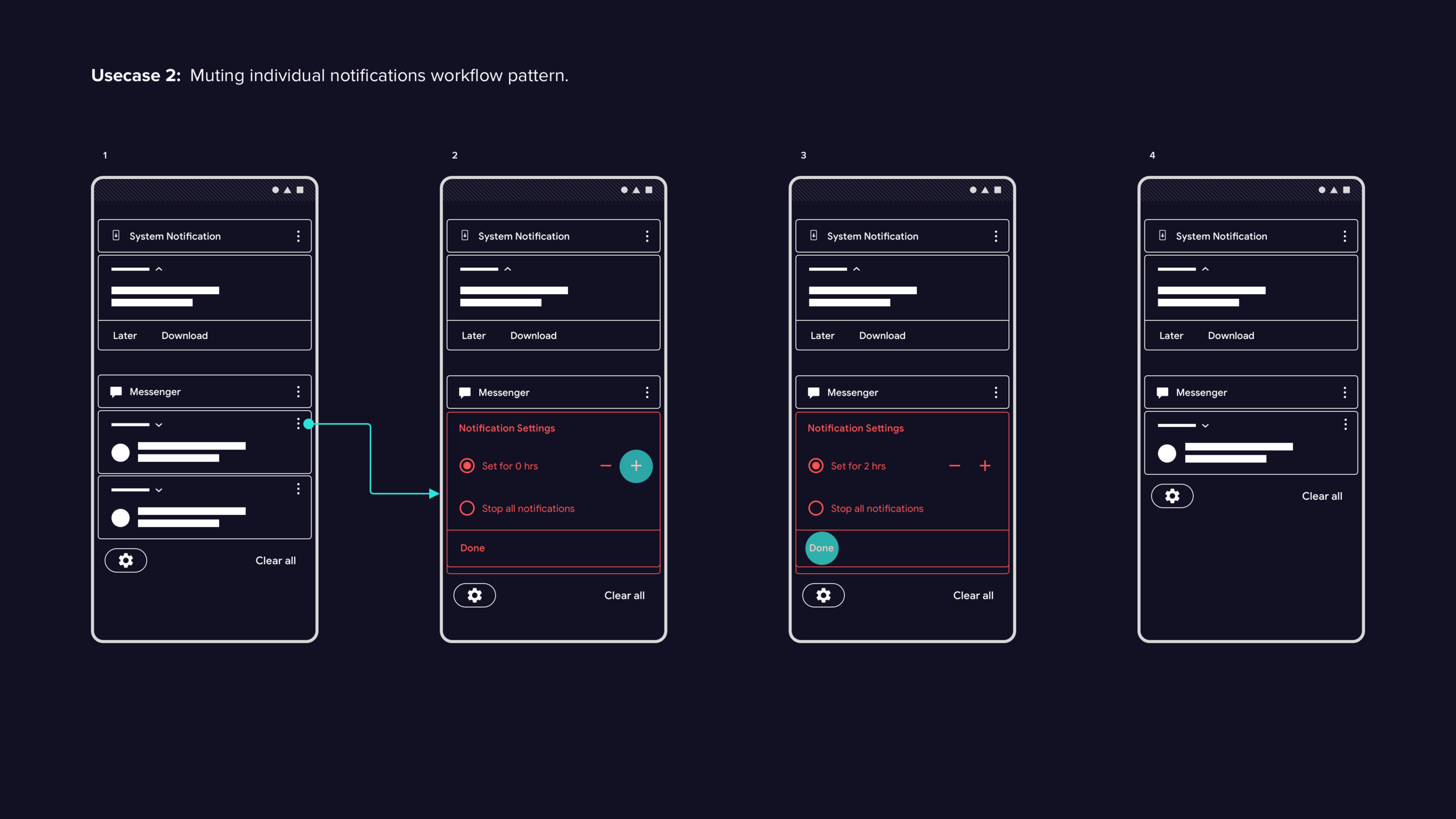
Most participants struggle with muting individual notifications or apps, and express unawareness of the feature. Diverse OEM design patterns further hinder discoverability.
The swipe gesture for accessing mute is not easily discoverable.
Once discovered, muting is completed quickly and accurately.
Recommendations
App headers effectively chunk and organize notifications, improving usability and discoverability. To further strengthen the experience: add an overflow icon for multiple actions, and make notification actions available on both app headers and individual notifications to avoid confusion between muting all versus specific notifications. A 20/80 ratio of new to established design patterns is recommended for optimal discoverability and learnability.
Itinerary Section
Findings
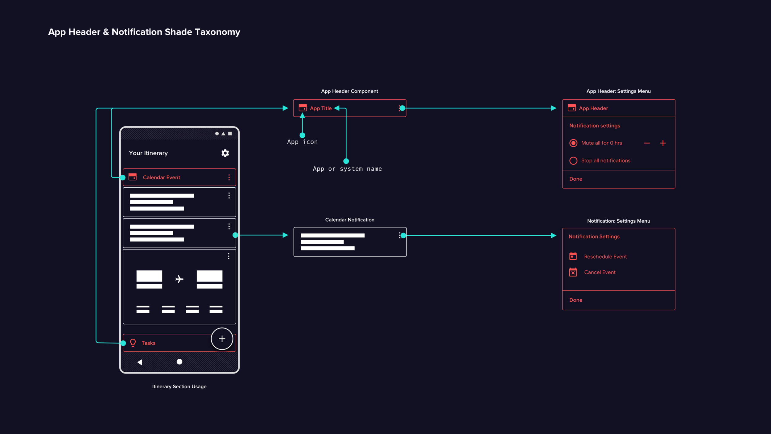
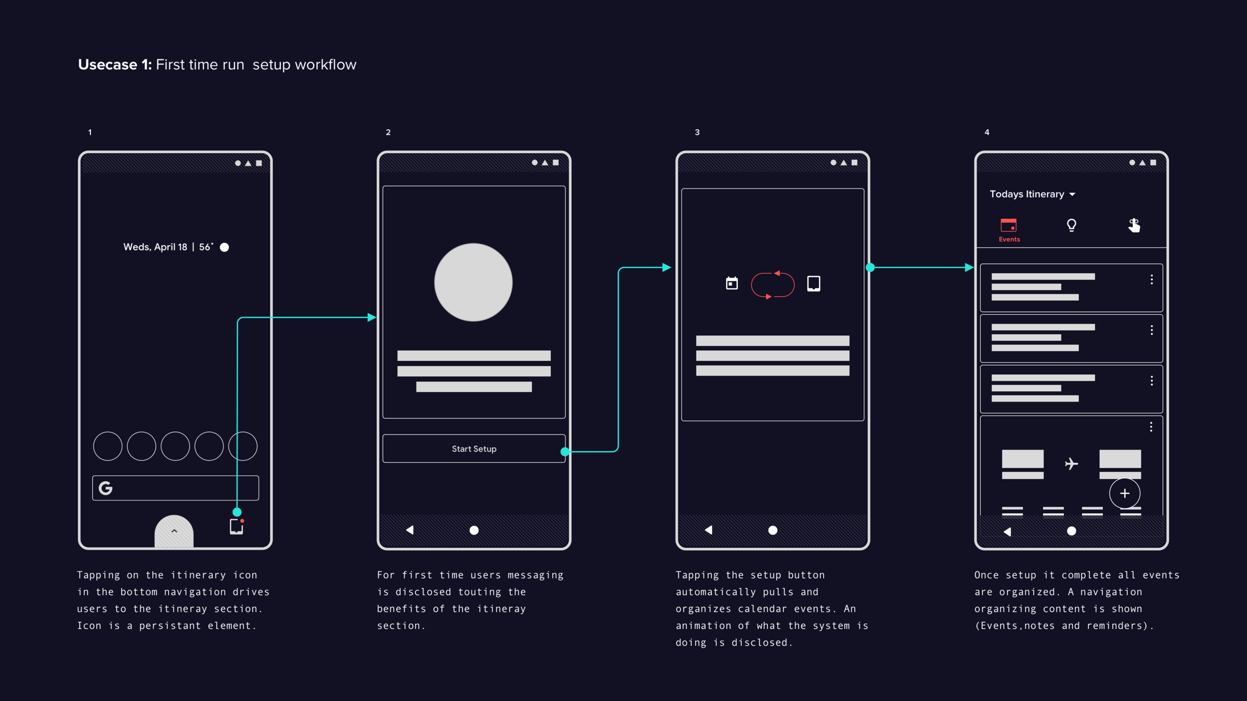
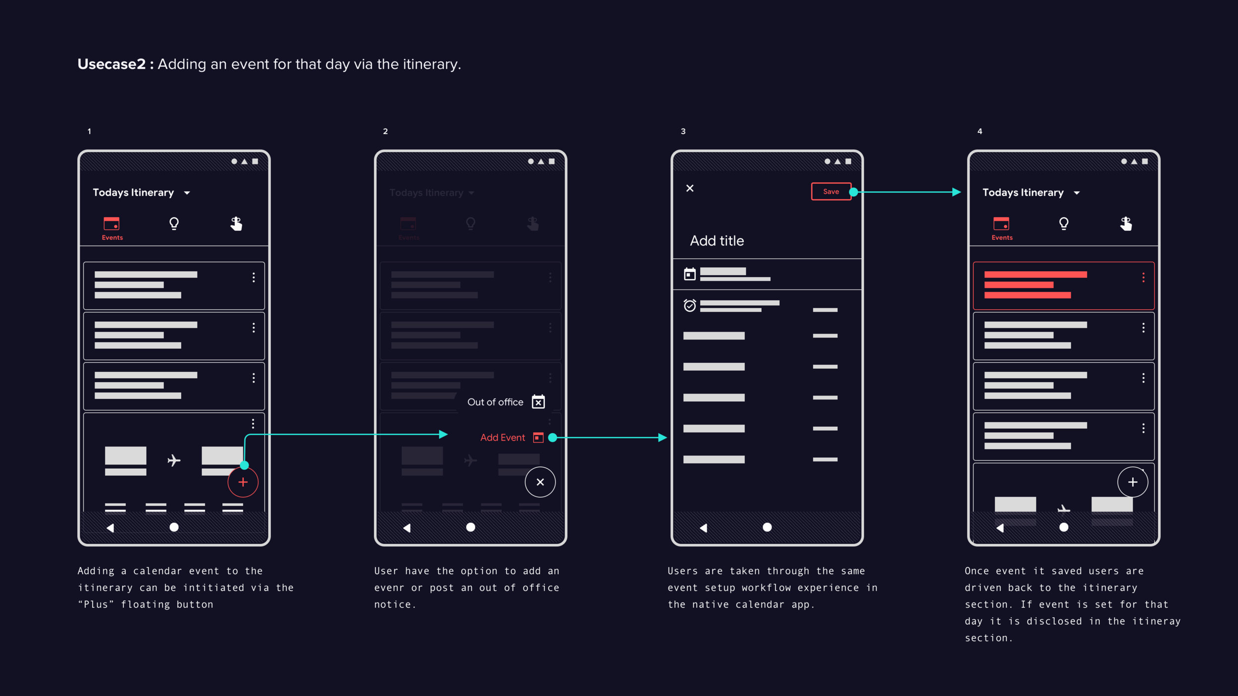
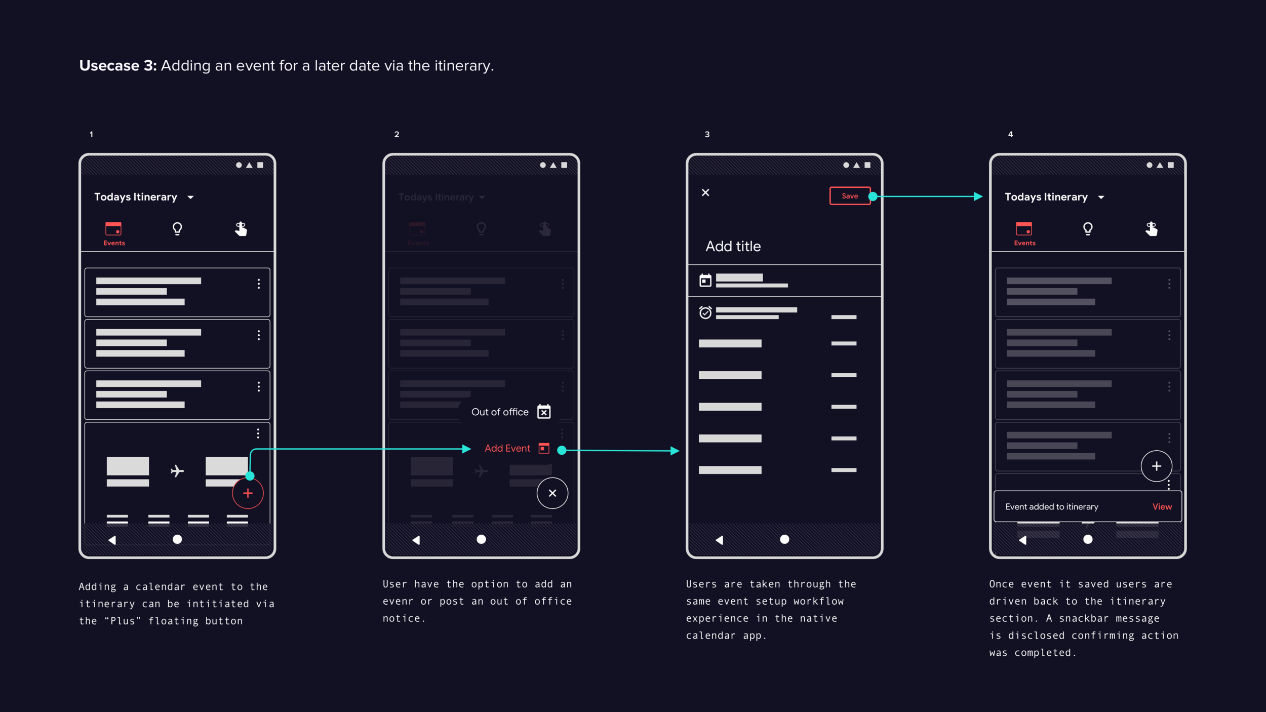
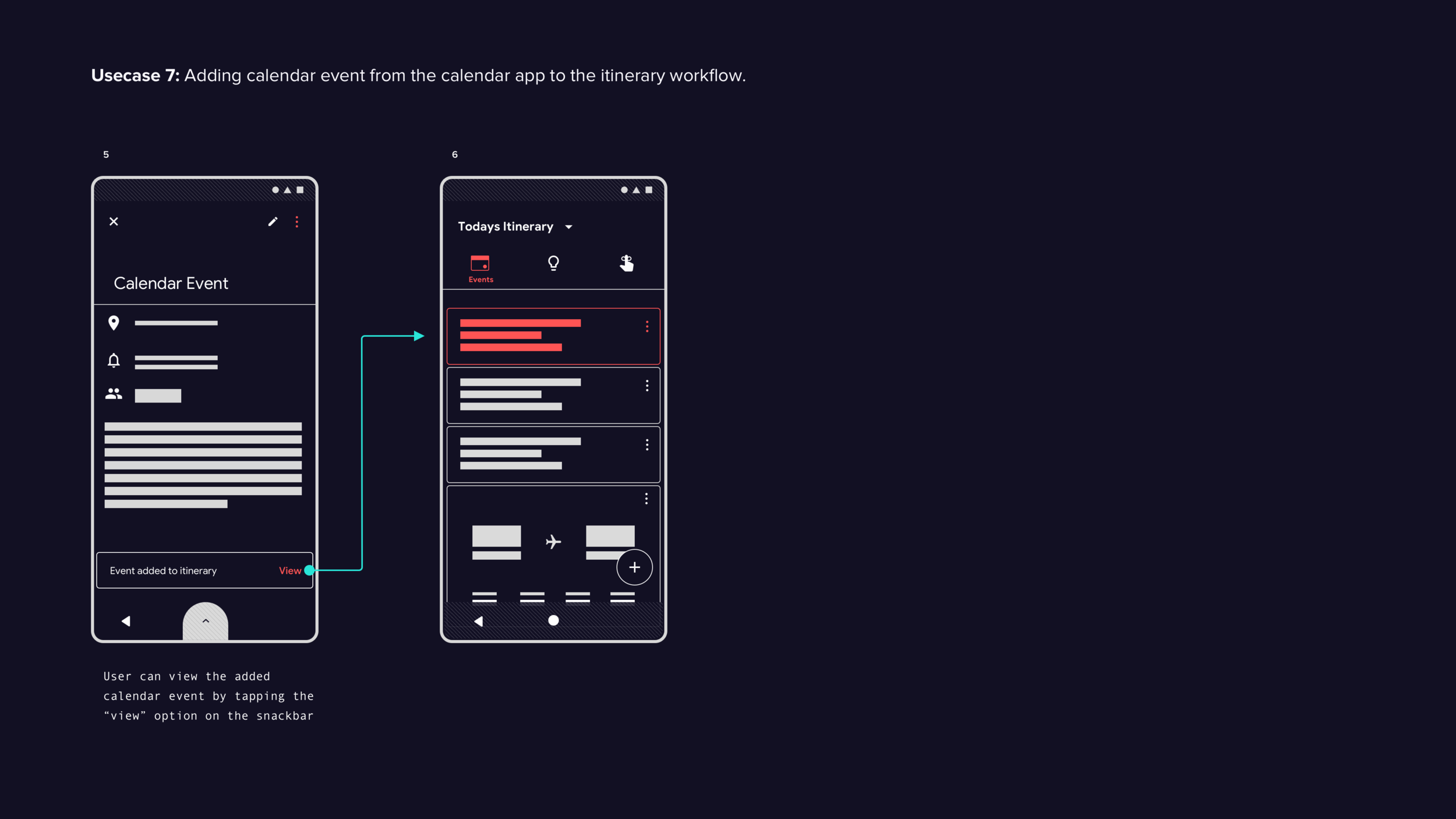
All participants respond positively to the itinerary center concept and understand it as a curated collection of timely, system-generated events. The idea of manually adding items creates initial confusion — most feel it would undermine the concept — but upon further discussion, participants warm to it as long as added items remain consistent with what the system already tracks.
Participants respond positively when informed that a dedicated itinerary section could divert traffic away from the notification feed:
Limiting notifications to critical, timely events — system updates and text messages — reduces user anxiety and builds confidence.
The itinerary center taps into users' existing mental model of schedule control, creating a sense of calm and reducing unintended habituation.
Recommendations
Further testing is needed to validate the concept. Next steps include:
Testing the first-time setup workflow through an automated setup task and measuring user satisfaction.
Collecting feedback on manually adding items and using existing design patterns to improve discoverability, recoverability, and learnability.
Understanding how users prioritize and associate different content types — emails, calendar events, reminders, notes, to-do lists — to inform how the itinerary section is organized.
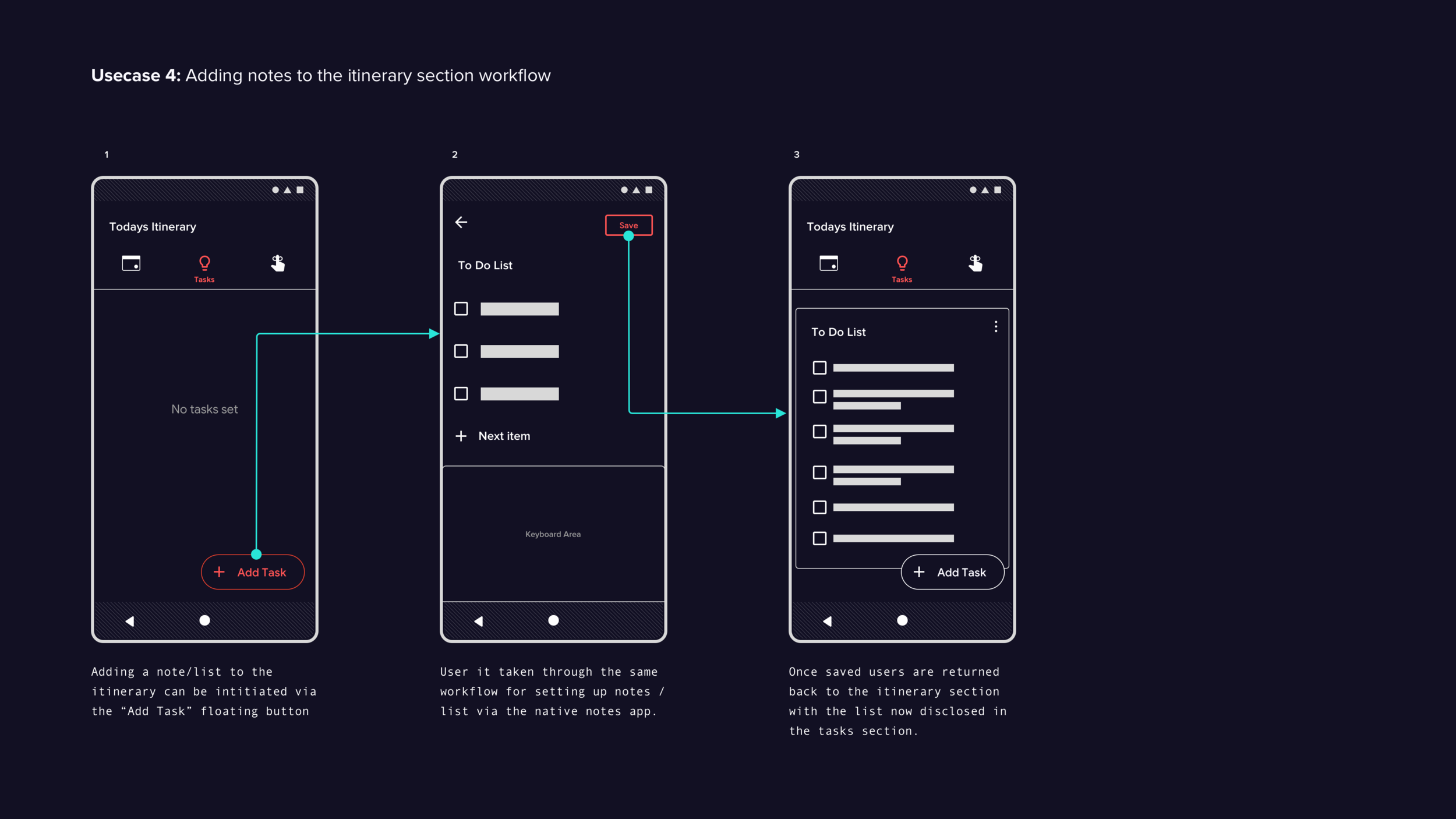
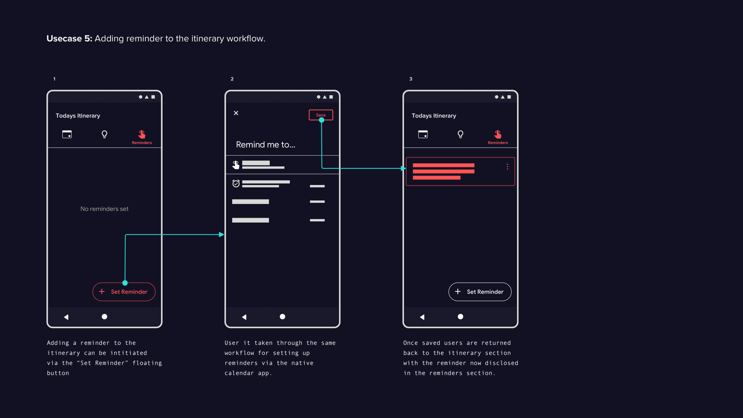
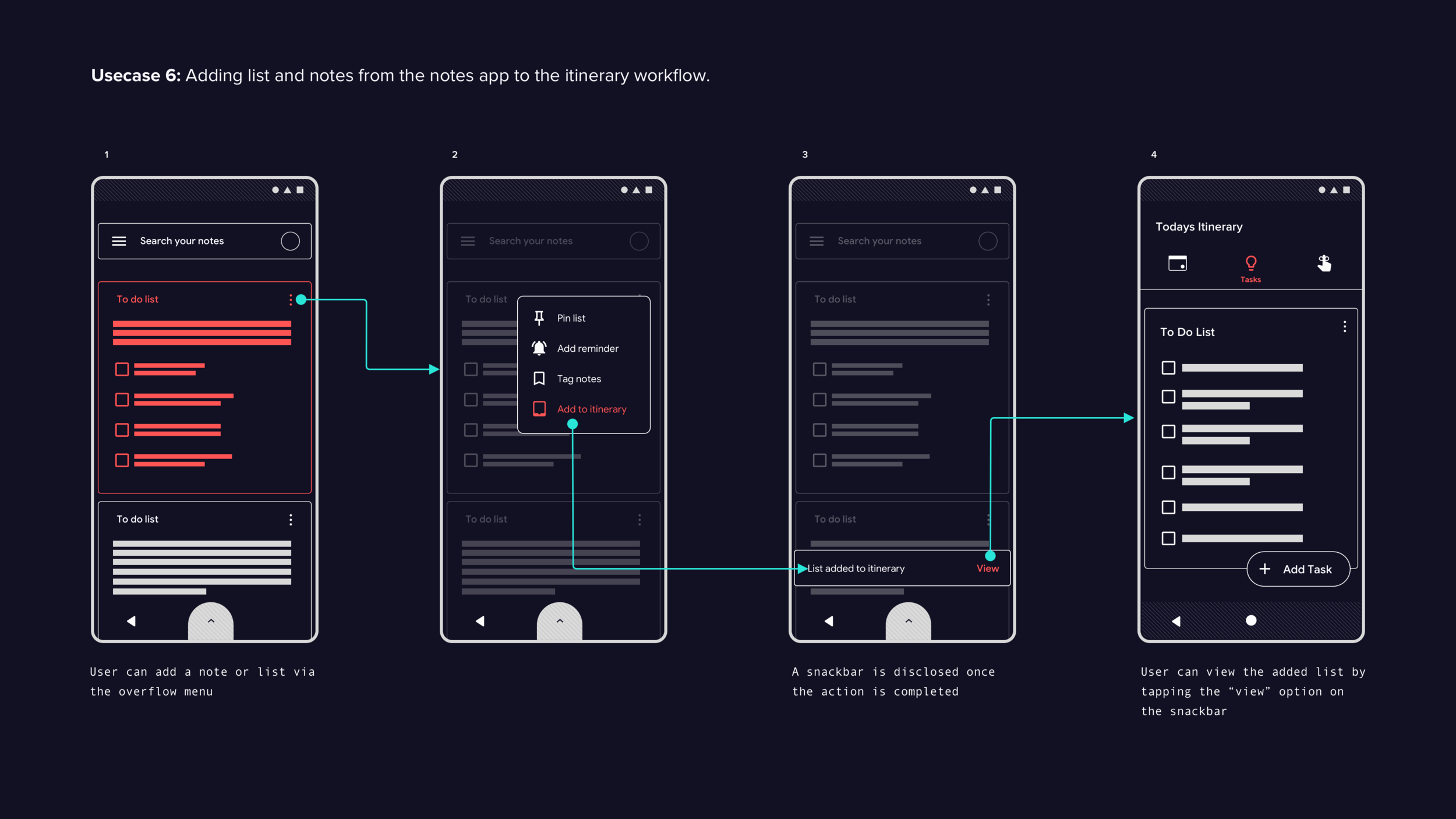
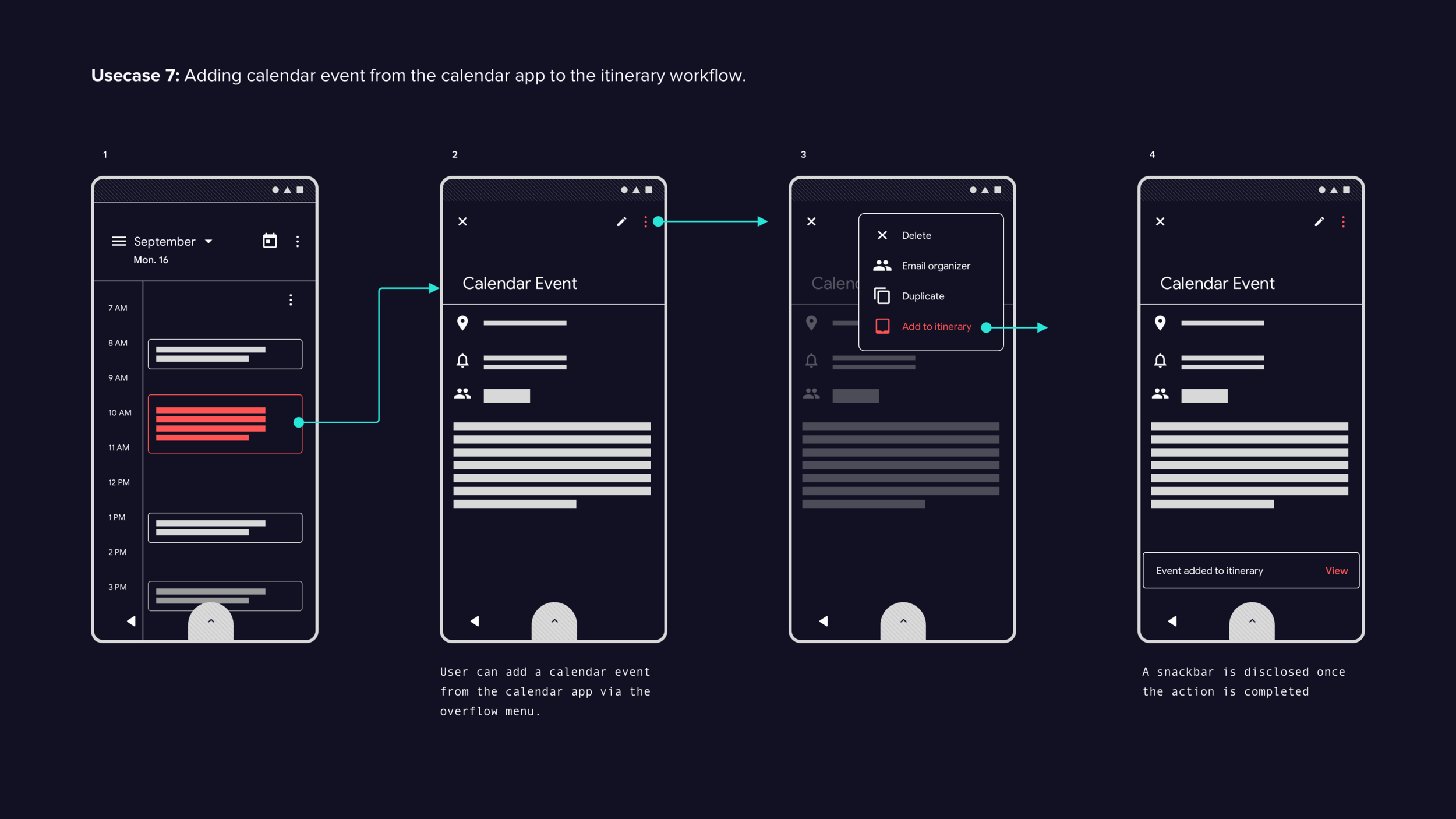
Digital Assistant Experience
Findings
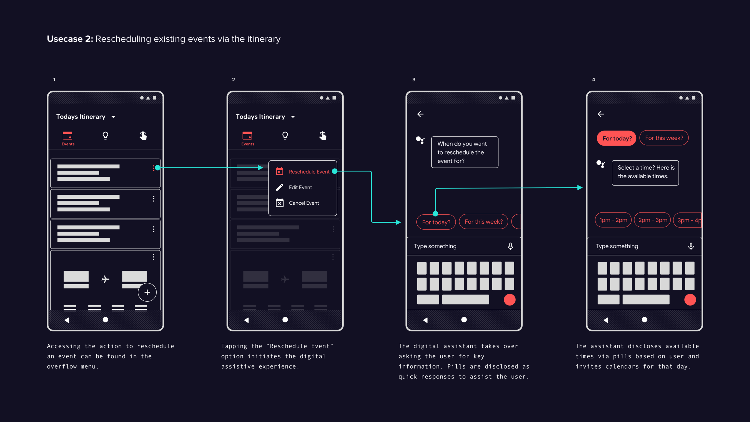
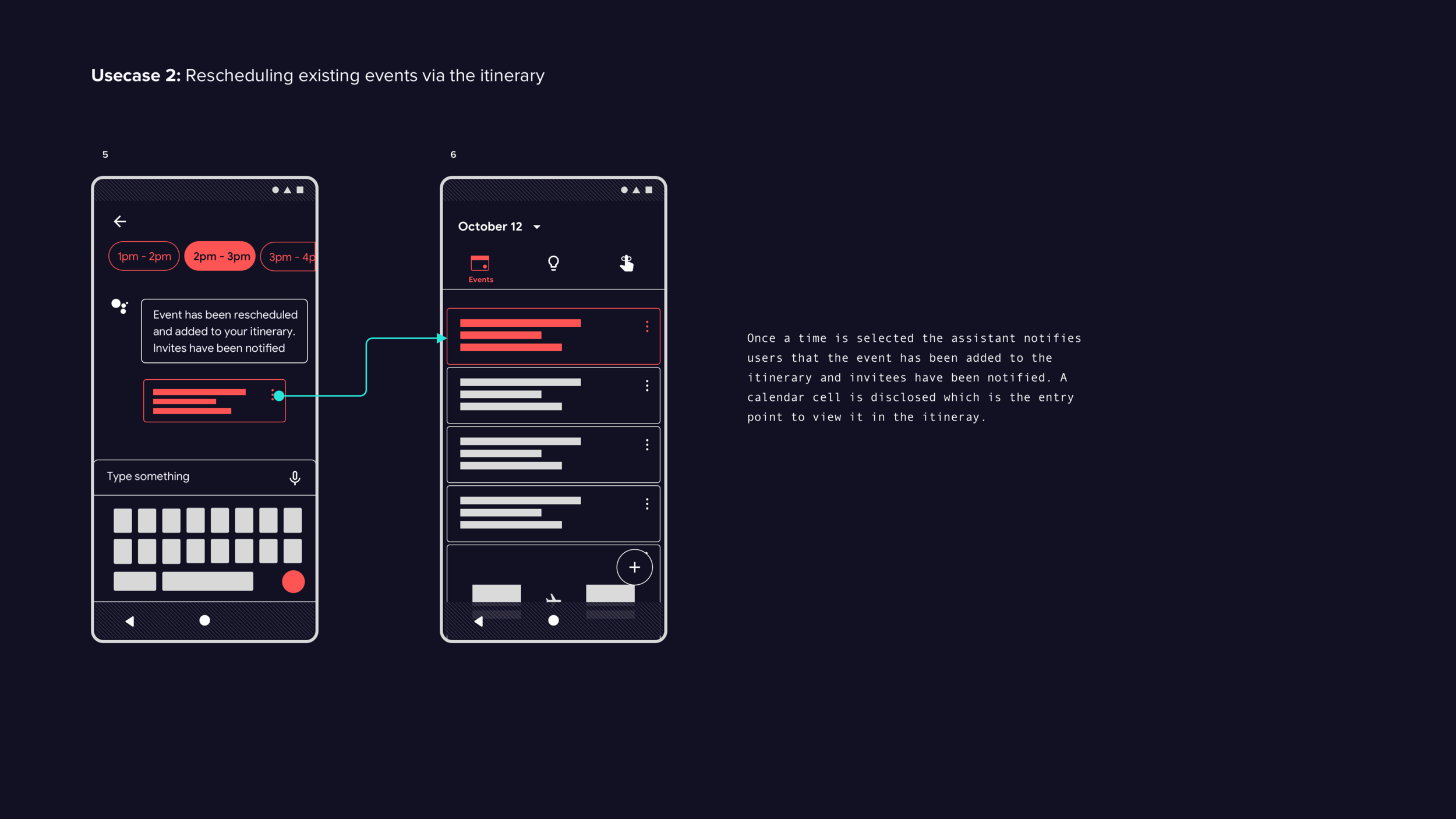
All six participants successfully cancel a calendar event using the itinerary section. However, when asked to reschedule, all struggle to find the entry point — attempting a range of gestures including swipes and long-presses. The entry point in the prototype is the assistant icon, which participants are already familiar with, but most expect an overflow icon instead.
Once the assistant icon is discovered, participants complete the rescheduling task without errors and find the assistive workflow easy and intuitive.
Recommendations
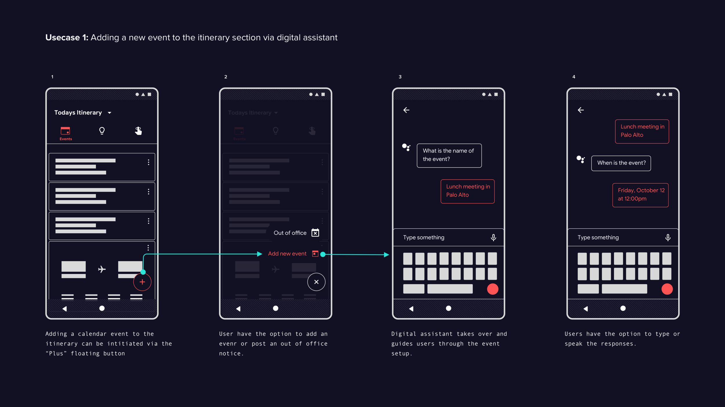
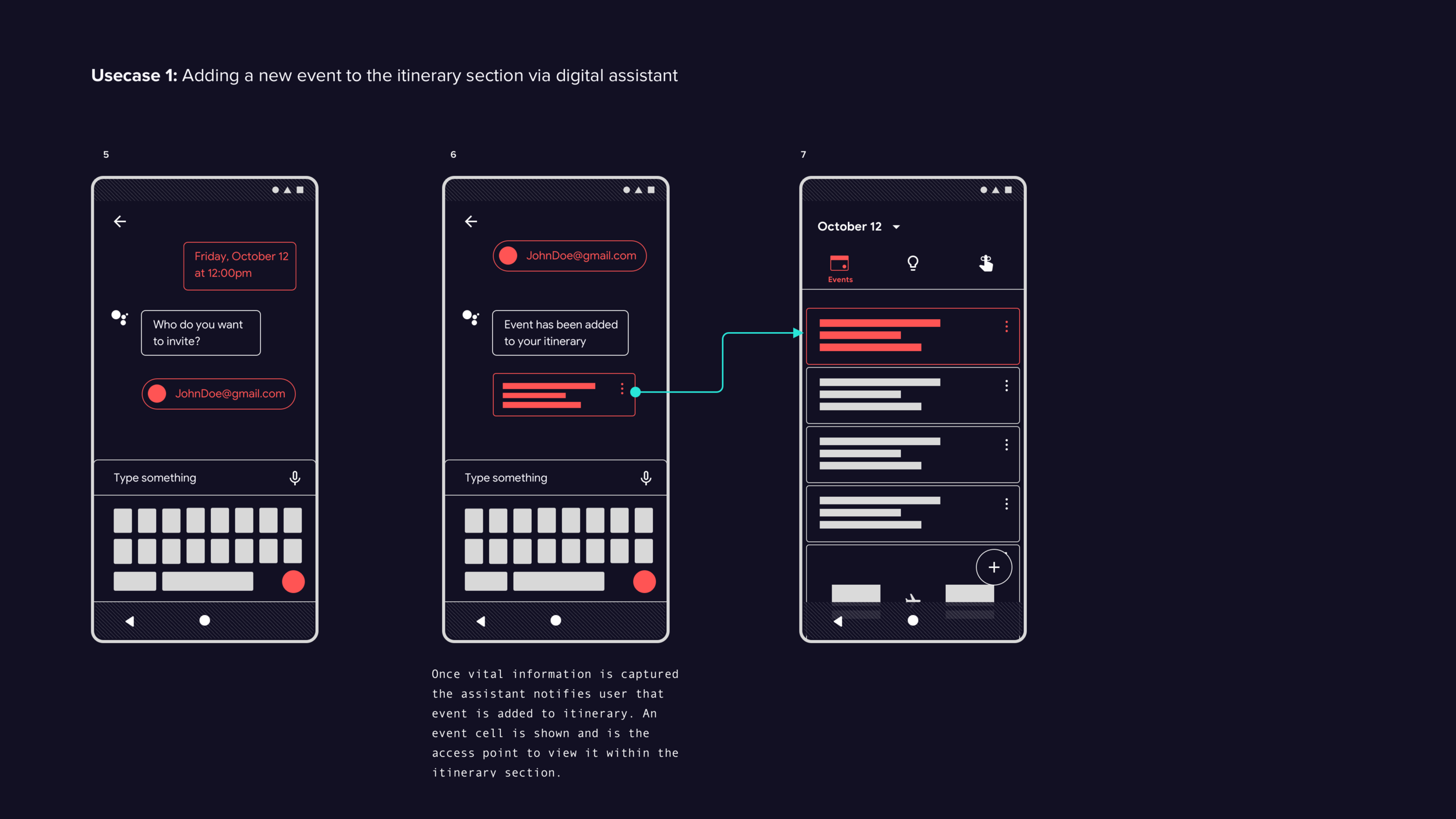
While initial feedback on the digital assistant experience is positive, testing covers only one use case. Further testing is needed to evaluate its effectiveness across the system. Recommended areas for the next round of prototypes:
Itinerary — adding and rescheduling calendar events
Notification shade
Native notes and calendar apps
Default search
App tray
Design rules are established as guidance for implementing the digital assistant pattern. Further testing is needed to measure their effectiveness.
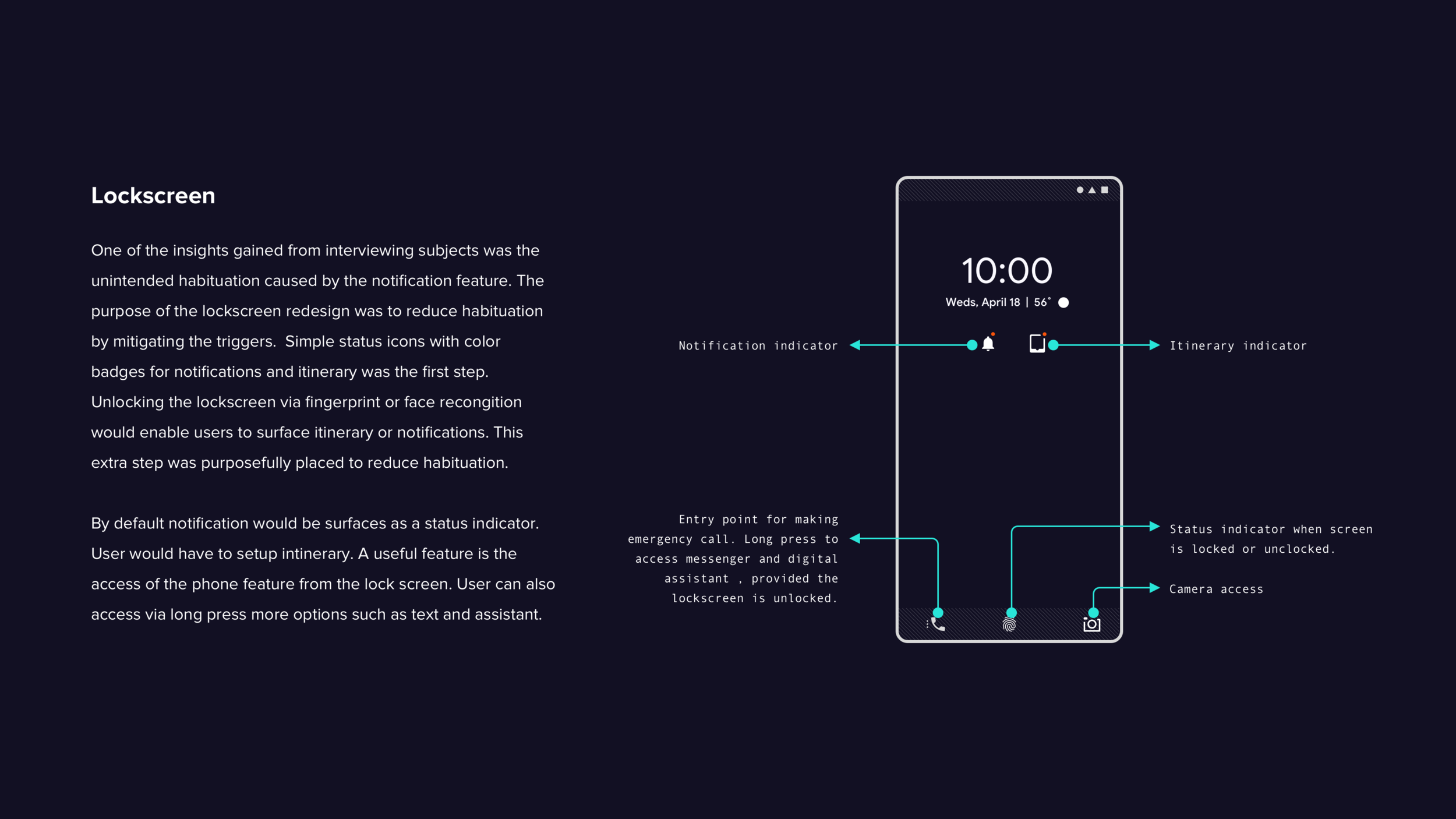
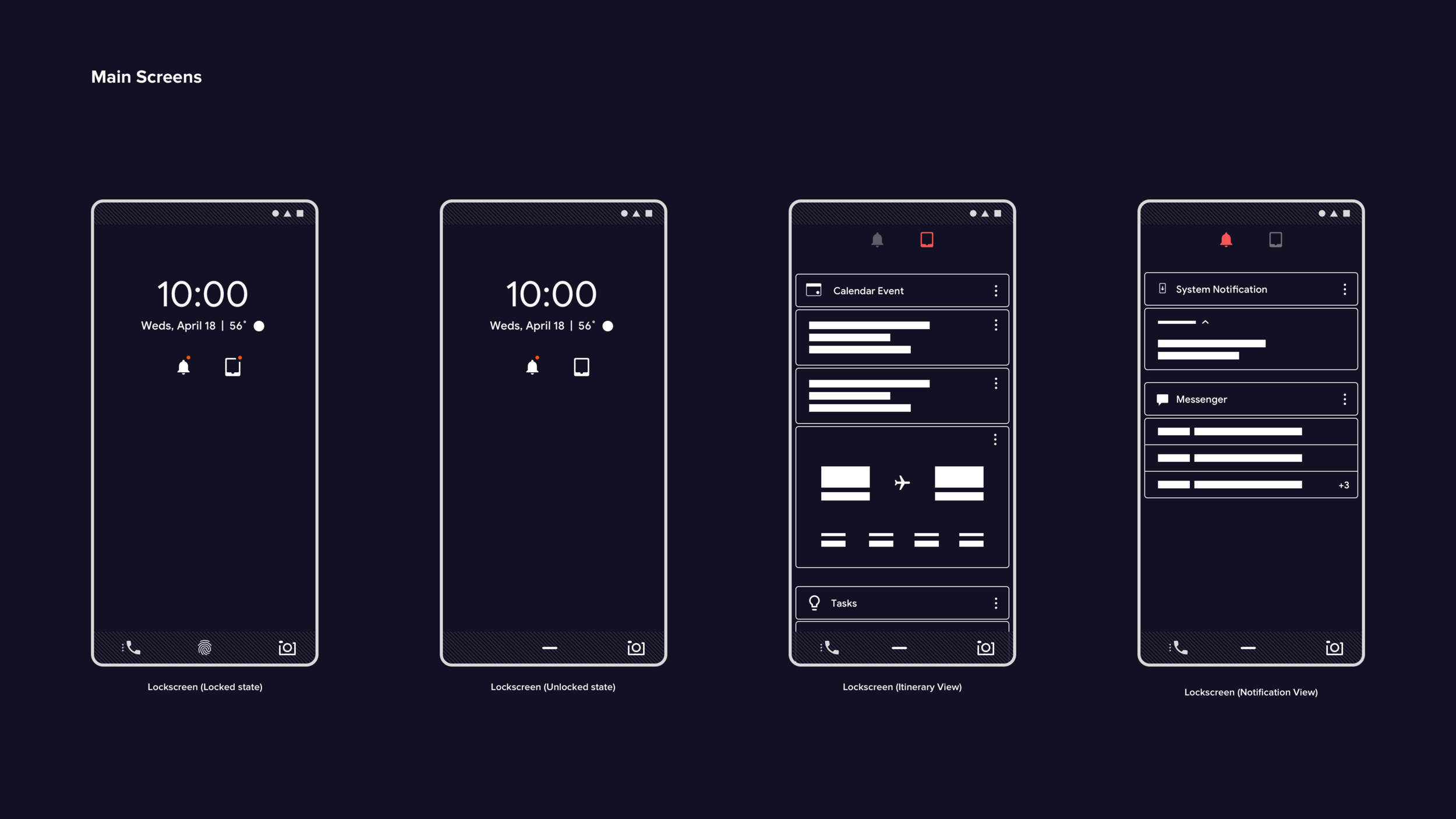
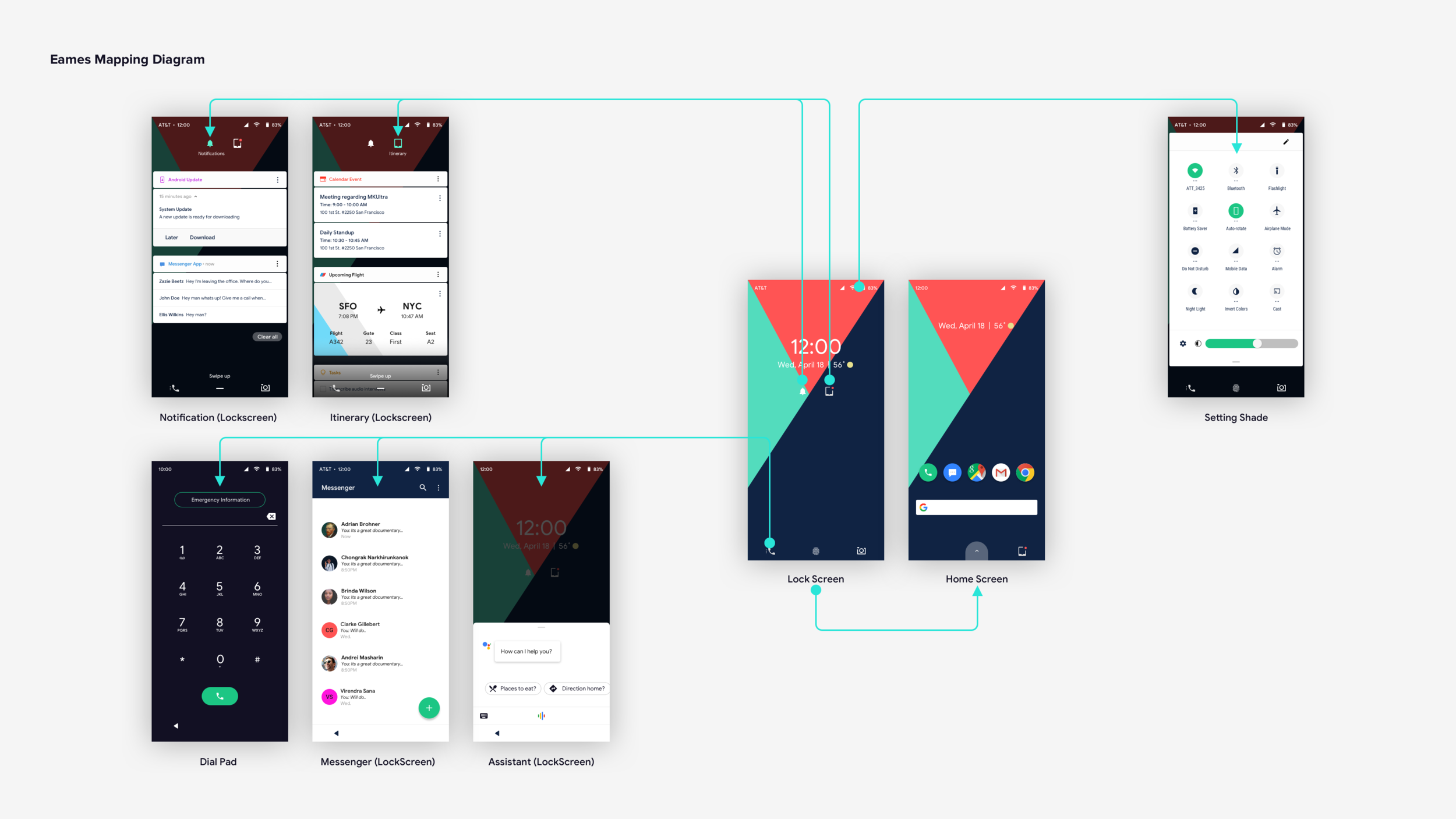
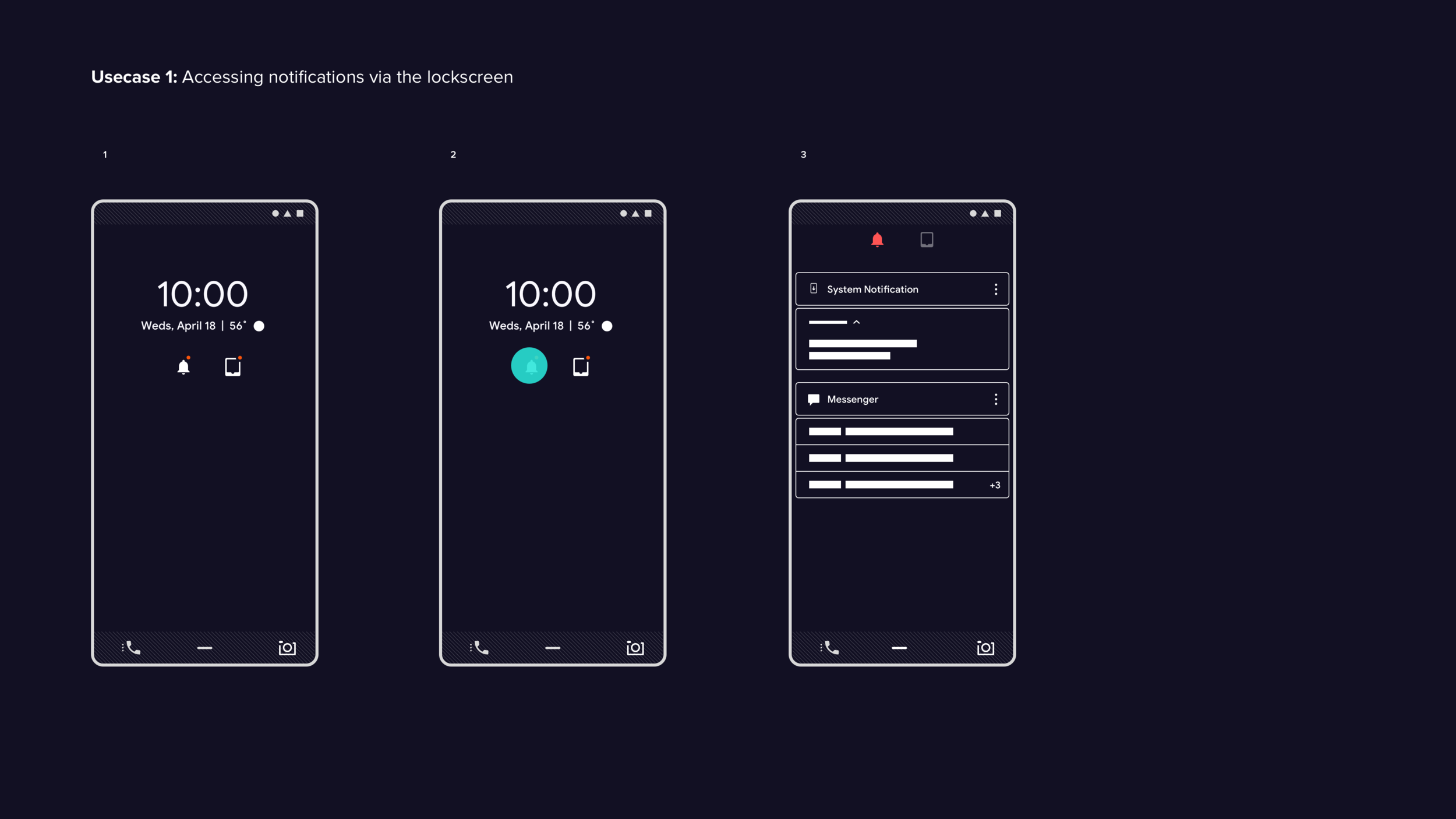
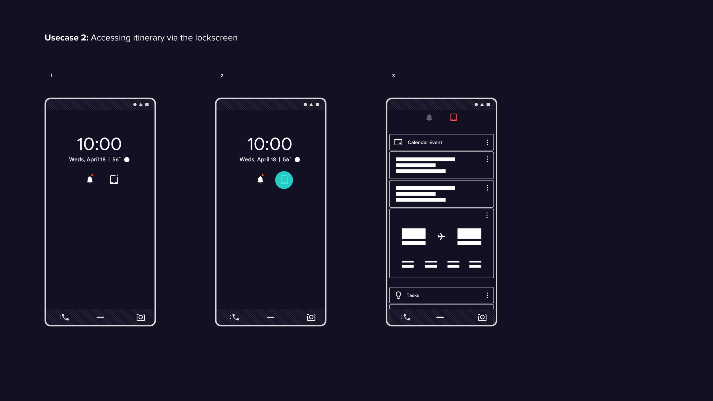
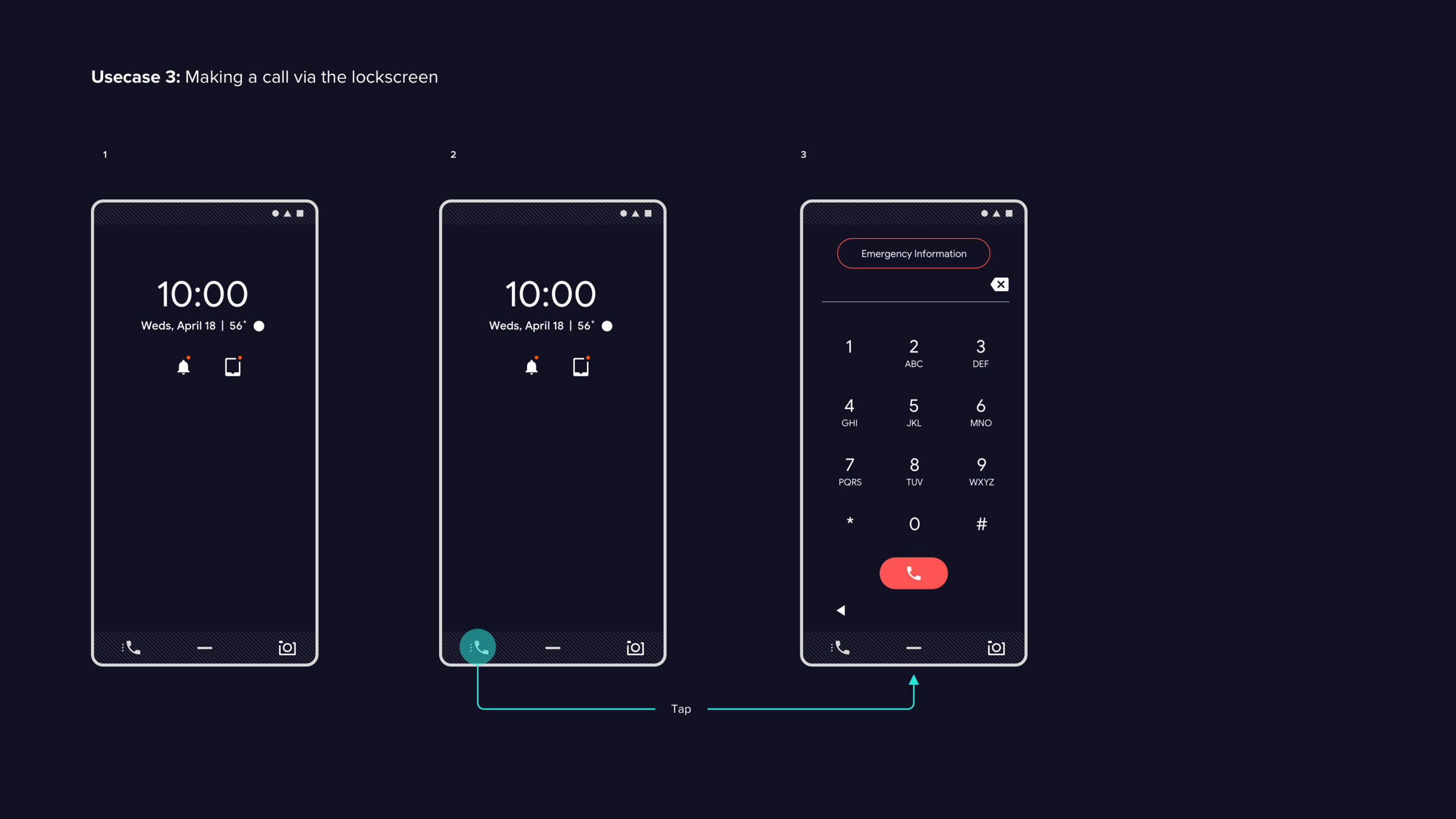
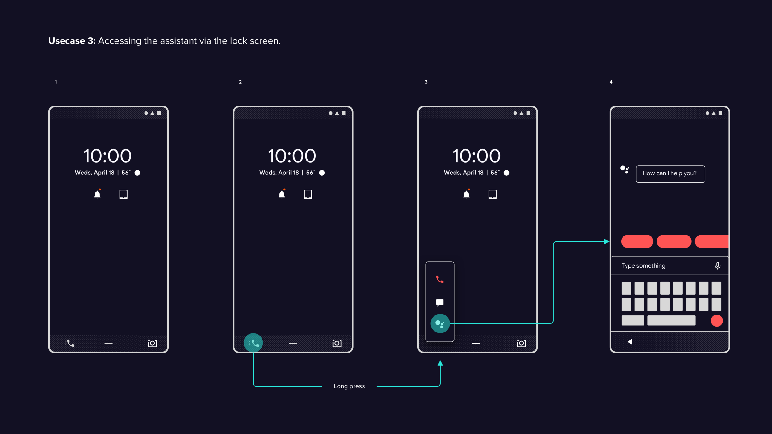
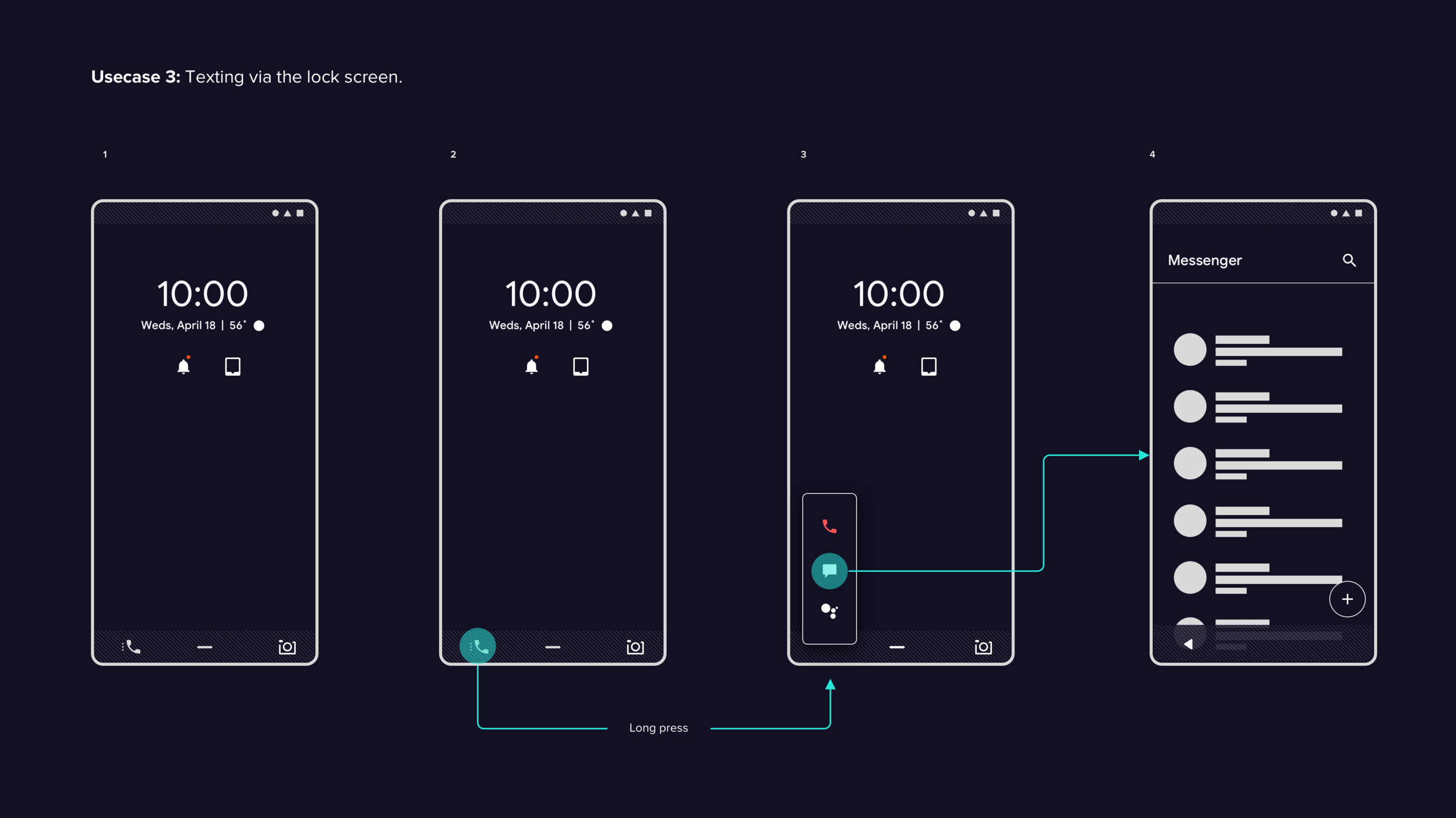
Lock Screen
Lock screen designs are developed as part of the project but fall outside the scope of the test sessions due to time constraints. Further testing would be needed to evaluate the effectiveness of this new approach.
App Tray
Findings
The intent-based categorization (IBC) layout is evaluated as an alternative to the classic grid view. Results are positive across all six participants:
All six participants access the app tray and navigate to various apps without friction.
Three of six initially struggle to understand the association between the history carousel and the app tray, but quickly grasp it once they access an app. All find the carousel distracting, and some find the information density problematic when searching. Two note that swiping twice to access all apps feels inefficient.
Four of six return to the home screen first before swiping up to access the app tray — a behavior driven by existing muscle memory from classic 3-button navigation.
Two of six use the tab affordance directly to access the app tray. Once used, all find the experience easy.
All participants find app categorization valuable. Three express interest in personalizing the layout and creating custom categories.
Recommendations
The IBC layout is well received and warrants further exploration around customization and personalization workflows. Offering users a choice between the IBC layout and the classic icon grid provides flexibility while accommodating different preferences. Any customization options should be intuitive and accessible regardless of technical ability — additional testing is recommended to validate the most effective implementation approach.