After exploring 3 directions for Lightbrite and its wearable, Thea, one was chosen to build on. The work shifted from exploration to resolution — refining that single direction into a complete, buildable brand framework that defined how Lightbrite and Thea performed across every touch point.
Role: Brand Strategy & Identity Design
Client: Lightbrite
Type: Brand Identity & System
Year: 2023 - 2026
Tools: Illustrator, Figma, Midjourney, Photoshop
With a direction chosen, the work shifted from exploration to resolution. What follows is how that single direction was refined into a complete, buildable brand framework — a fully realized identity that defined how Lightbrite and Thea behaved together and performed across every touchpoint.
The Brand Framework
With a confirmed direction, I developed a comprehensive brand framework — the complete, fully realized expression of the Lightbrite and Thea identity system across every dimension of the brand.
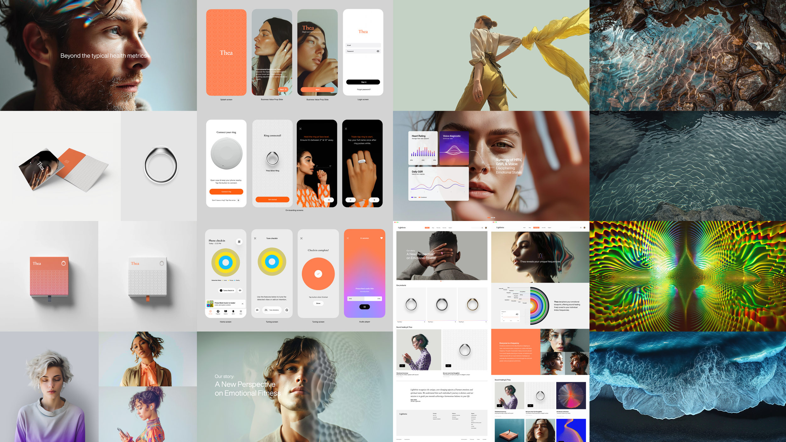
Parent and Sub-Brand Architecture
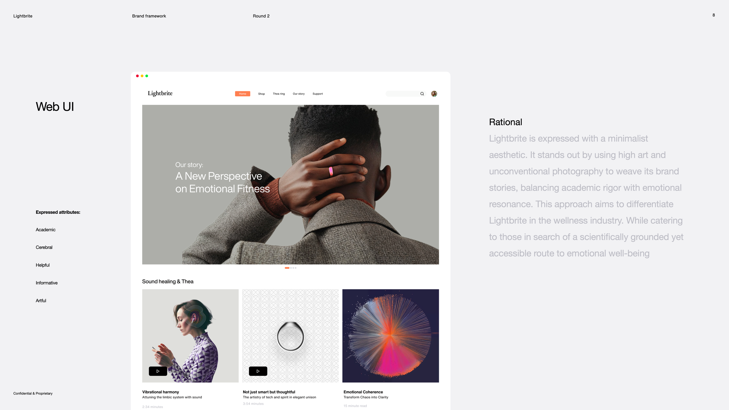
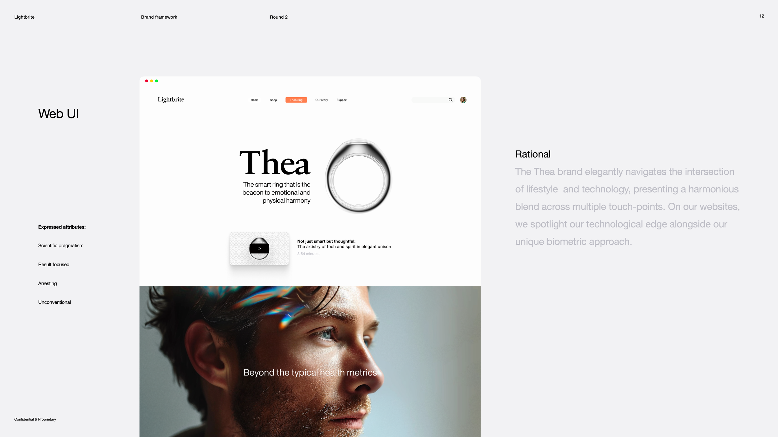
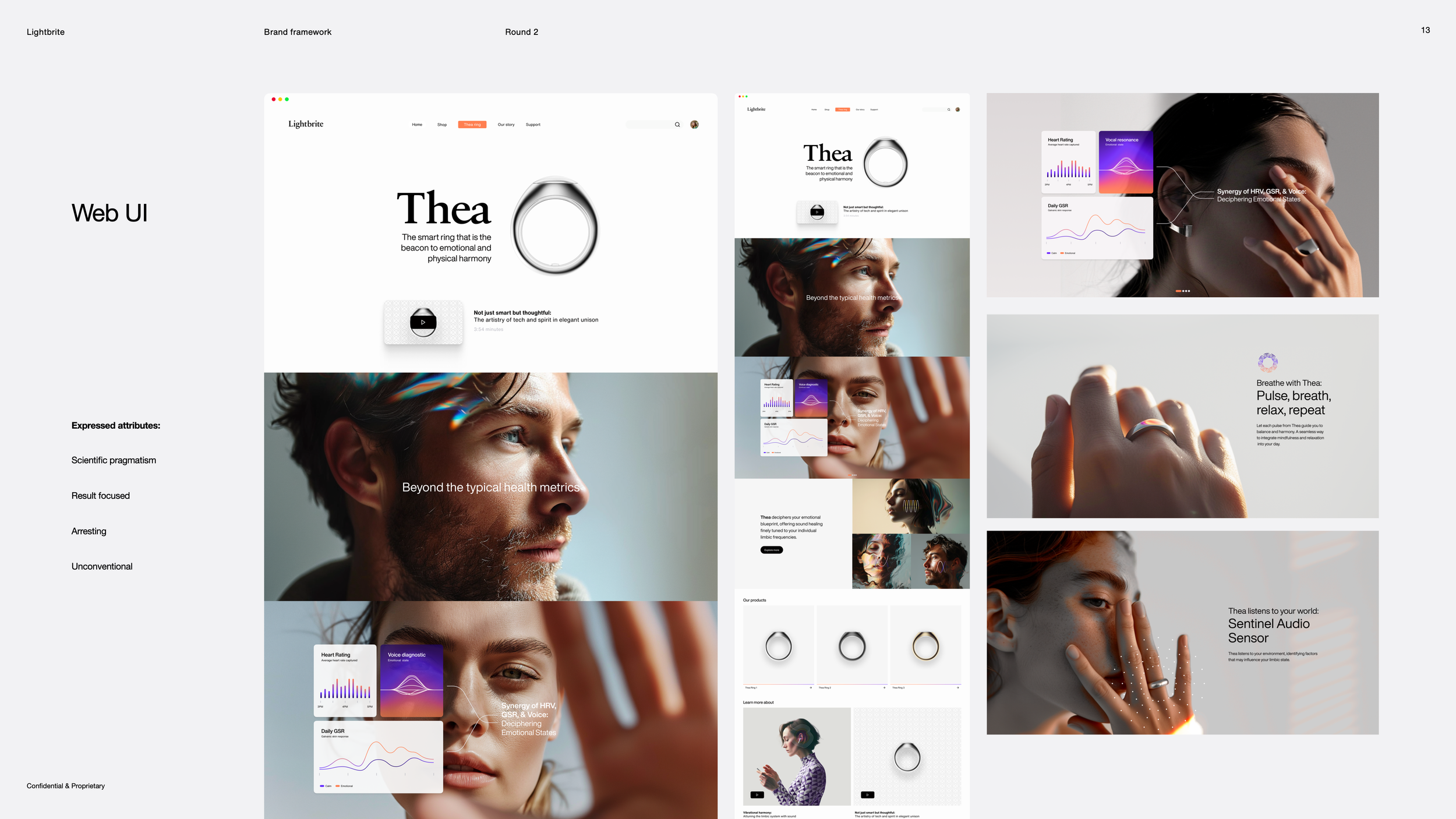
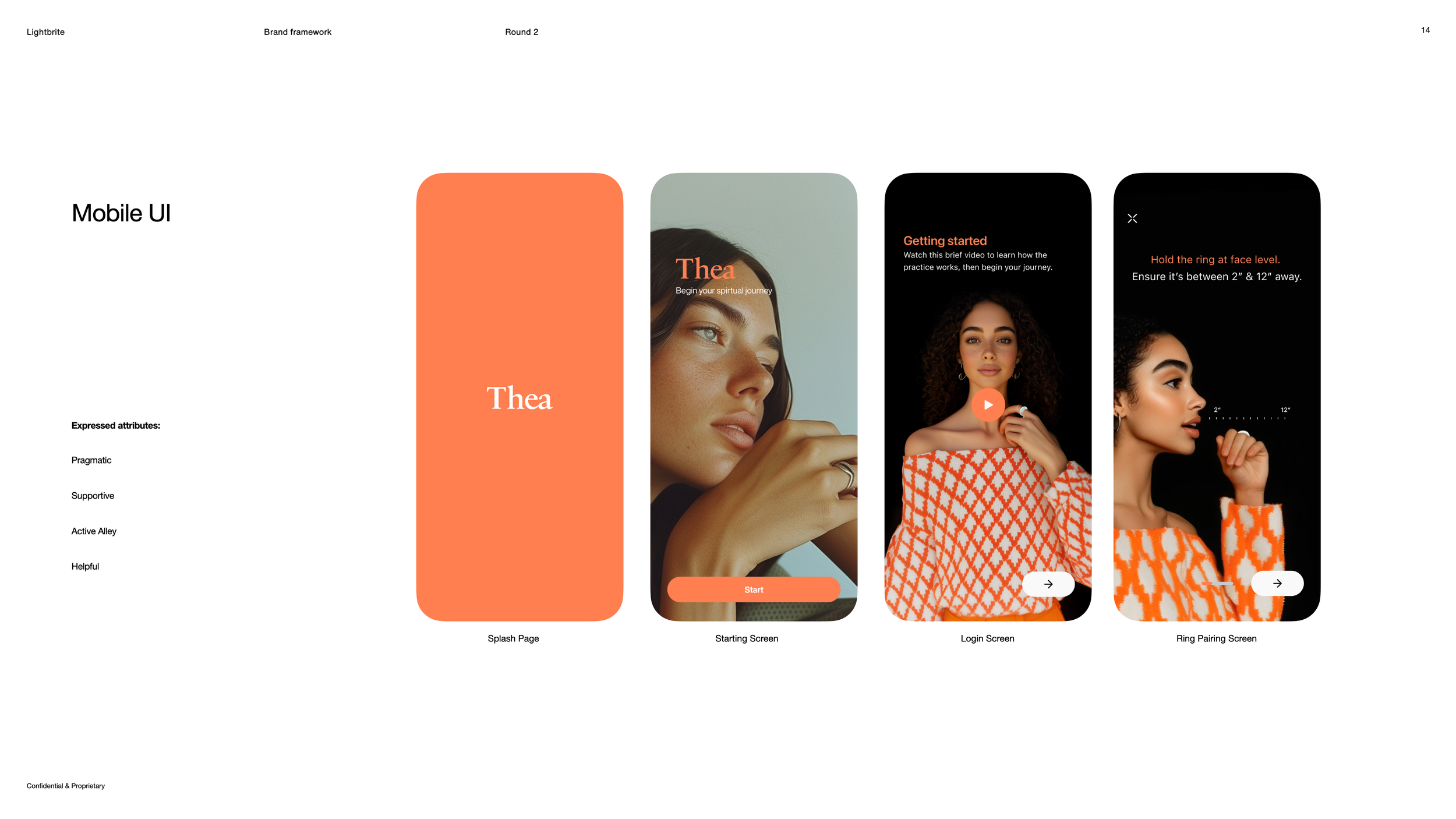
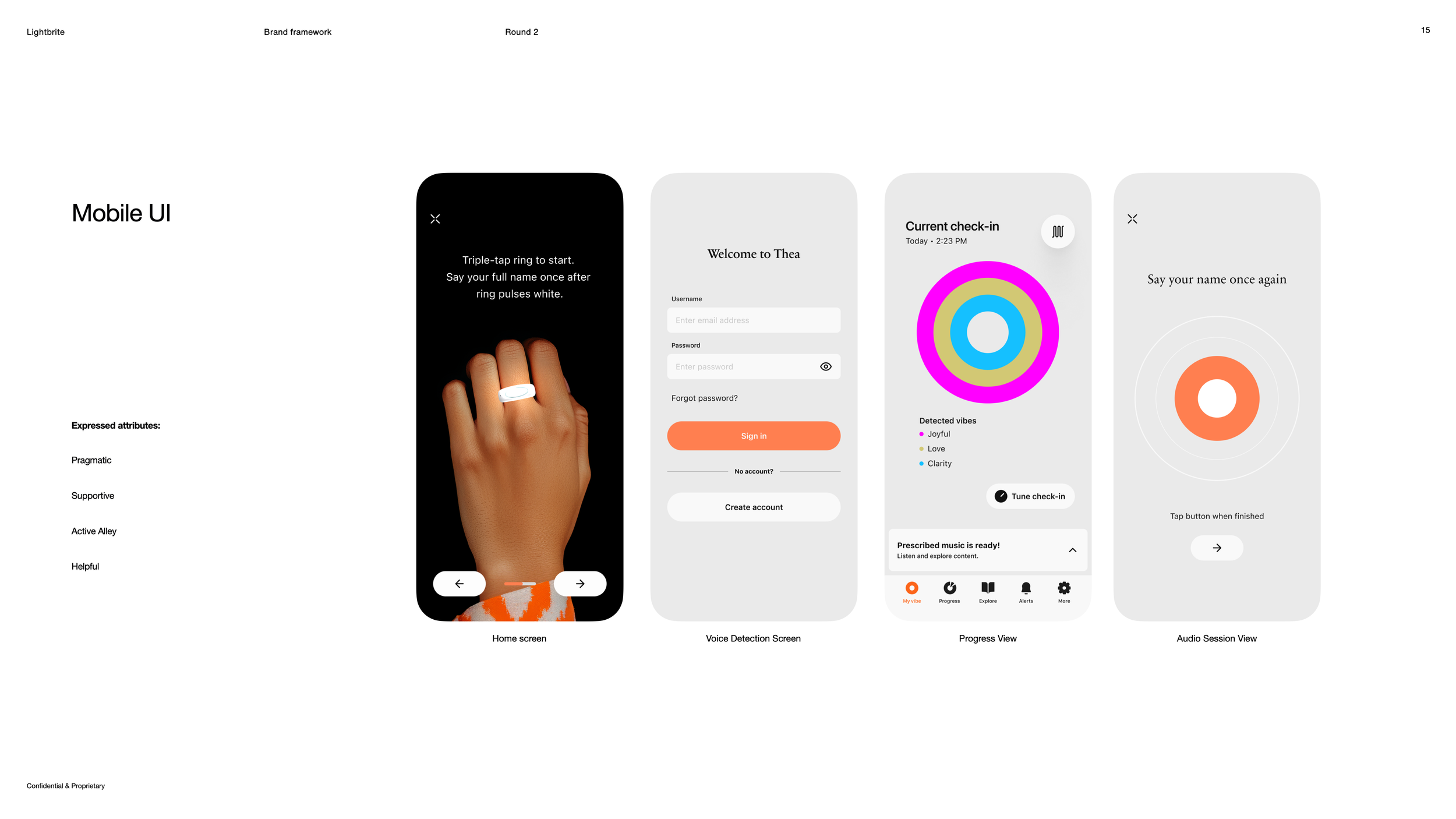
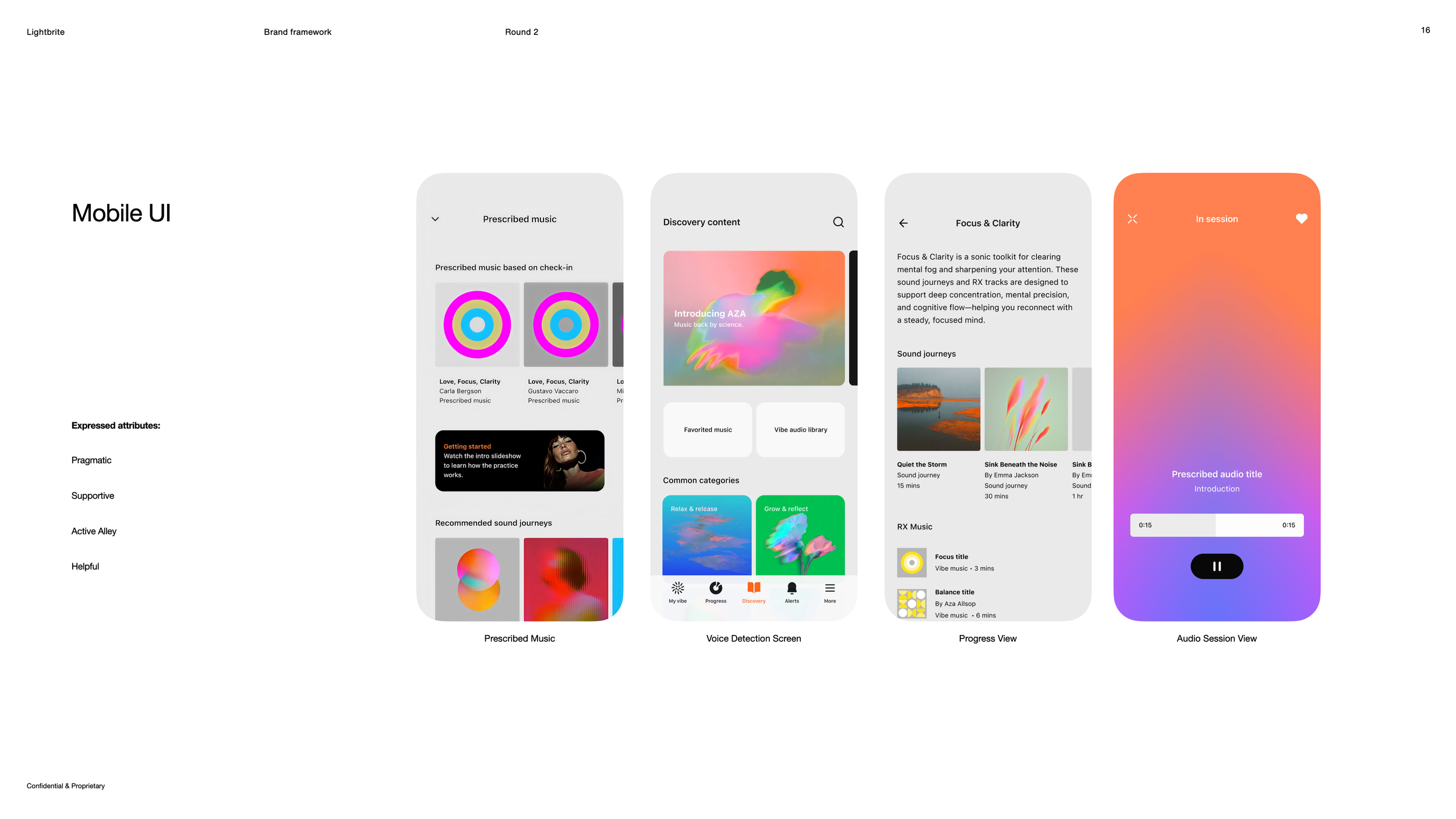
The framework resolved how Lightbrite and Thea operated together and independently. Lightbrite carried the science-led, corporate voice — minimalist in expression, using high art and unconventional photography to balance academic rigor with emotional resonance, and positioning the company as a scientifically grounded yet accessible voice in wellness (aligned with Fearless Innovation and Scientific Pragmatism). Thea expressed the human, consumer-facing experience — living at the intersection of lifestyle and technology, foregrounding the bio-metric approach and technological edge while staying warm and approachable across touch points (aligned with Active Ally and Expressive Artistry). Showing both across real applications made the architecture practical rather than theoretical.
Touchpoint Applications
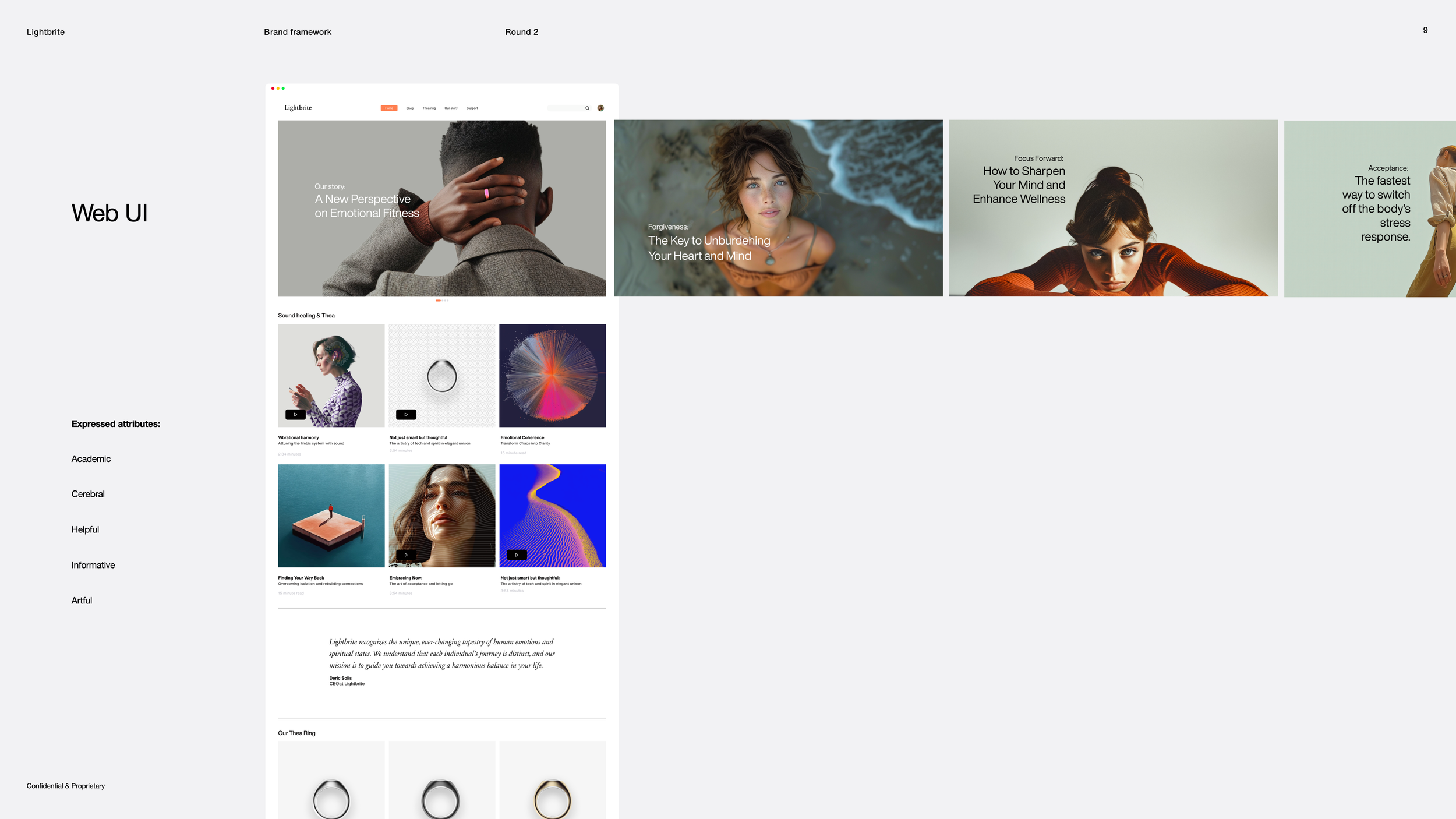
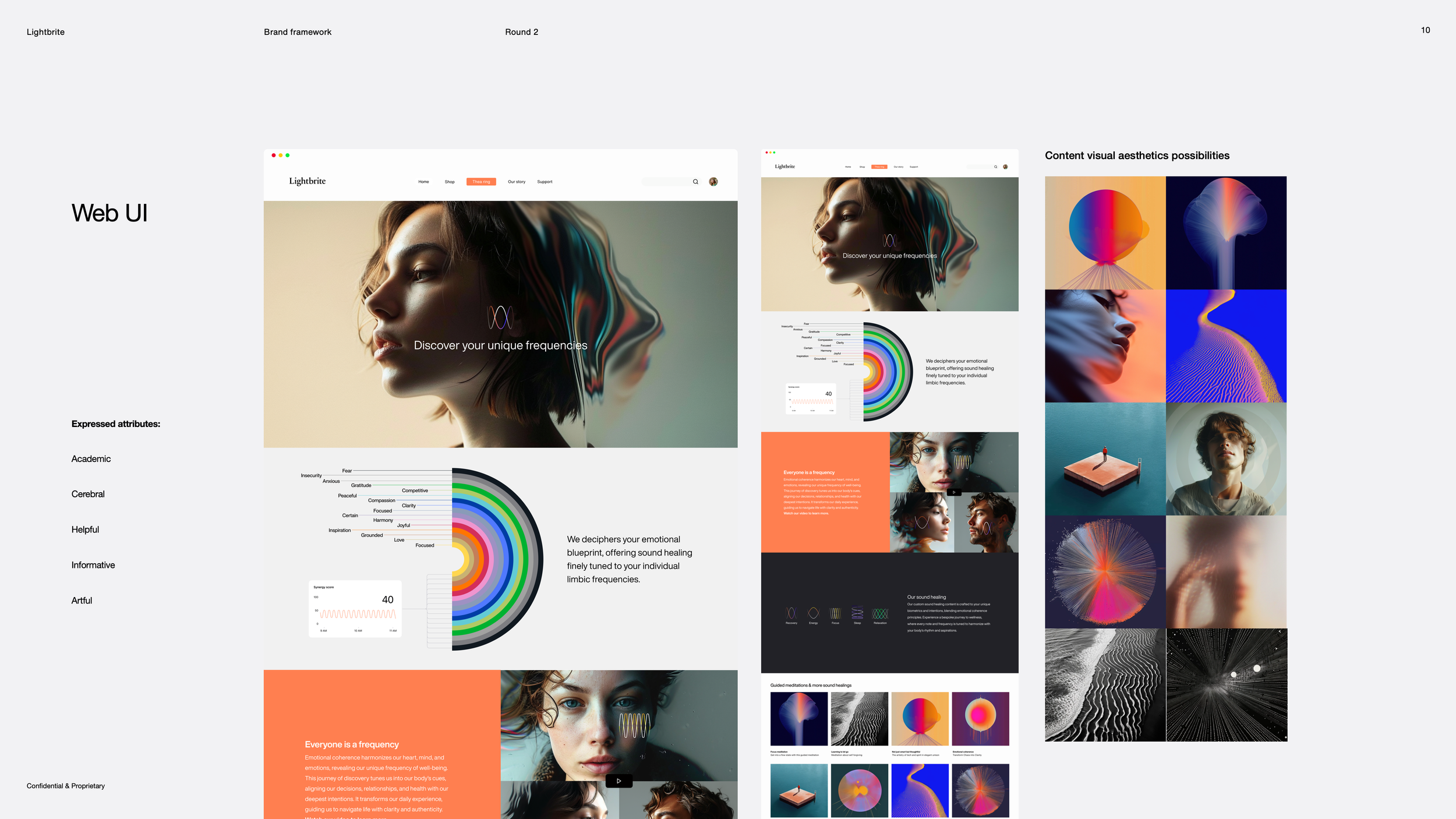
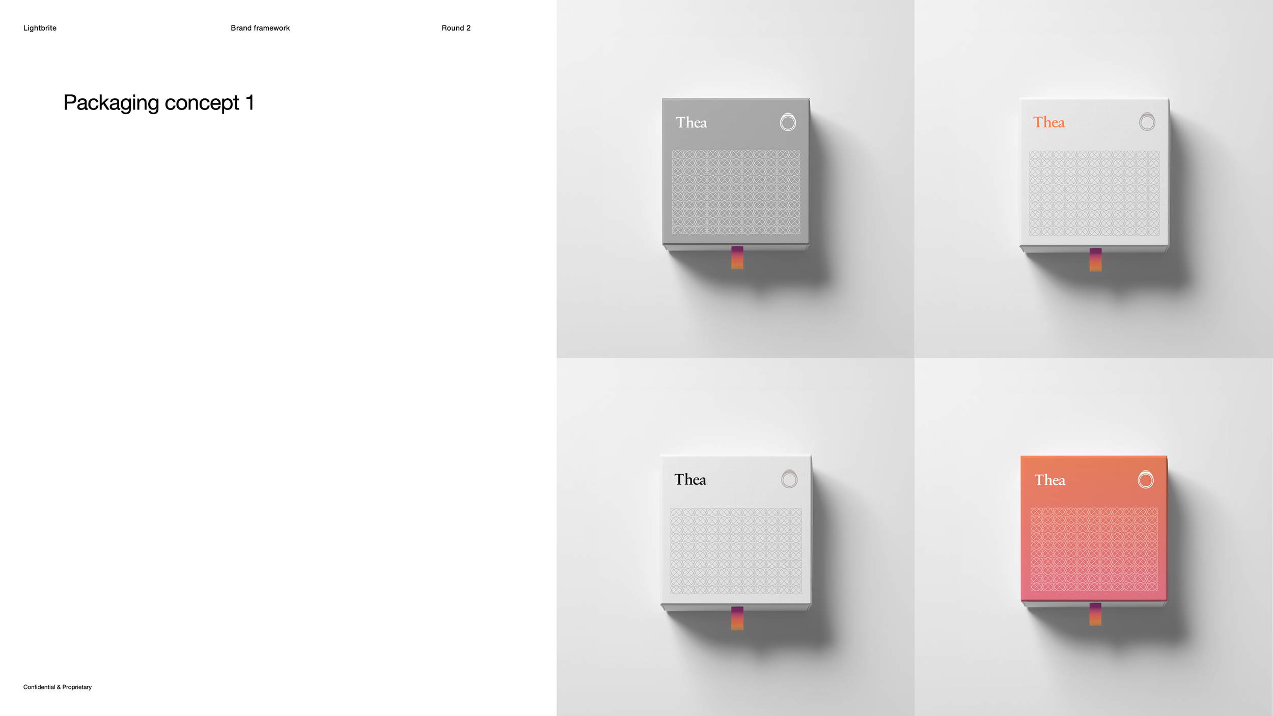
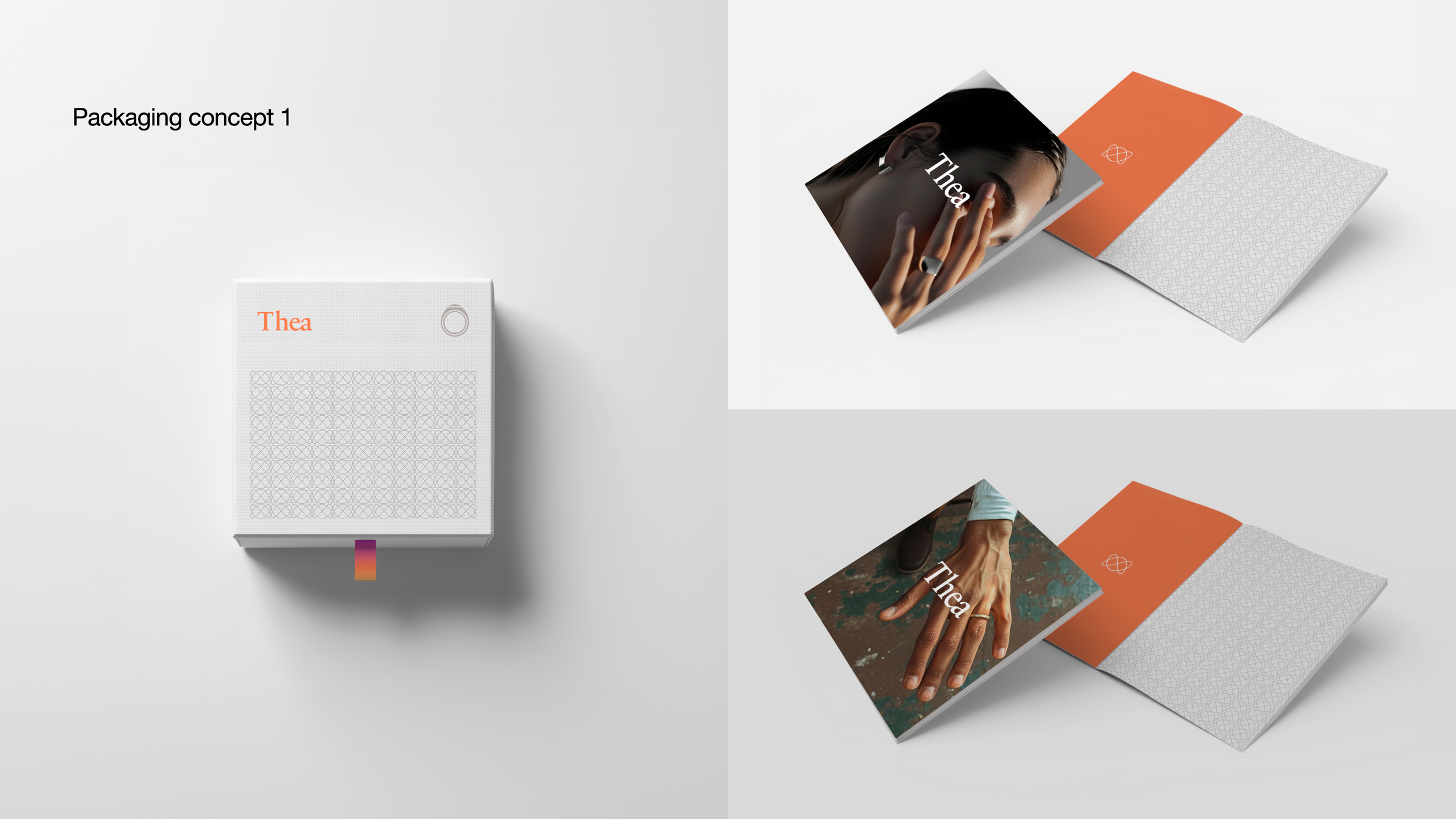
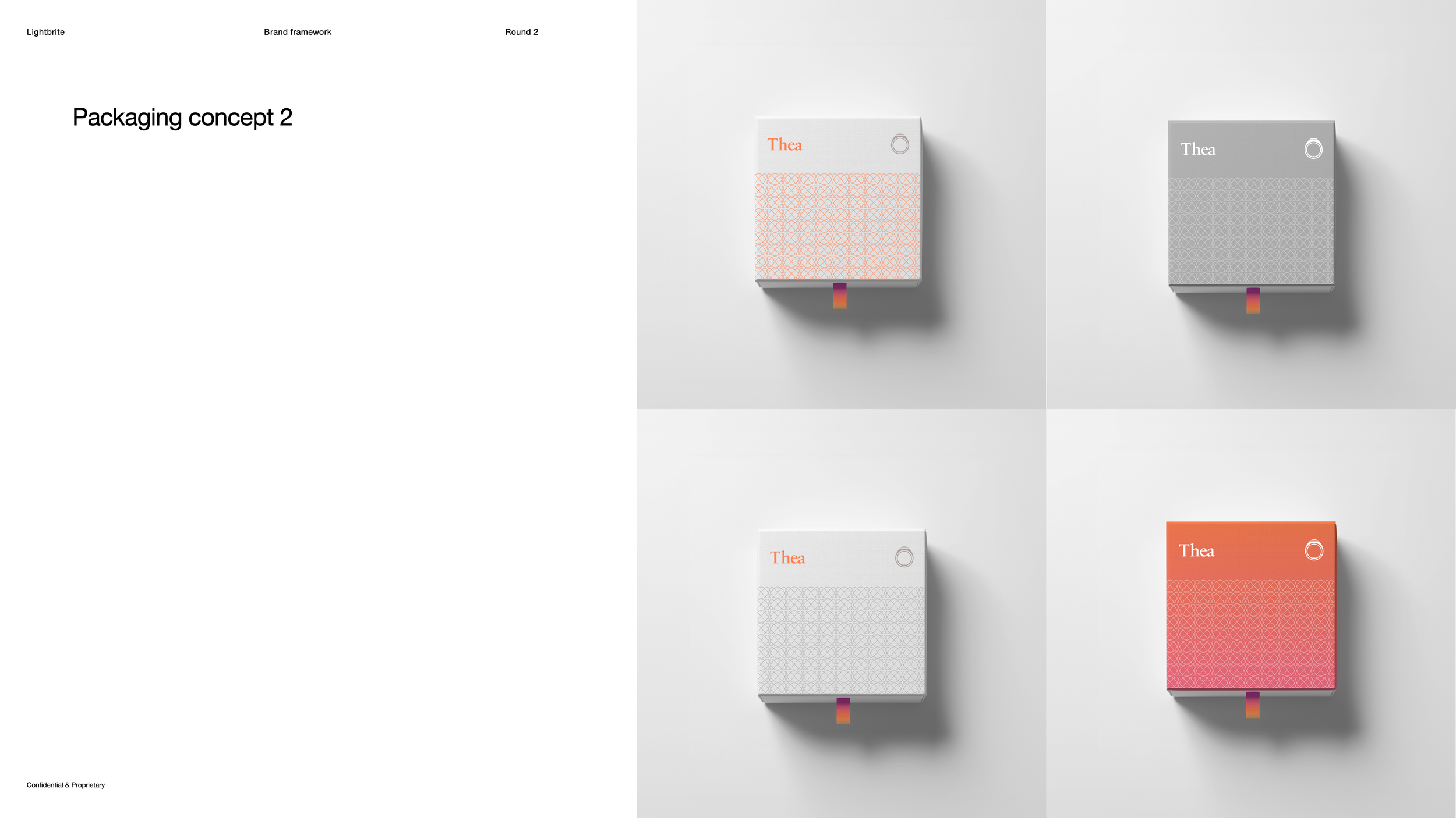
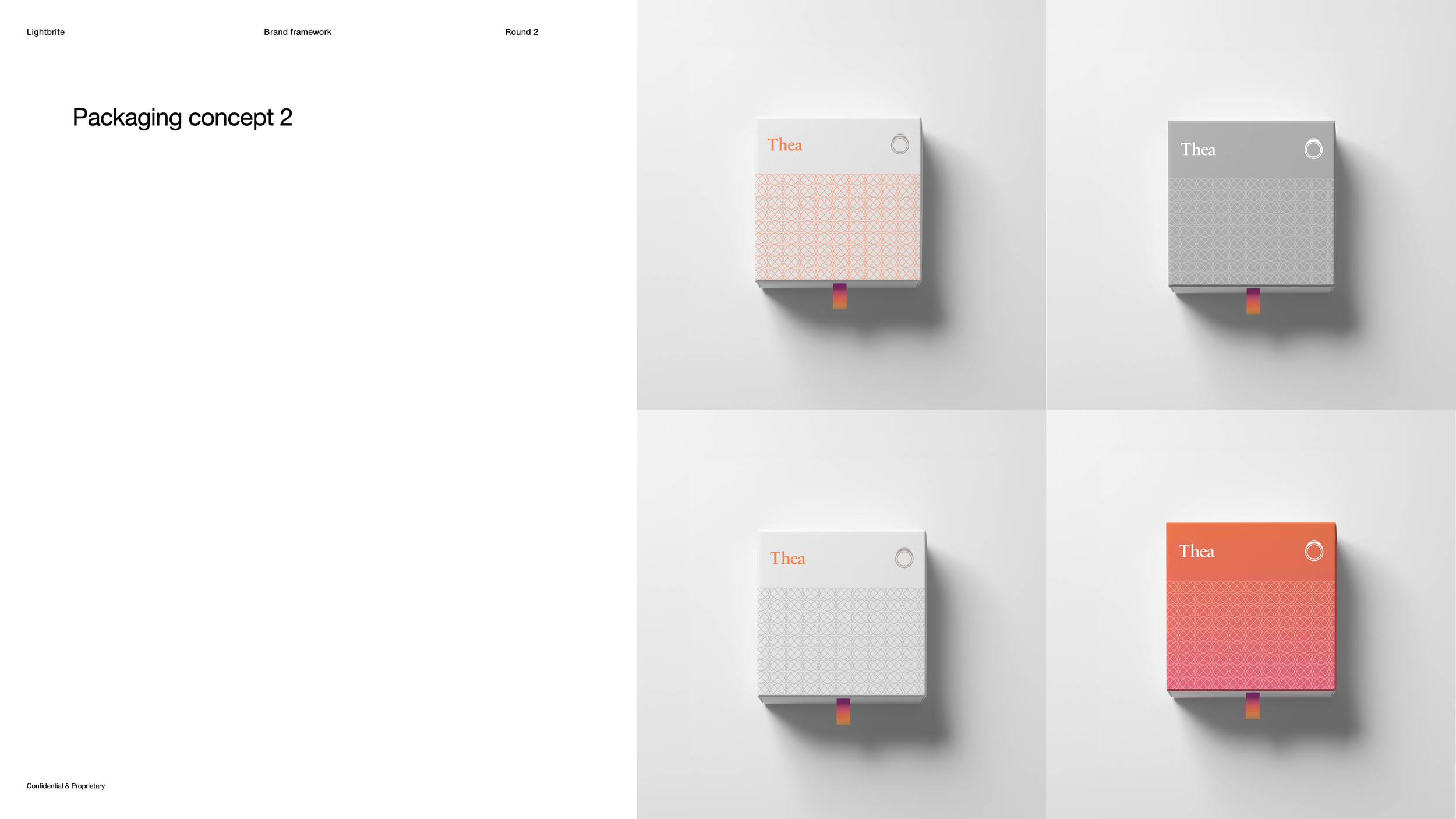
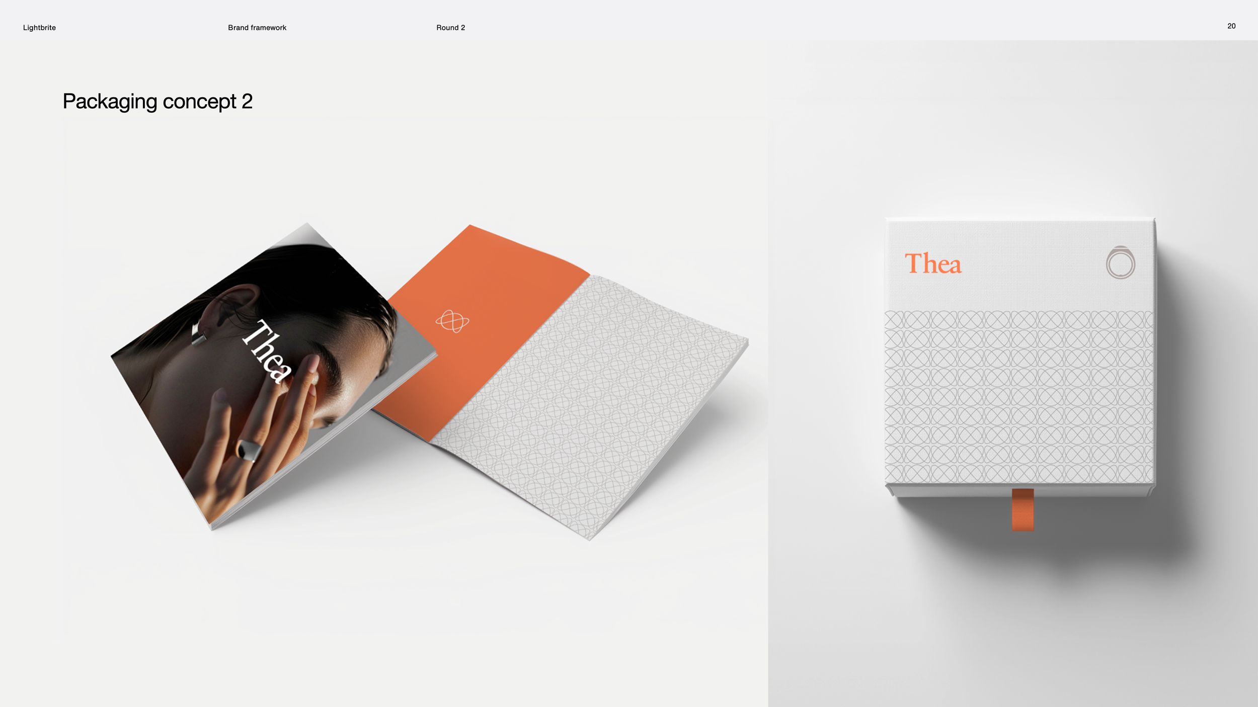
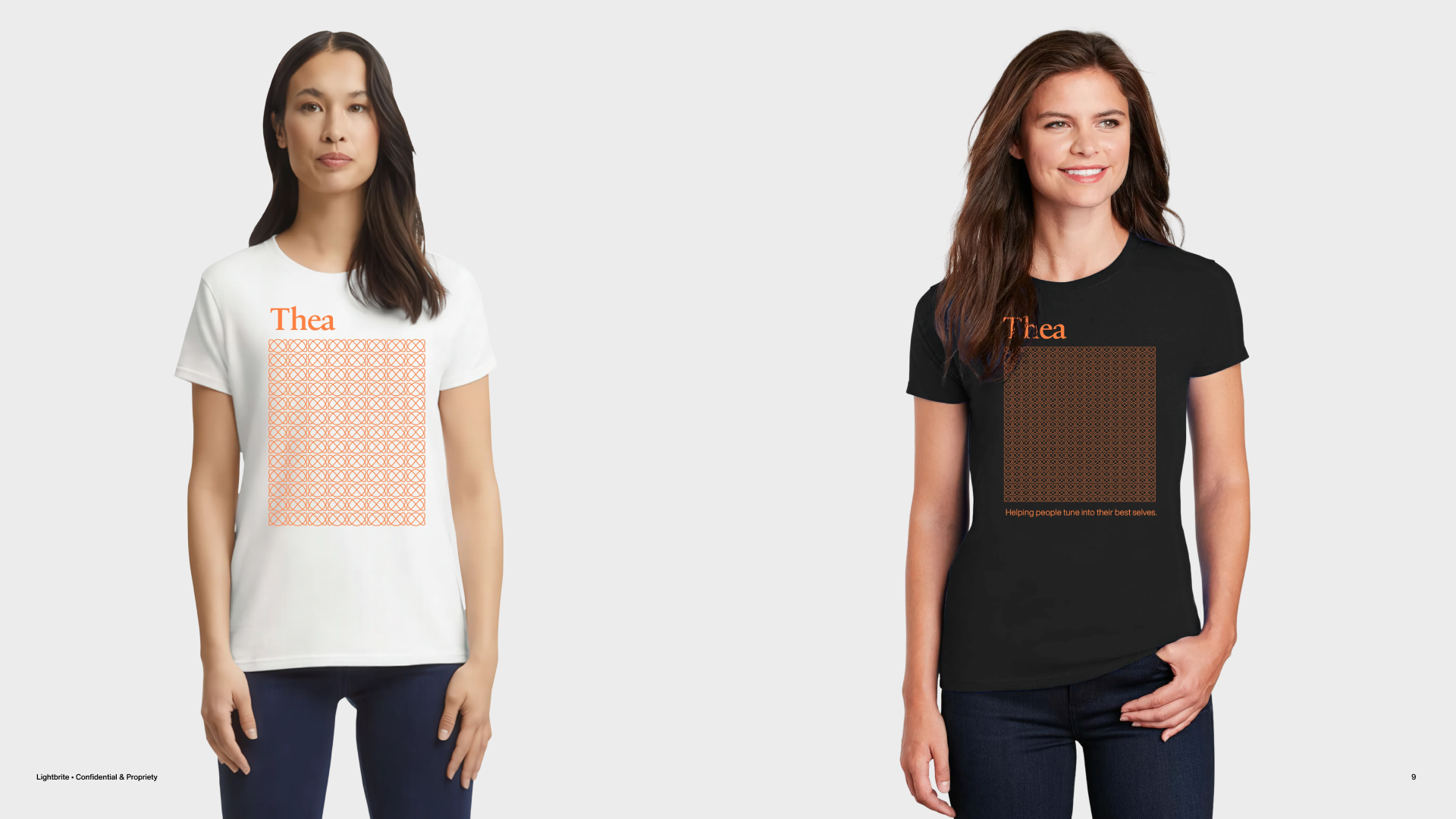
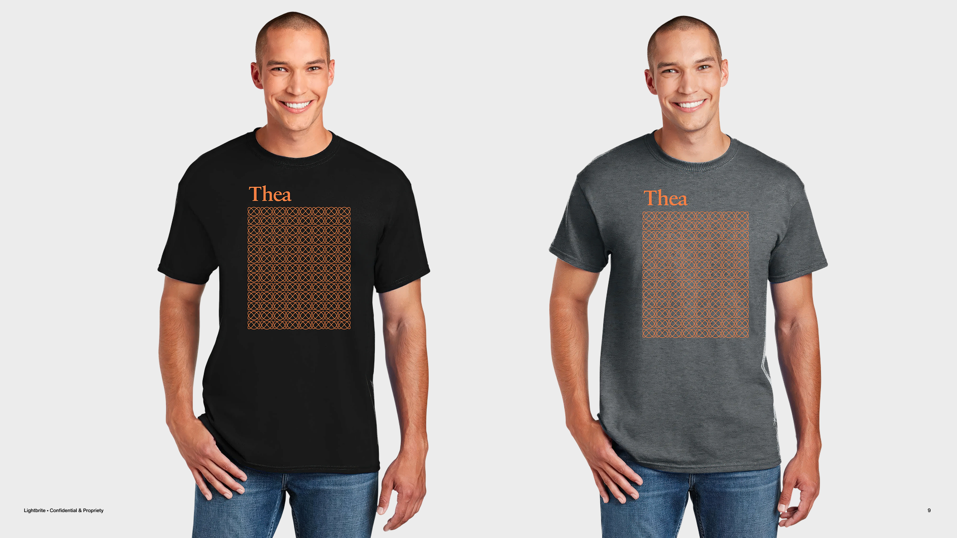
The framework showed the brand performing across a full range of touch points: web and mobile interfaces, print collateral, and packaging design. Each application was treated as a working expression of the system — demonstrating that the brand was buildable, consistent, and ready to be put to work.
Voice, Tone, and Copy
Rather than documenting copy principles in isolation, voice and tone were demonstrated through the actual copywriting used throughout the framework. This spanned web, mobile, and print contexts — making the verbal identity tangible and showing how it integrated with the visual system rather than existing separately from it. The verbal system was anchored by a vision statement, mission statement, brand statement, and tagline
Visual System
The complete visual system was documented across the full range of brand expressions — logo usage, color system, typography hierarchy, and brand mark — demonstrating how each element behaved individually and in combination across a variety of contexts.
Photography Direction
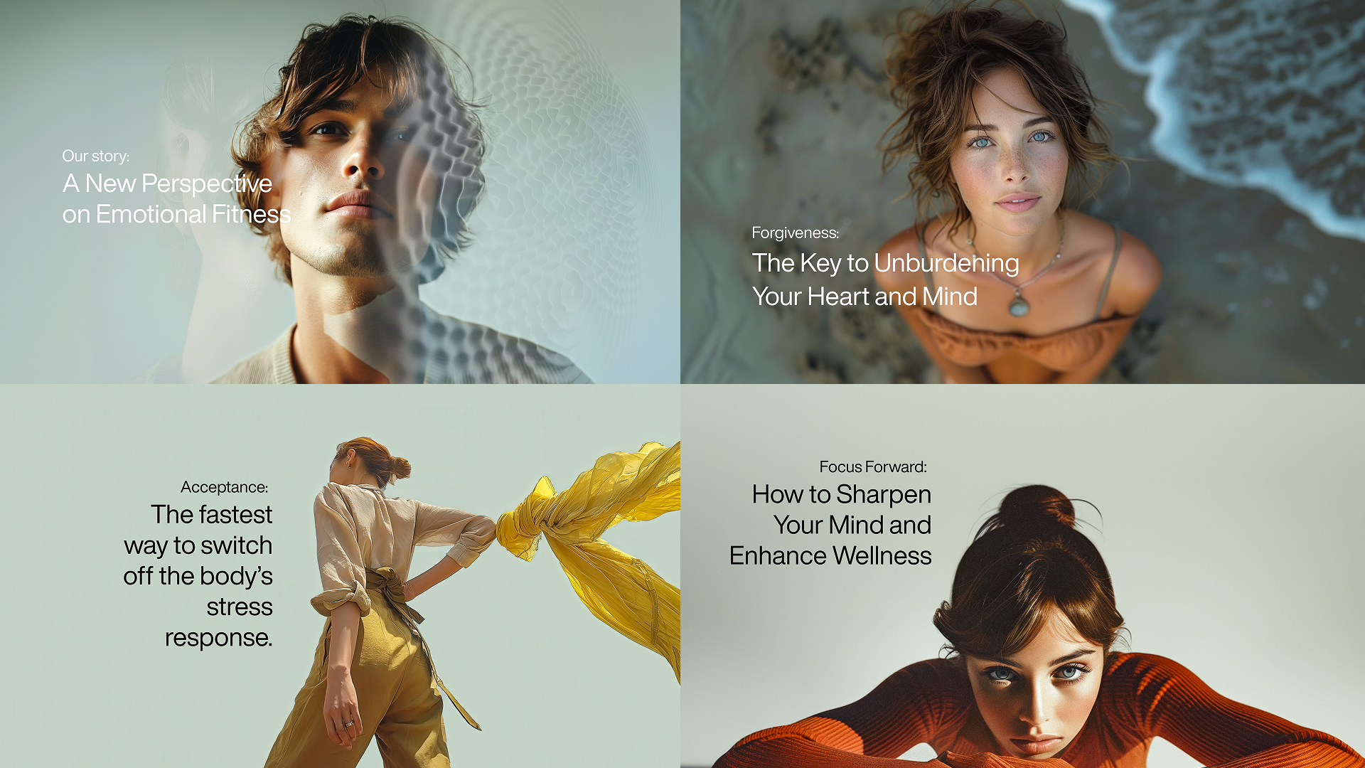
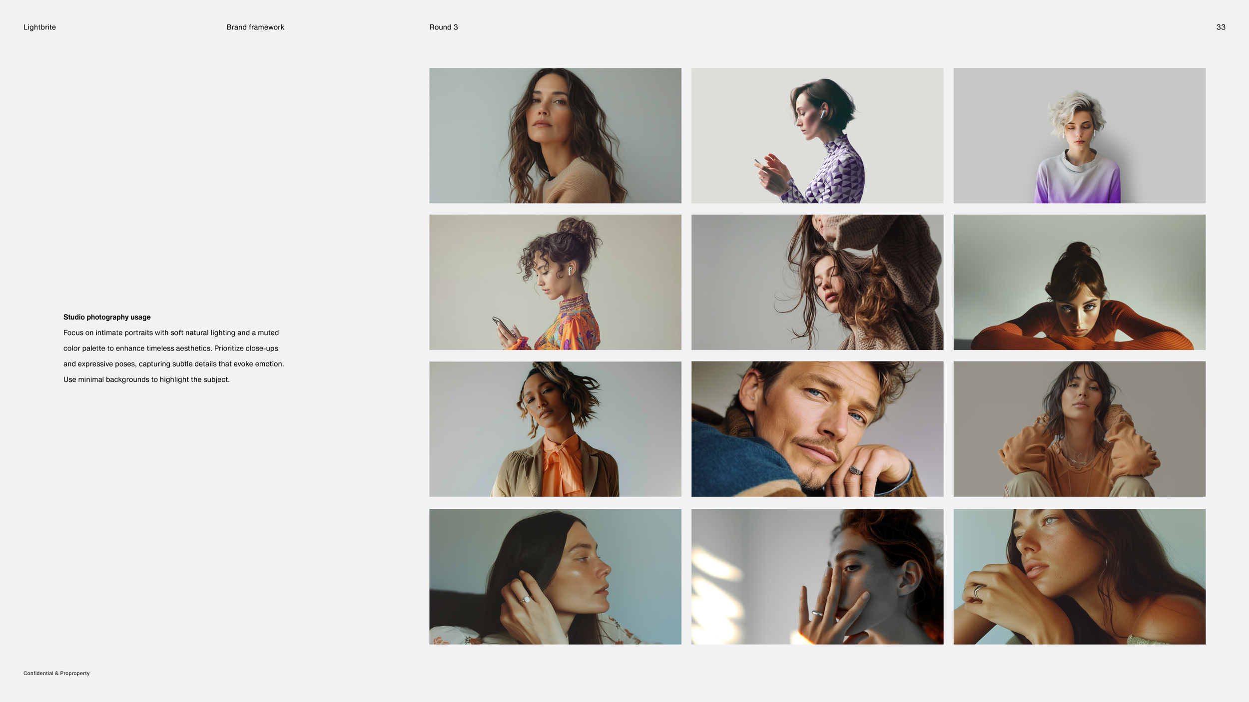
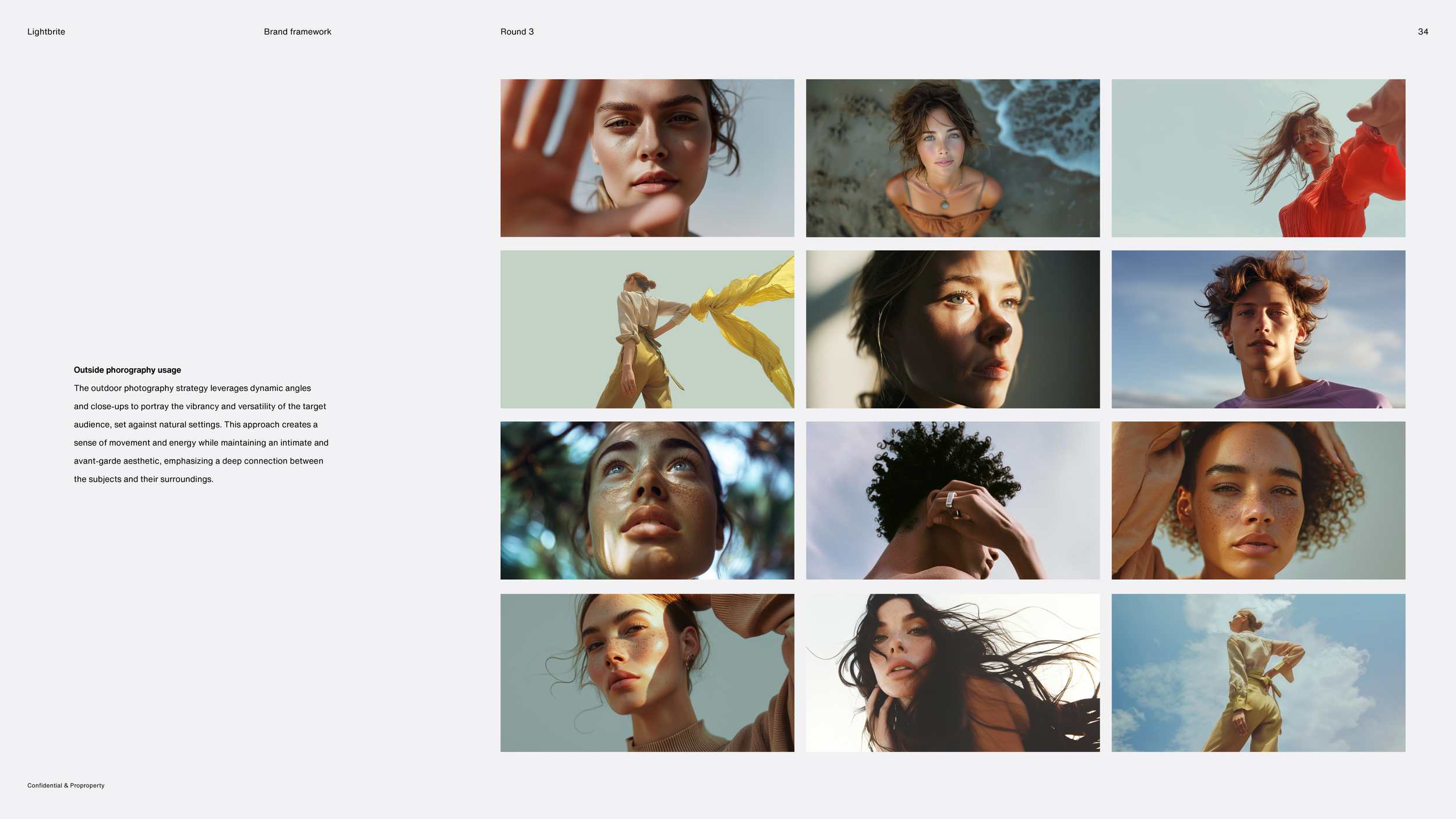
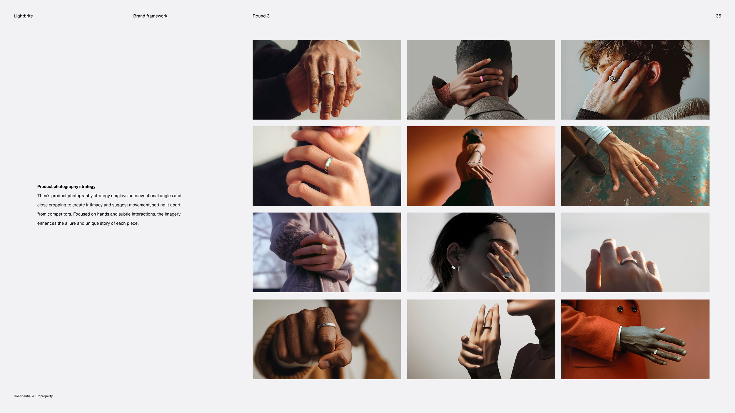
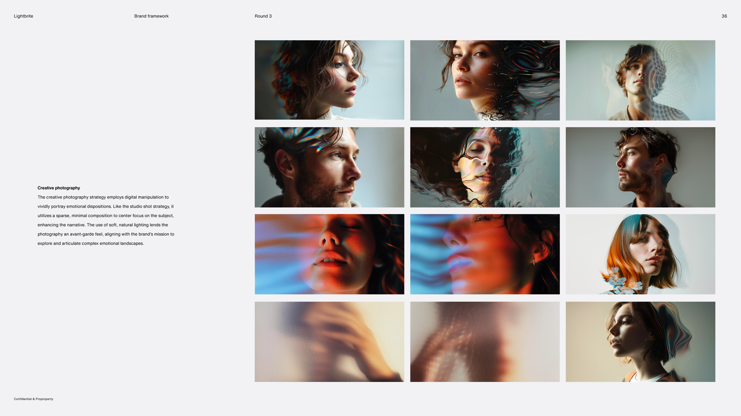
The framework included art direction for photography, establishing the visual tone and subject approach aligned with the brand's emotional register — human, intimate, and grounded rather than aspirational or clinical.
Outcome
The brand framework was met with strong enthusiasm from the founders and stakeholders. Rather than simply delivering a visual identity, it established a strategic brand system at a pivotal stage in the company's growth, serving as the foundation for Lightbrite's investor-facing communications.
I carried that system into the pitch deck through data visualization, copywriting, and messaging, ensuring the narrative and the visuals reinforced one another. Applied across both the MVP and investment materials, the brand generated significant investor interest and contributed directly to approximately $1.7 million in early-stage funding.
Ultimately, the project solved the dual-brand challenge that had defined the engagement from the beginning, giving Lightbrite a unified identity and a compelling platform from which to launch its product and secure investment.