Monohm was a small, ambitious startup that dared to build a communication device for people who wanted less from their phone — not more. Their product, The Runcible, was a deliberate and considered alternative to the smartphone.
Role: Brand & UX Designer
Client: Monohm
Type: Brand Identity, UX
Year: 2018–2019
Tools: Illustrator, Figma, Cinema 4D
In late 2018, I connected with Monohm, a Berkeley-based startup developing an alternative to the smartphone. The timing was significant — the company was at a pivot point, reassessing its direction and preparing to approach investors with a sharper, more refined story. I was brought in initially to help reshape their investor communications: a new wordmark and a reworked pitch deck.
The work resonated, and the scope expanded. What began as investor materials evolved into a fuller engagement — rethinking the UX of their operating system, Rabbit OS, and extending that visual identity work into the brand. The UX work remains under NDA; what's shown here focuses solely on the brand identity.
The Challenge
Monohm arrived at the engagement at a critical moment — actively seeking further investment while carrying a fragmented identity. A company name, a separate product name, and an operating system each pulled in different directions, making it difficult to tell a coherent story to investors or consumers. Founder Aubrey Anderson recognized that moving forward meant simplifying. The device would be consolidated under a single name — Monohm — and the brand rebuilt around that decision.
The creative challenge followed from that: develop an identity that felt fresh and inviting, without losing the quiet, considered ethos the product stood for. It had to feel classic without feeling dated, futuristic without feeling cold — and credible enough to carry the company into its next chapter.
The Wordmark
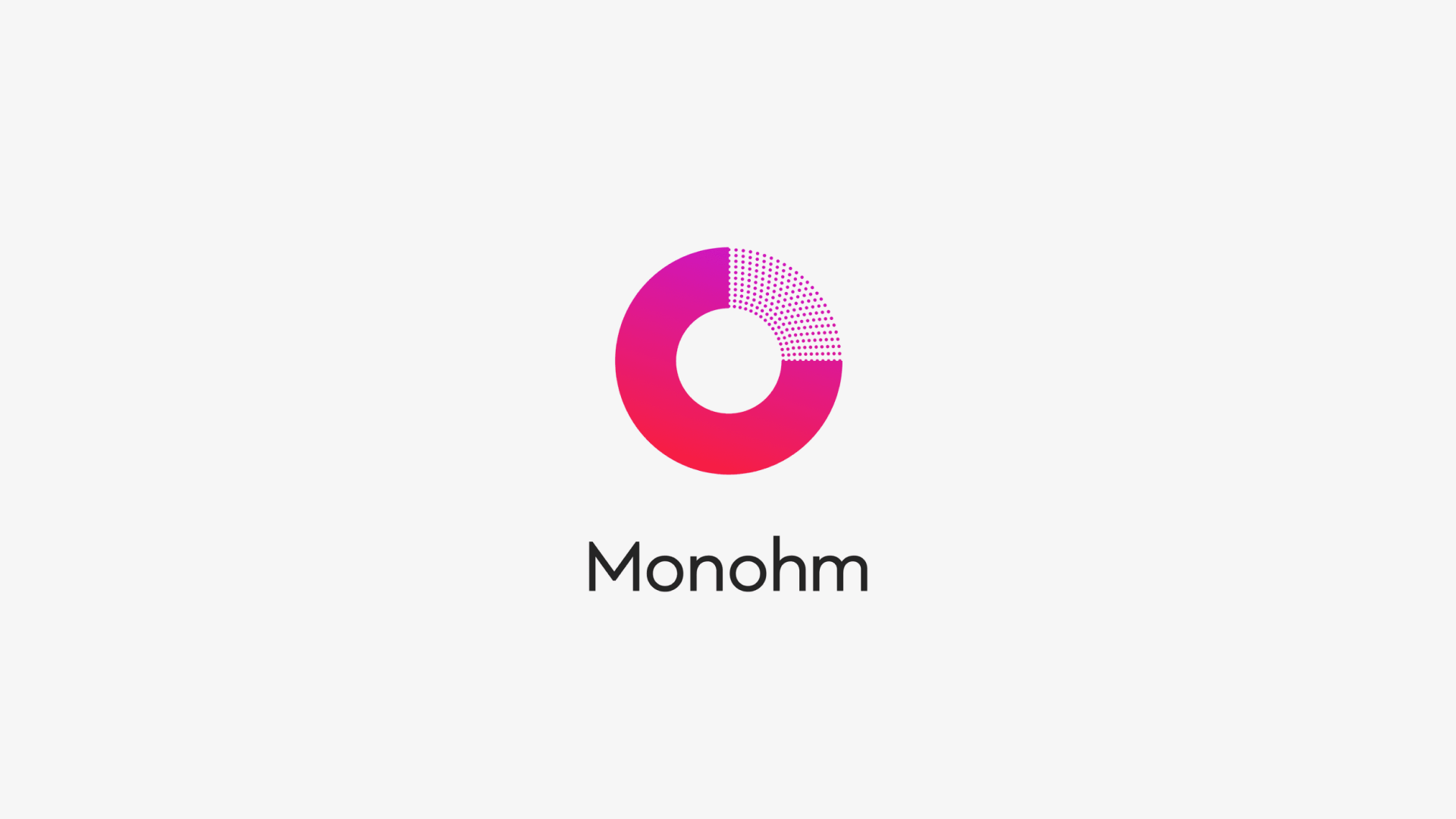
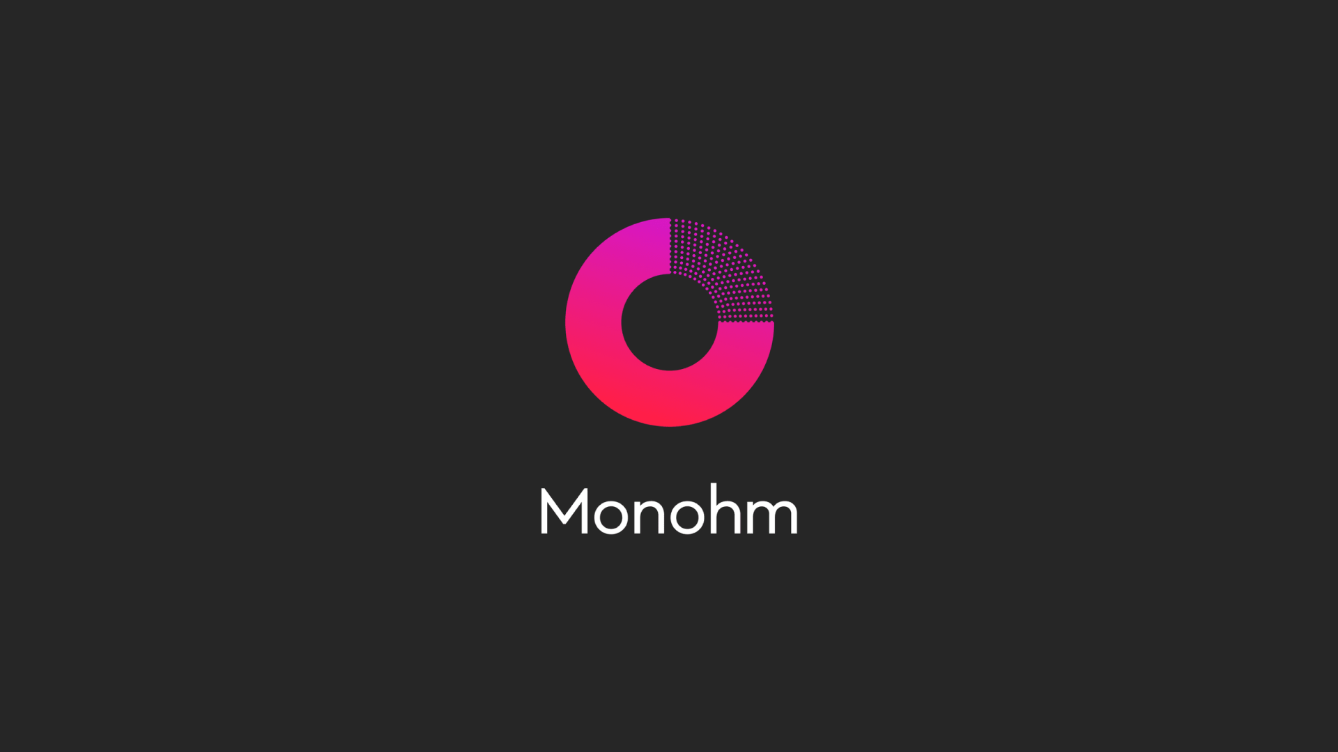
The new Monohm wordmark was drawn from the tradition of semi-humanist and geometric typefaces of the 1940s — Futura, W.A. Dwiggins' Metro, and Johnston Sans, best known for its enduring use in the London Underground. The goal was a mark that felt classic and quietly futuristic, with enough warmth to remain approachable. Timeless rather than trendy.
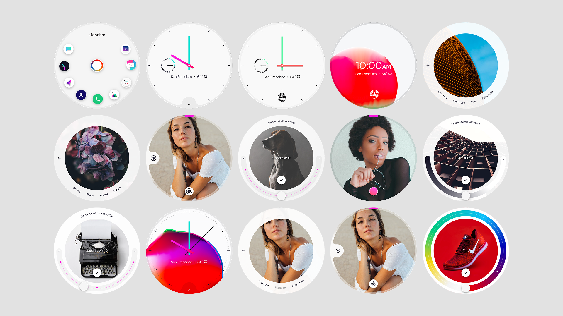
Light Theme
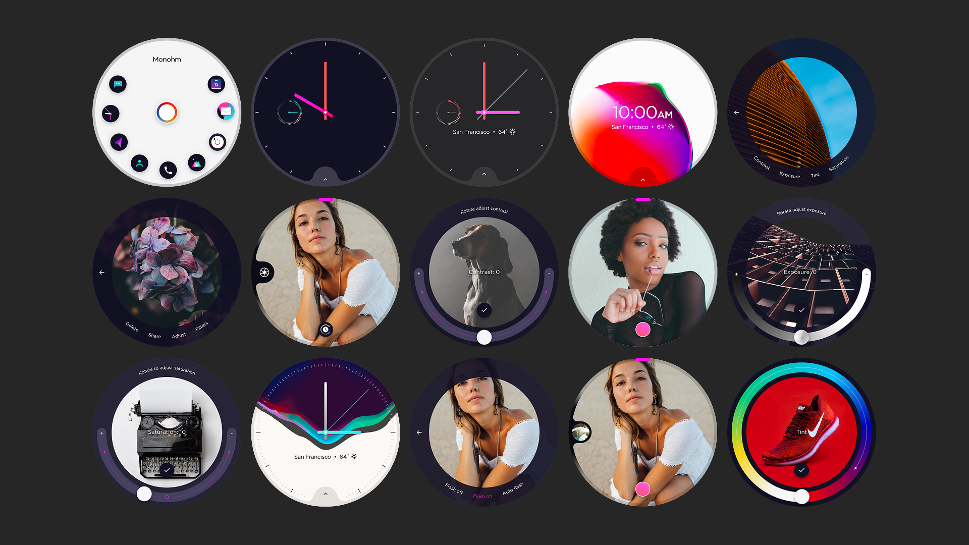
Dark Theme
The Product
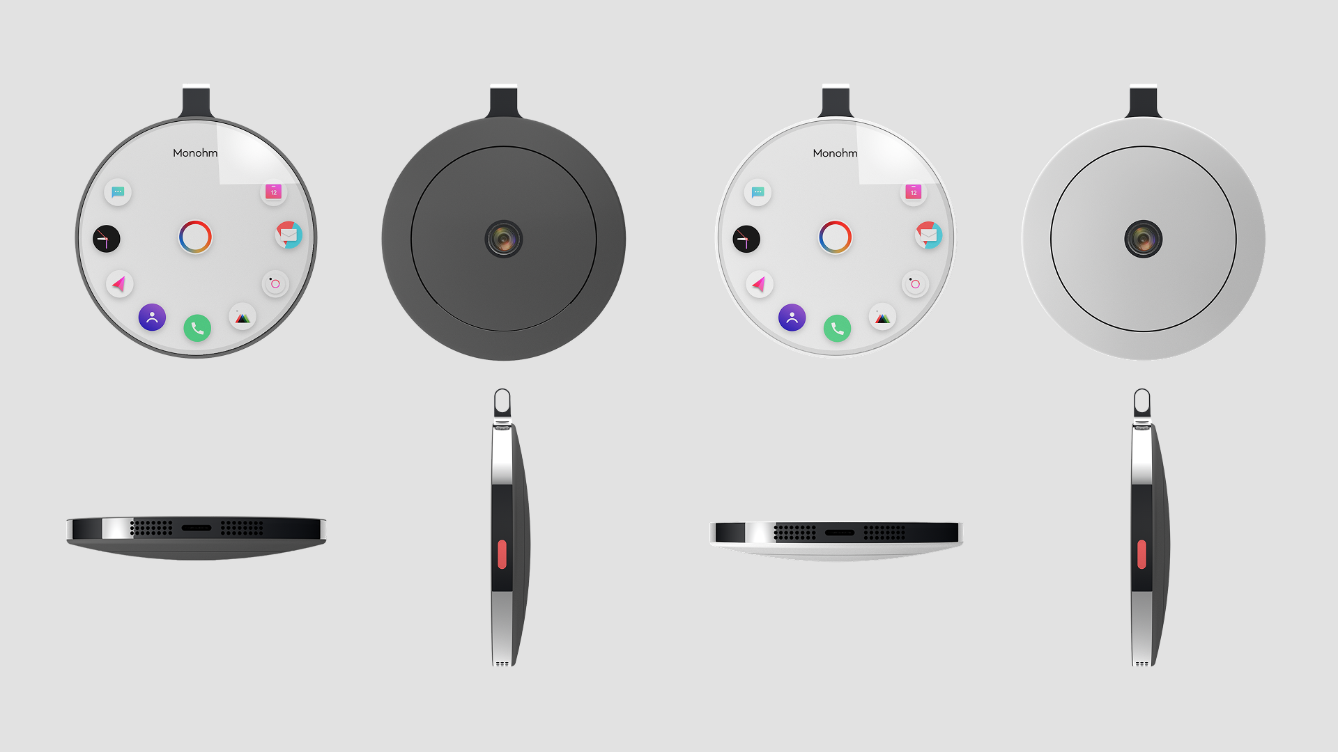
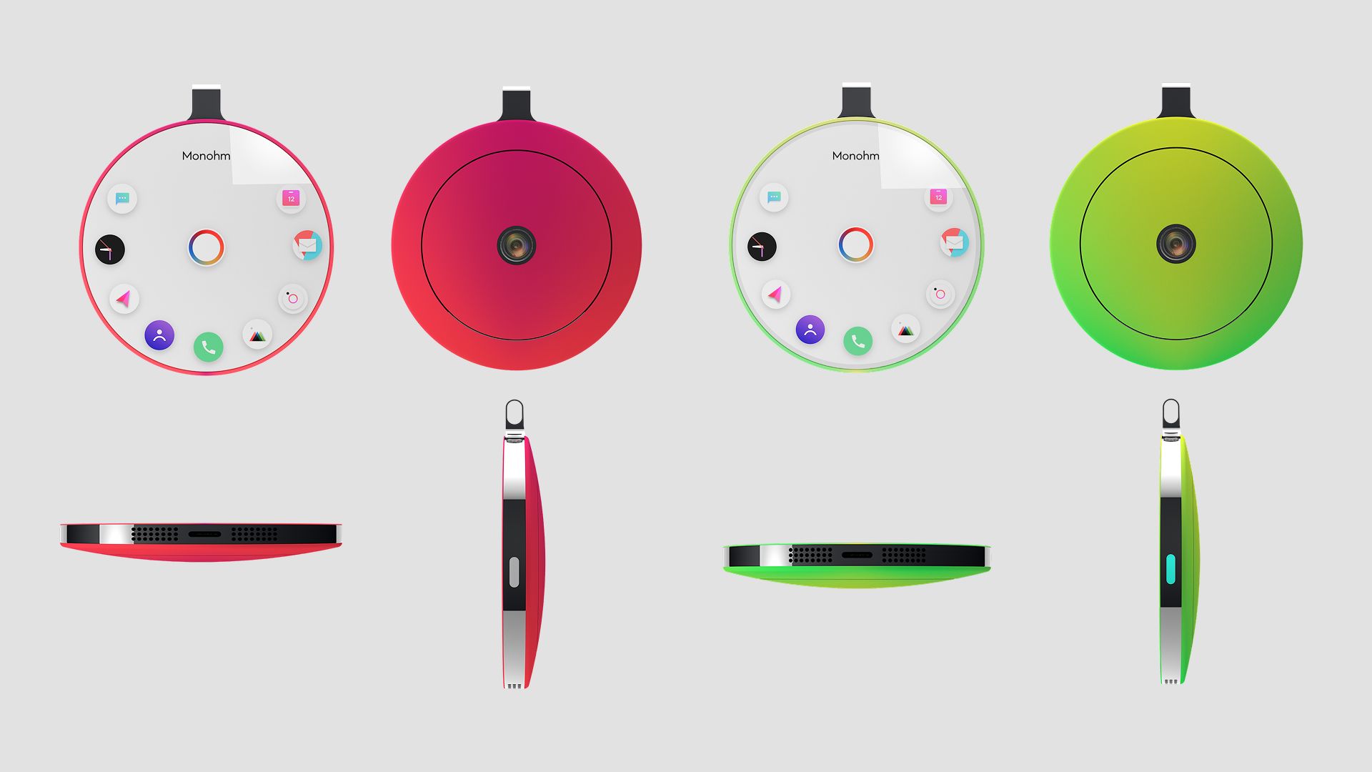
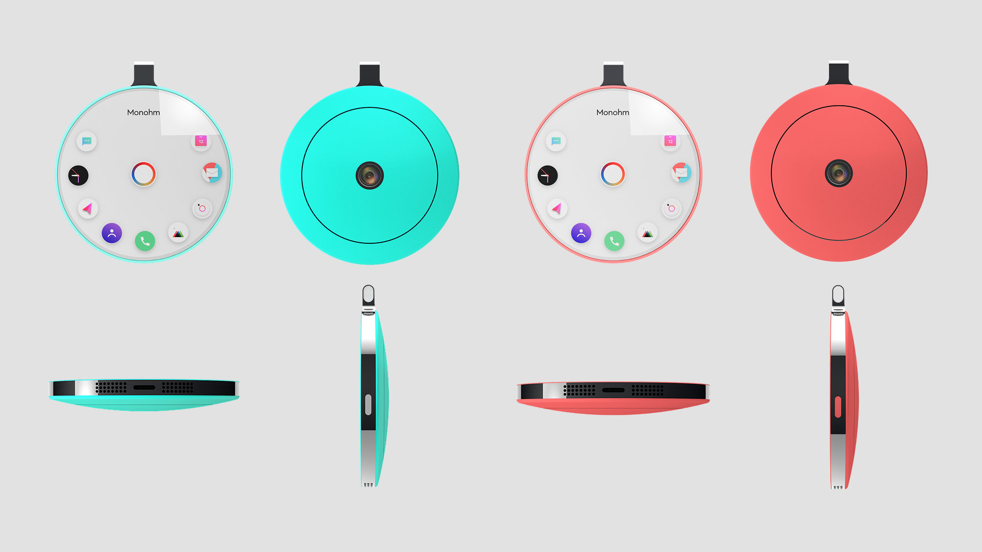
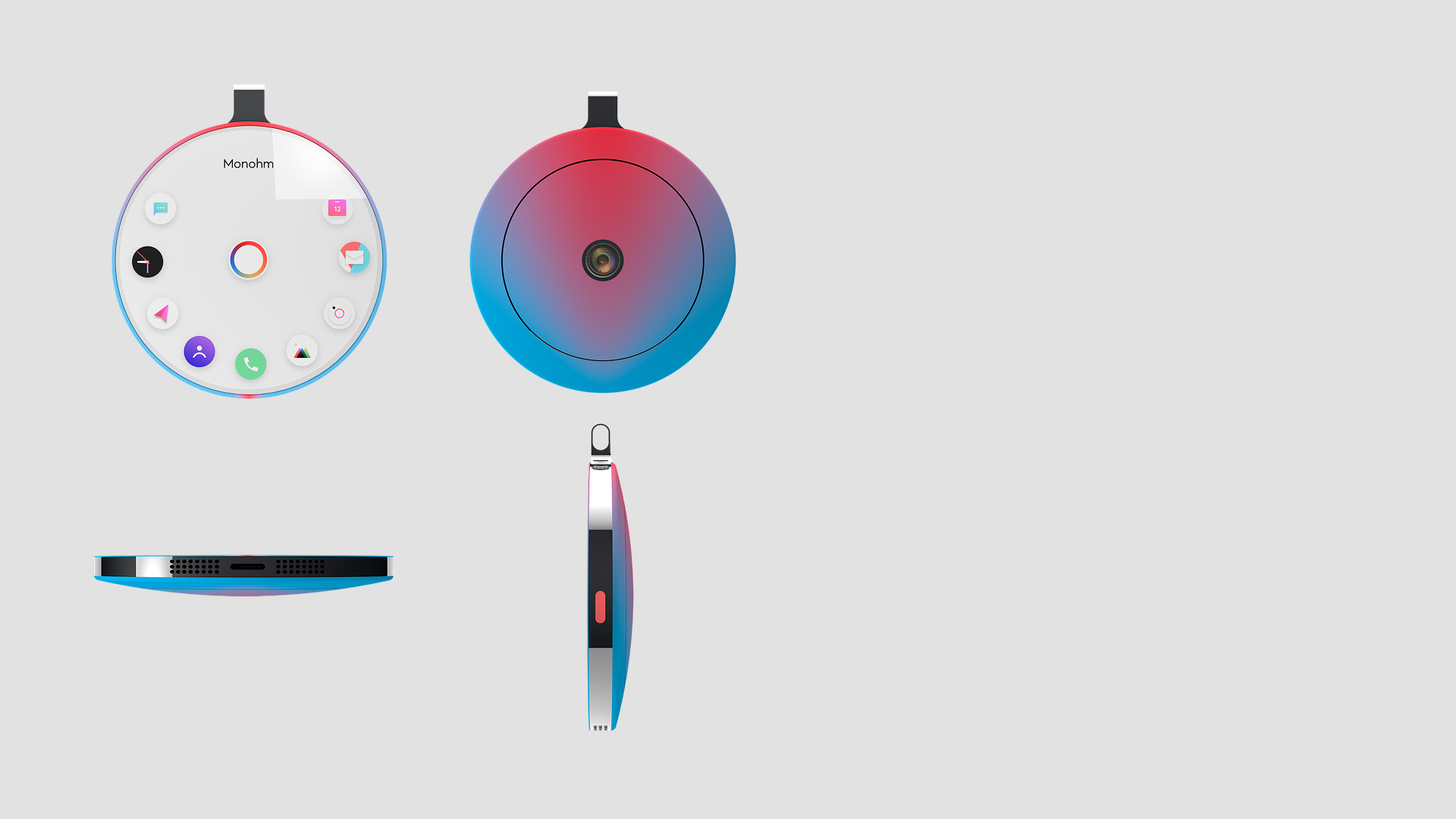
Alongside the brand work, a concept was developed for what a new Monohm device could look like. The direction was shaped by two reference points: the pocket watch as a psychological anchor — an object people already understood as intimate, personal, and worth keeping close — and the industrial design language of Leica, with its precision, restraint, and material honesty.
The concept was rendered in anodized aluminum with a gradient ceramic backing. The intent was a device that felt less like consumer electronics and more like a considered object — something with the quiet appeal of well-made jewelry.