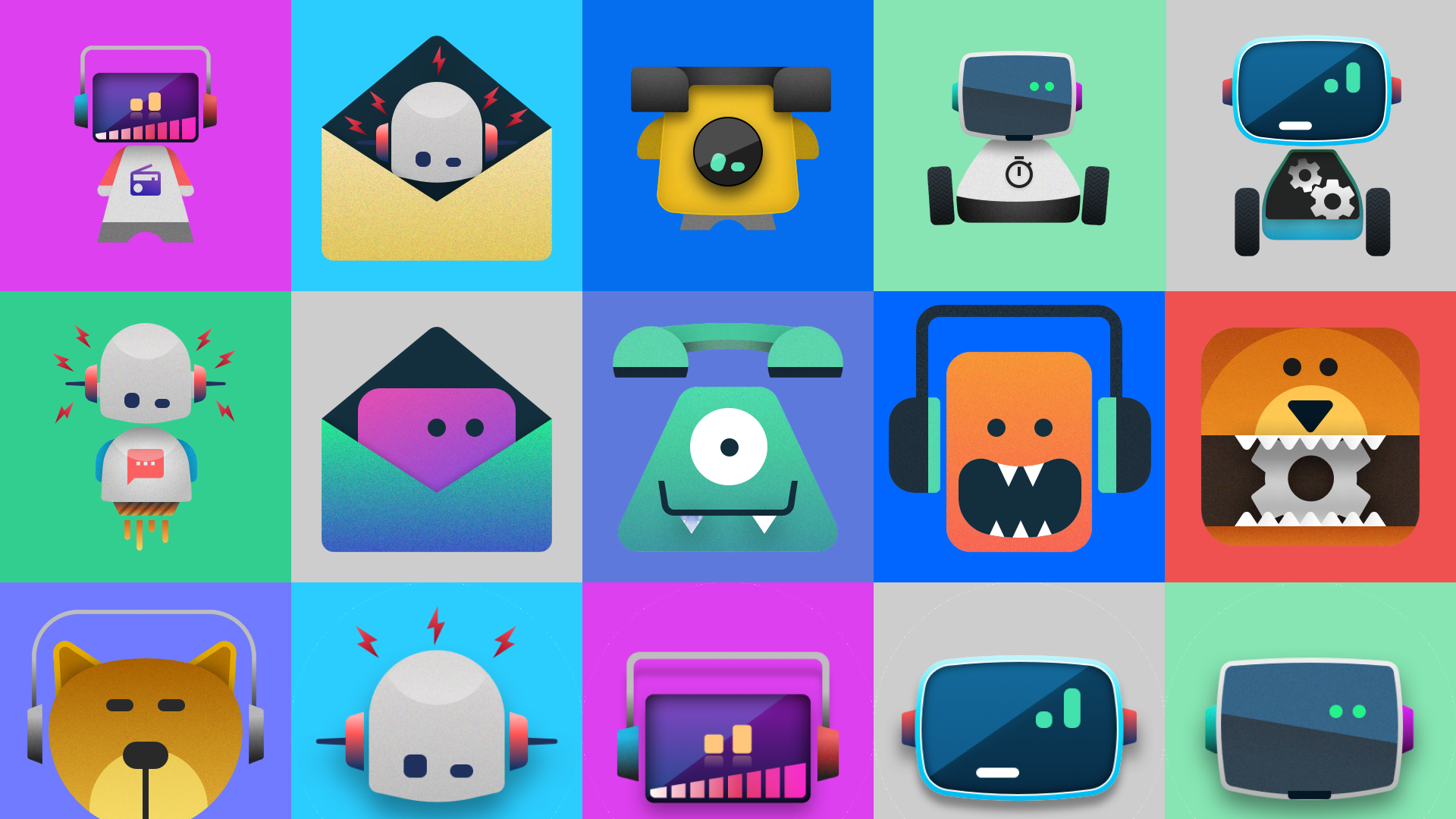
Glow is an IoT startup based in Los Angeles building communication devices for kids — designed to foster connection and self-expression through technology made specifically for them.
Role: Founding Product & Brand Designer
Client: Glow LLC
Type: Brand Identity & Design
Year: 2020
Tools: Illustrator, Figma, Cinema 4D
In 2020, I joined Glow LLC as a founding designer to help founder Ilya Pozin establish the company's brand identity and develop an investor deck. The two work streams ran in parallel — each informing the other as the brand took shape.
Brand Direction
Early conversations with Ilya centered on understanding his vision and the brands he admired. From the outset, he had a strong affinity for the name Glow — it carried a metaphorical resonance that felt right for the product. The idea that a child could shine or glow through connection was central to what the devices were designed to do.
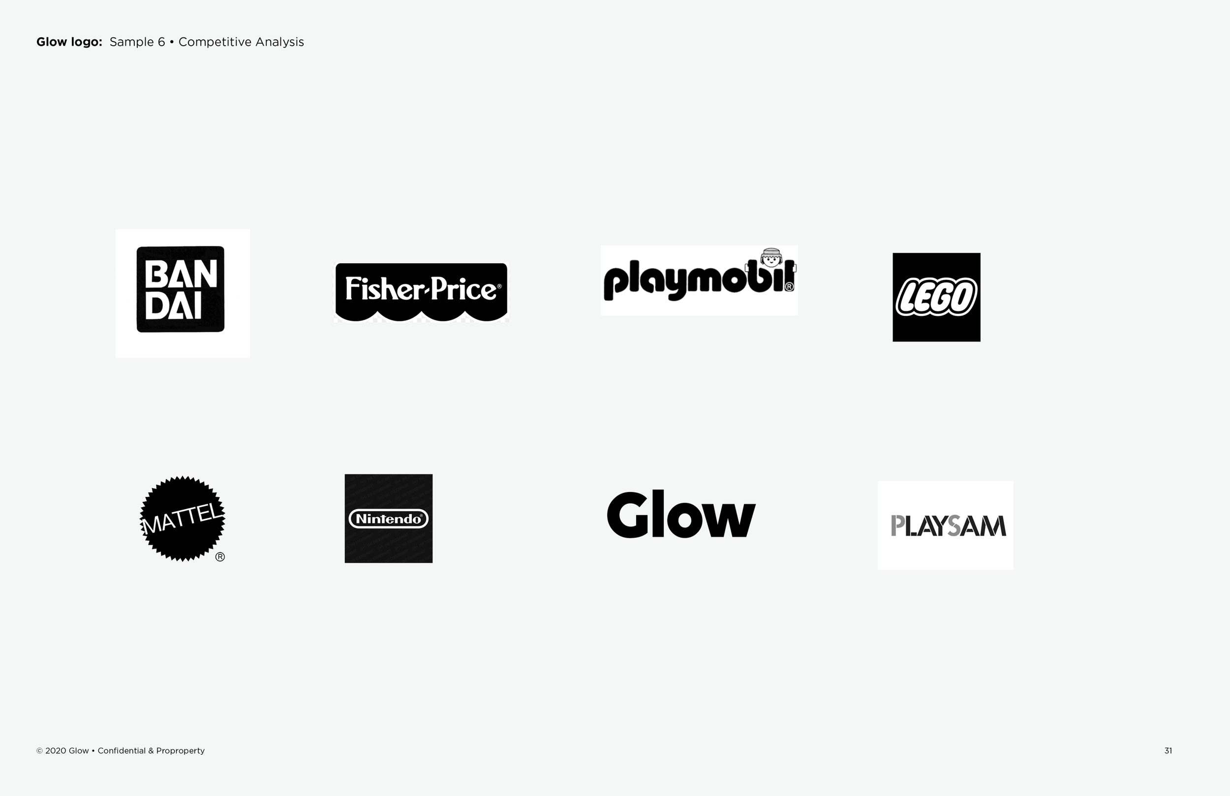
To ground the creative direction, a competitive audit was conducted across existing brands in the space and adjacent tech brands of interest. The analysis helped surface a clear path forward and informed how Glow could differentiate itself.
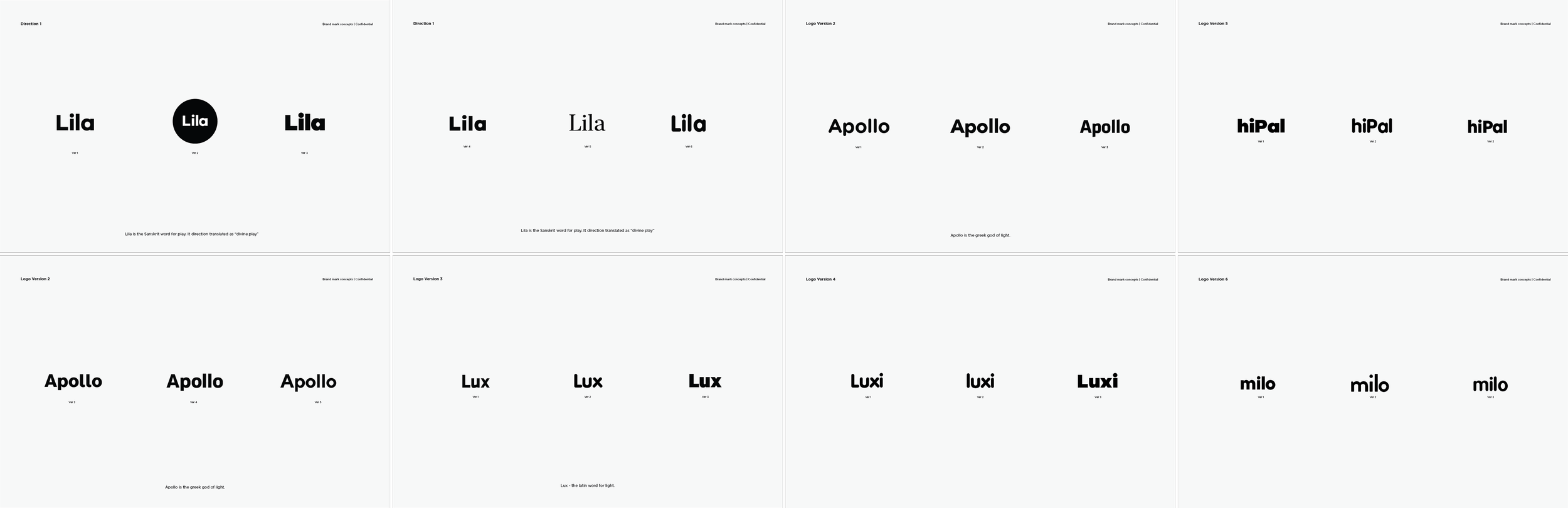
While alternative names were explored, we ultimately returned to Glow. The focus then shifted to developing a wordmark that struck the right balance — friendly and playful, but sufficiently understated to reflect the technological nature of the devices. With children already fluent in brands like Apple and Google, a subtle identity felt more appropriate than the exaggerated playfulness typical of toy brands. Ilya and I were aligned on that from the start.
The typeface selected was Volte — a sans-serif geometric that balanced warmth with restraint, hitting the tone we were looking for.
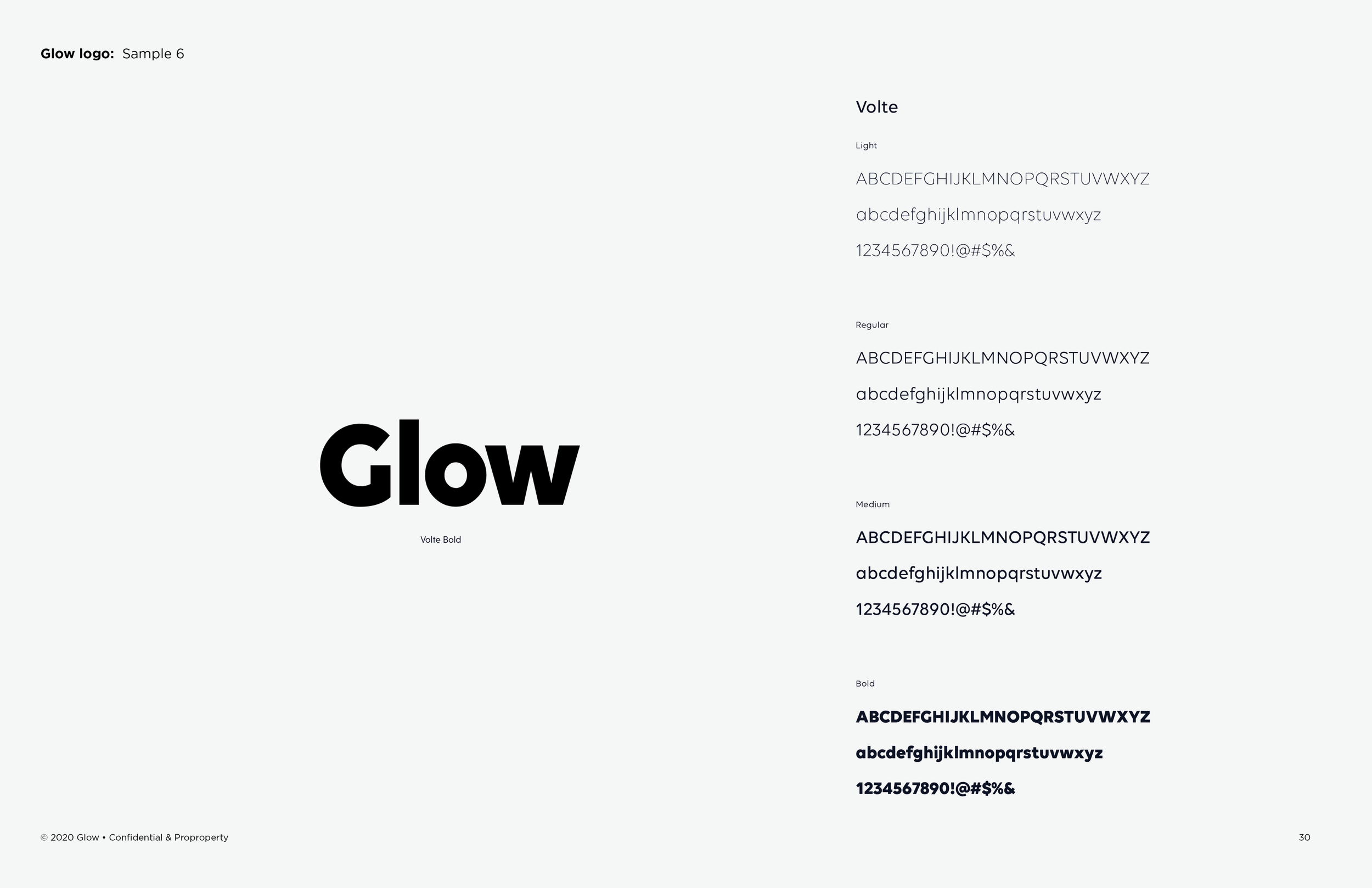
Glow word mark documentation
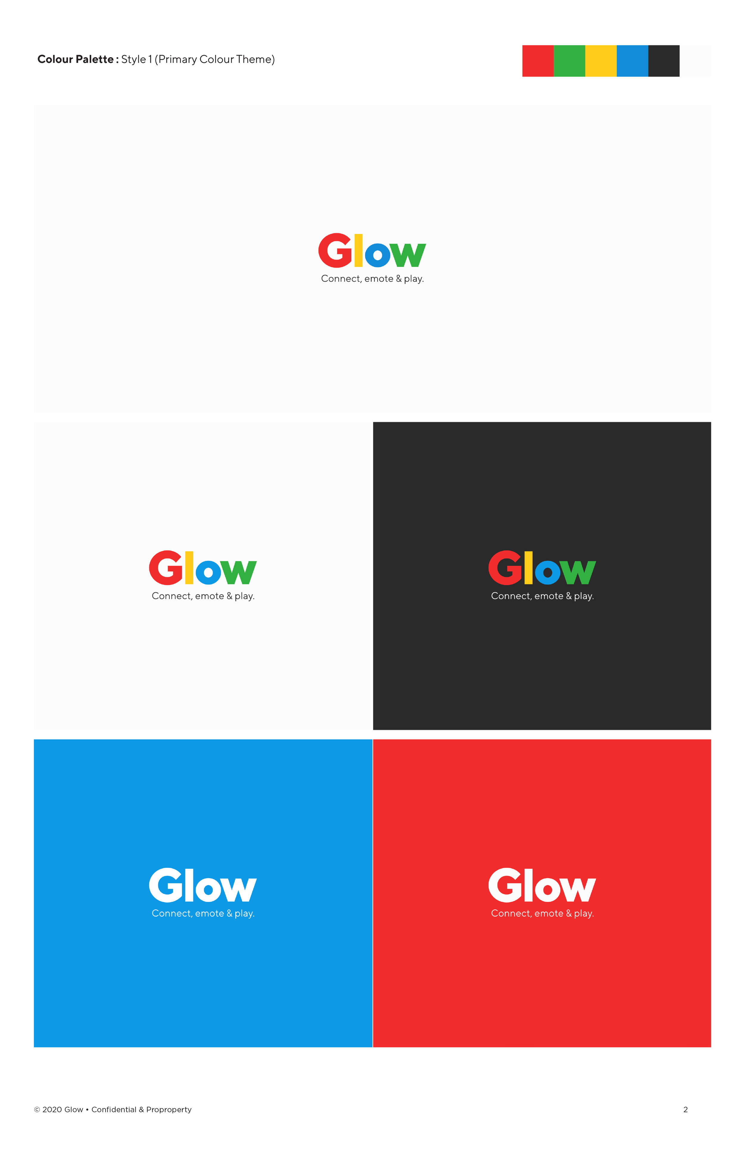
Color Palette
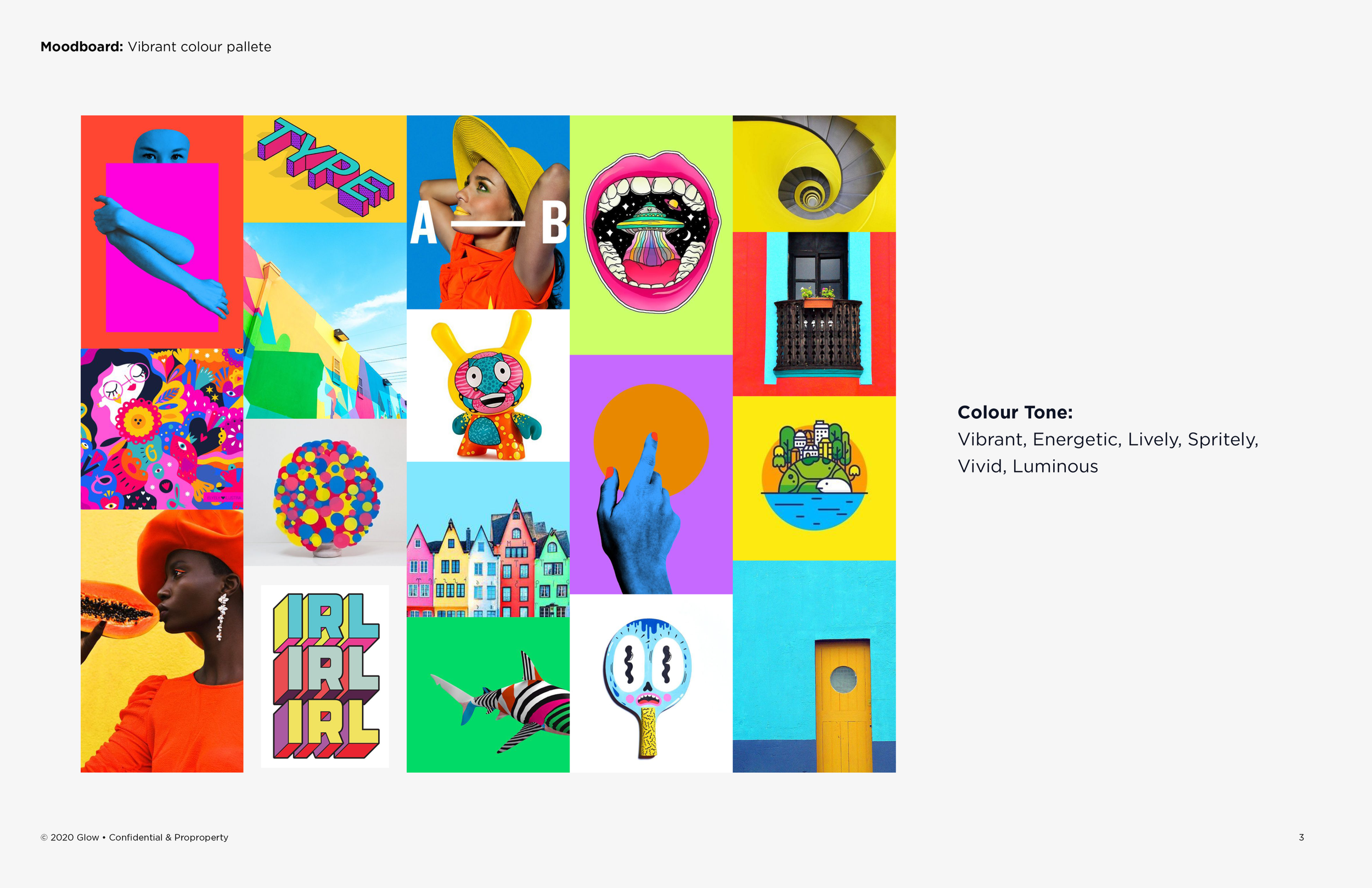
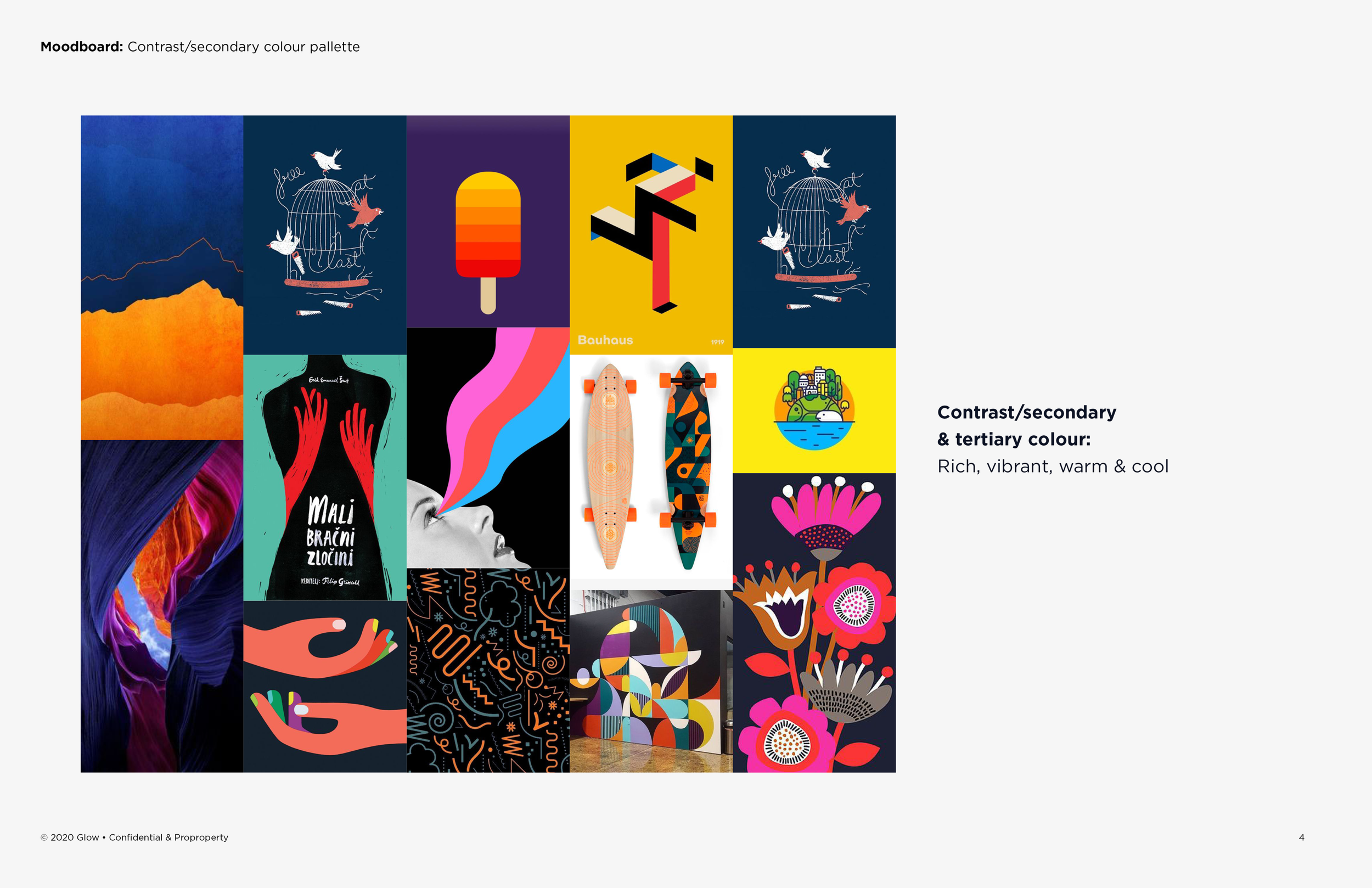
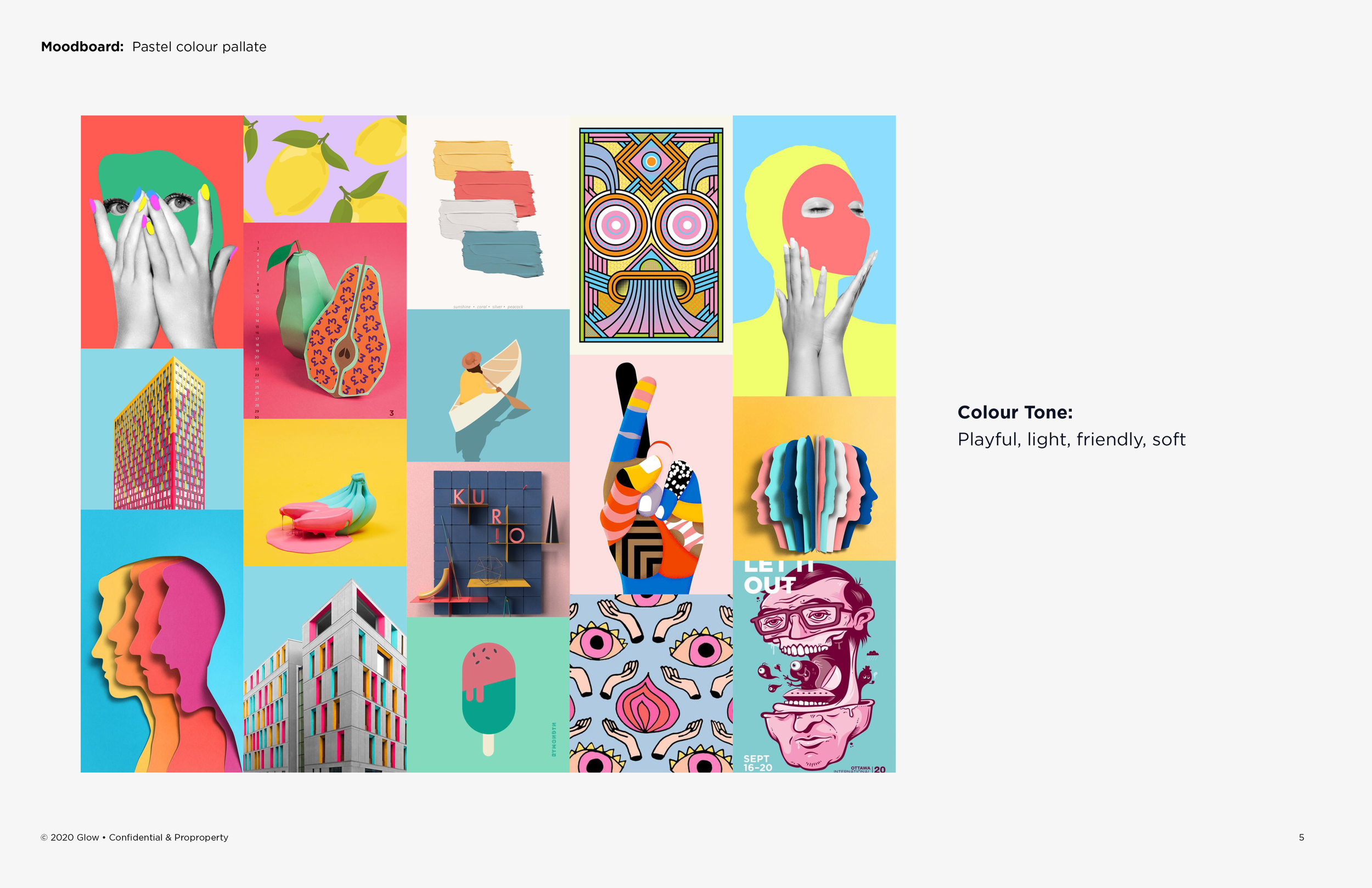
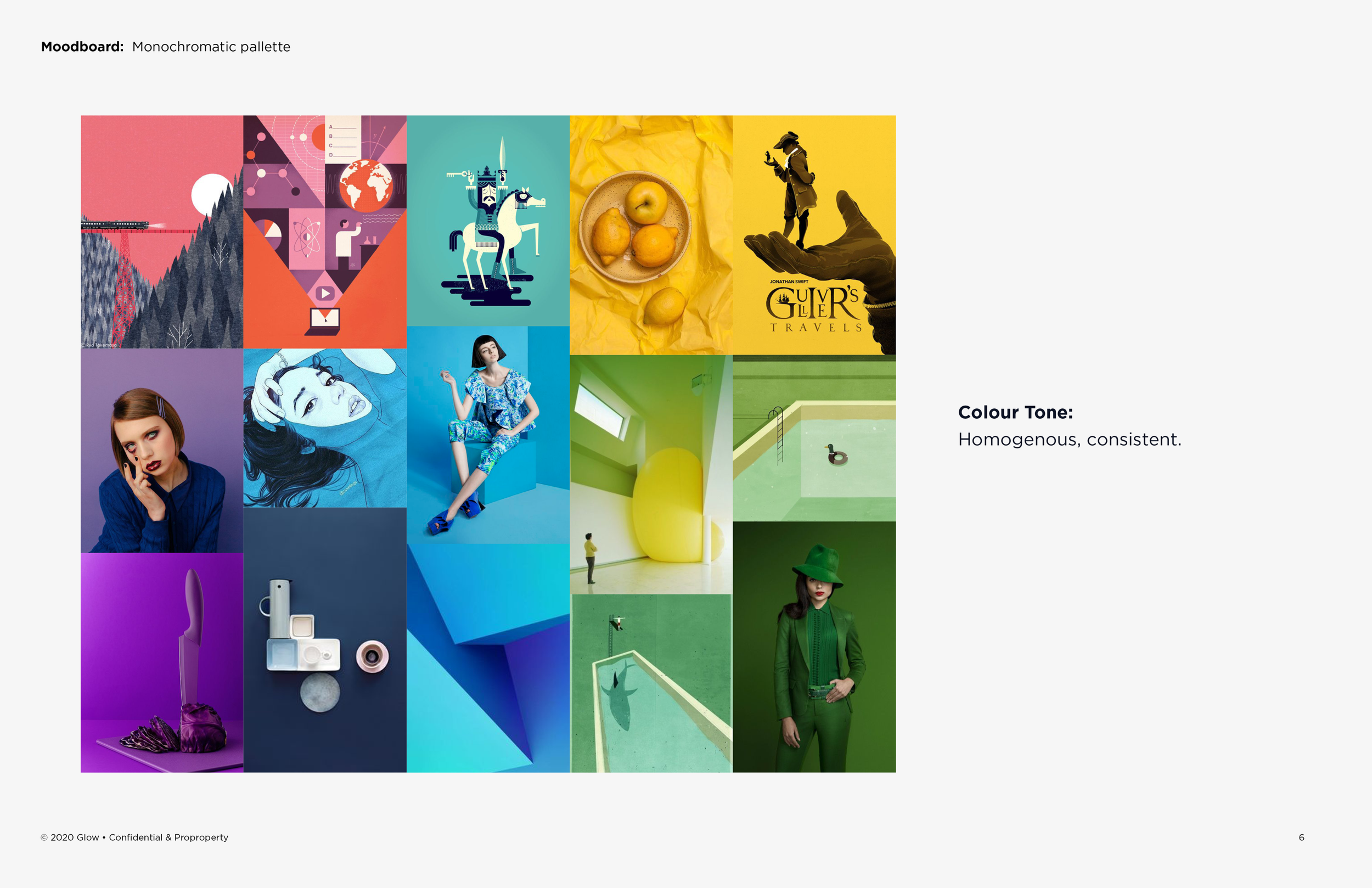
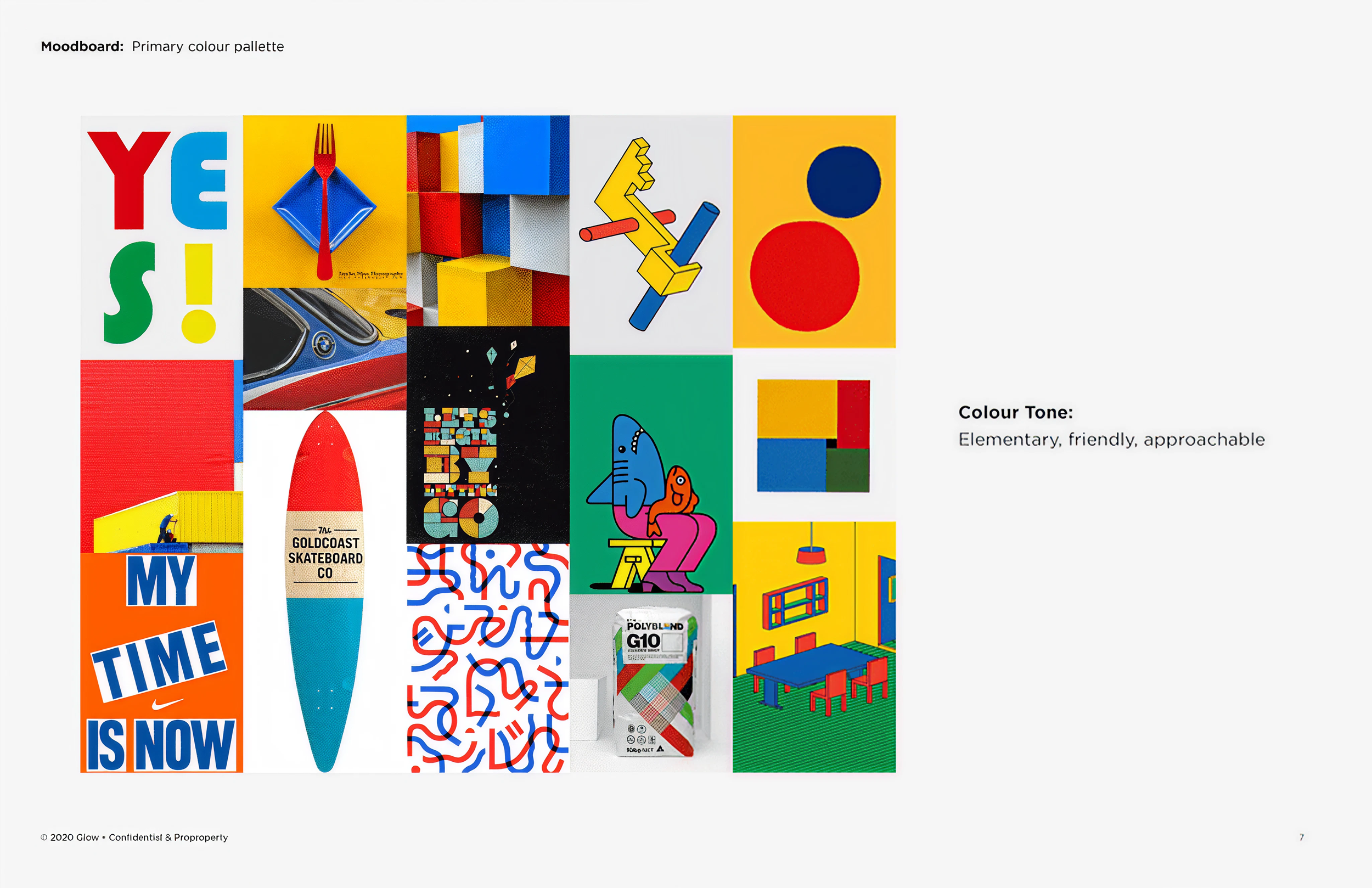
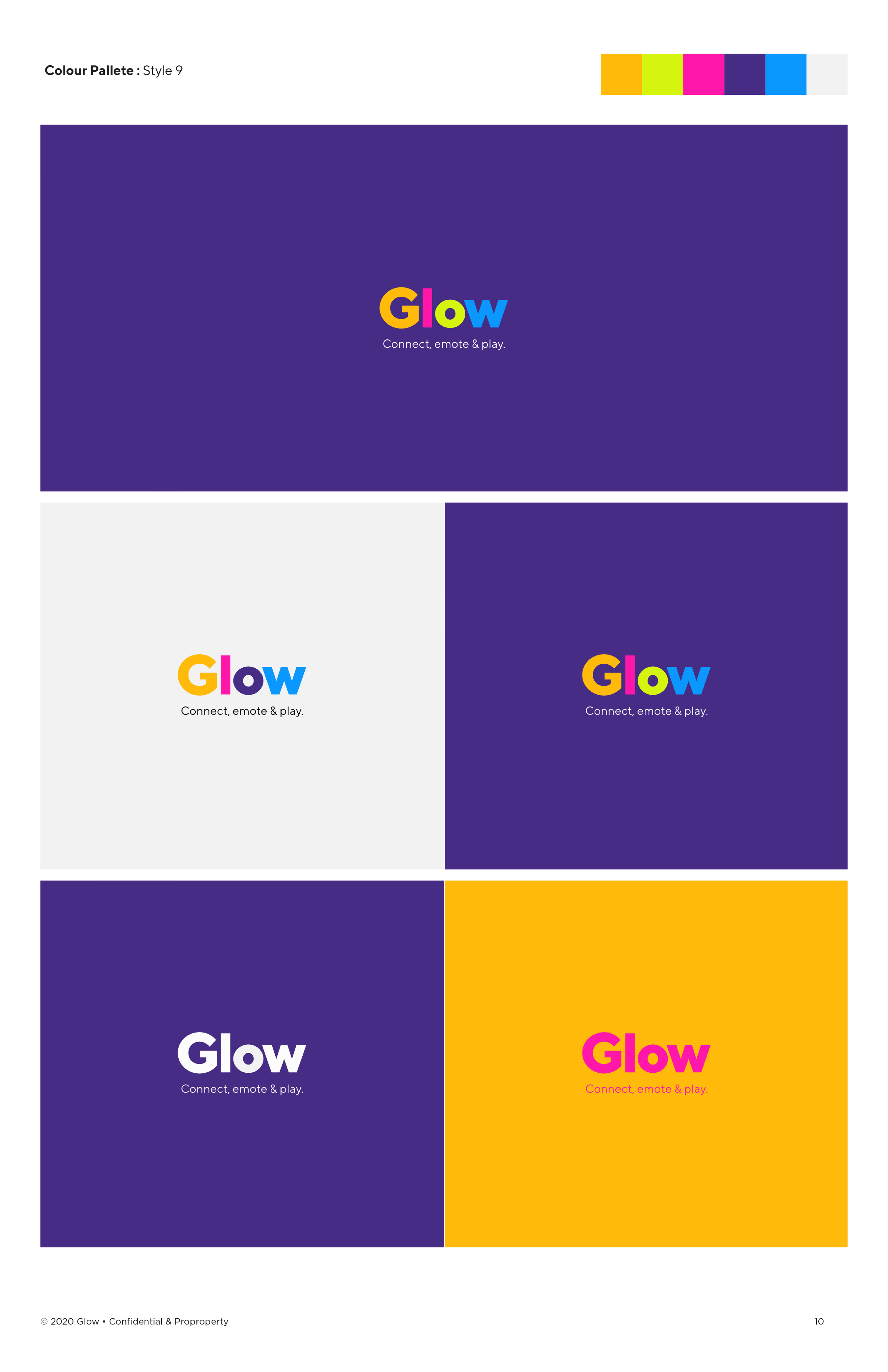
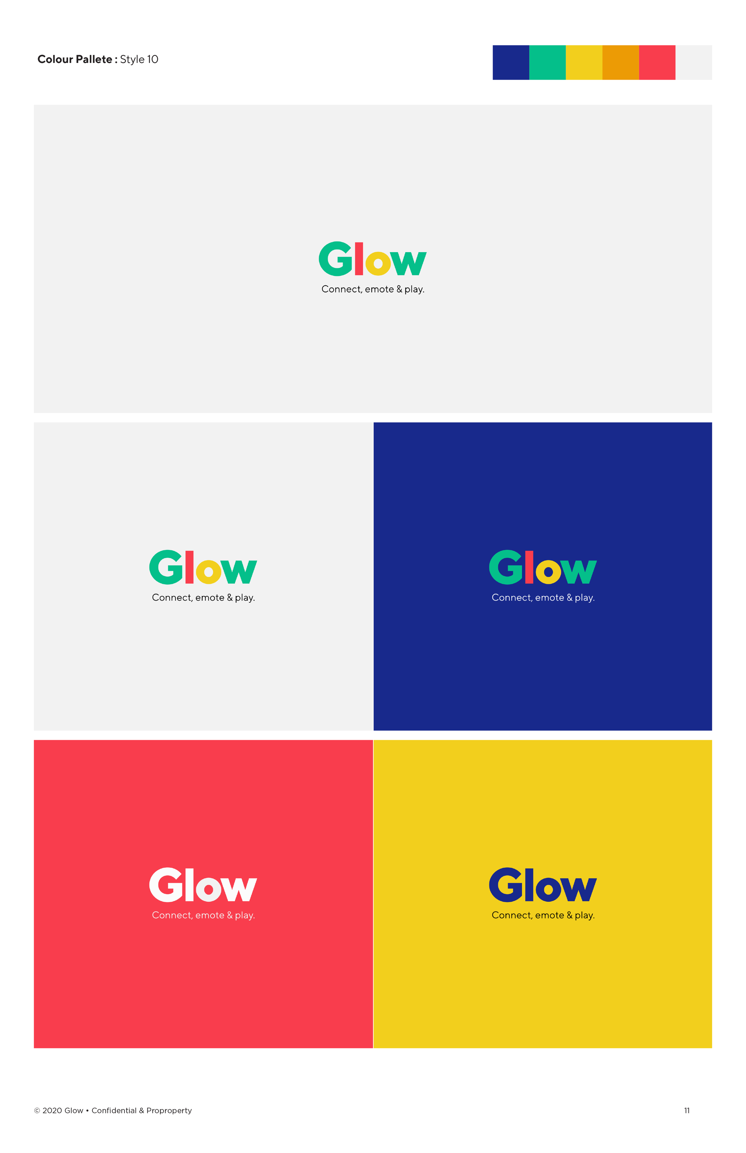
A series of mood boards were developed to explore different tonal directions — friendly, vibrant, approachable, and monochromatic. Rather than committing to a single direction, elements from multiple boards were fused into a palette that captured vibrancy and contrast while staying true to the brand's intended character.
Application
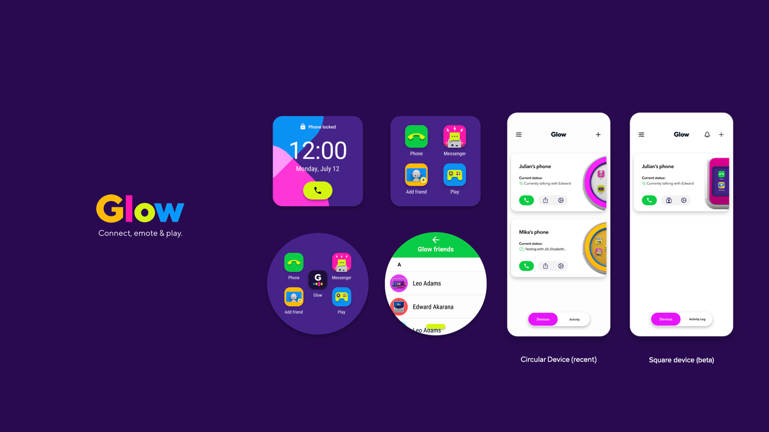
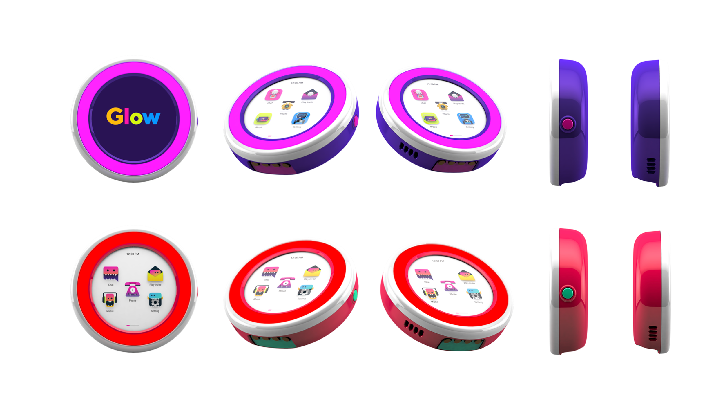
With typography and color established, the identity was applied across key touch points — the IoT device launcher, the iOS mobile app, and the hardware itself — ensuring a consistent brand experience across every surface a child or parent would encounter.