Lightbrite is an early-stage wellness technology startup developing Thea, a wearable that pairs real-time biometrics with sound therapy to support emotional intelligence. I rebuilt the brand from the ground up — strategy, identity, and system.
Role: Brand Strategy & Identity Design
Client: Lightbrite
Type: Brand Identity & System
Year: 2023 - 2026
Tools: Illustrator, Figma, Midjourney, Photoshop
The Challenge
When I came on board, the brand was effectively starting from zero. Lightbrite had previously hired a design firm to develop the industrial design for the Thea wearable, along with an initial attempt at branding the product. But the work felt surface-level — aesthetically driven without the research or strategic thinking needed to support it — and the founders were dissatisfied with the outcome.

I restarted the process from first principles, building the brand on a stronger strategic foundation. Three major challenges quickly emerged:
1 | Defining a New Category
Thea combined wearable health technology with sound therapy — two established fields that had not previously been unified in a consumer product. With no clear category or competitive references, the brand needed to establish immediate context and meaning for something unfamiliar.
2 | Structuring a Dual-Brand System
Lightbrite and Thea already existed as separate names before I joined. The challenge was defining their relationship and creating a clear, intuitive brand architecture between company and product.
3 | Balancing Data & Emotional Resonance
The founders envisioned a premium product with broad appeal — which meant finding an androgynous aesthetic that felt warm and feminine in sensibility while remaining confident enough to resonate with men. Beyond gender, the brand needed to thread the line between scientific credibility and emotional warmth, feeling trustworthy without becoming clinical or cold.
Research & Discovery
Before defining any direction, I needed a grounded understanding of the space, the stakeholders, and the intended audience. I approached this through multiple parallel streams of research.
Stakeholder Interviews
I conducted interviews with Lightbrite's two founders and CEO to clarify the company's mission, product vision, and intended market positioning. These conversations surfaced key tensions, ambitions, and internal language that ultimately informed the brand's strategic foundation.
Several clear brand beats emerged: the product needed to feel premium and high-end, appeal to women while remaining accessible to men, and strike a careful balance between the worlds of wellness and technology. The founders also introduced two concepts central to their vision — cymatics and sacred geometry — as potential visual and conceptual anchors for the brand.
Original Market Research
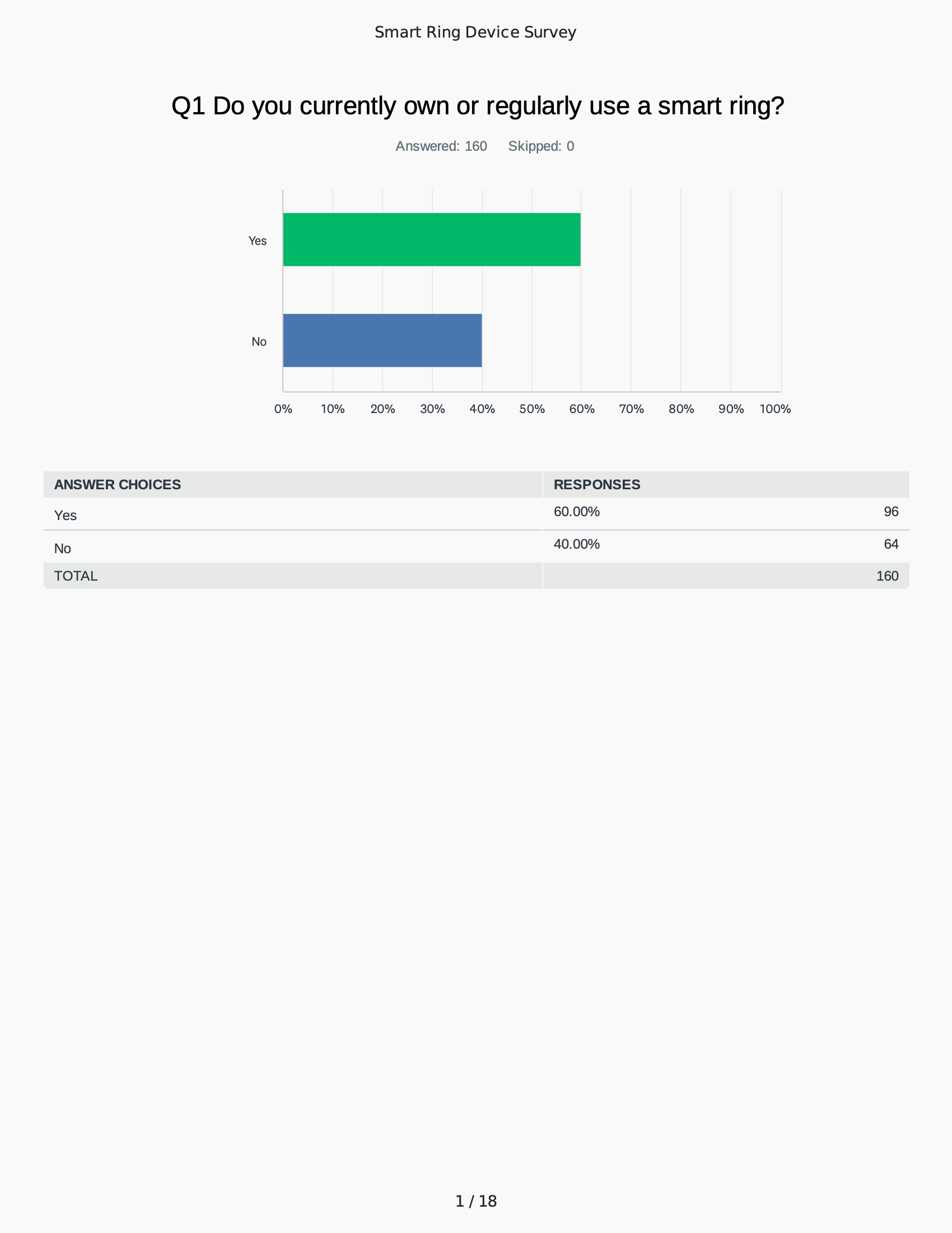
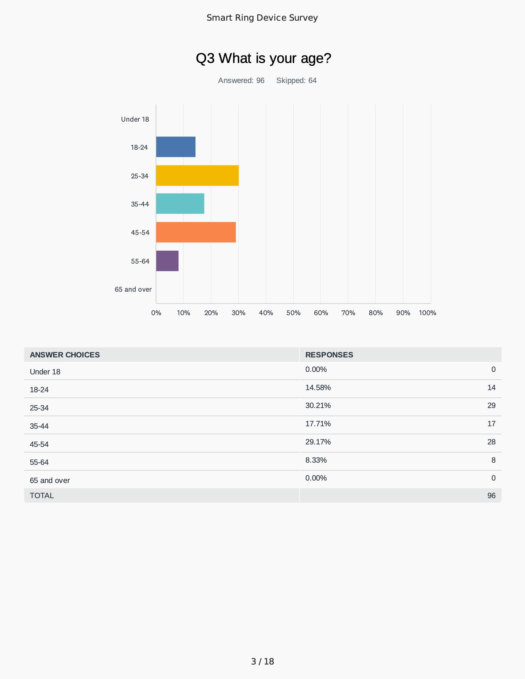
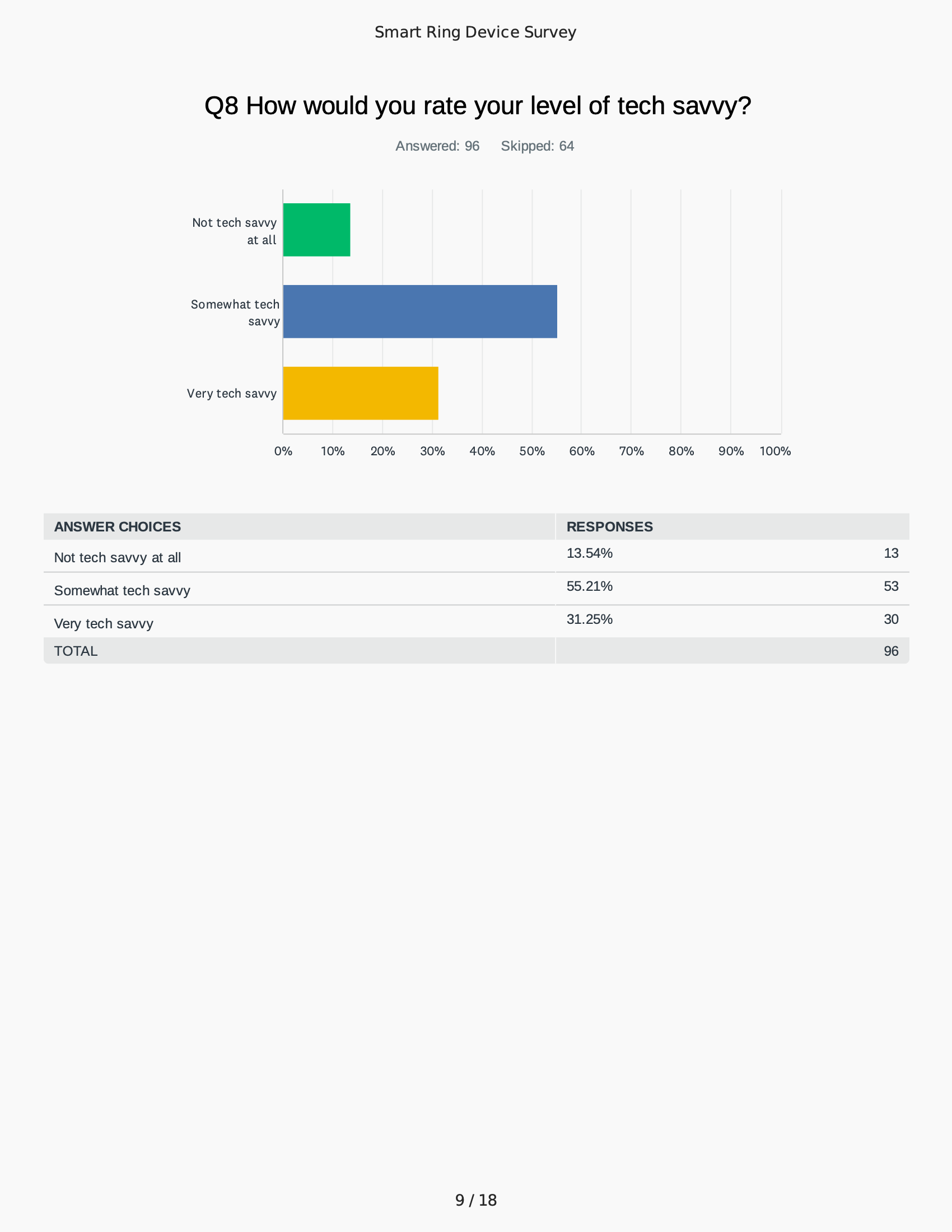
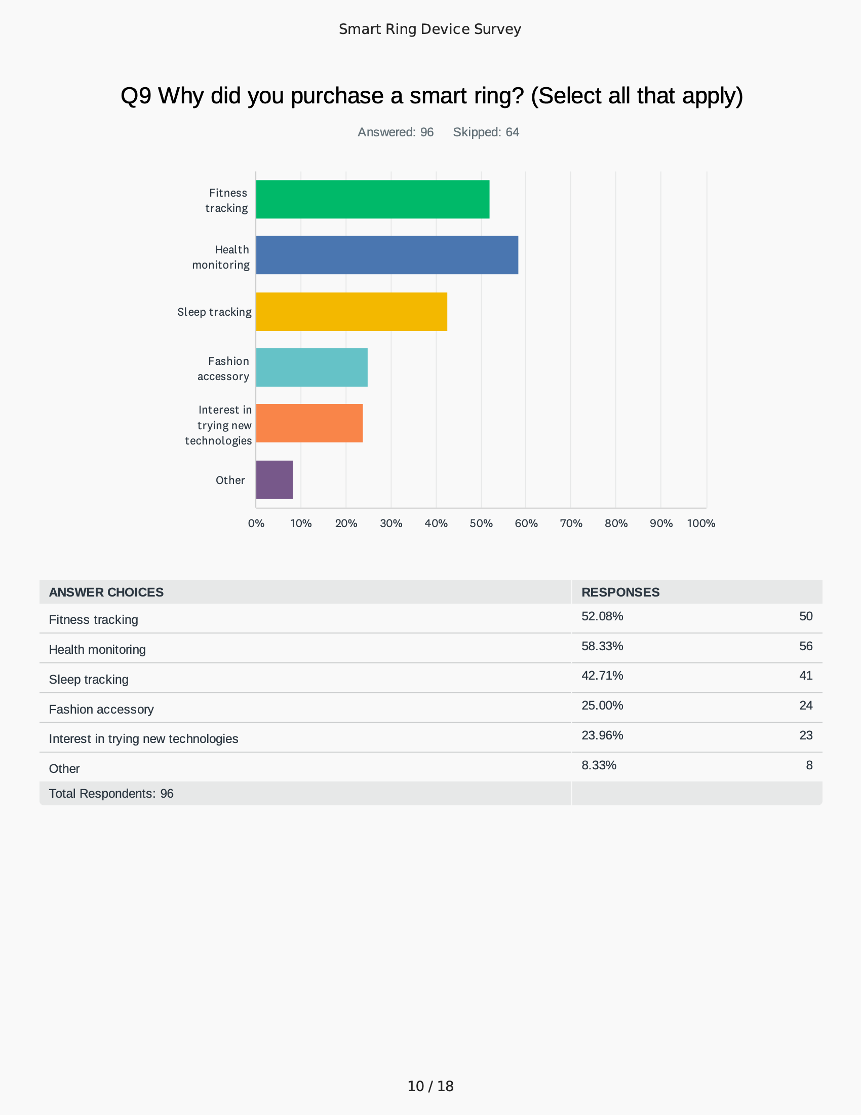
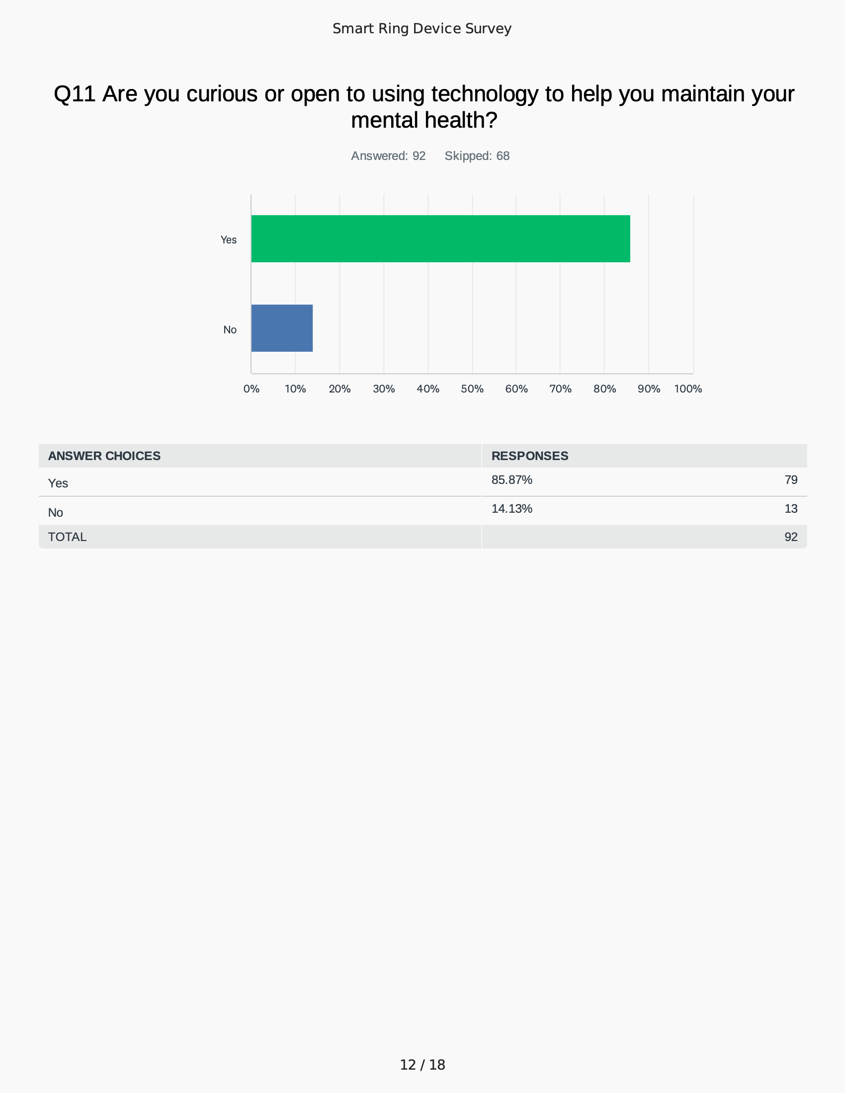
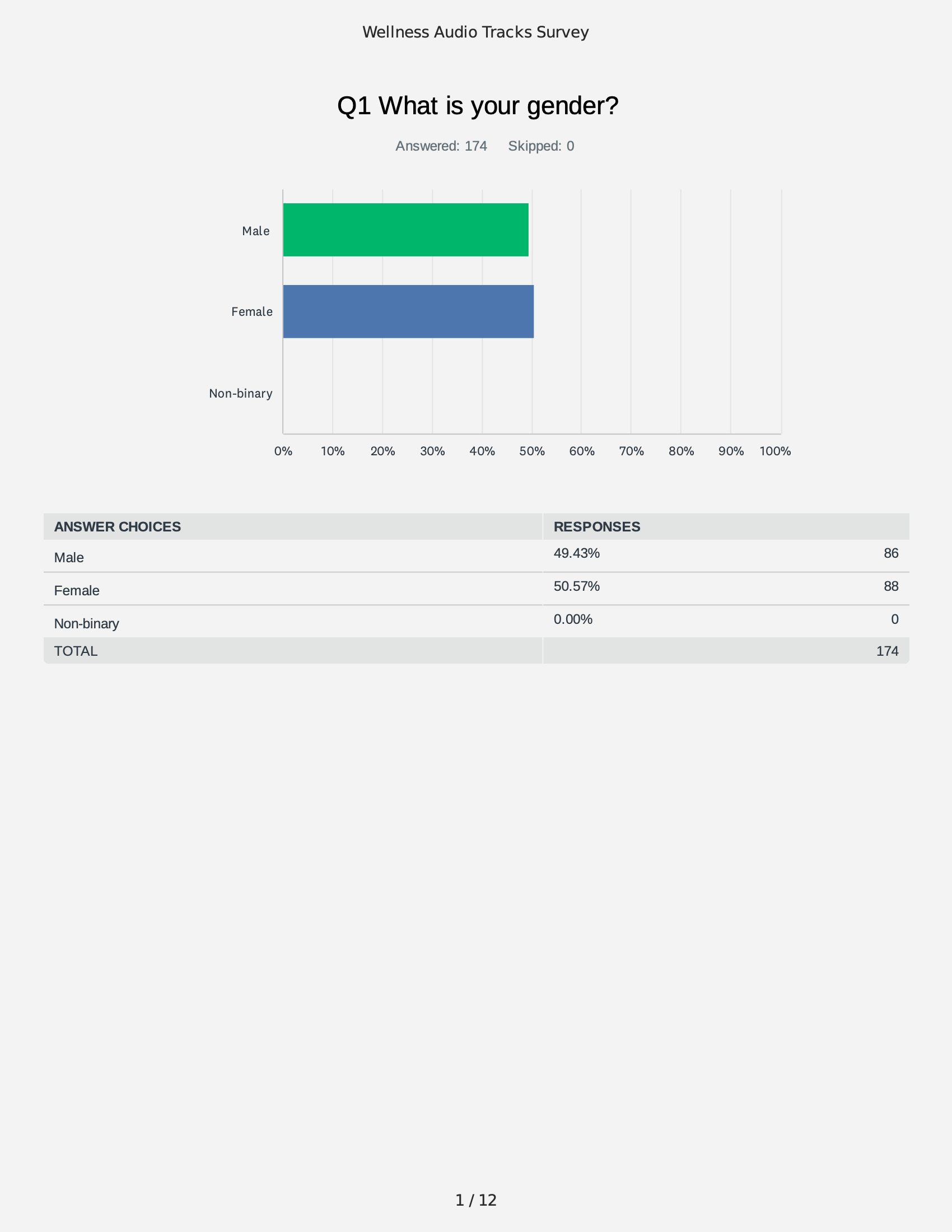
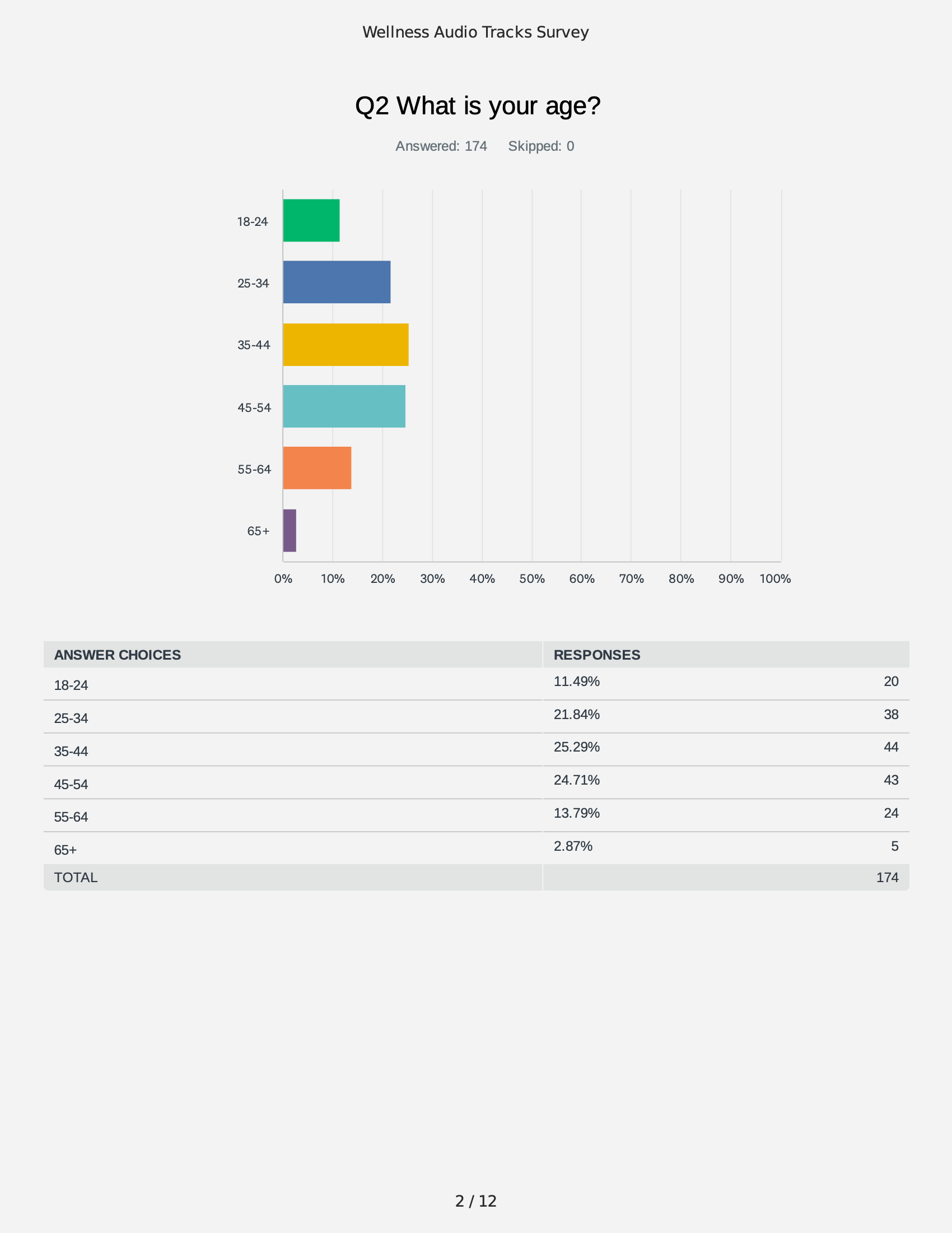
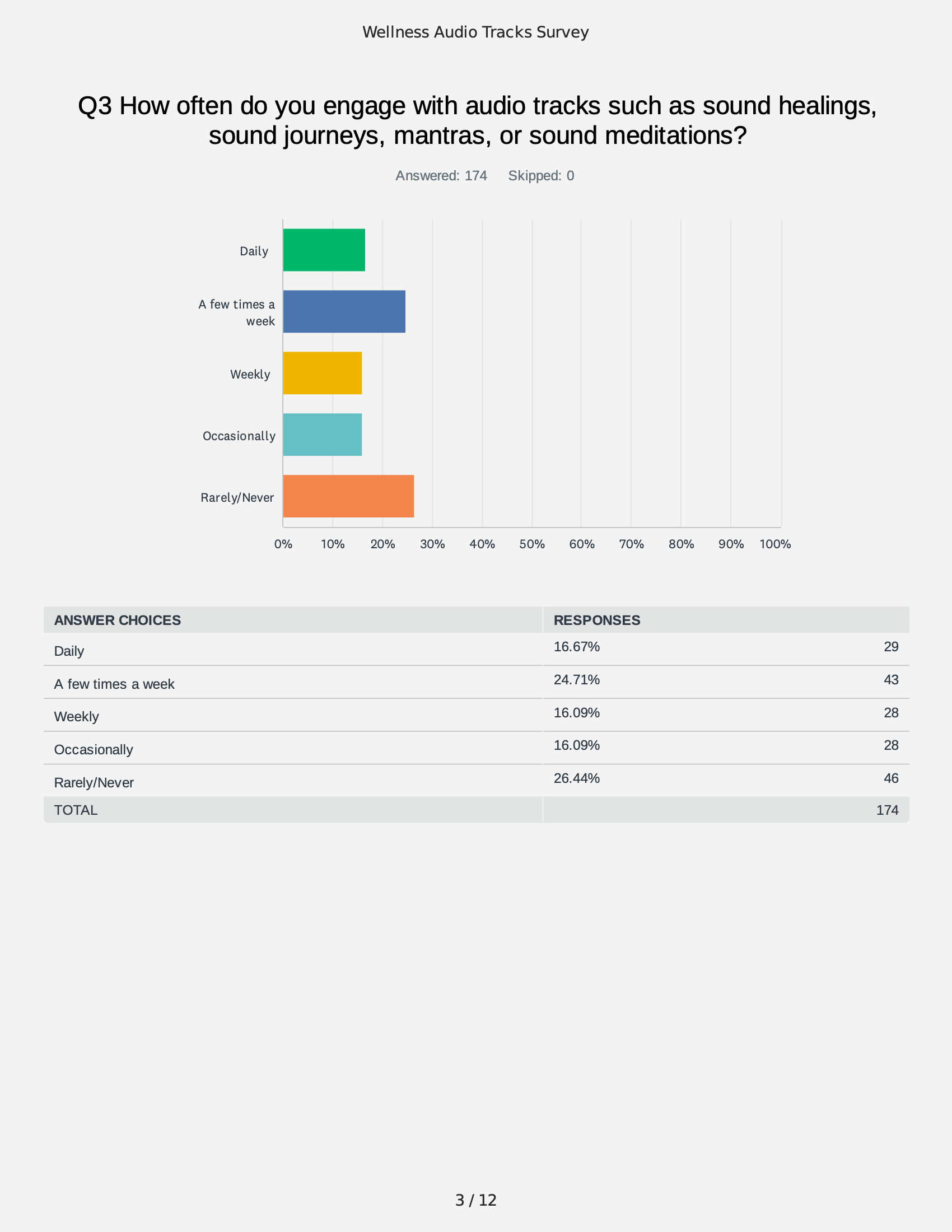
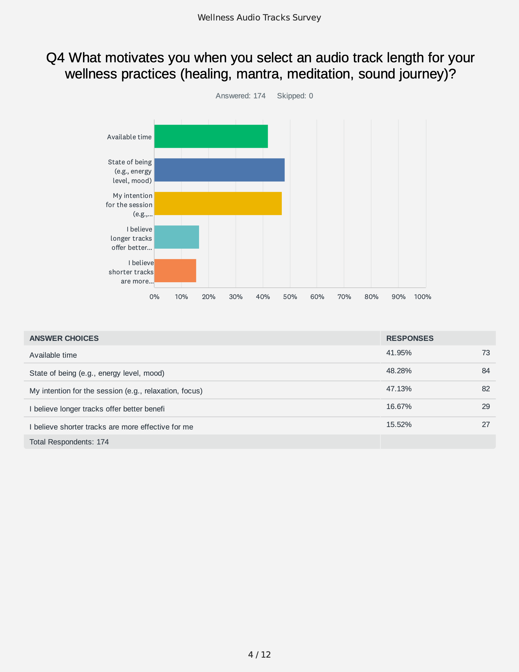
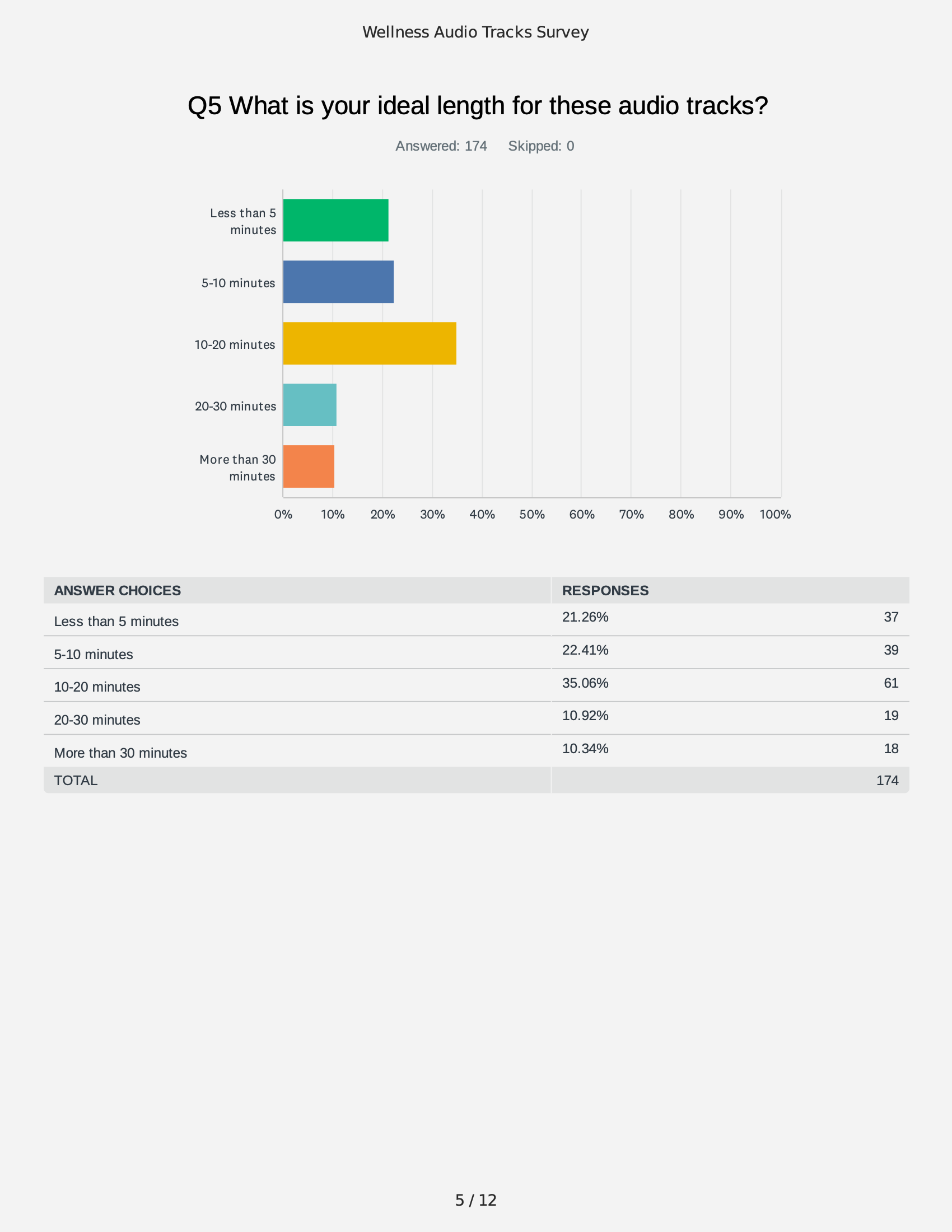
To ground the work in audience insight, I designed and ran two original surveys — one with smart ring users, the other with people who use wellness audio tracks — to understand who the audience was, what motivated them, and how open they were to technology as a tool for emotional wellbeing. Among smart ring users, 60% owned or regularly used a device, primarily for health monitoring (58%) and fitness tracking (52%), and a striking 86% were open to using technology for mental health support — directly validating Lightbrite's core proposition. This group skewed female (58%), educated, and concentrated in the 25–34 and 45–54 age ranges. The wellness audio audience was nearly gender-balanced and weighted toward the 35–44 and 45–54 groups, but the most important finding was behavioral: usage was primarily mood-driven (48%) rather than habitual — a key insight that shaped how Thea should meet users emotionally, in the moment, rather than prescribe fixed routines.
Brand Pillars & Attributes
Insights from stakeholder interviews, survey findings, and broader research were synthesized into four brand pillars that guided all subsequent brand decisions:
Fearless Innovation - curious, exploratory, resilient, unconventional, forward-thinking
Active Ally - supportive, collaborative, optimistic, knowledgeable, human-centered
Scientific Pragmatism - objective, results-driven, grounded, analytical, precise
Expressive Artistry - evocative, experimental, reflective, emotive, aesthetic
Together, these pillars established a personality framework that balanced scientific credibility with emotional warmth, allowing the brand to operate across both technical and human contexts.
Competitive Audit
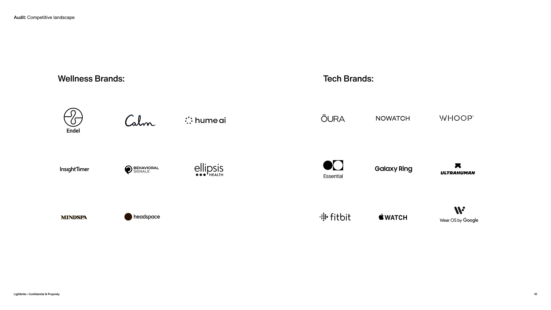
I reviewed brands across both wellness and technology to identify saturation points and openings for differentiation. A clear pattern emerged: most defaulted to standard logotypes in light-to-medium weight sans serifs — a visual language that felt safe, predictable, and largely interchangeable. That gap directly informed Lightbrite's creative direction.
Color & Logo Mark
Research
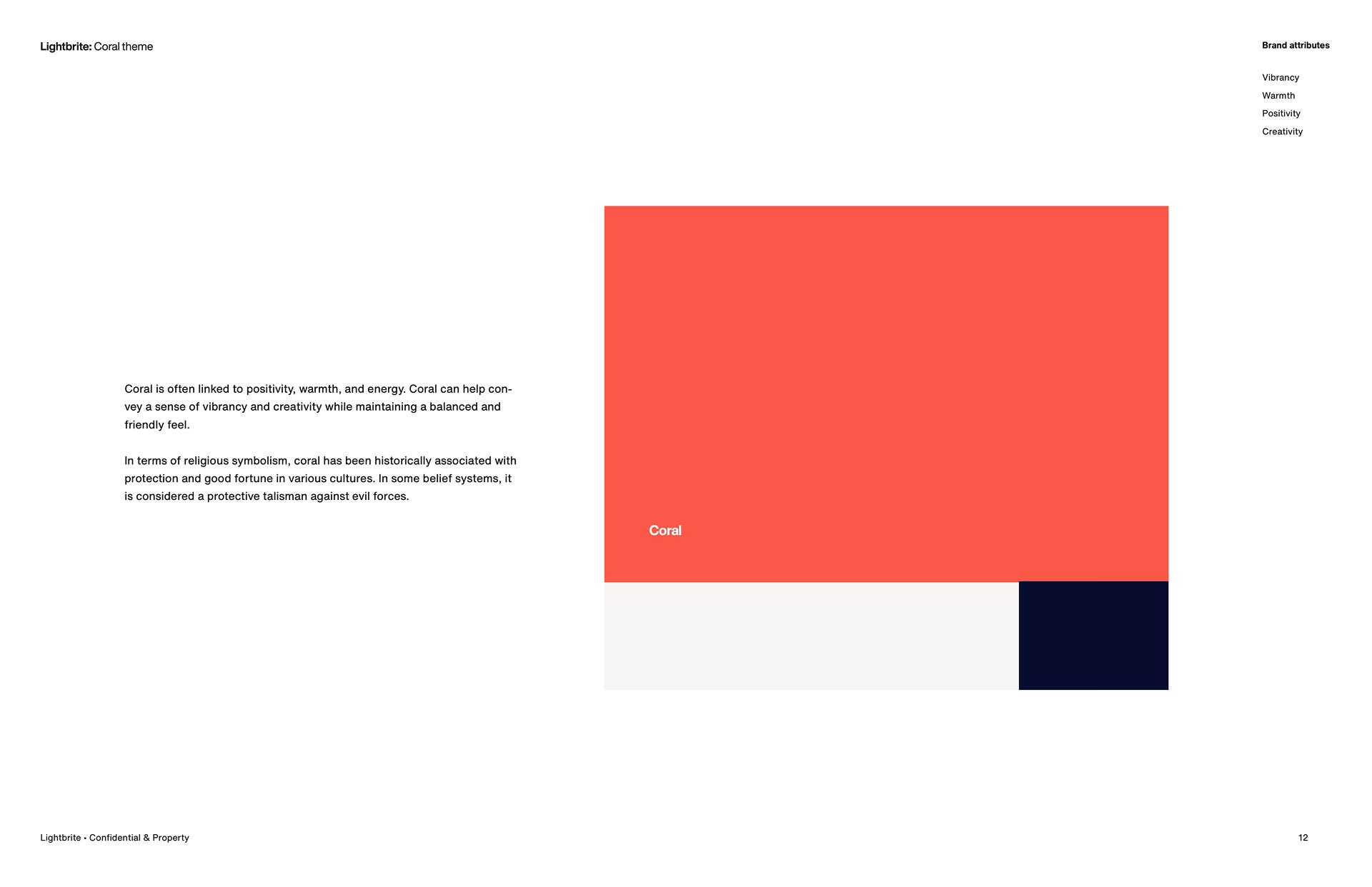
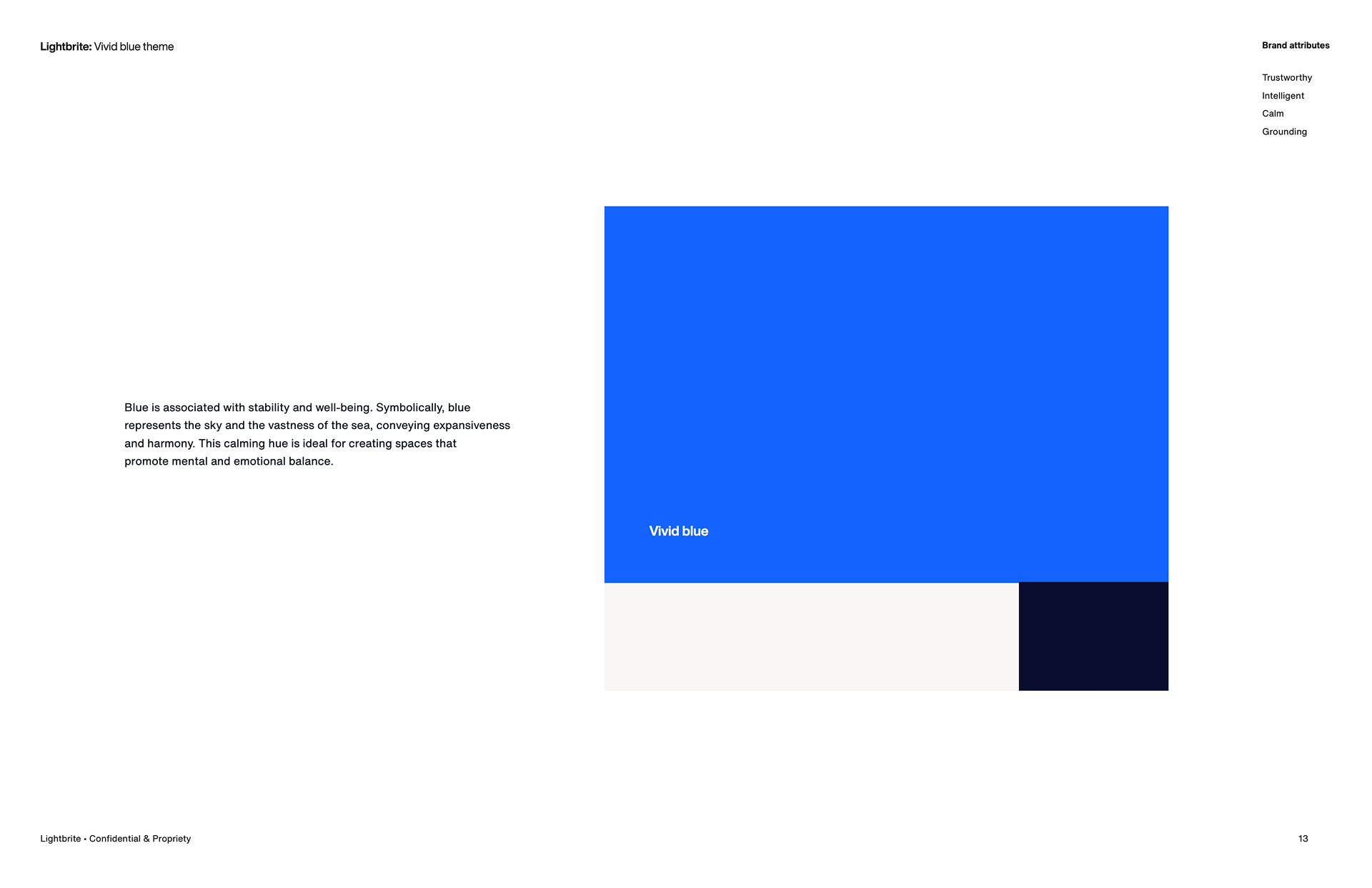
Beyond the competitive landscape, I explored psychological, historical, and visual references to ground the system's direction. On the color side, I studied how palettes have signaled healing, calm, and vitality across cultures and eras, weighed against current color trends in both the wellness and technology markets — identifying where the space was saturated and where Lightbrite could own something distinct.
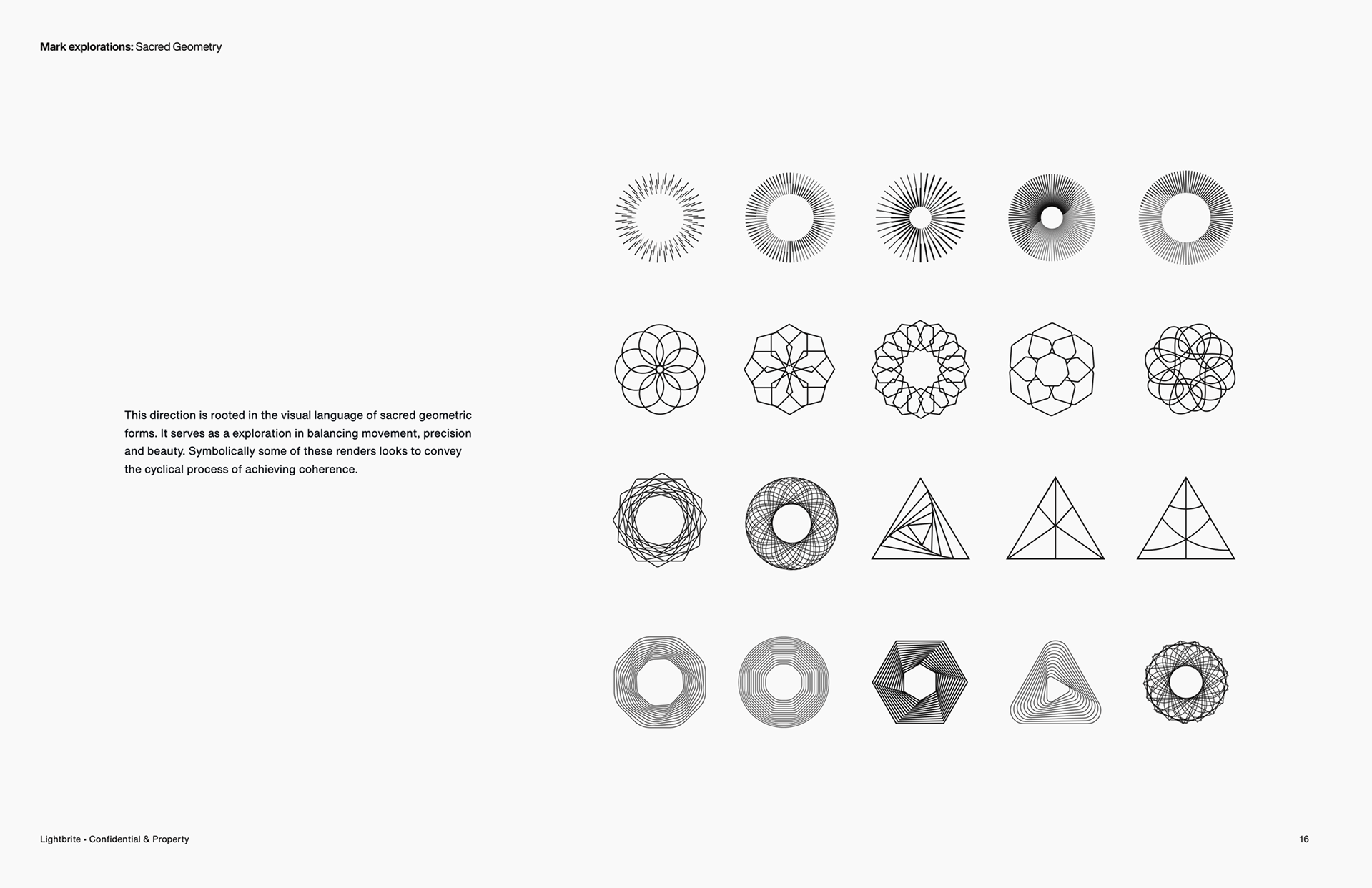
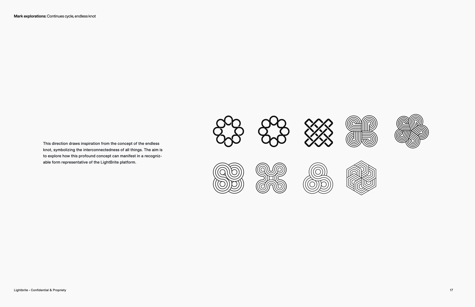
In parallel, the founders' interest in cymatics and sacred geometry became a significant focus — visual systems rooted in the mathematics of sound and resonance. Given Thea's foundation in sound therapy, these were not purely aesthetic references; they offered a direct visual analogue for how the product behaved. The research moved quickly from theory into form: the patterns began informing initial logo mark studies, with structures emerging directly from the geometry of sound. These weren't final solutions, but they established a foundational visual language that carried through the rest of the identity system.

Resolving the Naming Architecture
With initial approvals in place, I turned to one of the most structurally important challenges: how Lightbrite and Thea would coexist within a single identity system.
The solution was a clear parent–sub-brand structure. Lightbrite operated as the umbrella brand — the corporate, science-led voice behind the technology. Thea sat beneath it as the product brand — the consumer-facing expression focused on the wearable and the experience it enabled. Each needed a distinct identity while remaining unmistakably connected.
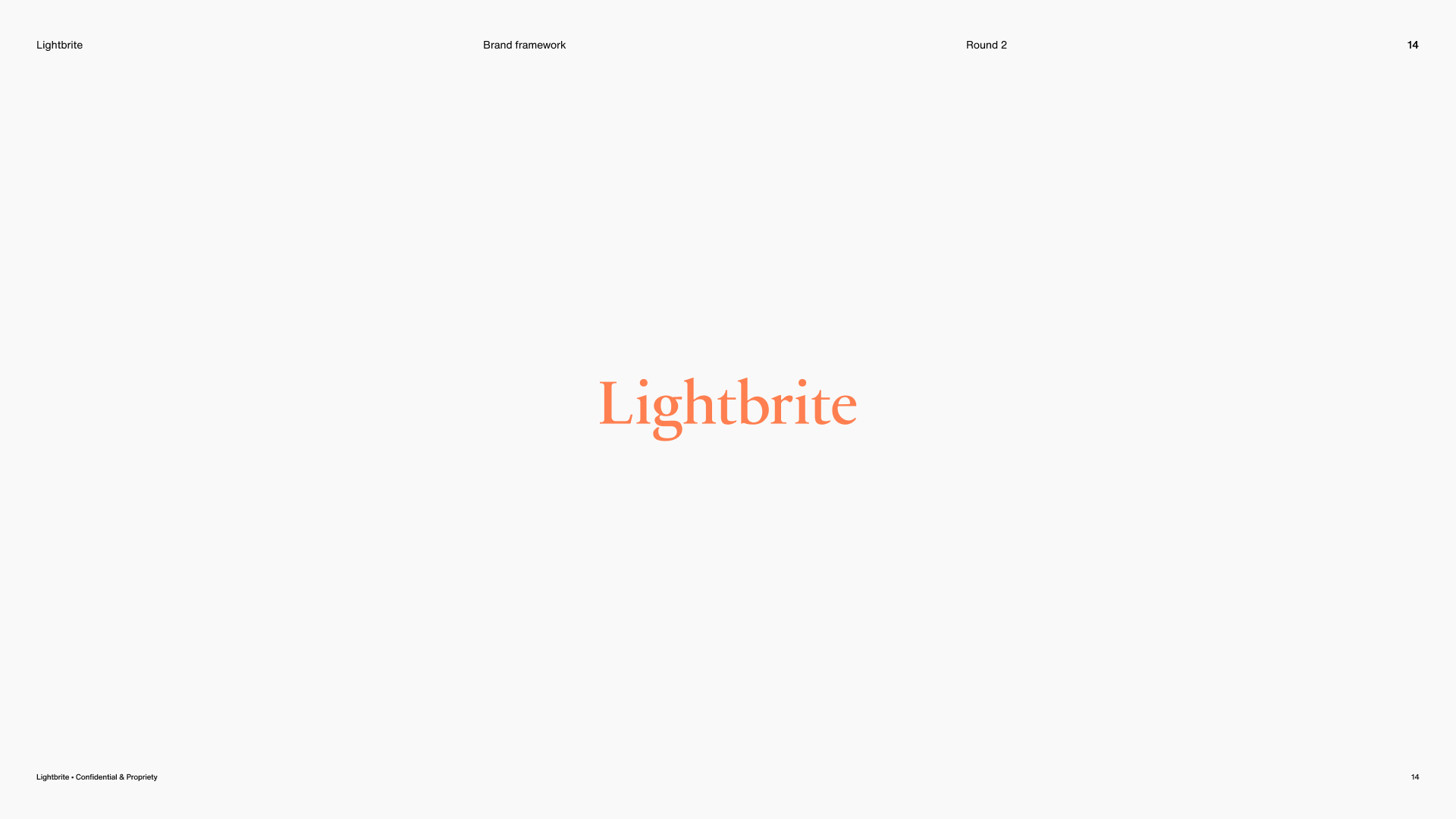
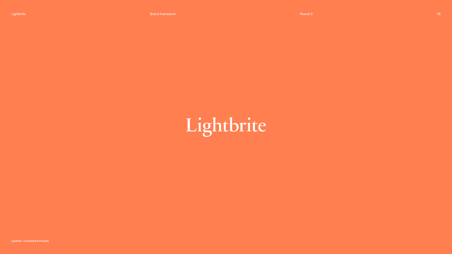
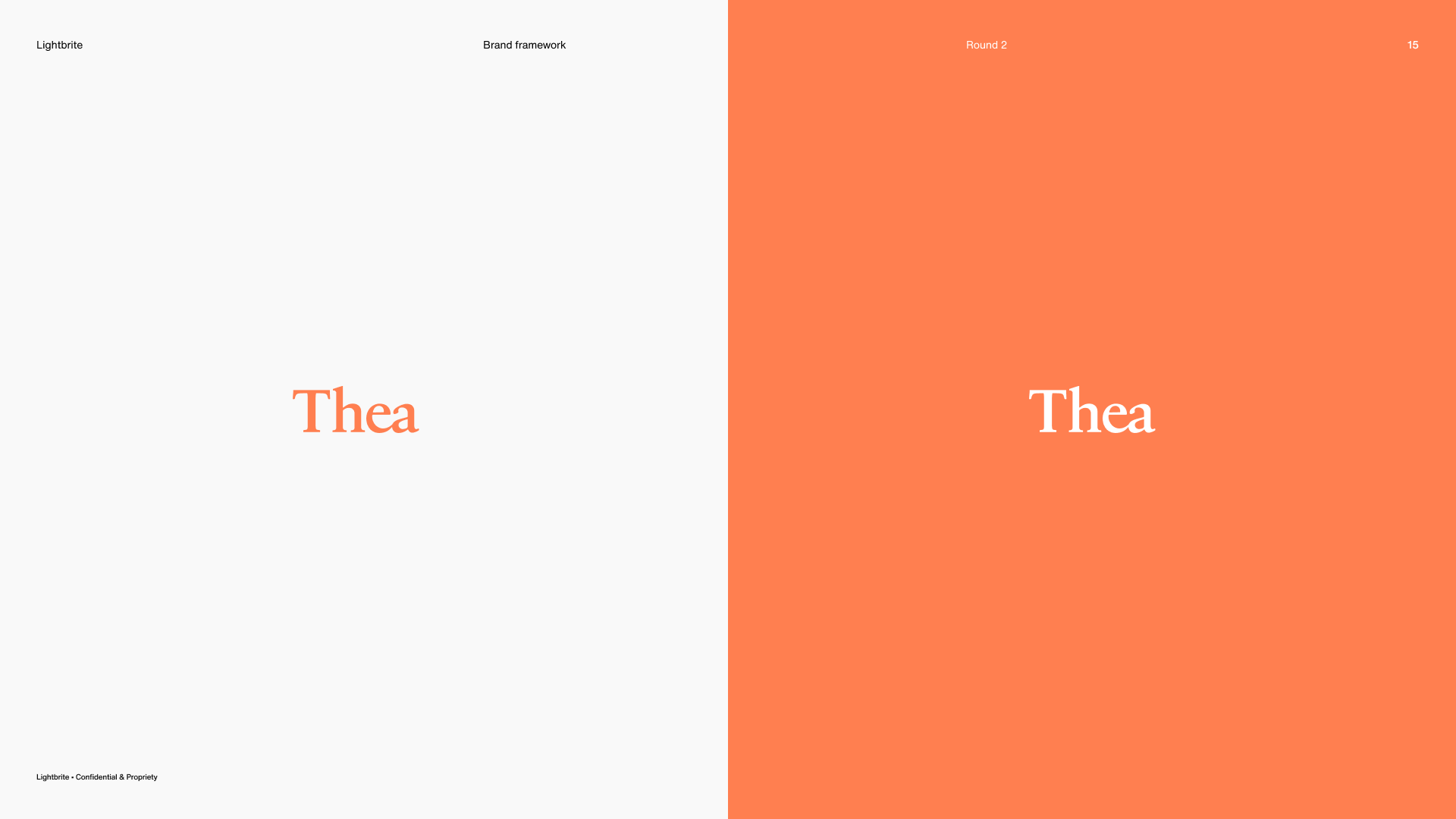
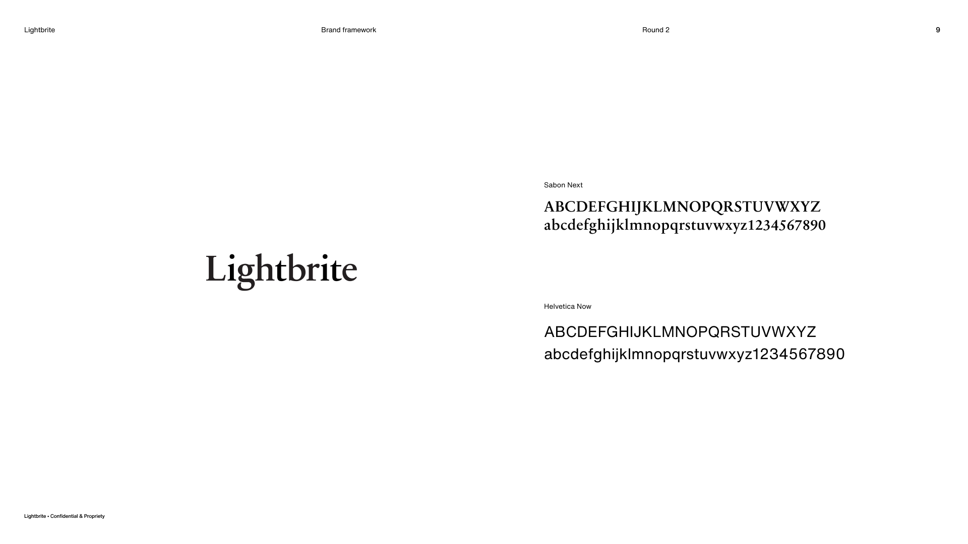
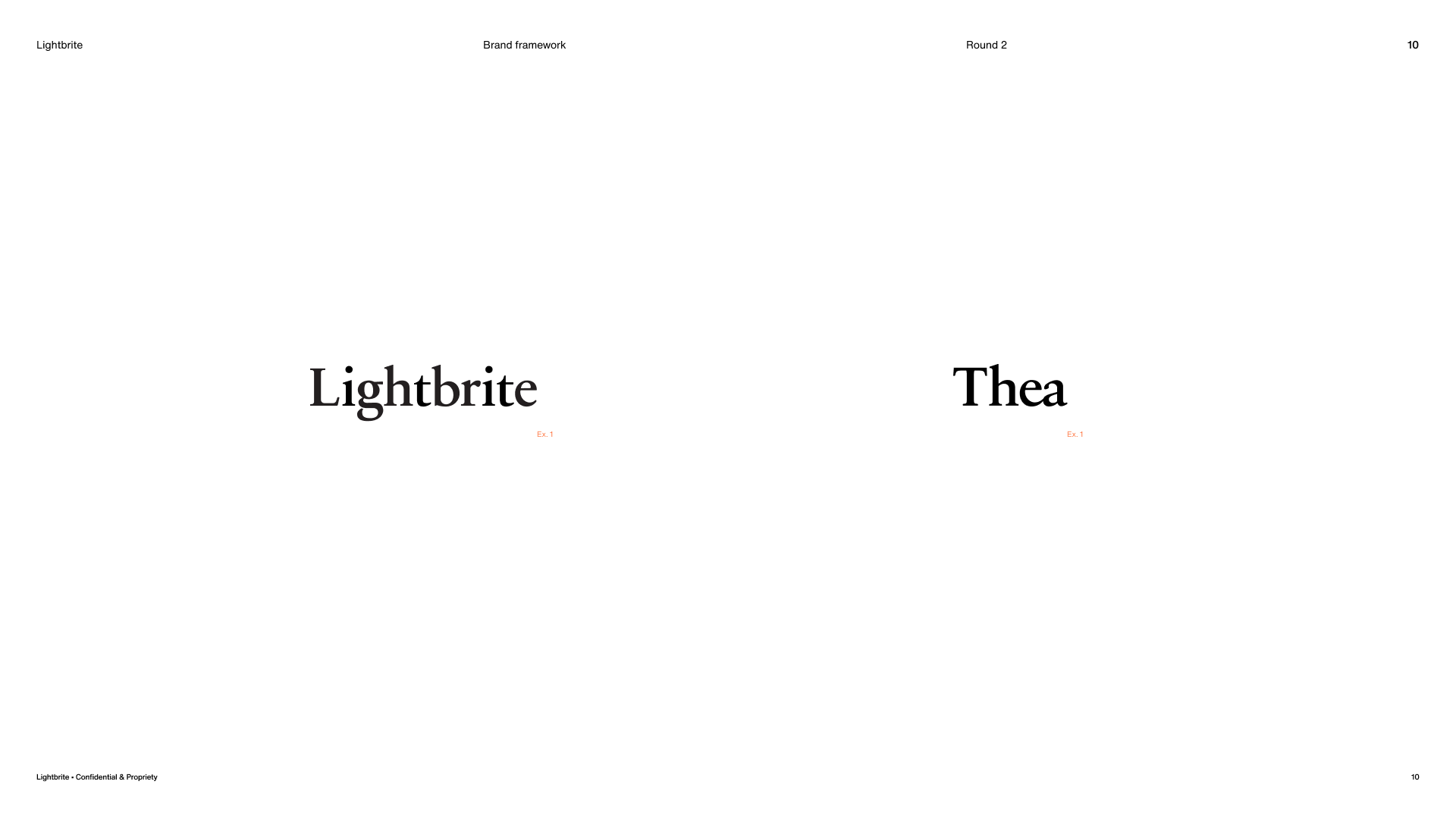
That connection began with type. I set both word marks in a modified Sabon — a typeface chosen for how it held opposites together: a quiet feminine elegance, a deliberate throwback to the scientific typography of an earlier era, and an approachability that kept it from feeling austere. Elegant and functional in equal measure, it also paired cleanly with Helvetica Now, balancing heritage against modern neutrality. For "Thea," I drew the e and a into an abutting pair — a subtle ligature-like join that gave the word mark a considered detail of its own.
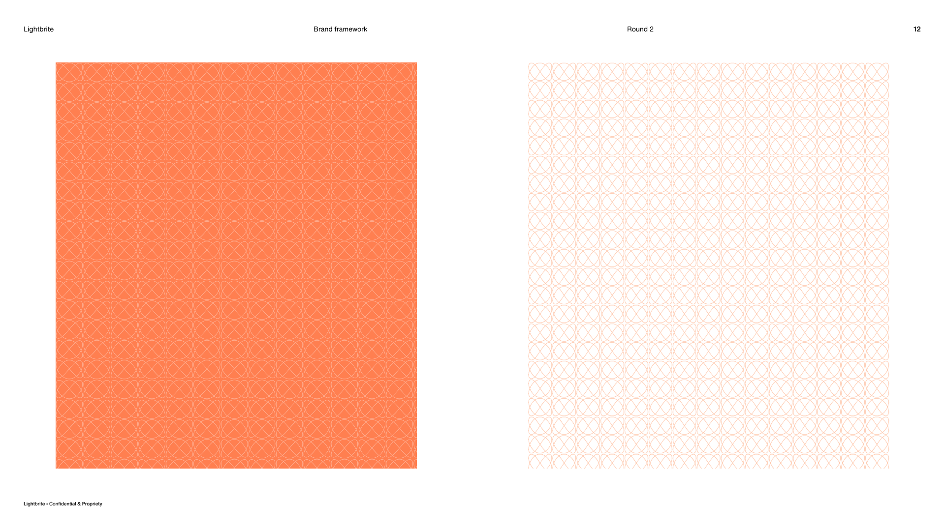
Lightbrite also carried a dedicated mark — a "bug" fashioned after a Lissajous curve, the looping figure traced by two oscillating waves, chosen as a direct nod to sound. Within the system, the bug always stood on its own; it was never locked up with the Lightbrite word mark. Beyond the mark itself, the Lissajous form extended into a repeating pattern motif — giving the brand a flexible graphic language drawn from the same geometry of sound.
Both word marks and the mark were presented to and approved by stakeholders before moving into the broader brand development phase.
Brand Development: Art Directional Passes
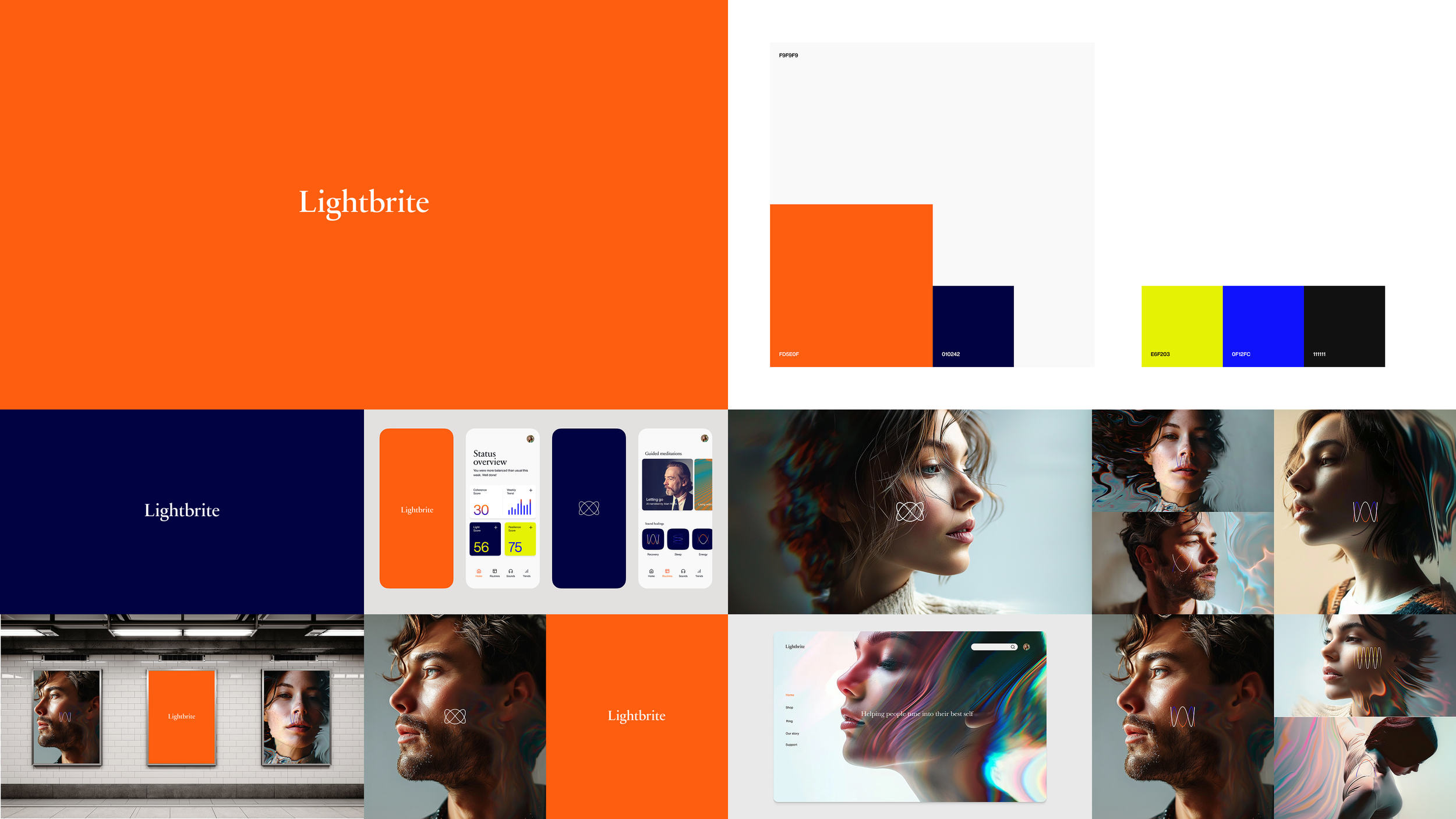
With the foundational elements approved — color palette, typeface system, brand mark, and word-marks — I developed three distinct art directional passes, each representing a different interpretation of the brand pillars across visual language, color application, and compositional approach. Rather than stylistic variations, each direction represented a distinct point of view on how the brand could live and behave.
Each pass was shown in context within a foundational system — not as isolated logo treatments, but as cohesive expressions across representative touch points. This allowed stakeholders to evaluate each direction based on how it actually performed rather than in the abstract. The directions were presented with clear rationale for each, demonstrating the strategic thinking behind every decision. Following review, one direction was selected as the foundation for the full brand framework.
From there, the chosen direction was tightened rather than redrawn — resolving edge cases, aligning every element, and pressure-testing the system across applications until it held together consistently. What remained was a settled foundation, ready to carry the full brand framework.
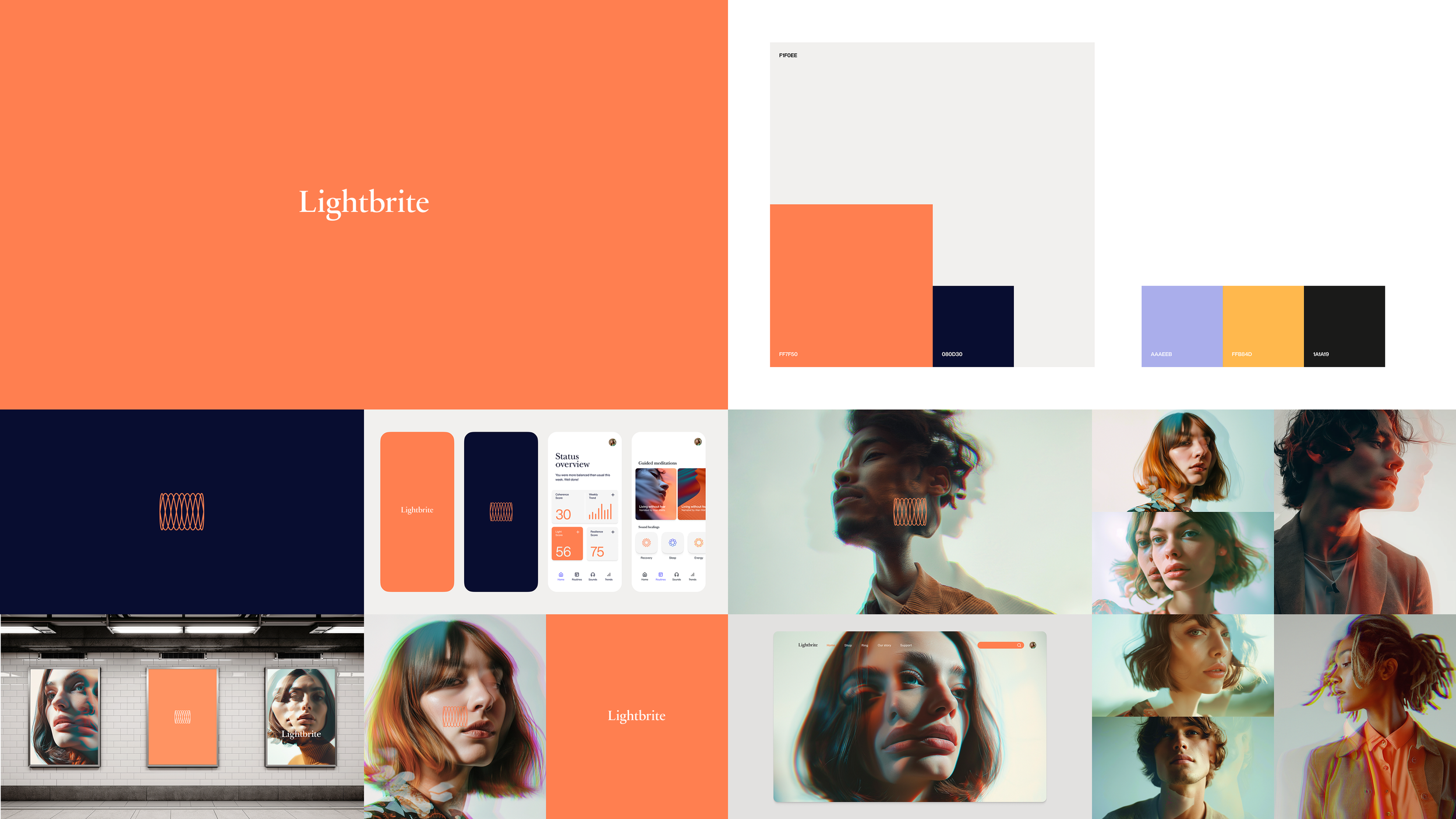
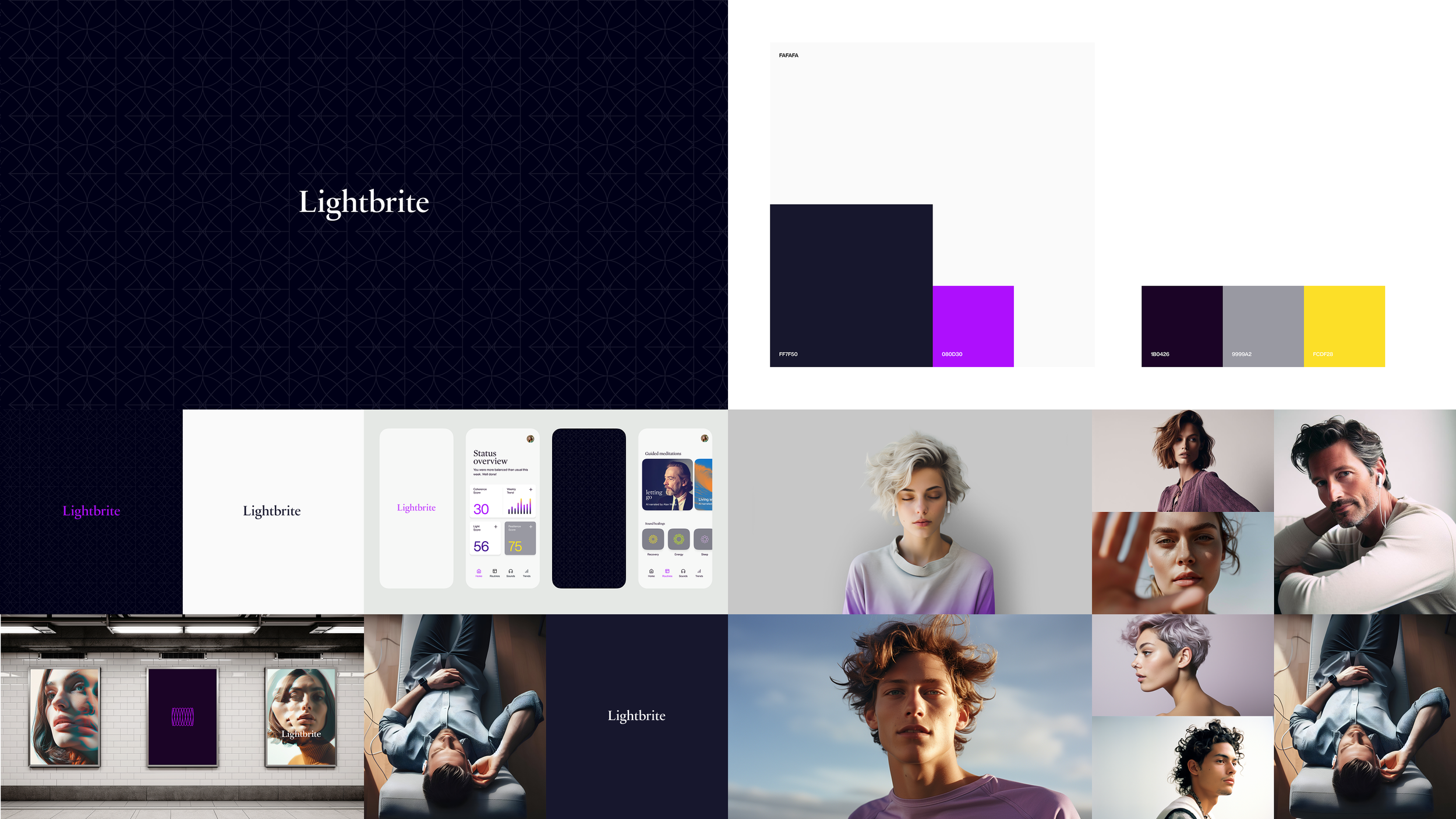
The Selected Direction
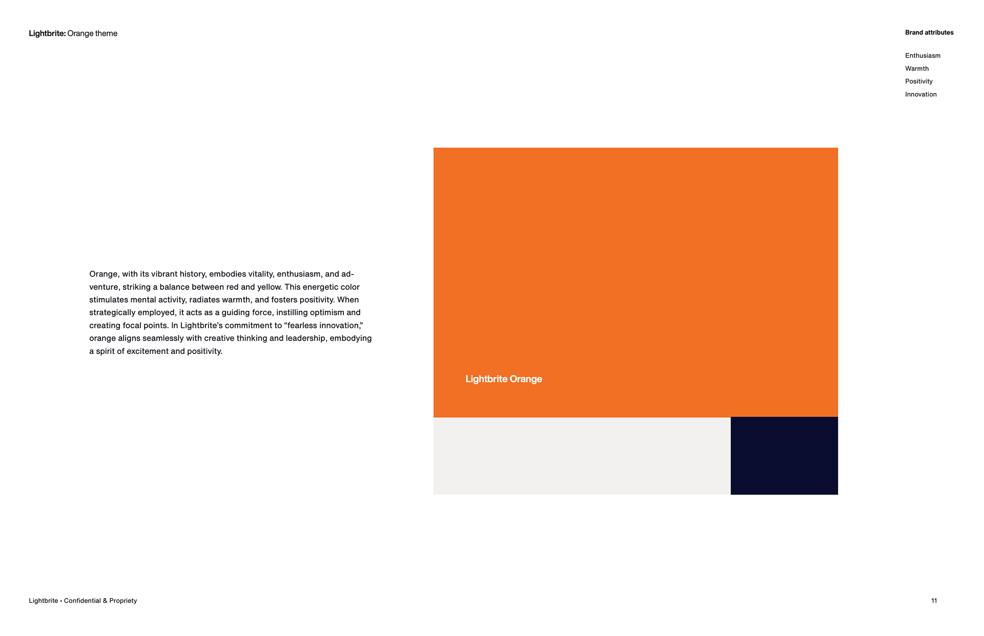
The second direction — built around a coral primary color — was selected, though the coral was warmed during refinement, pushed more orange than red to feel less clinical and more alive. The samples below show the resolved identity system and the finalized color in use. Part 2 expands the system out across the full brand.